
Categoria: Blog
-

The same house, a different floor: how UI changes on the inside without changing on the outside
What if the difference between a freelancer’s product and a mid-sized company’s has less to do with what’s on screen and more to do with what’s underneath?
-

Chips, Status Indicators & Badges: Look Similar, Mean Different
Chips, Status Indicators and Badges are small components, but they carry a lot of meaning. They are often made of the same ingredients: a short label, a coloured background and rounded corners. This can make them look interchangeable when designing or implementing an interface. They are not. Choosing between them should not be based on how the component looks, but…
-

5 patterns that separate a good dashboard from a memorable one
We’ve figured out why some dashboards tell you right away what to do—and others leave you guessing. The answer lies in five patterns that the best products on the market consistently follow.
-

Bridging the gap: collaboration between designer and developers after handoff
The handoff is complete. Documentation is thorough. Design specifications are clear. Yet this is not where collaboration ends—it’s where it truly begins. What follows is a critical phase where design intent meets technical reality.
-

Time Was Never the Point: The Truth About Task Board UX
Findings of a study into everyday work-management tools. An interface that looked simply outdated was, in fact, hiding a deeper problem: it was answering the wrong question. Discovering that, and what came next, completely changed how we approached this feature.
-

Creating Context-Aware Notifications for a Better Experience
Learn how different notification types communicate system events, validation, and background tasks while keeping users informed.
-

A Visual Recap of 2025: how we enhanced chatbot communication
Throughout 2025, the eXA team focused on improving how Pulse communicates, from shaping its tone of voice to collecting feedback and establishing communication guidelines.
-

Read Mode: Making Content Feel Effortless and Understandable
The reading experience on a screen doesn’t have to be chaotic, cluttered, and distracting. Learn how clean design, clear writing, and a friendly tone make reading easy and pleasant.
-
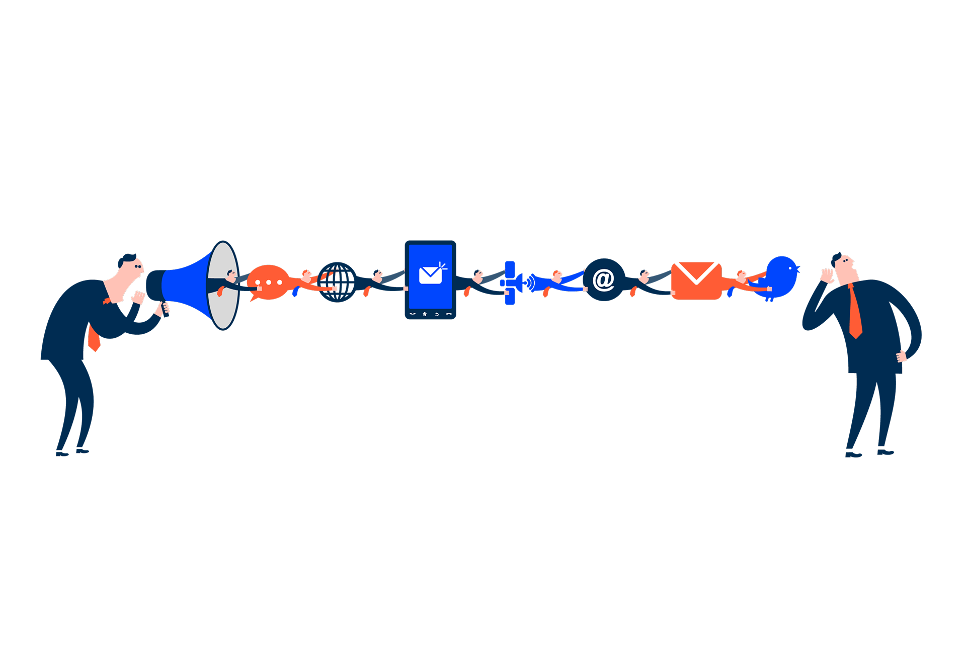
Designing the Invisible: How to Make Your Interfaces Work Without a Screen
Designing for screen readers means creating the best experience even when there is no screen to see. This article shares essential guidelines to help you create truly accessible and understandable components.
-

Compose Design Accessibility Statement
Compose Design is managed by Cegid’s Experience Architecture team, and it was developed to be used by as many people as possible, including people with disabilities. It currently has a score of 95%, respecting practically all the WCAG guidelines.
-
Declaración de accesibilidad de Compose Design
Compose Design lo gestiona el equipo de Experience Architecture de Cegid y sestá diseñado para que lo utilice el mayor número posible de personas, incluidas las personas con discapacidad. Actualmente tiene una puntuación del 95%, respetando prácticamente todas las directrices WCAG.
-
Declaração de Acessibilidade do Compose Design
O Compose Design é gerido pela equipa Experience Architecture da Cegid e foi desenvolvido para ser utilizado pelo maior número possível de pessoas, incluindo pessoas com deficiência. Tem atualmente uma pontuação de 95% respeitando praticamente todas as diretrizes da WCAG.