
It’s 8:47 AM on a Monday, and you, as a manager, have a dozen tasks to schedule across your employees before the morning briefing. You start with the first one: right-click on the day and time slot you need. Instead of the menu you expect, your browser’s own context menu pops up because your click didn’t quite land where the interface expected it to. You close it, adjust your click by a few pixels, and try again. It works. One task completed.
Now do that again. And again. Eleven more times, because it’s Monday and the week is full.
By the time you’re scheduling your twelfth task, the grid you’re working on has already been transformed, without you even noticing, into something completely different: rows of cut-out, overlapping cards, with half the text cut off, stacked so tightly that you can’t tell one from the other. The tool you’re using to keep track of a hectic week is now the very thing standing between you and your ability to get through it.
This isn’t a rendering error. It’s what happens when a time-based grid is required to store more (and with greater precision) information than it was designed to handle.
Good Intentions, Wrong Format
When we began analyzing this interface, the obvious conclusion would have been, “It’s urgent to modernize the calendar; we need a better calendar.” Better colors, a more readable font, a better structure for the cards. But the more we listened to the people who used this tool every day, the clearer a pattern became: no one thought in terms of time. They thought in terms of state.
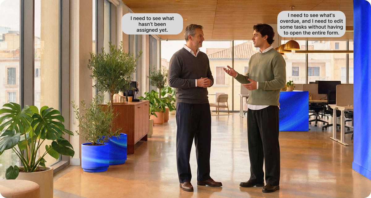
All the needs revolved around workflow. A calendar is designed to address time-related issues. Our users weren’t asking about time. They were asking about progress. It was in this discrepancy between the tool’s logic and the user’s logic that the true weakness lay, and no visual enhancement, no matter how sophisticated, would address it. That single distinction ended up shaping every decision that followed.
Designing for State Instead of Time
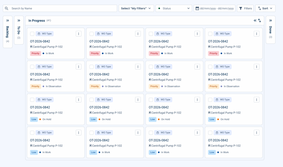
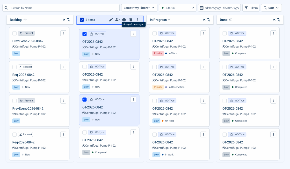
Instead of continuing to optimize a time-based grid, the team tested something structurally different: a state-based board, following Kanban logic (columns for Backlog, To Do, In Progress, Done, with work moving left to right as it progresses), closer to the logic of agile task boards than to any calendar.
Usability testing was carried out along the way, surfacing friction points and opportunities for improvement that were folded back into the design before it reached the version documented here.
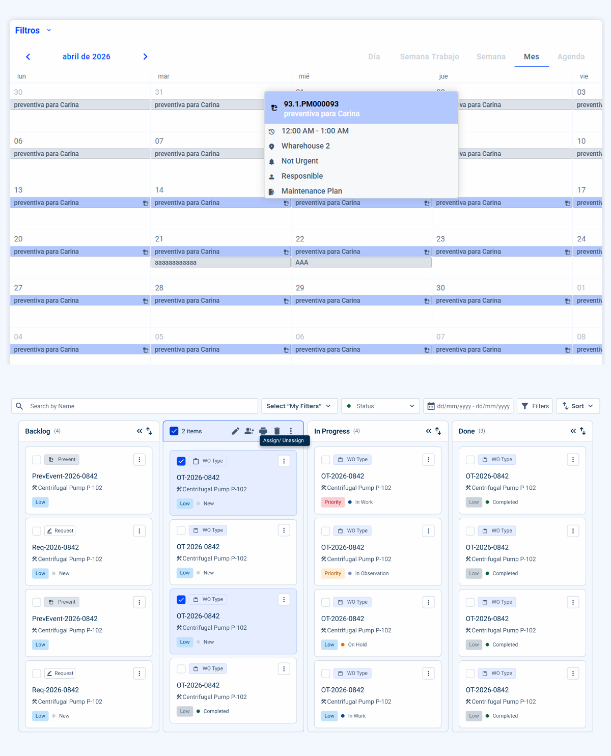
What Changed, and Why It Matters
Each decision below addresses a specific pain point identified during research and reflects a broader principle that extends beyond this interface.
1. Making State Information Visible by Default
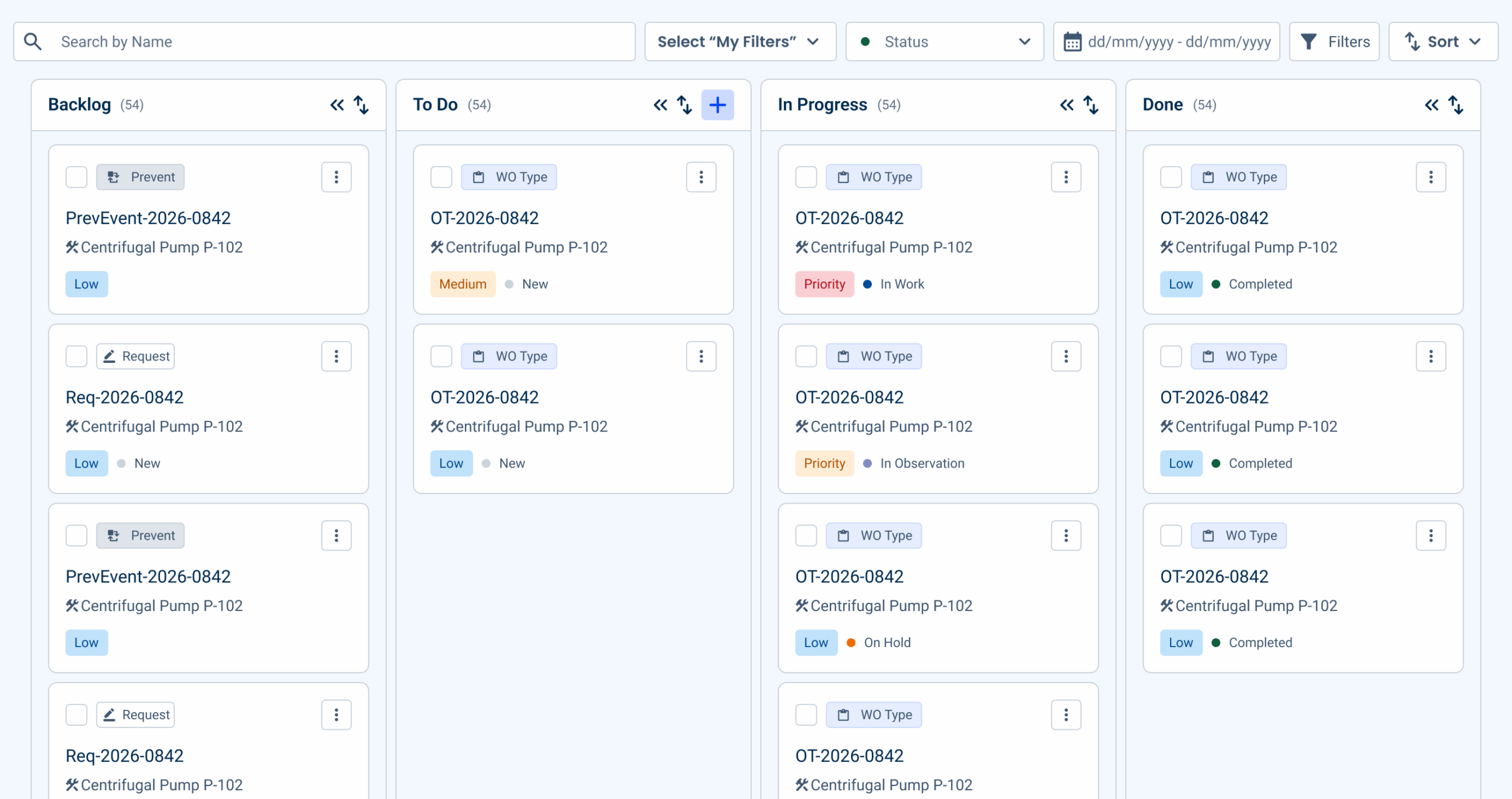
In the old design, workload and state were only displayed cell by cell and became an unreadable clutter as soon as the volume increased. In the new board, each column displays a real-time count straight away, without the need to click. Individual cards now convey more meaning at a glance as well: a small icon indicates the type of resource (a tool, a location, a route, or equipment) so people can recognize what they’re looking at before they even read a single word of the description. The most important information is no longer hidden behind an interaction; it’s now front and center, regardless of the amount of work in progress.
2. Let people act on tasks directly
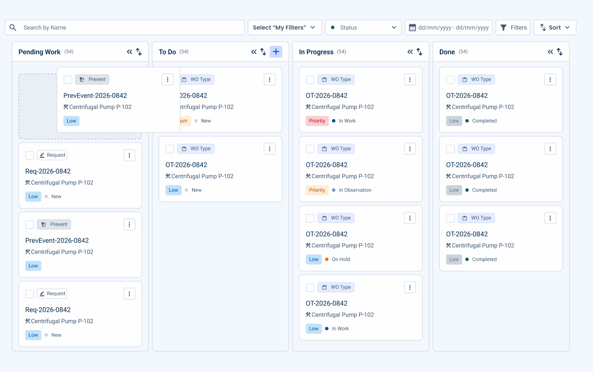
Previously, creating or moving a task meant right-clicking in a specific spot on the grid, and depending on the exact location of the click, the app’s own menu might not even be the one that appeared. Now, moving a task between states literally involves dragging it from one column to another, and creating new tasks is done using a specific button at the top of each column. All essential actions (CRUD) on a task (create, read, update, delete) take place without leaving the grid, so it’s no longer necessary to switch to a different view to manage a task’s entire lifecycle. The action mirrors the mental process people already use (“this has moved forward, I’ll move it”), rather than relying on a precise click on the right target.
3. Let people control how much detail they see
One of the most common mistakes in task management interfaces is assuming that displaying more information is always better. That’s not the case. The person doing the work should be able to decide how much information to see and when, rather than being overwhelmed by all the information right from the start.
In this design, hovering over a card reveals all the details (description, dates, assignees), while the default view remains minimalist: just ID, active, status, and priority. Even in this expanded view, truncated content (a long description, a task name, a list of attachments) displays the rest in a tooltip when you hover over it, so that nothing remains permanently cut off just because it didn’t fit.
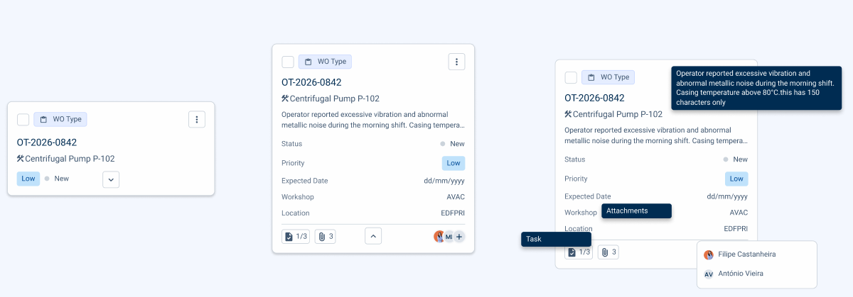
The same logic applies to entire columns: a collapsed column is reduced to a fixed strip with vertical text, completely hiding its list of cards, while expanded columns share the remaining space in a fluid, responsive layout. There’s even a single command to collapse or expand all the cards in the board at once, for those moments when you want to get a big-picture view instead of reviewing one card at a time.
4. Reduce clicks for frequent changes
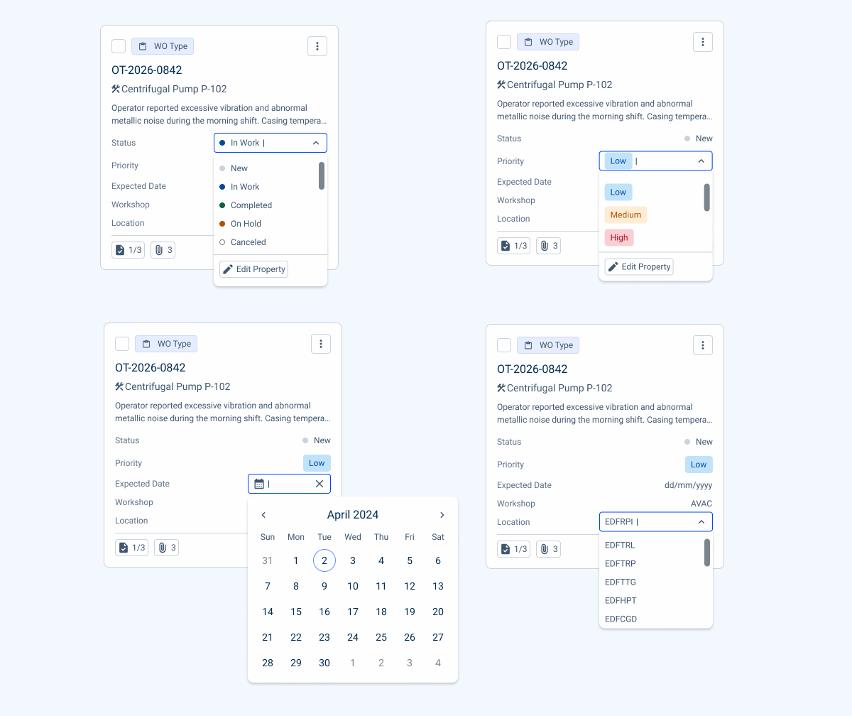
In the previous design, changing a task’s state or priority always required opening the full flyout (a lengthy form with multiple fields) just to change a single value. In the new design, fields such as state, priority, due date, or location can be edited directly on the card, using built-in drop-down menus and selectors that close as soon as the user clicks elsewhere.
The card’s footer follows the same logic: assigning a technician opens a small multiple-selection dropdown instead of the full flyout, adding a task is a quick click on a button on the technicians’ dropdown, and attachments have their own dedicated space; each action is limited to exactly what’s necessary and nothing more.
The columns can also be sorted independently by priority, due date, creation date, or estimated date, so people can reorganize their own view of the work without having to use a filter.
The rule we applied throughout the process was simple: if it’s something people change frequently, it shouldn’t require opening an entire form to do so.
5. Save filter combinations instead of rebuilding them
Work managers tend to repeatedly check the same sets of information, such as “my high-priority tasks” or “everything that isn’t assigned during my shift.” In the previous design, filters had to be rebuilt from scratch every session.
The new filter bar addresses this issue on several levels at once:
- A free-text search with a field selector (search by name, work order type, workshop, technician, etc.);
- Quick filters for rapid information segmentation (status and date range, with presets such as this week or this quarter);
- Overlay criteria, such as workshop, customer, or supplier.
- In addition to filtering, an independent sorting control reorders the table by priority, due date, creation date, or expected date, so that users can change the order of their own view without having to change any filters.
Saved combinations can be reused with a single click, active filters appear as chips, and a global reset clears everything instantly.

6. Design for the half-second before someone starts reading
In the previous design, the priority and status were displayed in a text field that had the same visual weight as the other elements on the card. To know that a task was urgent, you had to click on the card and read the word “urgent.” That’s counterintuitive: urgency is exactly the kind of information a person should perceive before they’ve even consciously read anything.
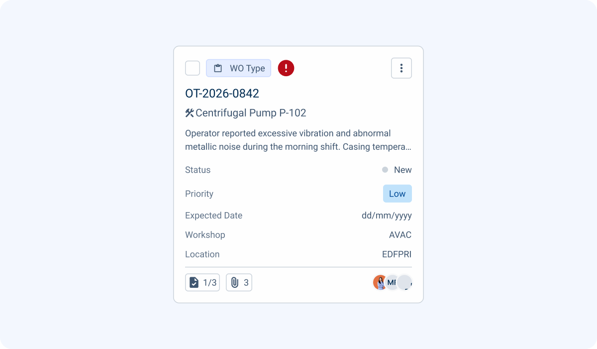
The new design treats color as the first layer of information, not the last. Priority and status now use consistent colors across the entire board, so a red label means the same thing whether you’re looking at the Backlog column or the In Progress column. Cards whose due dates have already expired have a visible error indicator that’s impossible to ignore during a quick scan of a column. The new cards added to the board are briefly highlighted, a signal that indicates “something has changed here” even before anyone has to look to see what it is.
None of this demands attention. This is the difference between an interface that informs and one that merely records. A color noticed out of the corner of one’s eye has already served its purpose by the time one begins to read the card beneath it.
7. Bring bulk actions into the board itself
This update addresses a common feature in work management tools: bulk actions, that is, editing multiple tasks at once, assigning them to team members in batches, generating reports, and removing multiple items. In addressing this issue, we found that bulk actions functioned as a separate feature, that is, disconnected from the view where work managers actually decide what needs to be done. This disconnect means that the moment someone realizes they need to act on multiple tasks at once, they have to leave the context where that decision was made to carry it out elsewhere.
In the new design, multiple selection is integrated directly into the board itself: when selecting multiple cards, a bulk action bar appears that includes the same actions, without ever leaving the screen where the decision began. The advantage here isn’t just the reduced number of clicks. It’s the continuity of thought. When the action takes place in the same location where the thinking occurs, the person managing the work retains the full context, rather than having to reconstruct it elsewhere.
During research interviews, one user put it plainly:
Yes. If this were implemented, I would work from the [feature to which the new design applies], not from the [another product screen].
Key takeaways
Here are some key takeaways from this study:
- Examine the problem before refining the interface: If people describe the problem using different terminology than the interface does (status versus time, for example), the problem likely lies at a level above the visual elements;
- Make frequent actions fast and let rare actions take longer. If people change a task’s state ten times a day, that action should take one click. If they only fill in full task details once, a longer form is an acceptable trade-off;
- Colors and visual cues should convey meaning, not serve as decoration. If a user needs to read text to understand the urgency, the visual cue appeared too late;
- Recurring settings should become saved preferences. If someone recreates the same filter every day, that’s not a problem with the filter, it’s a memory problem that the interface should solve on its own;
- Bulk actions should be where the decision is made, not in a separate menu disconnected from that context;
- Notice what goes wrong as the volume increases: A design that works with five items and falls apart with 15 is not complete, it hasn’t been tested at the scale that really matters.
Conclusions
If there’s one idea worth taking away from this work, it’s this: the right interface isn’t the one that looks the most modern, but rather the one that matches the way people actually think about the problem. The calendar wasn’t poorly designed. It was answering the wrong question. We only discovered this because we listened carefully to the language people used to describe what they needed, and that language referred to states and flows, not just hours and days.
It’s also worth noting that none of the design decisions discussed in this article resulted from an isolated intuition. Each of the principles above was tested, validated with real users, and revised several times before arriving at the version documented here.