
Open 10 different financial dashboards and, at first glance, they all look the same: cards with big numbers, a line chart somewhere in there, a table further down.
But spend 5 minutes actually using each one (not just looking at it) and the difference becomes obvious. Some answer, right away, the question “what do I need to do now?” Others leave you decoding what those numbers even mean.
That’s the difference we went looking for.
We analysed several of the leading products in the financial and enterprise management market, from vertical platforms built for SaaS to large-scale enterprise platforms. The goal wasn’t to copy interfaces, but to understand what actually sets them apart (we’ve already covered why dashboards matter in the first place — this article picks up on that topic.)
And the more products we compared, the clearer it became that the good decisions weren’t really original.
They repeated.
They showed up in different forms, in products with completely different audiences and purposes, but they were always solving the same underlying problems.
We call them patterns. There are five of them, and none of them requires sophisticated technology: they simply call for a deliberate design decision, because the easiest path (a grid of static numbers) is also, invariably, the least useful one. That is precisely why they are worth sticking to.
1. Work lists
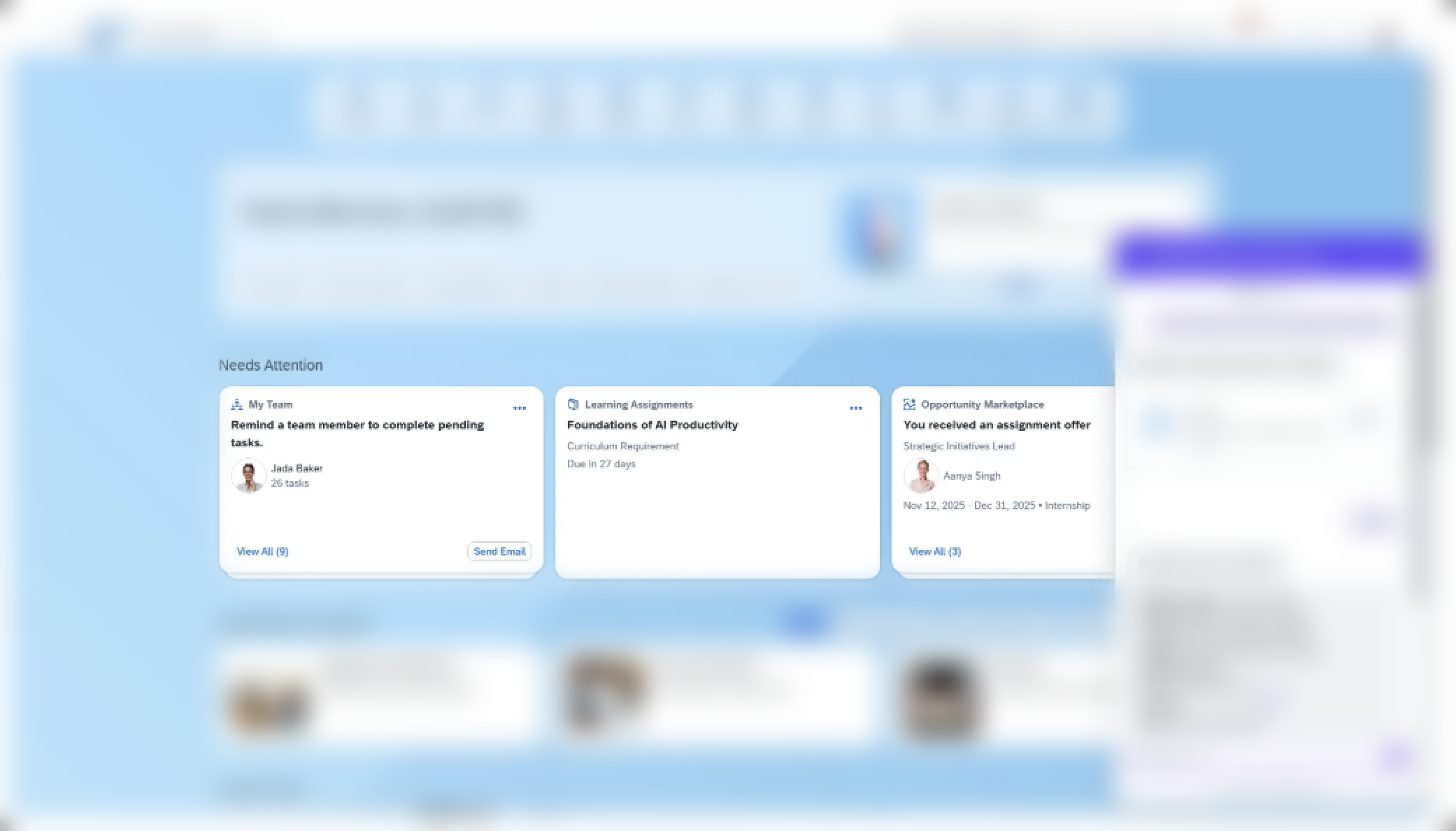
The first pattern is perhaps the most transformative one: the best dashboards don’t just display data, they turn into work lists.
In one of the products analysed, the main dashboard area functions literally as an operational to-do list:
- transactions to reconcile
- invoices to send
- contracts to review
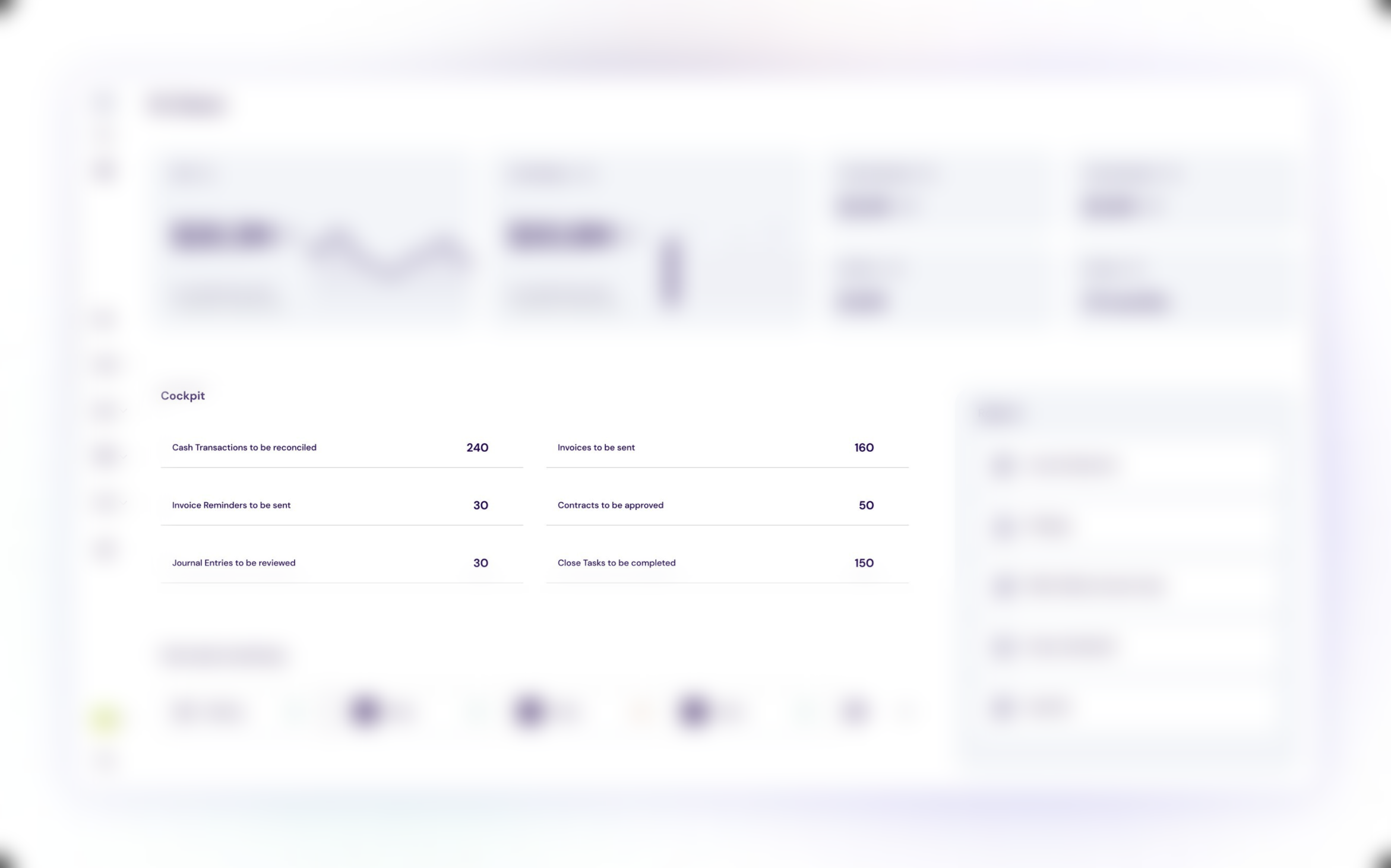
It’s not a passive view of indicators. It’s a concrete starting point for the day’s work.
What we learned: a dashboard shouldn’t just mirror the database. It should answer “what do I need to do now?“, not only “what’s happening?”.
We also identified the most common failure associated with this pattern: lists of pending items with no indication of urgency or impact. When the volume is low, that’s not a big deal. When the volume grows, the lack of prioritization makes the list useless. The user sees 240 pending items and doesn’t know where to start.
Recommendation: whenever a dashboard presents action items, they should have an implicit ordering (urgency, value, deadline) and, ideally, a direct action attached to them, not just a number.
2. Clear visual hierarchy
The second pattern is structural: the most effective dashboards organise information into reading layers, and those layers are always the same: alerts at the top, trends in the middle, detailed analysis at the bottom.
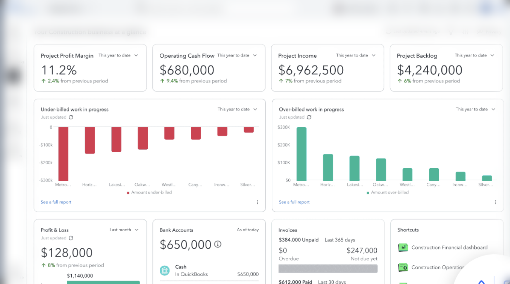
This order isn’t arbitrary. It matches how a user processes information when opening an application:
- first, they want to know if something is wrong
- then, they want to understand the general direction
- and only after that (if needed) do they want to dig into the detail.
A recurring detail within this hierarchy is the use of contextual sparklines on trend cards: a small line chart next to the number, communicating direction without requiring an analytical read. It’s a small element, but one that significantly reduces cognitive load.
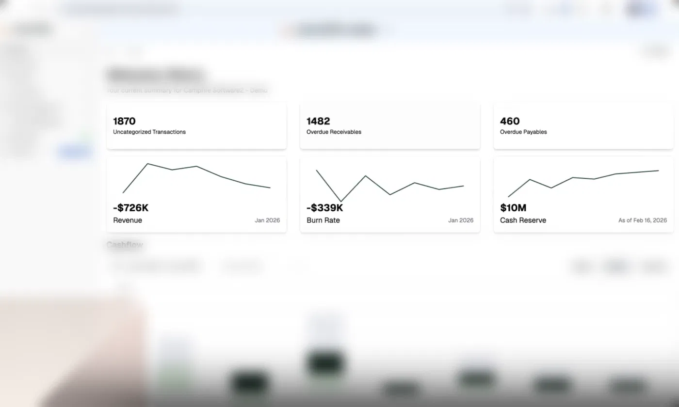
We also observed a common failure: negative or critical values presented with no semantic color coding. For a financial user, a negative number should communicate risk immediately, through color, an icon, or a directional indicator, without requiring the user to read the sign of the number.
Recommendation: every dashboard should follow the same vertical structure (alert > trend > detail), and every value with performance meaning should have consistent visual coding, not just typographic emphasis.
3. Contextual filters with scope logic
The third pattern concerns something that’s often treated as a technical detail, but that has a direct impact on user trust: filter logic.
In one of the products analysed, filters always follow an organisational hierarchy:
- the most general (organisation)
- the most specific (site, product, individual supplier)
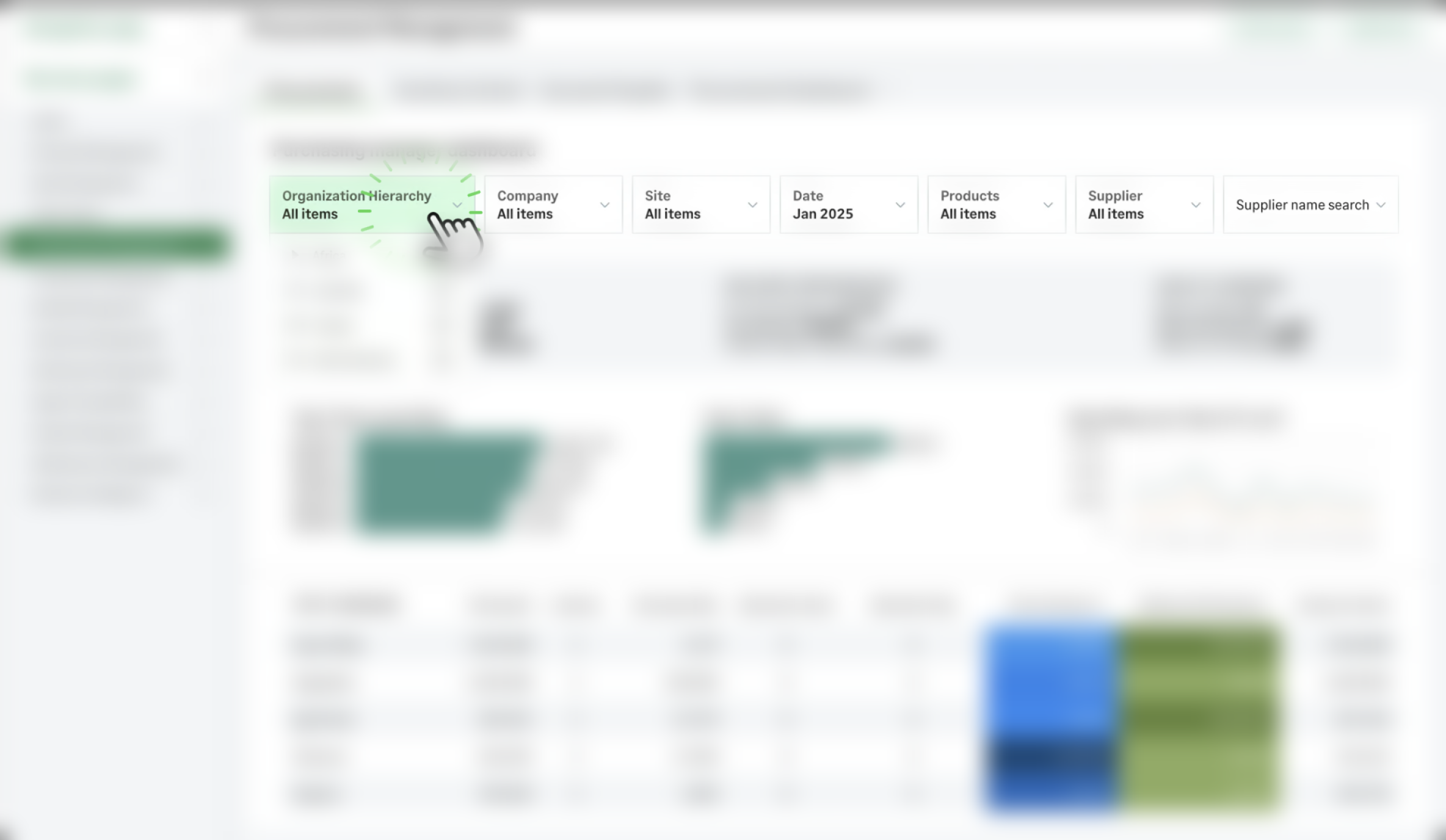
This order isn’t just aesthetic — it reflects how business decisions are actually made, from the macro to the micro level.
Filters are global and consistent. When a user applies a filter, it affects every area of the dashboard simultaneously, with no silent exceptions. A dashboard where some widgets respect the filter and others don’t is a dashboard the user quickly stops trusting.
A second product reinforces this point with a simple but effective detail: it makes it visible and explicit that the data shown is filtered. This removes the risk of a user making decisions based on a partial view of the data without realizing it.
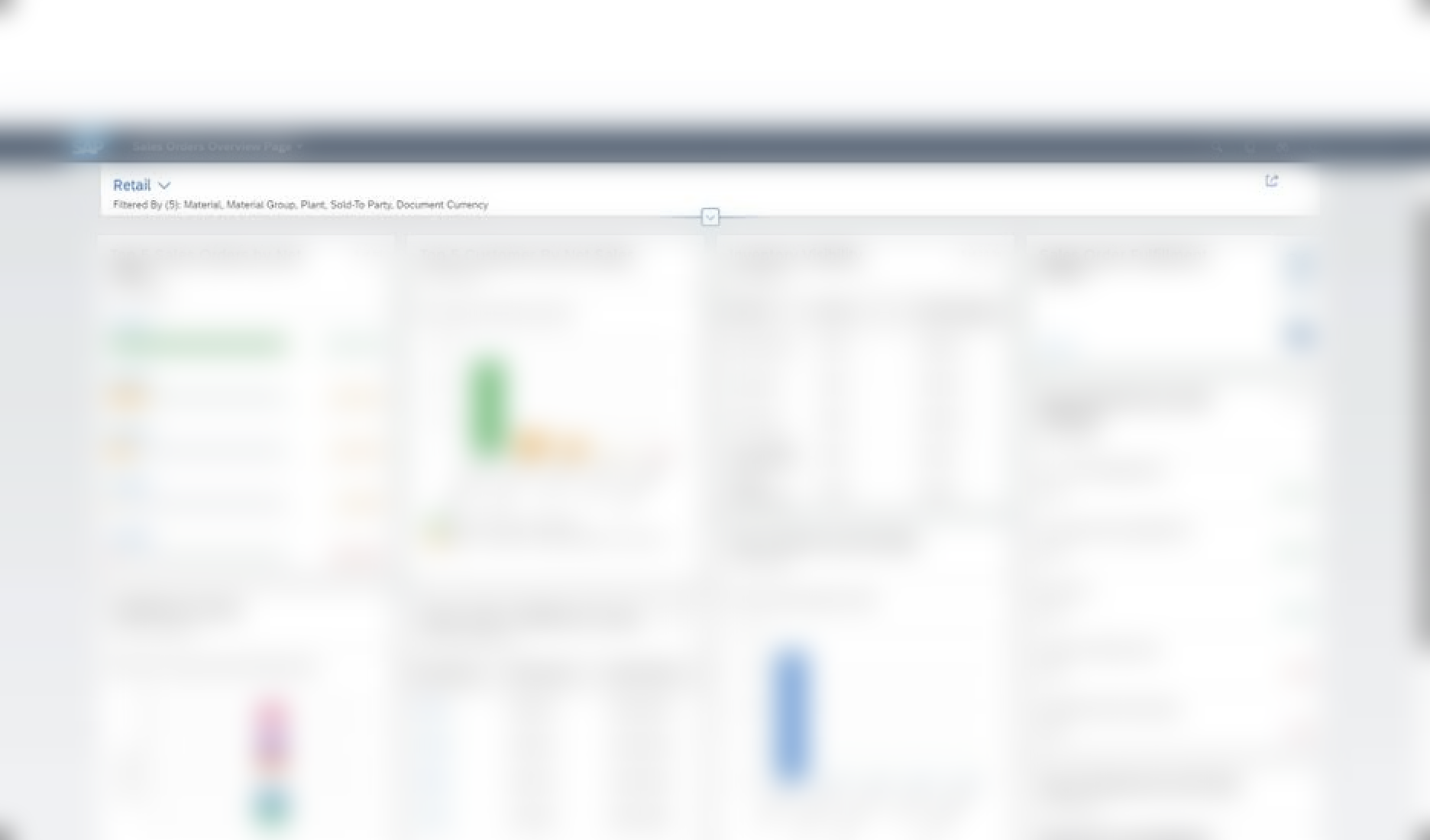
Recommendation: Set a default order for filters (from most general to most specific), ensure that all components of a dashboard respect the same filter state, and make it visible when a filter is active.
4. Data updates and status indicators
The fourth pattern answers a simple question that is rarely addressed in the interface: Can I trust these numbers?
One of the products solves this with a small but impactful detail: each metric card displays “updated 21 minutes ago” along with a refresh icon. The user doesn’t need to manually refresh the page to know the data is recent.
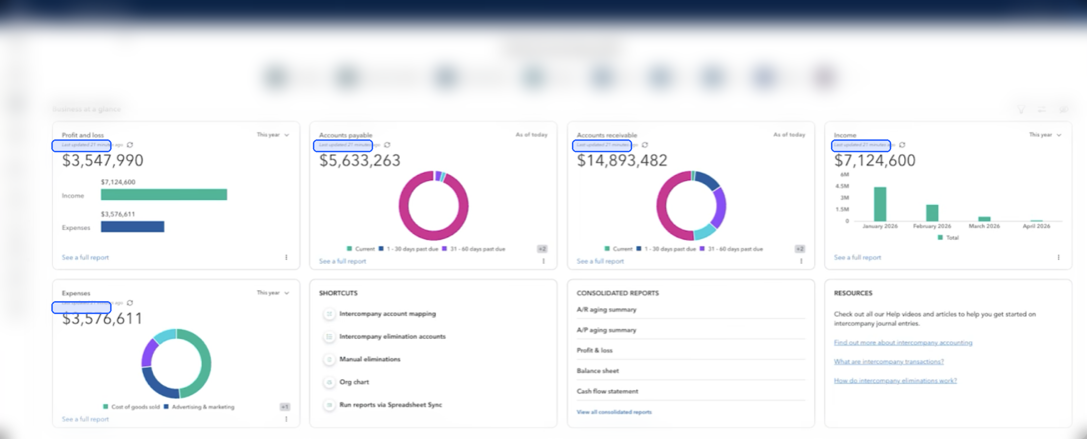
Another product tackles the same problem in a different, complementary way: integration status alerts are directly visible on the dashboard. If an integration with another system fails, it’s flagged proactively, without the user having to check module by module.
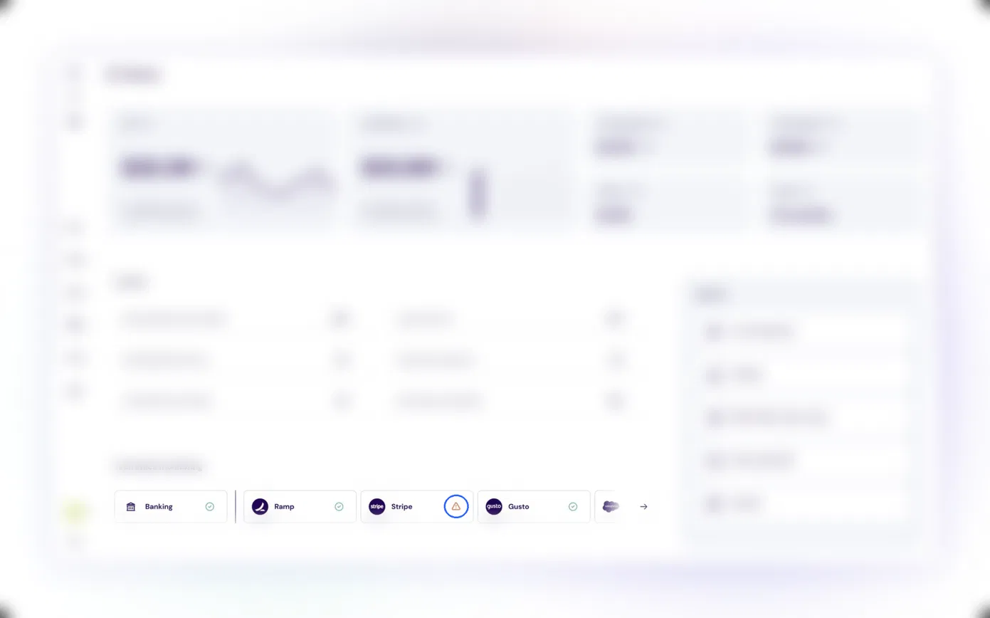
Both solutions solve the same trust problem, just at different points in the data’s lifecycle: one communicates when it was last updated, the other communicates whether it’s being updated correctly.
Recommendation: Every dashboard component that displays aggregated data should include, in a discreet yet visible manner, an indication of freshness or data source status.
5. Profile-based personalization and default values
The fifth and final pattern is perhaps the one that has the greatest impact on the perception of a product’s quality: contextual relevance.
This manifests itself in two distinct ways in the products analyzed.
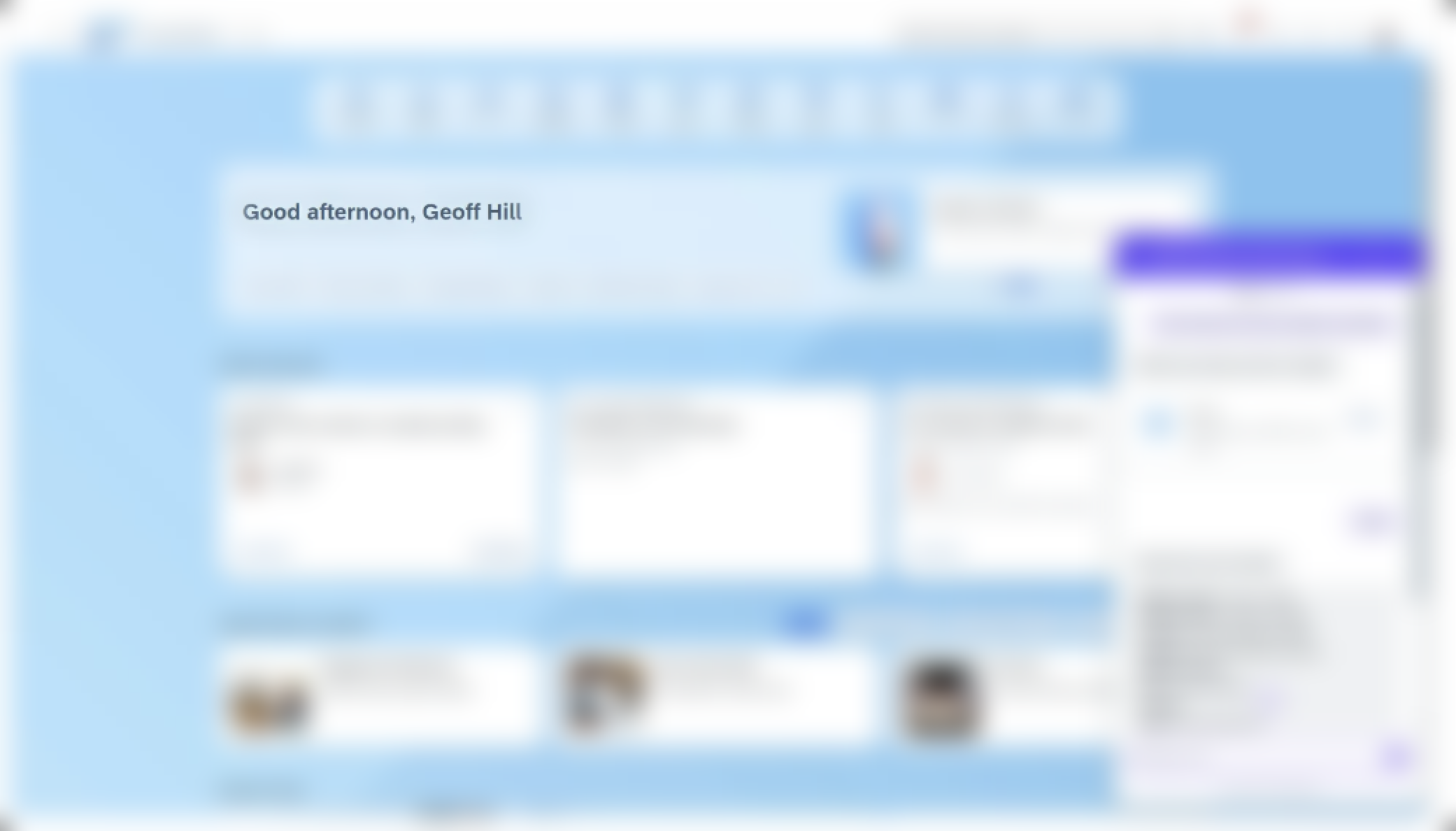
The first is symbolic: a personalized greeting with the user’s name and a time reference (“good morning”, “good afternoon”) which, on its own, doesn’t change any functionality, but immediately changes the perception that the system “knows who I am”.
In enterprise software, historically cold and transactional, this is a detail that stands out.

The second form is functional and far more relevant: different default dashboards based on the user’s profile.
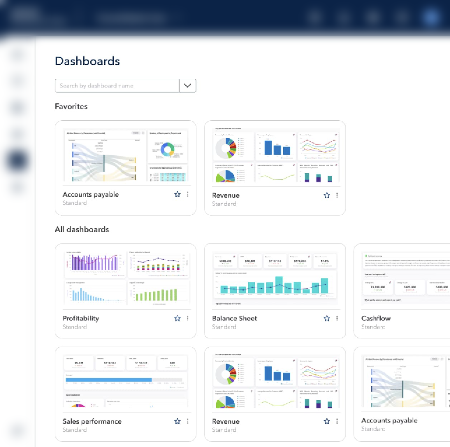
A procurement manager doesn’t see the same initial dashboard as a treasury manager; a production manager doesn’t see the same one as a CFO.
This “native homepage by profile” logic drastically reduces time-to-insight, because it removes the need for the user to manually configure what should already have been configured for them.
One of the products takes this principle even further, offering pre-built dashboards by industry sector, each with the relevant metrics already defined for that business context.
Recommendation: The design system should, from the outset, provide for default dashboard configurations associated with functional profiles, not just a single generic dashboard that everyone can configure.
In summary
None of these five patterns depend on sophisticated technology or artificial intelligence. They depend on deliberate design decisions:
- Turn data into actions, with prioritization.
- Always structure information the same way: alert, trend, detail.
- Make filters predictable, global, and visible.
- Communicate the freshness and reliability of the data.
- Adapt the starting point to the profile of whoever is looking at the screen.
A good dashboard isn’t defined by the amount of data it displays. It’s defined by how quickly the user understands what to do next.