
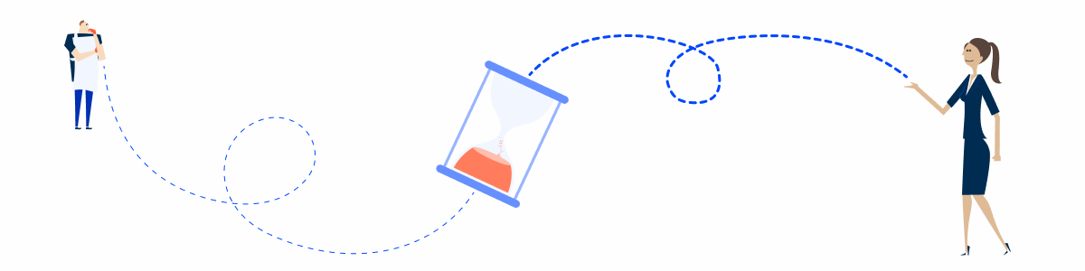
Most digital products have features that require users to wait while something happens in the background. These processes are often triggered by users, which is why it’s important to notify them appropriately.
Additionally, it’s just as important to inform users of the outcome, whether it was successful or not. In this article we’ll discover the different types of notifications to use and under what circumstance.
Types of Notifications
There are different types of notifications, each designed and developed for use in different contexts. Here are the different types:
- Instant and Temporary: These notifications appear directly within the context of the action the user is performing and are designed to remain on the screen for a limited time, informing the user about the status of an action, for example;
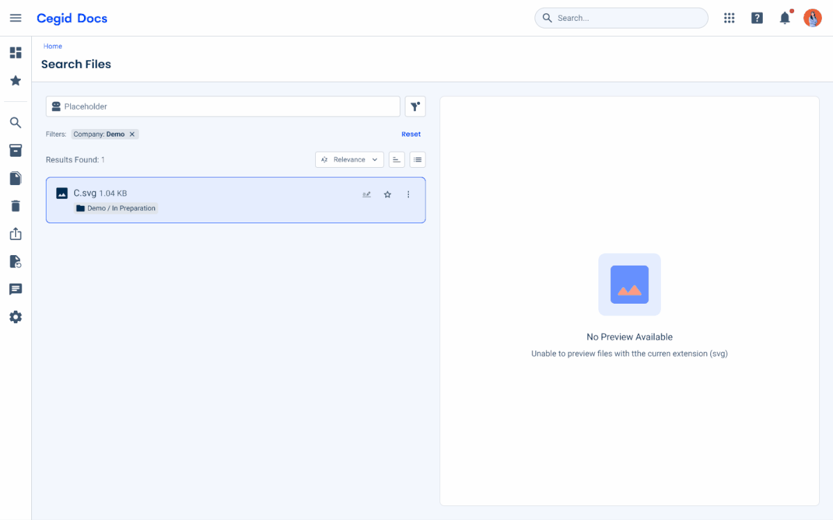
- System: These notifications are used to inform users about system-level events that occur regardless of their current context or interactions;
- Background Tasks: These notifications communicate the status of background processes, including progress, completion, and any relevant updates;
- Form Validation: These notifications communicate validation errors in forms, guiding users to resolve issues in their inputs.
Instant and Temporary
These notifications provide immediate feedback in response to user actions or system events and are displayed temporarily without interrupting the user’s workflow, for this purpose, Toasts are ideal.
They are used to communicate brief, non-critical information, such as confirmations, status updates, or minor issues.
Since they disappear automatically after a short period of time, their content should be concise, clear, and actionable when necessary, avoiding the need for user interaction or long-term visibility.
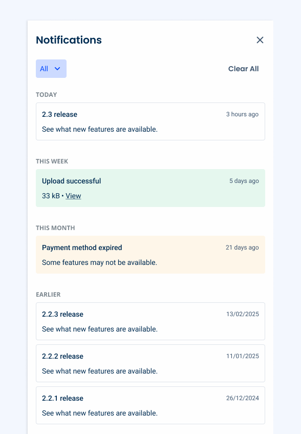
System
These notifications are used to communicate system-level events that occur regardless of the user’s current context or interactions.
They provide information about important updates, changes, or events that may require user attention or follow-up.
System notifications are displayed via the Notification Panel, allowing users to access and review them at their convenience; their content should be clear and descriptive.
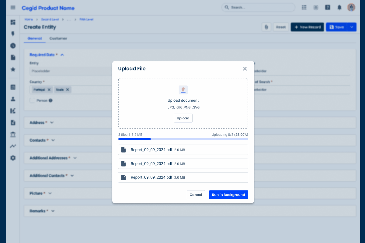
Background Tasks
These notifications provide updates on the status of processes running in the background, offering both immediate feedback and persistent visibility.
They typically appear instantly through a Toast to inform users that a background task has started, and remain accessible for ongoing status updates, such as progress or completion, through the Notification Panel in order to allow the users to monitor and revisit these processes at any time.
Their content should be clear, informative, and reflect the task’s current status, including a Progress Circle to indicate that something is happening.

Form Validation
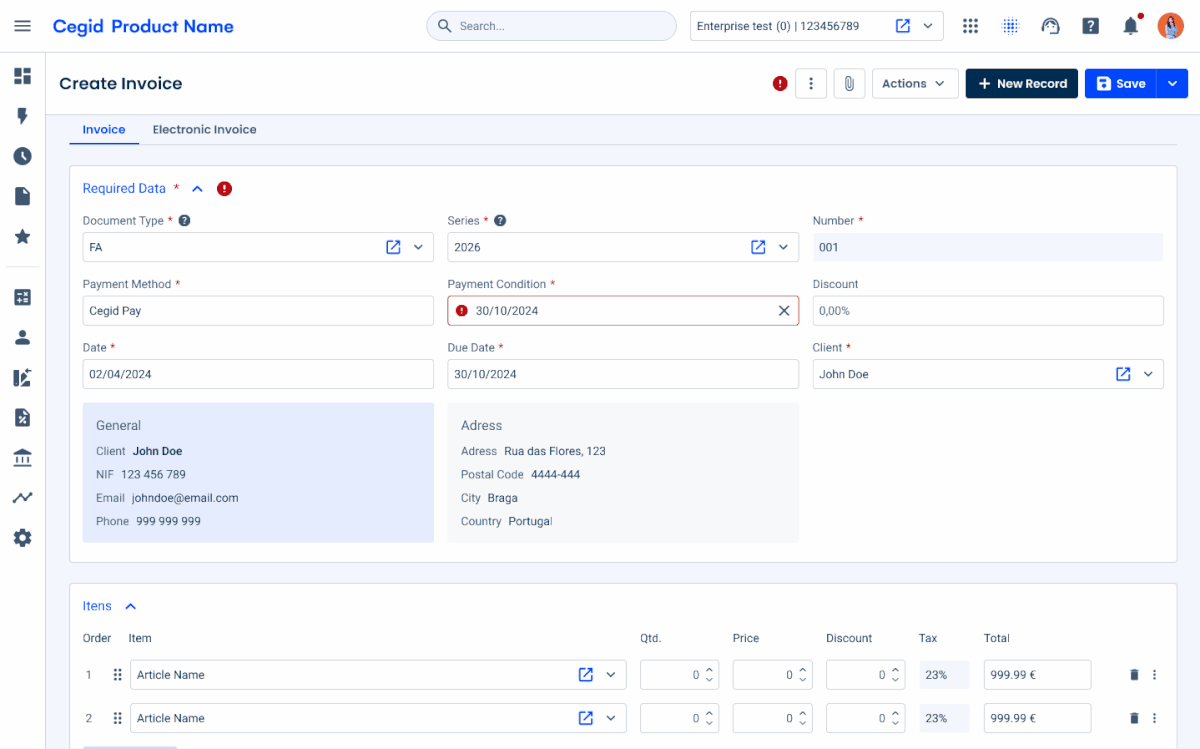
Forms are where intention turns into action, whether by submitting data or completing tasks. But they are also where, more often than not, things go wrong. Missing fields, incorrect formats, and system errors are an inevitable part of any experience with forms.
To clearly communicate that an error has occurred, an icon is always used alongside the message. The error circle icon, displayed in the error color, provides an immediate visual cue that something is wrong with the form the user is filling out.
This icon is first applied to the Page Title, indicating that an error has occurred in a specific section of the Expander or Tree View. It helps highlight issues at a higher level, allowing users to quickly understand where their attention is needed.
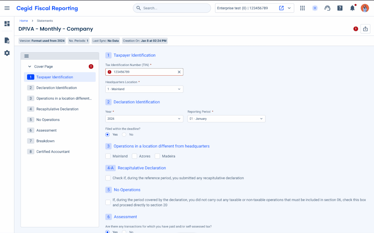
In more complex cases, such as a legal file where pages are organized in a Tree View, errors are first indicated at the item level in the Tree View. They are then reflected in the Page Title, highlighting the presence of issues and ensuring they remain visible as users navigate through the form.
Conclusion
Effective management of background tasks plays a key role in maintaining a positive user experience, and error handling is an essential part of that process.
By informing users when a process begins, keeping them aware of its progress, and clearly communicating the final outcome, products can build trust and reduce uncertainty. When something goes wrong, clear and timely feedback about the error helps users understand what happened and how to move forward.
Components such as Toasts can provide immediate feedback when a task begins, while the Notification Panel offers a more persistent way for users to monitor activity. Communicating the result, whether it is a success, a warning, or an error, ensures that users stay informed and can take action when necessary. Thoughtful error handling closes the loop, not only flagging issues but also guiding users toward a resolution.


