Etiqueta: Usability
-
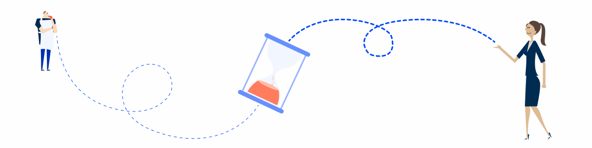
Handling Background Tasks
Background tasks are processes that are run “behind the scenes”. Although they don’t require immediate action from the user, it is still important they are aware of them.
-

Release v1.5
Overview Compose Design 1.5 is here! This update has a strong emphasis on usability improvements to our components, as well as making their guidelines clearer. Here’s some of its highlights: As always, we’re eager to know your thoughts. Let us know if your have any feedback! Bettered Foundations Improvements to Skeletons Through your feedback, we
-

Release v1.4
Overview Compose Design has recently undergone some important updates, which means it’s time for another release note. In addition to the usual component and pattern maintenance, there’s been changes in most branches of our Design System – including its foundations – making this one of our most impactful updates so far. As usual, our aim
-

Release v1.2
Compose Design v1.2 introduces key updates to enhance clarity, consistency, and usability across the system, ensuring a more structured and intuitive experience for users. This release focuses on refining patterns, improving component guidelines, and standardizing interactions to create a more seamless workflow.
-

Understanding the Disabled State
The disabled state indicates that a UI element is not interactive. When used correctly, it prevents users from making common mistakes while still being able to access important information.
-

Release v1.3
The latest release of Compose Design focuses on continuous updates to our components and patterns, as well as several improvements to our documentation. We aimed to enhance the reading experience by restructuring articles and ensuring their guidelines address frequently asked questions.
-

Release v1.1
Compose Design 1.1 introduces key enhancements to navigation, datagrid, and flyout components, improving usability for editing and reviewing records. Explore new features like dialog variations, expanders, and ultra-wide screen guidelines.
-

Key Principles for Keyboard Navigation and Shortcuts
This article covers essential principles for designing keyboard navigation and shortcuts, helping create accessible, efficient, and consistent user experiences.
-

Discover the exciting features
Compose Design brings a host of thrilling and transformative new features designed to enhance your experience. Dive into our latest updates and discover the innovations that will take your productivity and enjoyment to the next level.
-

Usage of overlay types within a product
Explore the usage of overlays like modals and flyouts within a product, and learn how they enhance user interaction.
-

What are Error Pages and how are they used?
Learn about error pages, their importance in user experience, and best practices for designing effective, informative, and user-friendly error pages.