Introduction
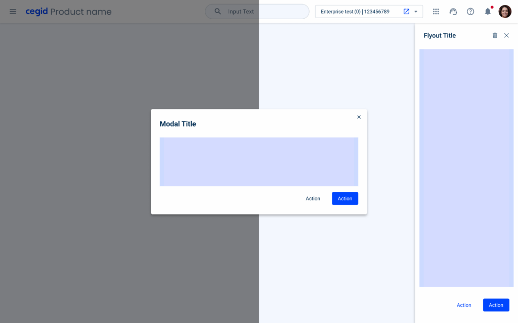
Modals and Flyouts are often referred as overlays, these two components are meant to be used in different scenarios and display different types of content. They differ at complexity, status, regularity and experience hierarchy.
When to use a Flyout
Flyouts are often used as a display for complementary information or to assist in accomplishing a task. These tend to be more complex, and to follow the user along the task flow.
Complexity and Message Status
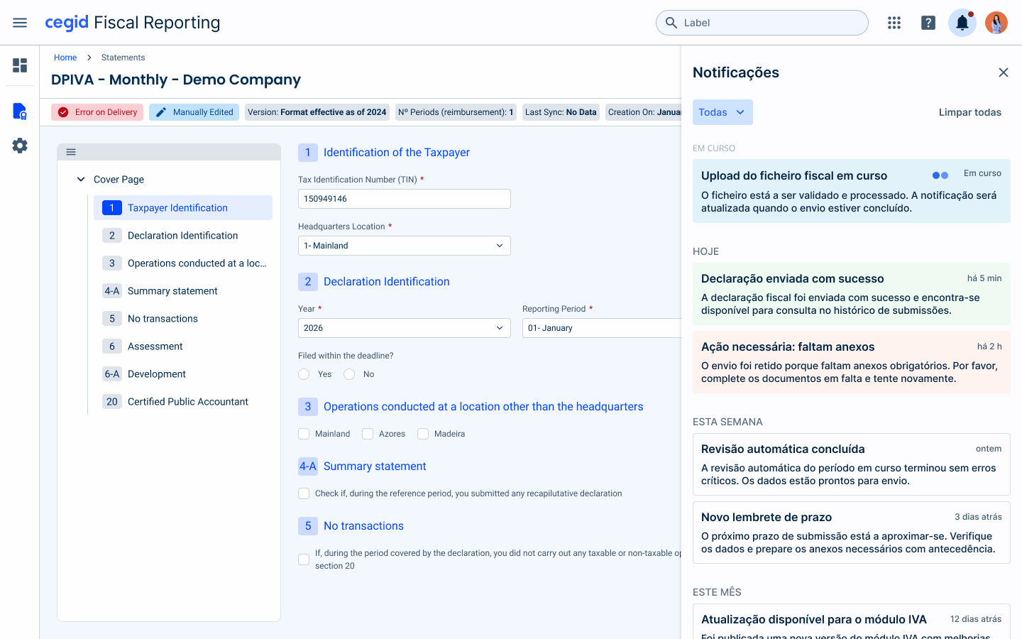
Typically flyouts are components where more complex content is awaited, as the space that is used in the screen.
As an example, the notifications are shown in a flyout as of the great amount of notifications that can be received in the product.
Application with Datagrid
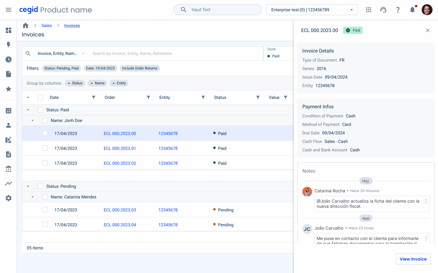
For certain cases, having a quick view of rows may be useful for data consumption within datagrids. Instead of acceding to each dedicated form, a flyout can be used to give a quick access to the most important information. This Information can be divided within three forms:
- Cards: It’s where the main information will the present, and it’s formed by the mandatory data and with certain fields that are important to the context (validate with eXA Team);
- Table: Only the most relevant data should be maintained, due to the restricted space of a Flyout (e.g., for invoices: Item, Quantity, and Unit Price). A totalizer should be added when dealing with monetary values, and the number of columns should be limited to three to avoid excessive horizontal scrolling;
- Notes: Notes can also be accessed within the quick view flyout, if the products are using, and if at least a note is presented.

Other Applications of the Flyout
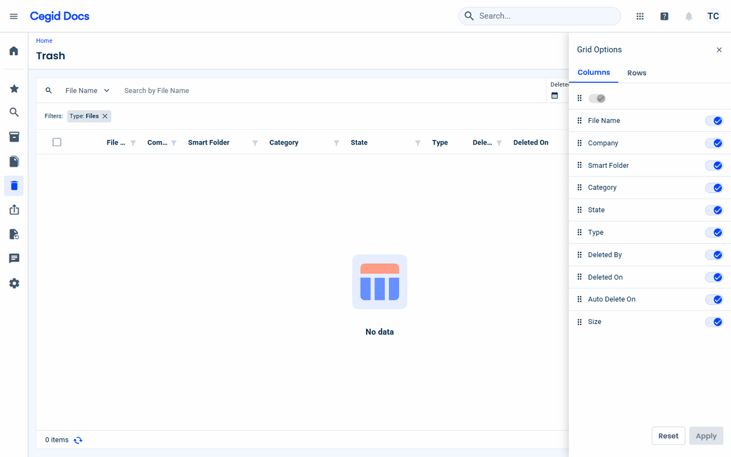
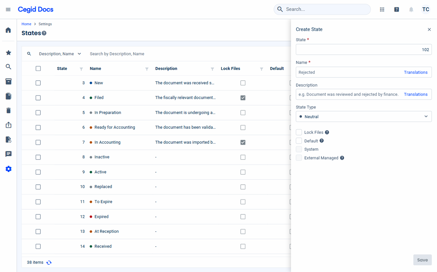
Beyond displaying details or longer forms, the flyout also works well for lightweight, contextual tasks that should not take users away from the page they are working on:
- Grid view settings: adjust which columns are visible using a switch for each column, while seeing the grid update in the background.
- Quick add form: add a new status through a short form, without leaving the current screen.
Regularity and Experience Hierarchy
As anteriorly said, flyouts are supposed to be assistants of the actual viewport, providing additional actions or information that can help the user accomplish the current task.
Flyouts tend to be more recurrently used compared to modals as it natural hierarchy inside the product and due the fact that they don’t block the user progression in their flow.

When to use a Modal
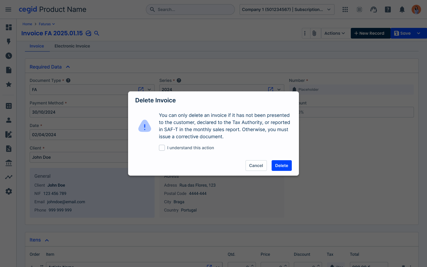
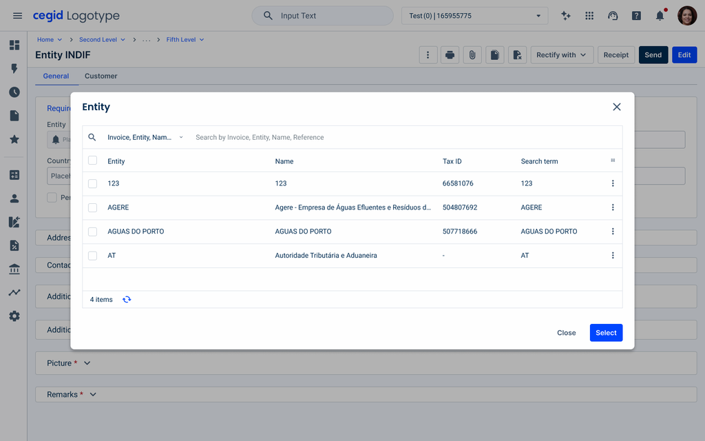
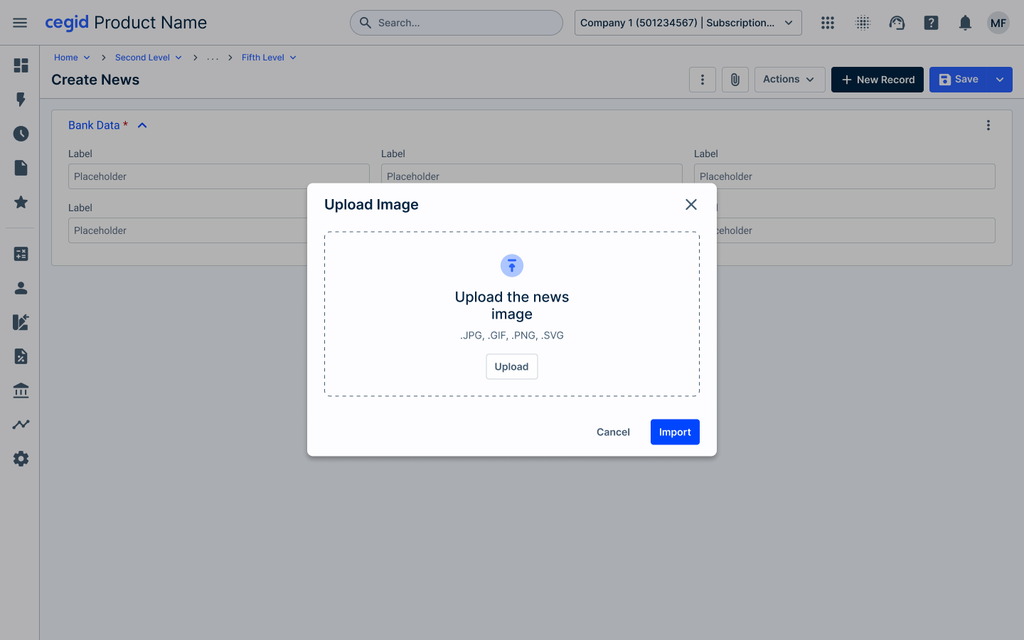
Modals are commonly used when immediate attention is required from the user, such as confirming destructive actions, or when a decision or choice must be made before moving forward, such as selecting an entity from a list or uploading an image.
Complexity and Message Status
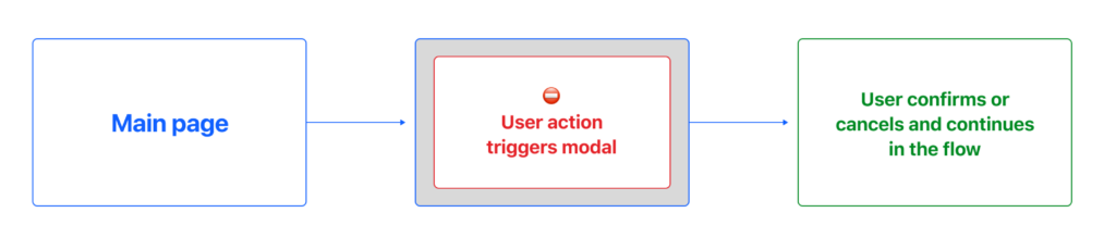
Typically modals are awaited to be simple and with a quickly interaction, as they are designed to be quickly answered by adding a shadow in the viewport when it’s triggered.
Ideally they are used for feedback or status messaging, such as confirmation for destructive actions or warning the users. For this sspecific usage a type of modal is used which is the Dialog pattern.
Other Applications of the Modal
Besides confirmations and short forms, the modal is also suited to focused tasks that require the user’s full attention before returning to the page:
- Detailed entity grid view: browse entities in a detailed grid, with more columns and information than the page allows, and select the one needed without losing the context of the current screen.
- Image upload: upload an image in a dedicated space where users can select the file and confirm it before going back to the task.
Regularity and Experience Hierarchy
As said before, modals are awaited to be quickly answered, as they stop the flow of what the user is doing, forcing them to take action or make a decision. By creating a flow that is too complex to complete, it may create frustration on user side.
Modals tend to be shown less often in order to block the user flow the less time possible and proportionate a linear flow for the user.
Conclusion
Flyouts and Modals serve different purposes, and choosing between them depends on the task and the extent to which the user’s workflow needs to be interrupted.
Use a flyout for complementary information or contextual tasks, such as quick views, view settings or short forms. The user keeps the main screen as reference and can continue working.
Use a modal when the user needs to make a decision or a choice before moving forward, such as confirming an action, selecting an entity or uploading an image. In these cases, pausing the flow is intentional and helps the user focus on a single task.
As a rule, prefer the flyout for longer or recurring interactions, and keep modals simple, short and less frequent, so the user’s flow is blocked for as little time as possible.
References
- Flyout Usage – Helios Design System
- Flyout Usage – Blackbaud
- Best Practices for Modals/Overlays – Medium
- Modal & Nonmodal Dialogs – Nielsen Norman Group
Related

Flyout

Dialog