
Forms
Form templates are essential for creating consistent, user-friendly interfaces.

- Overview
- Guidelines
Template
Forms are an integral part of user interactions in digital applications, acting as the primary method for entering and collecting data. Designing effective and user-friendly forms requires a balance between functionality, accessibility, and aesthetics. Form templates provide a structured foundation, ensuring consistency and efficiency in in the creation of forms for various use cases.
This article explores the essential elements that form templates usually include, such as input fields, dropdowns, checkboxes, and error messages, as well as advanced features such as dynamic field validation and responsive layouts.
Furthermore, we will outline key guidelines to follow, from ensuring clear labelling and logical grouping of fields to incorporating best practices for accessibility and optimization for mobile devices.


Used for:
Transaction Management
Ensure accurate data entry for client details, itemized charges, and tax information.
Financial Records
Provide a clear layout for recording debits, credits, and descriptions.
User and Access Management
Help administrators define roles and permissions efficiently.
Customizable Reports
Allow users to customize reports by selecting relevant criteria such as dates or accounts.
Don’t use for:
Data Visualization
Use dashboards with charts and graphs to display financial health or trends.
Quick Actions
Opt for inline actions or buttons for tasks such as marking invoices as paid or approving expenses.
Repetitive Actions
Automate recurring tasks, such as duplicating invoices, to save time.

What’s New?
- Added Guidelines;
- Added Multi-column Template;
Related
Elements
Forms in the design system are built to be flexible and intuitive, featuring a variety of elements to suit diverse accounting workflows:
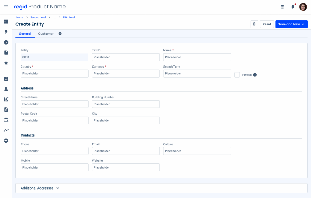
- The Page Title anchors the form, providing context and housing key actions such as saving, discarding, or submitting data.

- Tabs divide complex content into manageable sections, helping users navigate efficiently without overwhelming the interface.

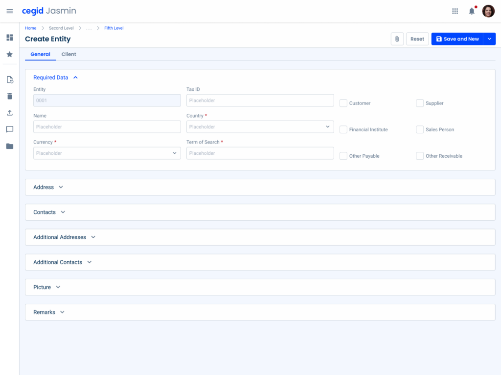
- The Expander organizes content into collapsible panels, keeping the form neat and focused.
- Inline Editing is perfect for dynamic data entry, such as adding items to stocks or invoices, allowing users to enter and adjust values directly on the form.

- Counters can be added below to display real-time calculations, ensuring users have a clear overview of totals without the need for additional tools. Together, these elements create a cohesive system that enhances usability and streamlines interactions with the forms.

Spacing
Effective spacing is essential for creating clear and organized forms, especially in accounting workflows where precision is key. Spacing is divided into two categories: outer elements and inner elements.
By harmonizing these spacing levels, forms achieve a balanced design that supports both usability and visual appeal.
Outer Elements
Outer spacings define the separation between larger structural components such as tabs and expanders, ensuring a clean and navigable layout.
A spacing of 24 px (1.5 rem) has been chosen to create a visual hierarchy between the different elements.

Inner Elements
Inner spacing, on the other hand, manages the spacing between input fields and other elements in components such as expanders, maintaining readability and ease of interaction.
A spacing of 16 px (1 rem) has been chosen so that there is enough readability between the components.

Variations
Form layout plays a key role in ensuring usability and efficiency, especially in accounting software, where precision and organization are key.
Depending on the complexity of the data and the user’s workflow, different column layouts can be used to balance clarity and space utilization. Here is an overview of the variations.
No Expander
Expanders are used in most forms, as they help to keep the content organized. However, they are not always suitable.
Forms that don’t use expanders should have a similar structure and follow the same spacing guidelines. This ensures that all products have good visual consistency.
Use dividers when adding titles to divide the content into different sections, as shown in the example below.
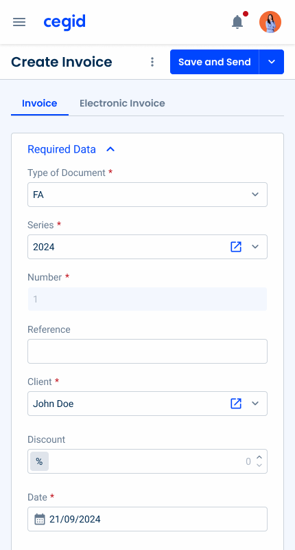
One-Column Layout
Ideal for simple forms that require a linear flow, such as contact details or single-action forms. This layout minimizes cognitive load, guiding users step-by-step.
This layout is ideal for forms that have up to four fields.

Two-Column Layout
Suitable for forms with moderate data entry, such as subscription configurations or expense reports. This layout balances readability and space, allowing related fields to appear side by side.
Furthermore, this layout is also available with two columns of checkboxes. This layout is ideal for forms with more than five fields.

Visually group related form elements and keep labels next to the corresponding fields.
Remove unnecessary fields and, if possible, divide the information into different pages.
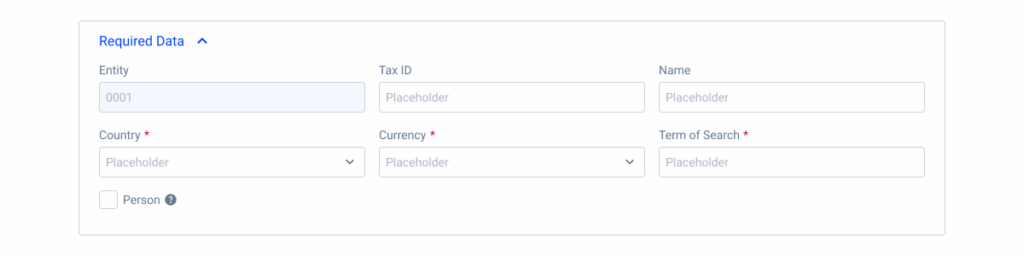
Three-Column Layout
Designed for more complex forms where users need to view and compare several fields simultaneously, such as tax forms or financial entries. It increases efficiency without overwhelming the user.

To keep forms succinct, avoid overloading users with forms that have a large number of fields and options to fill in and select.
Four-Column Layout
Ideal for advanced use cases requiring dense data entry, such as ledger entries or invoice creation. This layout maximizes space usage, but requires careful alignment to maintain readability.


Align the fields consistently in the columns for a clean and organized layout.

Behavior
Responsiveness
To improve the readability and comprehension of the written content, the Forms change their layout on different devices to make the content easy to consume, regardless of the device used.
Furthermore, the layout of the fields must be respected, as they change depending on the device used, for example on the desktop:
- The maximum number of fields in a line is four on desktop devices;
- When a field is isolated in a line, it should not occupy the entire width of the section, but rather four columns of the grid;
- For tablet devices, a layout of two fields per line must be used;
- For mobile devices, a layout of one field per line must be used.

Case Studies
Usage of notification types within a product
Usage of overlay types within a product