
Inline Message
Messages placed at the top of a page or section to inform the user of an important change.

- Overview
- Specs
- Guidelines
Component
An Inline Message is a user interface element designed to display short, contextual messages within the flow of a web page or application interface. These notifications are typically used to provide feedback, alerts, or status updates to users without disrupting their current tasks.
They are often displayed inline with the content or adjacent to relevant elements to provide immediate context and help user understanding.

A: Primary Variation
B. Secondary Variation
1. Icon
2: Title
3: Description
4: Right Adornment

Used for:
Real-time updates
When it is necessary to provide users with real-time updates or notifications without interrupting their current activity, Inline Message components can be useful.
Error handling
Inline Messages are effective for communicating errors or warnings within a specific context. Instead of showing a generic error message at the top of the page, Inline Messages can pinpoint exactly where the error occurred.
Contextual information
Inline Messages can deliver additional contextual information or tooltips to help users better understand certain elements or features within an interface.
Interactive elements
Inline Messages can contain interactive elements such as buttons or links, allowing users to take immediate actions without navigating away from the current context.
Don’t use for:
Overuse
Using inline messages excessively can clutter the interface and overwhelm users with unnecessary information. It’s important to strike a balance and only use Inline Messages when they add significant value.
Visual noise
Adding too many Inline Messages to an interface can create visual noise and make it difficult for users to focus on essential content or actions.
Ambiguity
Poorly designed or ambiguous Inline Messages can confuse users instead of providing clarity. Avoid using unclear Inline Messages, as they can lead to user frustration and errors.

Demo
Access the Figma file and inspect the element using Dev Mode.

Last Update


- Updated color variables;
- Updated iconography;
- Removed unnecessary variations;
Related
Variations

Primary
Info

.info {
  background: var(--info-10);
  icon-left: var(info_circle, --info-100);
  title: var(--grey-9);
  description: var(--grey-9);
  close: var(--grey-8);
}
Success

.success {
  background: var(--success-10);
  icon-left: var(check_circle, --success-100);
  title: var(--grey-9);
  description: var(--grey-9);
  close: var(--grey-8);
}
Warning

.warning {
  background: var(--warning-10);
  icon-left: var(error_circle, --warning-100);
  title: var(--grey-9);
  description: var(--grey-9);
  close: var(--grey-8);
}
Error

.error {
  background: var(--error-10);
  icon-left: var(error_circle, --error-100);
  title: var(--grey-9);
  description: var(--grey-9);
  close: var(--grey-8);
}
Insight

.insight {
  background: var(--grey-1);
  accent-icon: var(Bar Chart);
  title: var(--grey-9);
  description: var(--grey-9);
  close: var(--grey-8);
}
Secondary
Info

.info {
  background: var(--info-10);
  stroke: var(--info-100);
  icon-left: var(info_circle, --info-100);
  title: var(--grey-9);
  description: var(--grey-9);
  close: var(--grey-8);
}
Success

.success {
  background: var(--success-10);
  stroke: var(--success-100);
  icon-left: var(check_circle, --success-100);
  title: var(--grey-9);
  description: var(--grey-9);
  close: var(--grey-8);
}
Warning

.warning {
  background: var(--warning-10);
  stroke: var(--warning-100);
  icon-left: var(error_circle, --warning-100);
  title: var(--grey-9);
  description: var(--grey-9);
  close: var(--grey-8);
}
Error

.error {
  background: var(--error-10);
  stroke: var(--error-100);
  icon-left: var(error_circle, --error-100);
  title: var(--grey-9);
  description: var(--grey-9);
  close: var(--grey-8);
}
Insight

.insight {
  background: var(--grey-1);
  stroke: var(--theme-100);
  accent-icon: var(Bar Chart);
  title: var(--grey-9);
  description: var(--grey-9);
  close: var(--grey-8);
}
Size
Primary

.primary {
  height: 78px;
  icon-left: 24px;
  close: 20px;
  title: var(--subtitle-2);
  description: var(--label-regular);
}
Secondary

.secondary {
  height: 70px;
  icon-left: 24px;
  close: 20px;
  title: var(--subtitle-2);
  description: var(--label-regular);
}
Useful links

Consult our Figma file to access our assets and inspect them in dev mode.

This component is or will be provided by the Polygon framework. See its documentation to learn more.

This element is in line with the guidelines of the CDS (Cegid Design System). Find out more.
Behavior
Each Inline Message should contain a button that directs the user to the corresponding field. If the same messages apply to different fields, only one inline message should be displayed, allowing the user to navigate between the different fields. Inline Messages come in two variations, namely:
Primary: placed always after the Page Title. This variation contain general information about the content of the page. These messages are visually more prominent than “Secondary” messages.
Secondary: are directly related to a specific field in the form, grid or list, as they are placed next to them. Along with the inline message, the corresponding fields are marked with the icon and/or color corresponding to the type of notification.

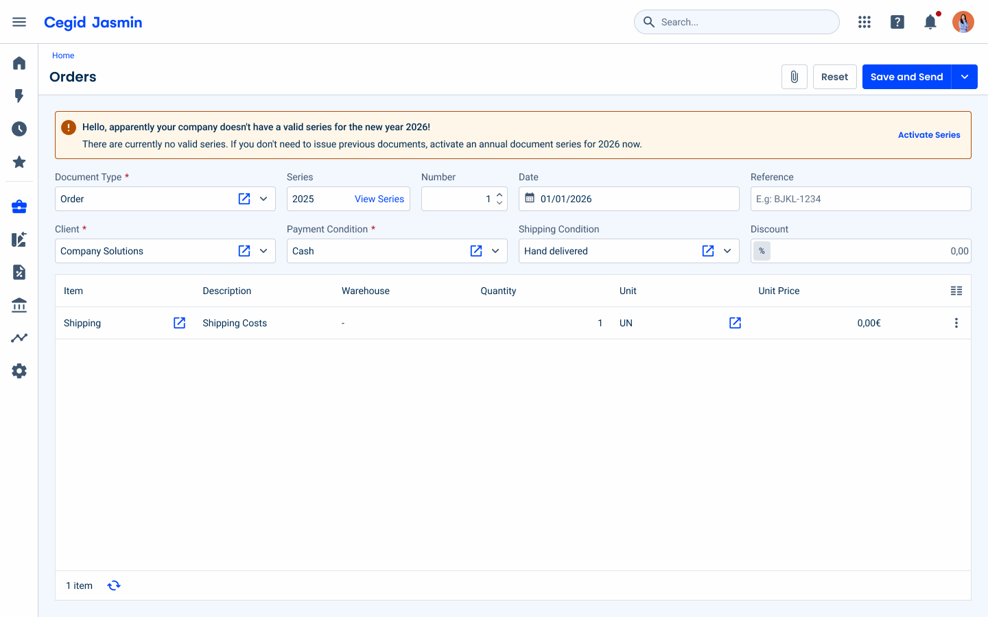
A general alert message should appear informing the user that no company has been configured.
Include more than two Inline Messages in the same view.
States
Inline messages provide users with contextual and timely feedback directly within the interface. Depending on the urgency and nature of the message, they are categorized into three distinct states:
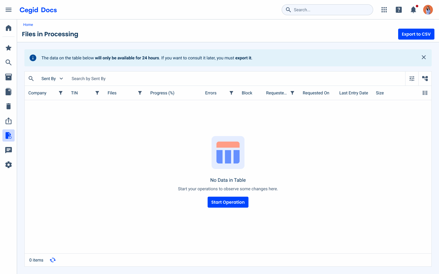
- Informative: Used to provide useful, non-intrusive context or general guidance to the user. It highlights useful details that improve the user experience without requiring immediate action.
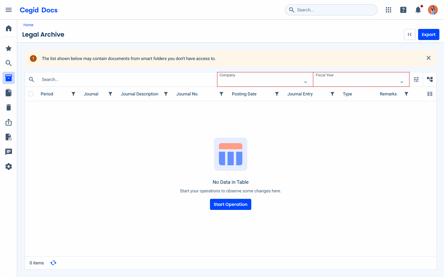
- Warning: Used to alert the user to potential issues that require their attention. This state indicates that action may be required to proceed, or that an important deadline is approaching (e.g., configurations are missing for an upcoming period).
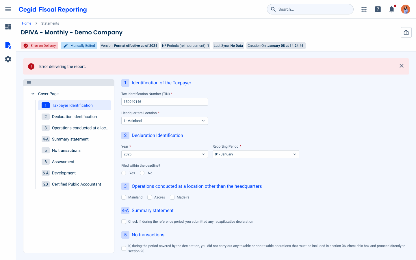
- Error: Used to inform the user that something has gone wrong or id not work as expected. This includes critical issues, such as failed form submissions, delivery errors, or system issues that prevent the user from completing their task.
Variations
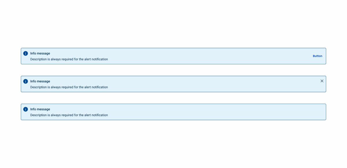
The Inline Message component offers three variations:
- With action button: Includes a primary action that the user can perform opening another feature or page;
- With close icon: Allows the user to dismiss the message, for less important informations, always applied with the informative state;
- Without actions: Purely informational, with no user interaction in order to force the user to read important messages.
Related