
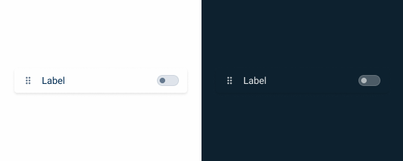
Sortable List
A sortable list is a feature that enables users to move items within a section by dragging and dropping them, facilitating the reordering of items, creation of hierarchies, and updating of lists.

- Overview
- Specs
- Guidelines
Pattern
A Sortable List allows users to rearrange items within a list by dragging and dropping. This interactive feature enhances user experience by enabling intuitive and efficient organization of list elements.
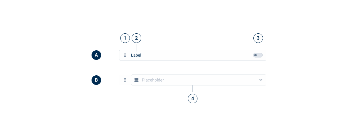
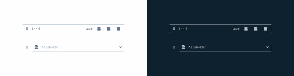
- A: Action Variation
- B: Editable Variation
- 1: Icon
- 2: Label
- 3: Action
- 4: Editor

Used for:
Form builders
Makes it easier to arrange form elements according to specific needs.
Task management applications
Users can efficiently prioritize and organize tasks by reordering them.
Content management systems
Helps users manage content hierarchy and order in a visual and intuitive way.
Don’t use for:
Small, simple lists
Sorting functionality may add unnecessary complexity without providing significant benefits.
Static lists
In the case of static lists, reordering items is not needed and could lead to confusion.
Complex hierarchical data
Simple sortable lists may not adequately represent or handle complex data hierarchies, requiring more sophisticated solutions.

Demo
Access the Figma file and inspect the element using Dev Mode.
Last Update
- Component updated and new variations added;
- Updated guidelines to reflect the new changes.
Variations
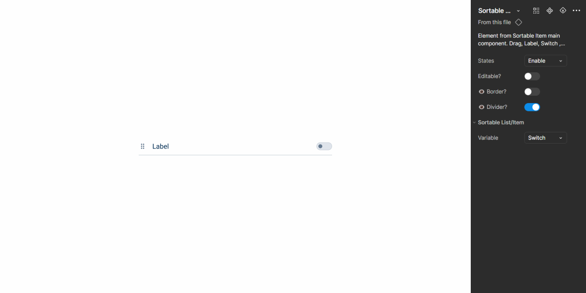
States
Enabled
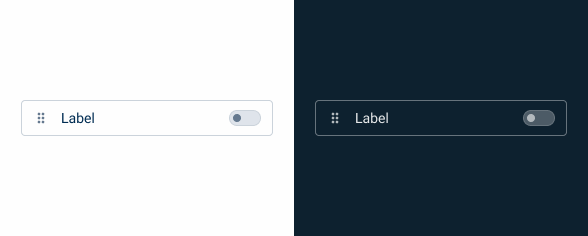
.enabled {
border-radius: var(--x-small-radius, 4px);
border: 1px solid var(--Greys-Grey-5);
background: var(--Greys-Grey-1);
}
Hover
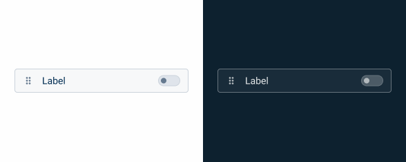
.hover{
border-radius: var(--x-small-radius, 4px);
border: 1px solid var(--Greys-Grey-5);
background: var(--Greys-Grey-2);
}
Pressed
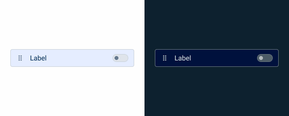
.pressed{
border-radius: var(--x-small-radius, 4px);
border: 1px solid var(--Greys-Grey-5);
background: var(--Themes-Theme-10);
}
Drag
.drag{
border-radius: var(--x-small-radius, 4px);
border: 1px solid var(--Greys-Grey-5);
background: var(--Greys-Grey-1);

/* Shadows/LightMode/Fixed Sections/Top */
box-shadow: var(--primary);
Focus
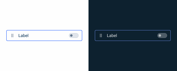
.focus{
border-radius: var(--x-small-radius, 4px);
border: 1px solid var(--Theme-Theme-100);
background: var(--Greys-Grey-1);
}
Disabled
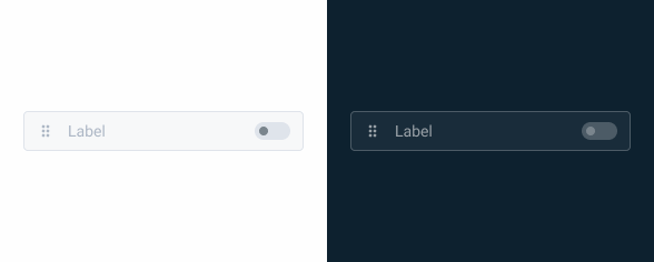
.disable{
border-radius: var(--x-small-radius, 4px);
border: 1px solid var(--Greys-Grey-4);
background: var(--Greys-Grey-2);
label: var(--Greys-Grey-6);
}
Useful links

Consult our Figma file to access our assets and inspect them in dev mode.

This component is or will be provided by the Polygon framework. See its documentation to learn more.

This element is in line with the guidelines of the CDS (Cegid Design System). Find out more.
Usage
A sortable list is employed to allow users to reorganize items within a list through drag-and-drop interactions.
By providing a flexible and intuitive way to manage and organize items, a sortable list enhances user experience and increases productivity in various applications.

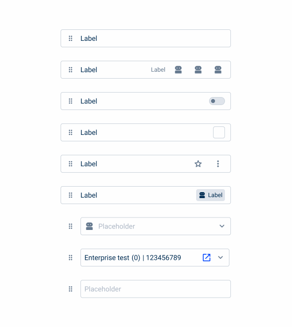
Use complex iconography for the actions.

Use several actions at the same time.
Variations
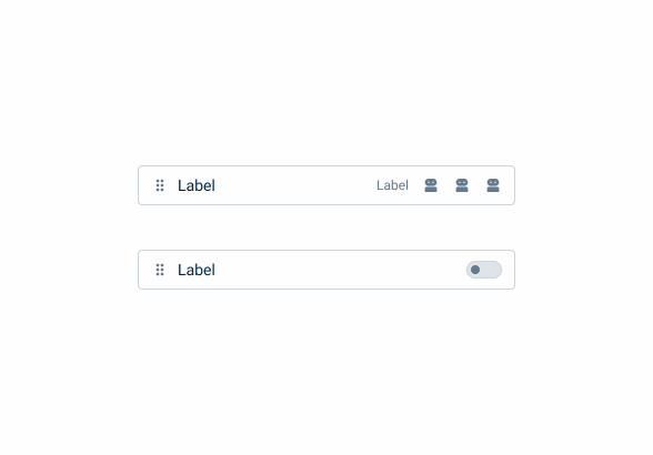
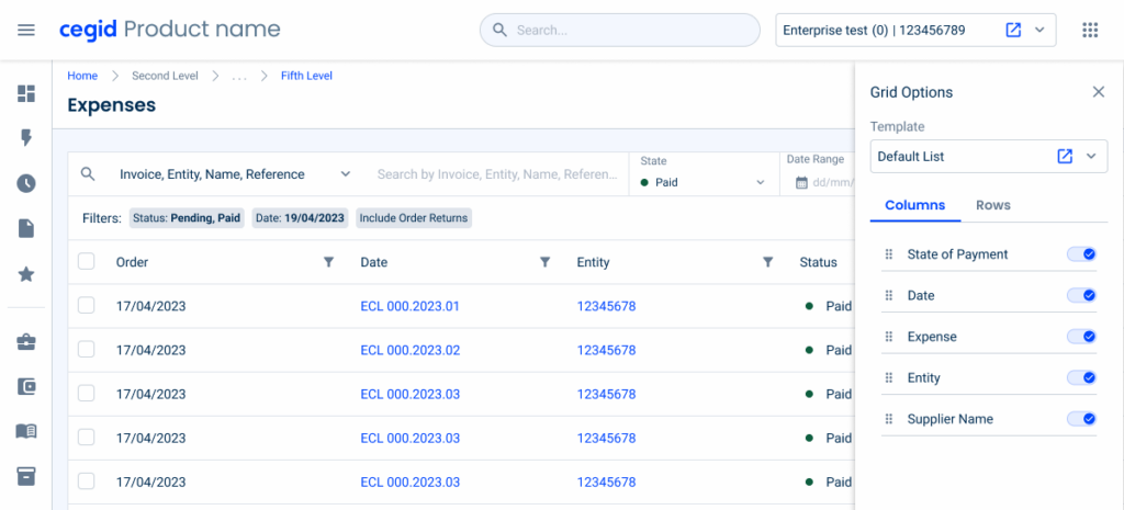
Editable
By removing elements from the interface that could create visual clutter, we have designed a variation that allows the integration of other components that require more complex user input. This allows Sortable Lists to include elements such as text fields and select boxes.

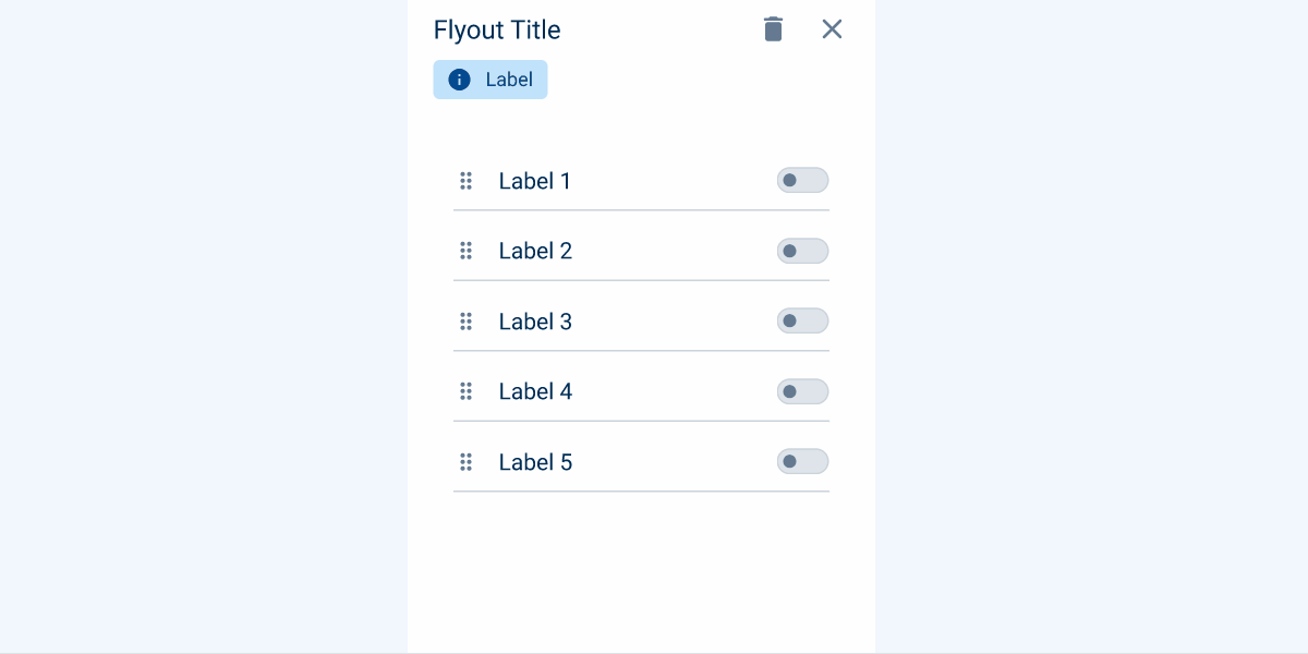
Responsiveness
Sortable Lists can be integrated into various interfaces, although they can be tricky to implement in smaller spaces, such as flyouts. Alternative design variations improve flexibility, allowing the component to fit seamlessly into any interface while maintaining a clean look by removing less necessary elements or using dividers.
Behavior
Cursor Changes:
- In mouse-driven interfaces, changing the cursor shape can signify drag-and-drop capability. When users hover over a draggable object, the cursor shifts to indicate that clicking will start the dragging process;
Feedback that an Object Has Been Grabbed:
- Once the user grabs the draggable object, two forms of feedback are necessary: confirmation that the object has been successfully grabbed and a preview of the outcome before the user drops the object;
Dragging above existing content:
- If a component is dragged above the canvas, existing content should be pushed down to create a drop zone;
Magnetism and Snapping in Place:
- According to Fitts’s Law, accurately moving the cursor to a specific on-screen location can be difficult, making drag-and-drop inefficient for precise adjustments. To address this, implementing a magnetic snapping effect can help by automatically aligning objects into place, even if the user hasn’t precisely targeted them.
Case Studies

Handling Background Tasks

Read Mode: Making Content Feel Effortless and Understandable

A Visual Recap of 2025: how we enhanced chatbot communication
Useful links
Consult our Figma file to access our assets and inspect them in dev mode.
This component is or will be provided by the Polygon framework. See its documentation to learn more.
This element is in line with the guidelines of the CDS (Cegid Design System). Find out more.