
Selector
The Selector pattern enables users to compare and choose between subscriptions and companies.

- Overview
- Specs
- Guidelines
Pattern
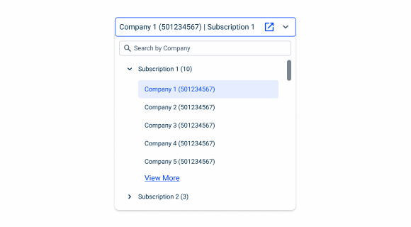
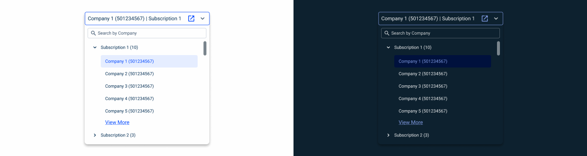
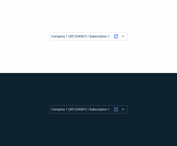
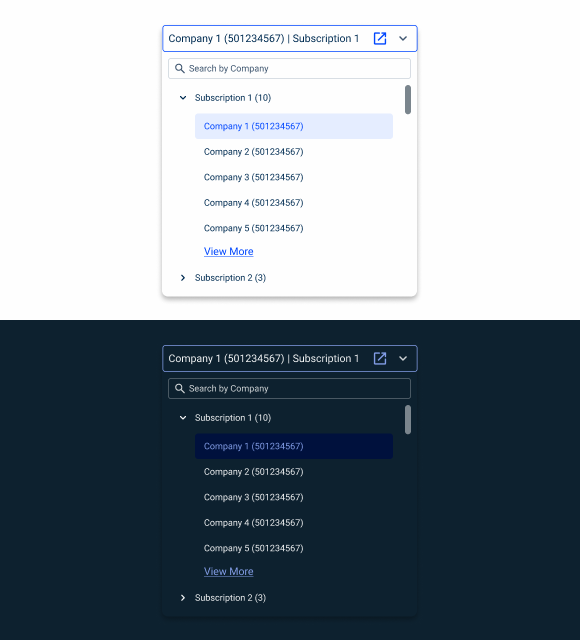
The selector is a pattern designed to help users choose between their different companies and subscriptions. This pattern is particularly useful in situations where the user is working with multiple companies at the same time, thereby preventing them from having to log out of the product.
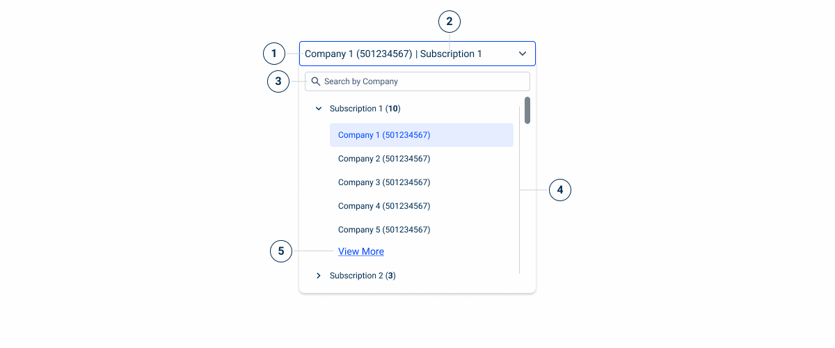
- 1: Company Name
- 2: Subscription Name
- 3: Search Field
- 4: Tree View
- 5: Link Action
Used for:
Change subscription/company
Selectors have the sole purpose of helping users choose and switch between the company/subscription they are currently working with.
Don’t use for:
Other selections
For other use cases the Select Box is the best option, as it offers different possibilities in terms of multiselection.
Demo
Access the Figma file and inspect the element using Dev Mode.
Last Update
- Added pattern to design system.
Related
Accent Icons
Variations
States
Enabled
.enabled {
  height: 36px;
  width: 340px;
  stroke: var(--grey-5);
  corner-radius: var(--x-small-radius);
  padding: var(--spacing-8);
  label: var(--label-regular, --grey-9);
  icon_1: var(--open_in_new, --theme-100, 20px);
  icon_2: var(--expand_more, --grey-8, 20px);
}Hover
.hover {
  height: 36px;
  width: 340px;
  stroke: var(--grey-6);
  corner-radius: var(--x-small-radius);
  padding: var(--spacing-8);
  label: var(--label-regular, --grey-9);
  icon_1: var(--open_in_new, --theme-100, 20px);
  icon_2: var(--expand_more, --grey-8, 20px);
}Focus
.focus {
  field{
    height: 36px;
    width: 340px;
    stroke: var(--grey-6);
    corner-radius: var(--x-small-radius);
    padding: var(--spacing-8);
    label: var(--label-regular, --grey-9);
    icon_1: var(--open_in_new, --theme-100, 20px);
    icon_2: var(--expand_more, --grey-8, 20px);
  }
  dropdown{
    padding: var(--spacing-8);
    shadow: var(--components-secondary);
    search: var(--text-field-addornment-small, --icon_search, 16px);
    treeview{
      fatherElements: (--treeview-item-small, --icon_chevron_right, 16px);
      chiedlElements: (--treeview-item-small, --spacing_36_left);
    }
  }
}Empty State
.focus {
  field{
    height: 36px;
    width: 340px;
    stroke: var(--grey-6);
    corner-radius: var(--x-small-radius);
    padding: var(--spacing-8);
    label: var(--label-regular, --grey-9);
    icon_1: var(--open_in_new, --theme-100, 20px);
    icon_2: var(--expand_more, --grey-8, 20px);
  }
  dropdown{
    padding: var(--spacing-8);
    shadow: var(--components-secondary);
    search: var(--text-field-addornment-small, --icon_search, 16px);
    emptyState: var(--small, --accentIcon_list);
  }
}Useful links

Consult our Figma file to access our assets and inspect them in dev mode.

This component is or will be provided by the Polygon framework. See its documentation to learn more.

This element is in line with the guidelines of the CDS (Cegid Design System). Find out more.
Usage
Multi Subscription
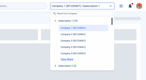
Unlike other Select Boxes, the primary function of the selector is to help the user choose a company included in a subscription.
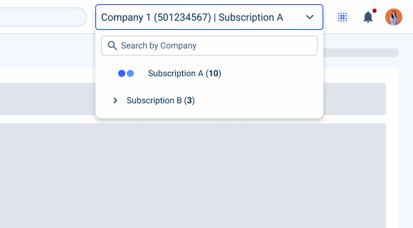
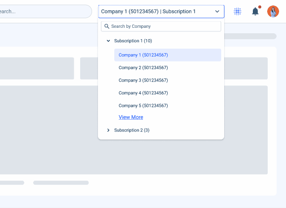
To this end, a search and a tree view are essential for allowing users to search for a specific company and easily navigate between the different levels, which are:
- First level: Subscription level (in cases where this is the only level available);
- Second level: Company level, where a user can have several companies within a subscription.
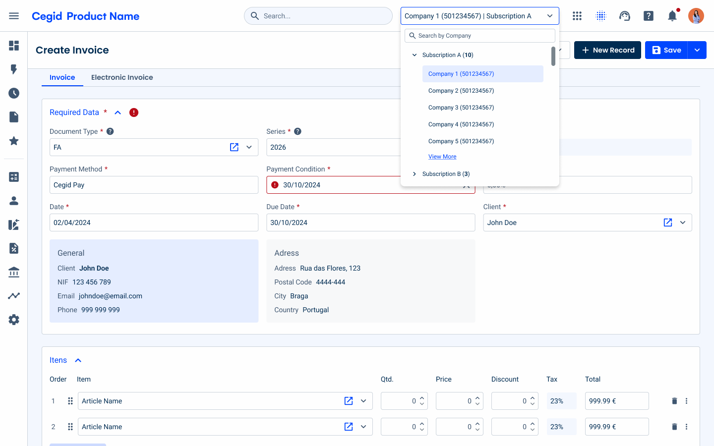
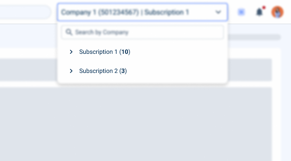
Indicate the number of companies in bold in parentheses, after the name of the subscription.
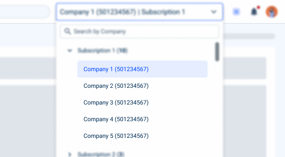
Include the company’s TIN number in parentheses after the company name.
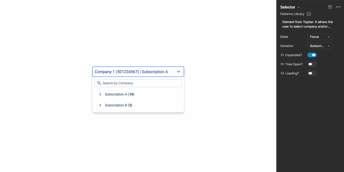
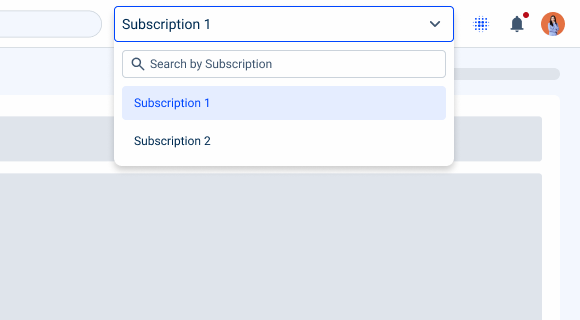
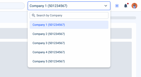
Single Company/Subscription
The selector is flexible and can be adapted to different contexts and user needs. Here are some other uses:
- Subscription only: for cases where the user has only the subscription option and there is no company level;
- Company only: for cases where the user has only a subscription and can only switch between companies.
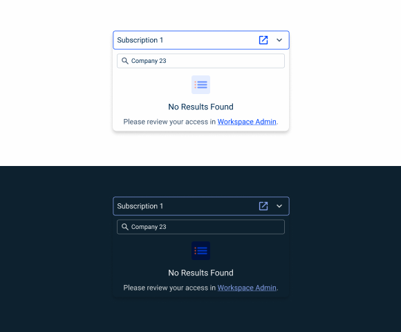
Search
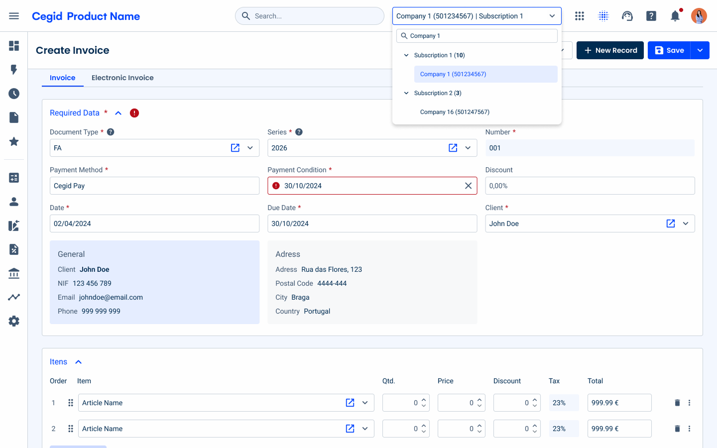
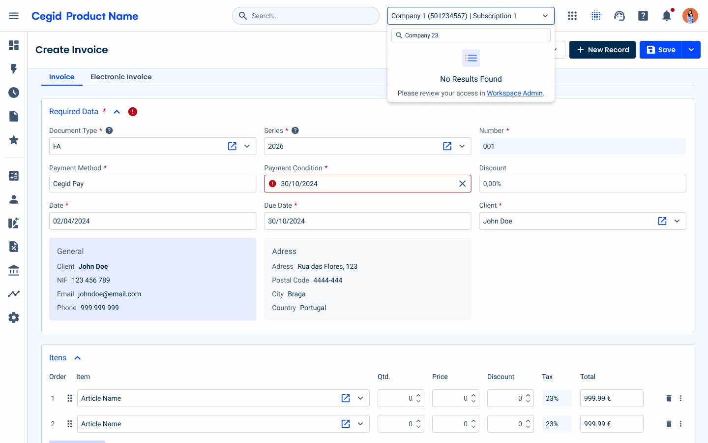
For cases where the user may have many companies, and to avoid having to scroll through all the entries, a search has been added.
The search is located at the top of the dropdown, and when searching for a company, the results must always display the associated subscription.
It is possible that, when performing a search, no results will be found; in that case, the empty state must be used. This empty state should be located below the search input and in its small variation.
A link is also provided for the user to access Workspace Admin, as this is the product that manages access to our Cegid products.
Loading
Since this selector is likely to contain many companies in a single subscription, we need to implement an efficient way to display the results quickly; therefore, the loading process is divided into two different moments:
- When we open a subscription for the first time;
- When we load the remaining elements of a subscription.
Opening a Subscription
When opening a subscription for the first time, the user will see an initial load of the first five child elements.
Loading Companies
If the user has a subscription with more than five companies, a link will be available to load them incrementally.
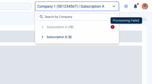
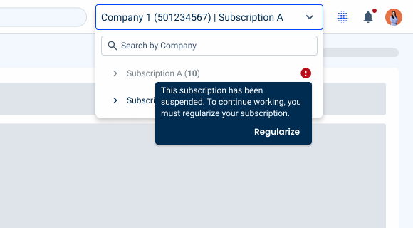
Error Handling
Since errors can occur in a subscription for various reasons, it is necessary to address this scenario.
In such cases, the subscription (1st level) will be displayed as disabled, accompanied by an error icon.
A tooltip should provide details about the error and how to recover from that error, in some cases, may also include a button to help users resolve the issue.
Case Studies

Creating Context-Aware Notifications for a Better Experience
