
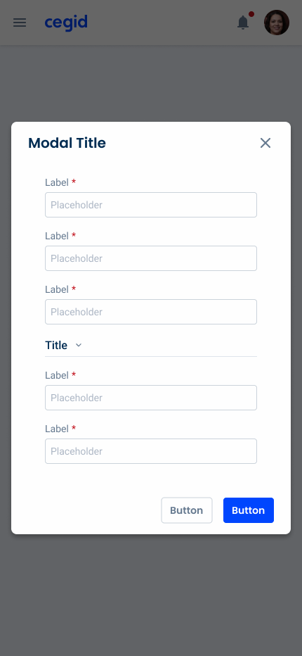
Modal
Modals are overlay windows that focus user attention on essential tasks, enhancing UX by temporarily disabling the background interface.

- Overview
- Specs
- Guidelines
- Mobile
Pattern
Modals are an integral part of modern user interface design, providing a powerful tool for capturing user attention and conveying essential information. As overlay windows that appear on top of the main content, modals serve various purposes, such as confirming actions, collecting input, or presenting additional details without leaving the current page.
By temporarily disabling the background interface, modals create a focused interaction space, encouraging users to engage with important tasks or decisions. However, designing effective modals requires careful consideration of usability and accessibility to ensure they enhance the user experience rather than disrupt it.

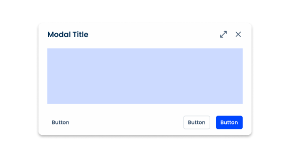
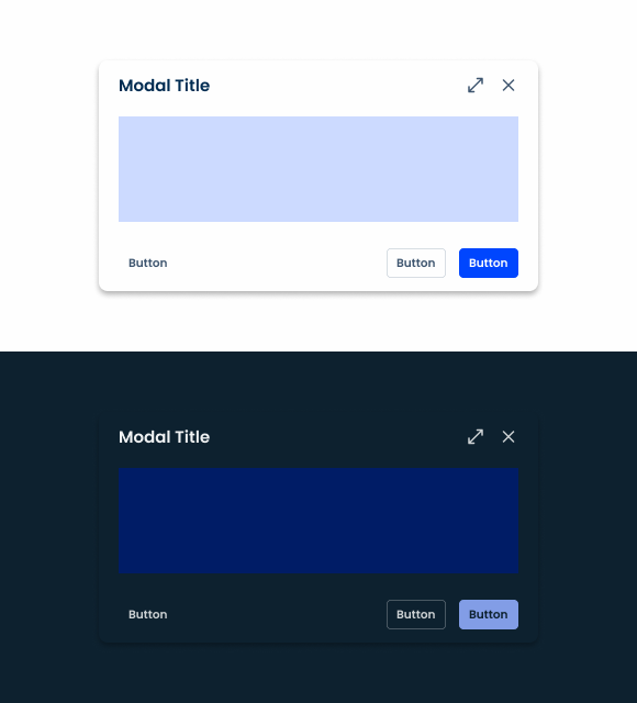
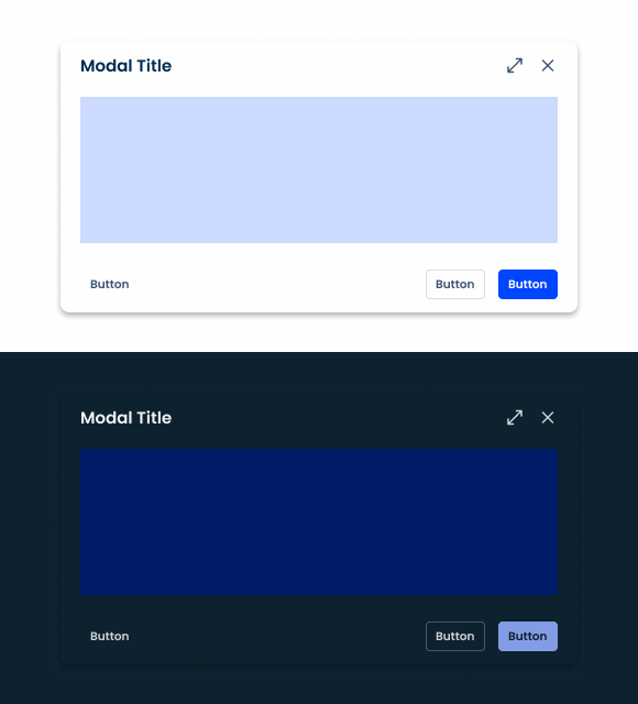
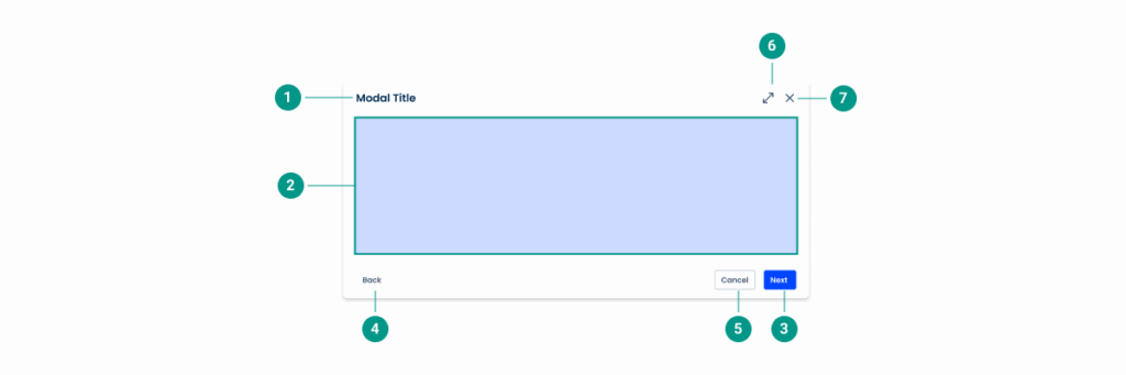
- 1: Title
- 2: Main Content
- 3: Close
- 4: Fullscreen
- 5: Action Buttons
Used for:
Focus on critical information
Modals draw attention to essential information or actions that require user acknowledgment or response. By temporarily blocking the background, they ensure the user focuses on the task at hand.
Form input
Modals can be used to collect user input without leaving the current page. This is useful for login forms, feedback requests, or any data entry tasks that need to be completed in the context of the current workflow.
Onboarding or tutorials
Use modals to guide new users through important features or processes in an application. This can help improve the onboarding experience.
Don’t use for:
Critical navigation
If users need to navigate quickly between different parts of an application, modals can make this difficult by blocking access to the rest of the interface.
Non-critical content
Modals are not used for content that isn’t crucial or time-sensitive. Information that can be presented inline or on a separate page is better suited outside of a modal.
Blocking actions
The use of modals that prevent users from accessing essential actions or information needed to complete their current task should be avoided, as this can create frustration and disrupt the workflow.
Demo
Access the Figma file and inspect the element using Dev Mode.

Last Update

- Added Fullscreen option;
Related
Close
Accent Icons
Variations
Sizes
Small
.small {
  width: 40%;
  min-width: 460px;
  max-width: 1000px
  padding: var(--spacing-16, --spacing-24);
  header {
    title: var(--Heading-H6);
    title_color: var(--grey-9);
    fullscreen-icon: 24px;
    close: var(--close-large);
    gap: var(--spacing-16);
    gap_content: var(--spacing-16);
  }
  content{
    gap_top: var(--spacing-8);
    gap_bottom: var(--spacing-16);
  }
  footer {
    gap: var(--spacing-16);
    button_1: var(--primary-theme-regular);
    button_2: var(--textButton-grey-regular);
    button_3: var(--tertiary-grey-regular);
  }
  shadow: var(--shadow-tertiary);

}Regular
.regular{
  width: 60%;
  min-width: 552px;
  max-width: 1120px;
  padding: var(--spacing-16, --spacing-24);
  header {
    title: var(--Heading-H6);
    title_color: var(--grey-9);
    fullscreen-icon: 24px;
    close: var(--close-large);
    gap: var(--spacing-16);
    gap_content: var(--spacing-16);
  }
  content{
    gap_top: var(--spacing-8);
    gap_bottom: var(--spacing-16);
  }
  footer {
    gap: var(--spacing-16);
    button_1: var(--primary-theme-regular);
    button_2: var(--textButton-grey-regular);
    button_3: var(--tertiary-grey-regular);
  }
  shadow: var(--shadow-tertiary);

}Large
.large {
  width: 80%;
  min-width: 664px;
  max-width: 1200px;
  padding: var(--spacing-16, --spacing-24);
  header {
    title: var(--Heading-H6);
    title_color: var(--grey-9);
    fullscreen-icon: 24px;
    close: var(--close-large);
    gap: var(--spacing-16);
    gap_content: var(--spacing-16);
  }
  content{
    gap_top: var(--spacing-8);
    gap_bottom: var(--spacing-16);
  }
  footer {
    gap: var(--spacing-16);
    button_1: var(--primary-theme-regular);
    button_2: var(--textButton-grey-regular);
    button_3: var(--tertiary-grey-regular);
  }
  shadow: var(--shadow-tertiary);

}Useful links

Consult our Figma file to access our assets and inspect them in dev mode.

This component is or will be provided by the Polygon framework. See its documentation to learn more.

This element is in line with the guidelines of the CDS (Cegid Design System). Find out more.
Sizes
There are three possible modal sizes: small, regular and large. Their use depends on the size that best suits the amount of content.
Modals are used for focused tasks, such as forms, datagrids and navigation. We offer various styles to enhance user experience and workflow efficiency.
The width of the modal is responsive according to the screen size.
Small
The small size corresponds to a width of 40% and a maximum height of 80%. The minimum width is 460px and the maximum 1000px.
It is ideal for informative modals with little information. Although we have a template available for small regular modals, in many cases, it might be preferable to use a dialog modal instead, as its simplicity is better suited to providing less content.

Regular
The regular size corresponds to a width of 60% and a maximum height of 80%. The minimum width is 552px and the maximum 1120px.
It is ideal for modals with small forms or informative modals with some content.

Large
The large size corresponds to a width of 80% and a maximum height of 80%. The minimum width is 6640px and the maximum 1200px.
It is ideal for templates with a large amount of content and larger forms.
Behavior
Desktop
When designing modals, it’s essential to consider the device and the context in which they appear to optimize user experience.
On desktop interfaces, modals are typically placed at the top or center of the screen, drawing immediate attention to the content without obstructing the user’s view. This central positioning helps to ensure that users focus on modal content, especially when the screen real estate is large.

Mobile (responsive)
On mobile devices, however, the modal positioning strategy differs due to the smaller screen size and user interaction patterns. Modals may appear at the bottom or center of the screen on mobile, depending on what’s required from the user.
This approach can take advantage of the ease of thumb reach, allowing users to access buttons and make quick decisions with less effort. By adapting modal placement to the device and user context, designers can enhance accessibility and usability across platforms.
Button Hierarchy
In order to ensure maximum visibility, the primary action should appear as a button (or split button) in the primary variation.
If a secondary action is required, it should be presented as a primary grey button (or split button in a secondary variation). This should be used for tasks of major importance that have less priority over the primary one.
Any supporting actions should use tertiary buttons (or button icons), which allow users to access various functions without overwhelming the interface. For this same reason, all other remaining functions should be consolidated into an overflow menu.
There may be cases where adding an additional left-aligned button – such as a back button – helps improve the user experience. These should show as grey text buttons.
It is worth noting that the action bar buttons follow these same guidelines as they are very similarly structured.
Cancel button
The cancel button should be used when handling complex modals with several steps. This ensures users are aware they are completely abandoning the task without applying any changes, which might not always be clear when there’s only a close icon.
Because closing is a supporting action, it must be represented as such – with tertiary buttons.
As each provides a different user experience, if you need to add a cancel button, the close icon should remain.

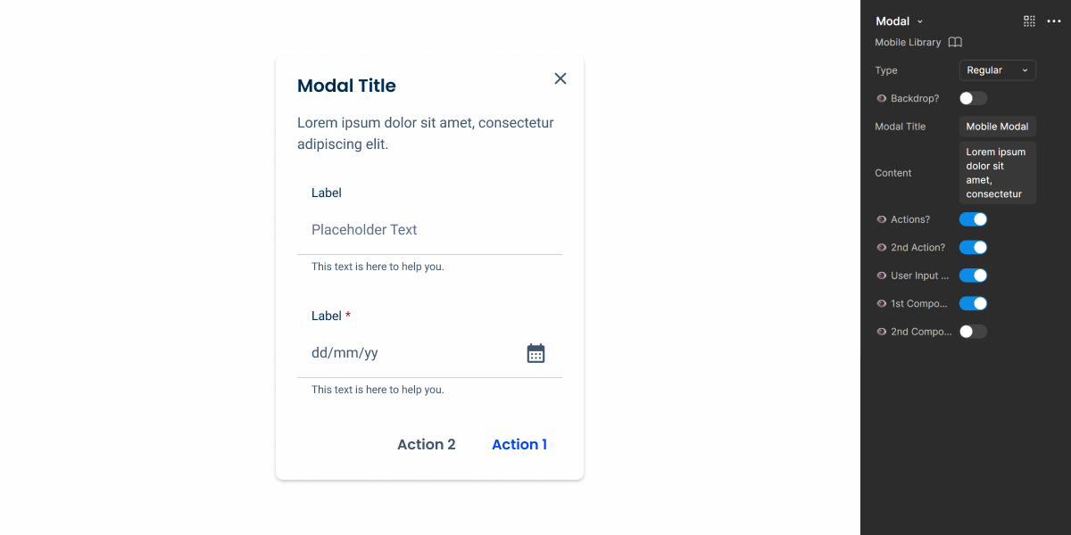
Modal Styles
We offer various modal styles adapted to the applications’ needs, enhancing both the user experience and workflow efficiency.
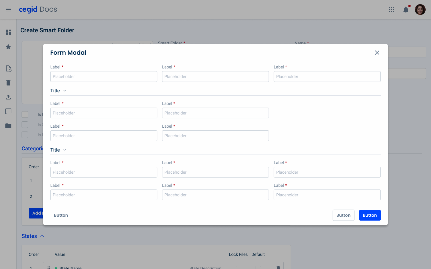
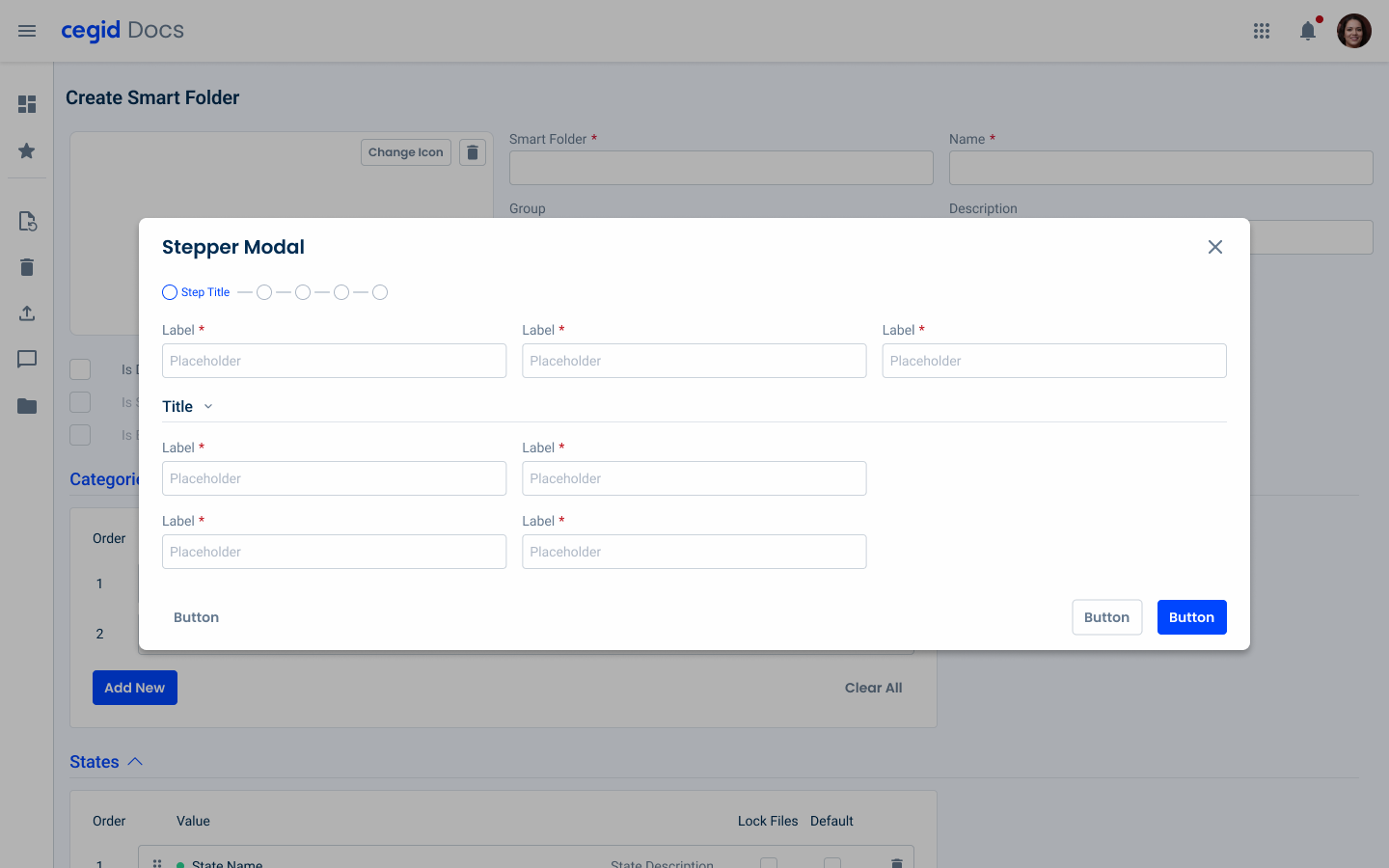
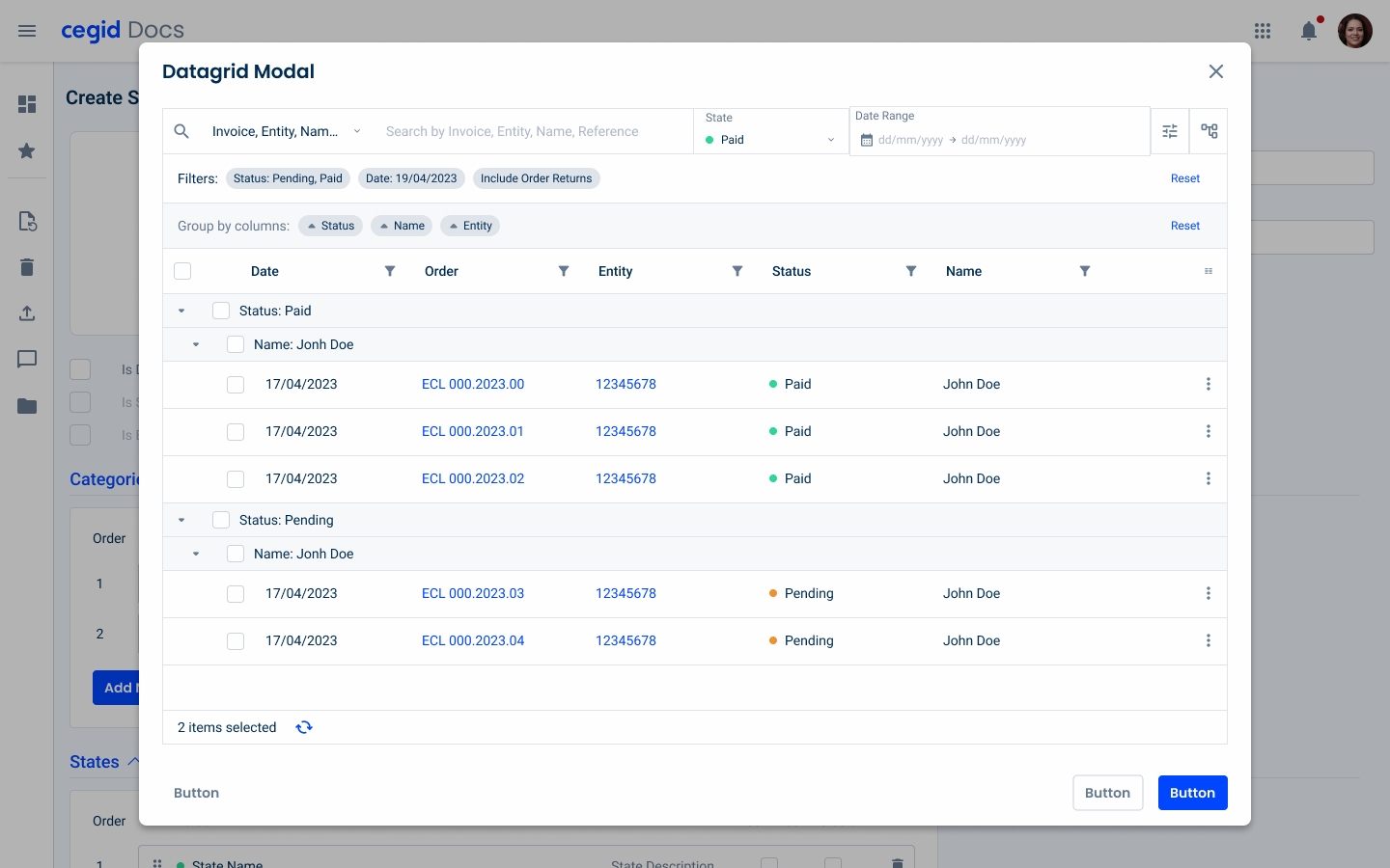
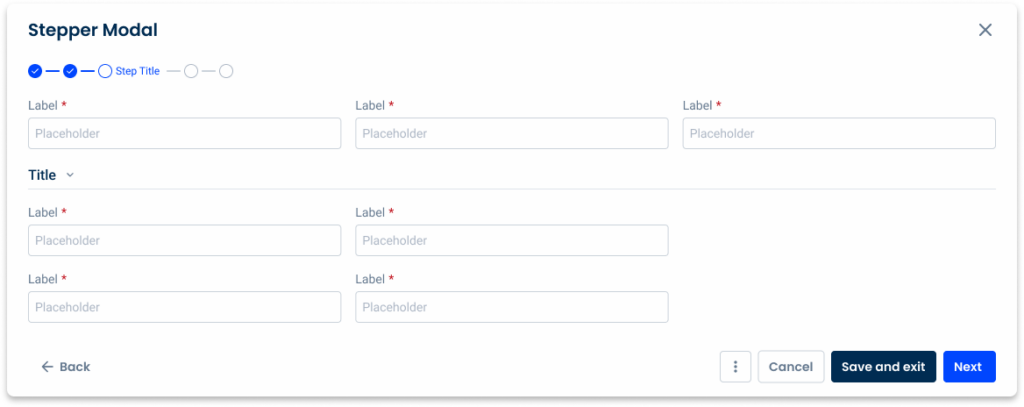
Our options include forms for collect input, datagrids to manage complex datasets, steppers to navigate multi-step processes, vertical navigation to browse vertically structured content, and horizontal navigation to access adjacent content seamlessly.
Make sure you include only the necessary information to ensure that the modals are easy to navigate.
For the cases where the forms are too long, the fullscreen option can be used.
Forms

Datagrid

Stepper

Vertical Navigation

Horizontal Navigation

Voice-Over
For general guidelines on screen reader compatibility, see the following blog post on best practices: Designing the Invisible: How to Make Your Interfaces Work Without a Screen.
Tell users they have entered a Modal.
After closing the modal, return screen reader users to the same place they were on the page.
Overload the Modal with too much content.
Forget to tell the users how to close the Modal.
Trap users inside the Modal.
Let screen readers read what’s behind the Modal. No background elements outside the Modal should be focusable/readable by the screen reader.
Reading Order
| Reading Order | Element | Screen Reader Reading |
| 1 | Title | Modal title |
| 2 | Body | Modal body (e.g. form, file uploader section, etc.) |
| 3 | Primary button | Next, button, primary action |
| 4 | Back button | Back, button |
| 5 | Secondary button | Cancel, button, secondary action |
| 6 | Expand button | Expand, button |
| 7 | Close button | Close, button |
Case Studies
Usage of overlay types within a product
What Changes?
The mobile version of the Modal has undergone some changes to its layout, receiving a more compact design that favors the vertical content display and the use of Text Buttons.
No size variations were created, as they’re not necessary in this context. However, we still wanted to make sure Modals remained flexible, so we have created three different versions that can be used in different scenarios, which we’ll explain later in this article.

Demo
Access the Figma file and inspect the element using Dev Mode.
Variations
Modals are frequently used to address user flow issues, thanks to their ability to be overlaid on top of an interface. To facilitate their use in different situations, we have created three different variations.
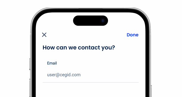
Regular Modal
Regular Modals are placed in the center of the device screen. They can resemble Dialogs and, similarly, should be used in scenarios where they are intended to be quickly dismissed (such as when asking users for a single piece of information, such as their email) and/or when wanting to grab the user’s immediate attention.
It’s important to understand that Regular Modals can be intrusive and block important information, which can frustrate users. Before implementing them, make sure they’re the most appropriate solution.
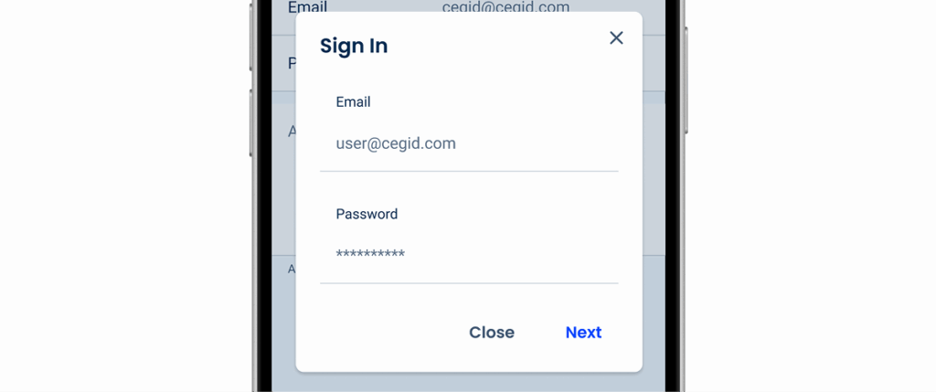
Use Regular Modals for extensive or complicated tasks.
Bottom Sheet Modal
Bottom Sheet Modals are placed at the bottom of the device screen. As such, they’re perfect for complementing the primary task while keeping the center of the interface visible. They are also ideal for presenting multiple options through a Menu.
They can also be used to collect user input, making them a good alternative to Regular Modals when looking for a less disruptive option.
A grabber can be added at the top, which must allow users to either dismiss the modal or increase its size. This makes this variation extremely flexible and the most suitable for most situations.
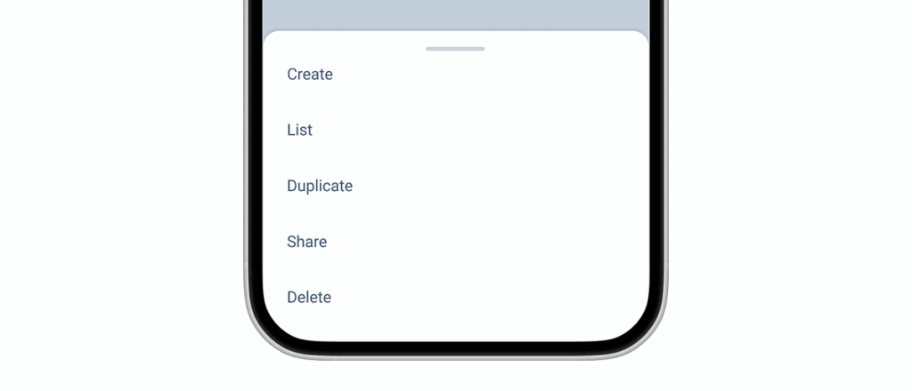
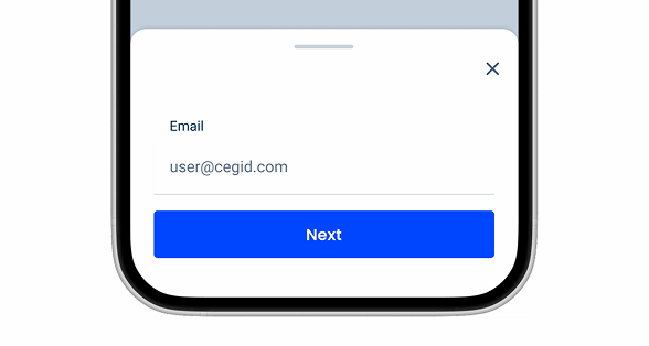
Consider adding a “Close” button, as some users may not know how to use grabbers or may tap outside the modal to dismiss it.
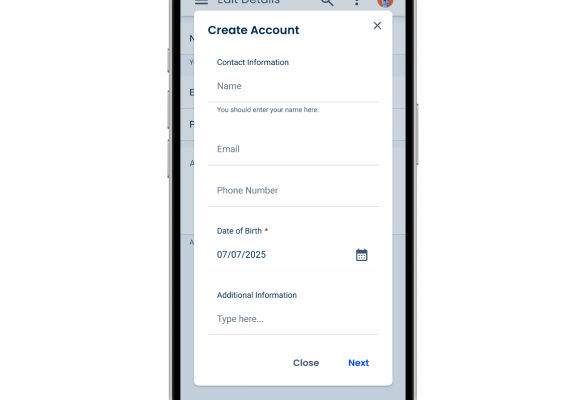
Full Screen Modal
Like all other modals, Full Screen Modals are placed over the content with which the user interacts. However, they take up the entire screen. They allow users to focus entirely on the content of the modal, while the primary task remains paused.
Naturally, they are most useful when displaying large amounts of information and often require user action, such as accepting the Terms and Conditions for a product.
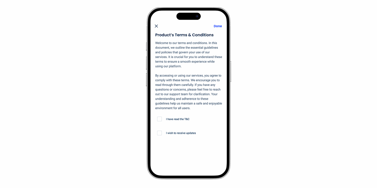
Use Full Screen Modals for simple or less important tasks, as they are the most disruptive variation.
Always add a “Close” button to this type of modal.
Case Studies