
Dialog
Dialogs are a type of modal used to convey information, often requiring users to make a decision by interacting with an overlay window.

- Overview
- Specs
- Guidelines
- Mobile
Pattern
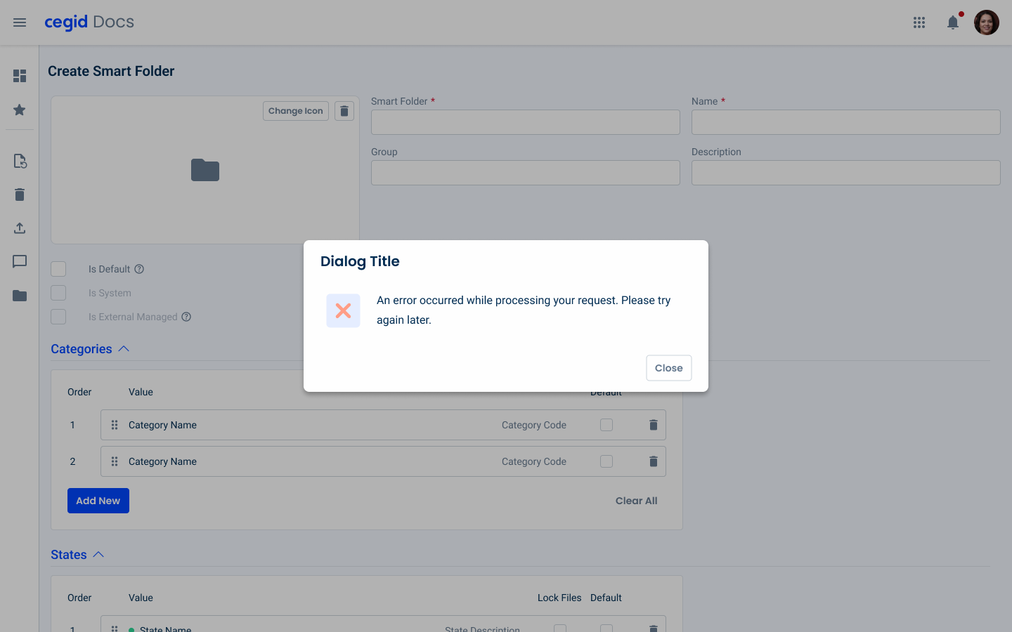
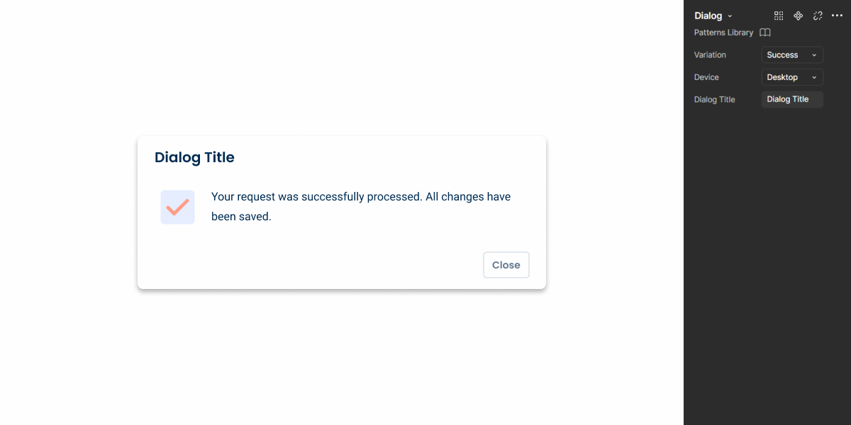
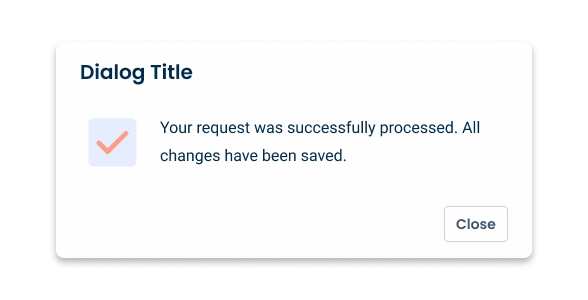
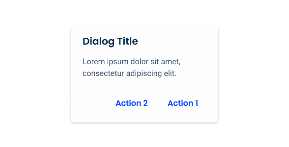
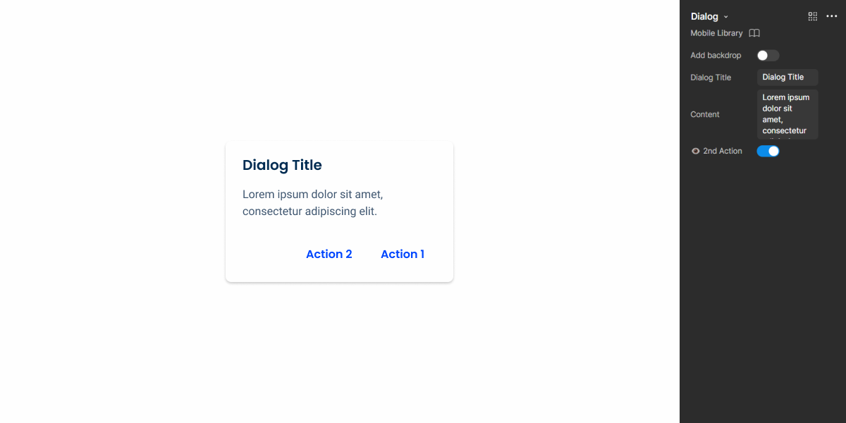
Dialog modals are small overlay windows primarily used to display information. Since they disable the background interface, they are an effective way of ensuring that users receive important details about their current task. Additionally, they can be used to confirm actions.
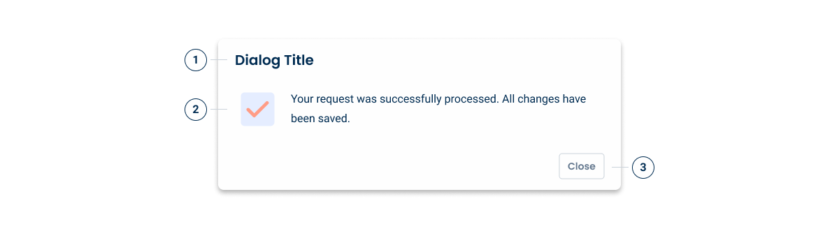
- 1: Title
- 2: Accent Icon
- 3: Action Button
Used for:
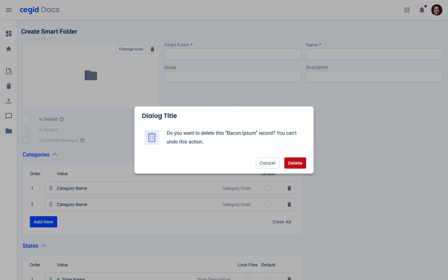
Confirm destructive actions
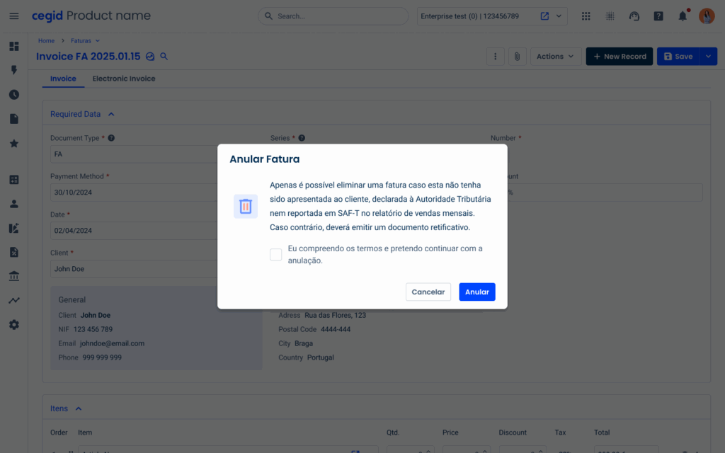
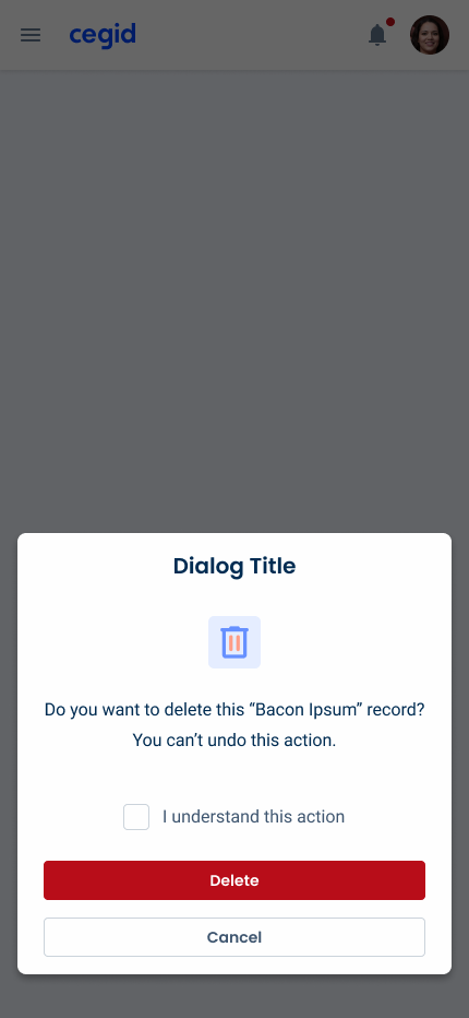
Dialogs are used to confirm critical actions, such as deletions or submissions, where irreversible changes occur.
Focus on critical information
Dialogs draw attention to essential information or actions that require user acknowledgment or response. By temporarily blocking the background, they ensure the user focuses on the task at hand.
Onboarding or tutorials
Use dialogs to guide new users through important features or processes in an application. This can help improve the onboarding experience.
Don’t use for:
Critical navigation
If users need to navigate quickly between different parts of an application, dialogs can hinder this by blocking access to the rest of the interface.
Non-critical content
Dialogs are not used for content that isn’t crucial or time-sensitive. Information that can be presented inline or on a separate page is better suited outside of a dialog.
Blocking actions
The use of dialogs that prevent users from accessing essential actions or information needed to complete their current task should be avoided. This can create frustration and disrupt the workflow.
Glossary
If you’d like, you can consult the dialogs glossary, which contains a set of dialogs, their description, associated buttons and translation into Portuguese and Spanish.
Demo
Access the Figma file and inspect the element using Dev Mode.
Last Update
- Added new tab for the mobile version of the pattern.
Related
Accent Icons
Variations

Device
Desktop
.desktop {
  width: 576px;
  padding: var(--spacing-16, --spacing-24);
  header {
    title: var(--Heading-H6);
    title_color: var(--grey-9);
  }
  content{
    gap_top: var(--spacing-8);
    gap_bottom: var(--spacing-16);
    accent_icon: 64px;
    description: var(--body-1);
    gap: var(--spacing-16);
  }
  footer {
    gap: var(--spacing-16);
    button_1: var(--primary-theme-regular);
    button_2: var(--textButton-grey-regular);
  }
  shadow: var(--shadow-tertiary);
}Mobile

.mobile {
  width: 398px;
  padding: var(--spacing-16, --spacing-24);
  header {
    title: var(--Heading-H6);
    title_color: var(--grey-9);
  }
  content{
    gap_top: var(--spacing-8);
    gap_bottom: var(--spacing-16);
    accent_icon: 64px;
    description: var(--body-1);
    gap: var(--spacing-16);
  }
  footer {
    gap: var(--spacing-16);
    button_1: var(--primary-theme-regular);
    button_2: var(--textButton-grey-regular);
  }
  shadow: var(--shadow-tertiary);

}
Useful links

Consult our Figma file to access our assets and inspect them in dev mode.

This component is or will be provided by the Polygon framework. See its documentation to learn more.

This element is in line with the guidelines of the CDS (Cegid Design System). Find out more.
Size
Unlike other modals, the primary function of dialogues is to provide information in short sentences. Therefore they always have a small size.
A width of 40% with a maximum height of 80% is ideal for informative dialogs with little information or with confirmation of actions.

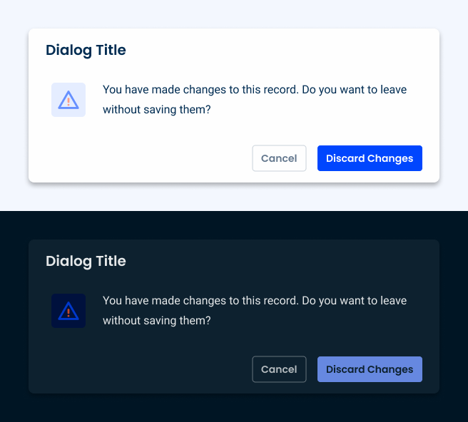
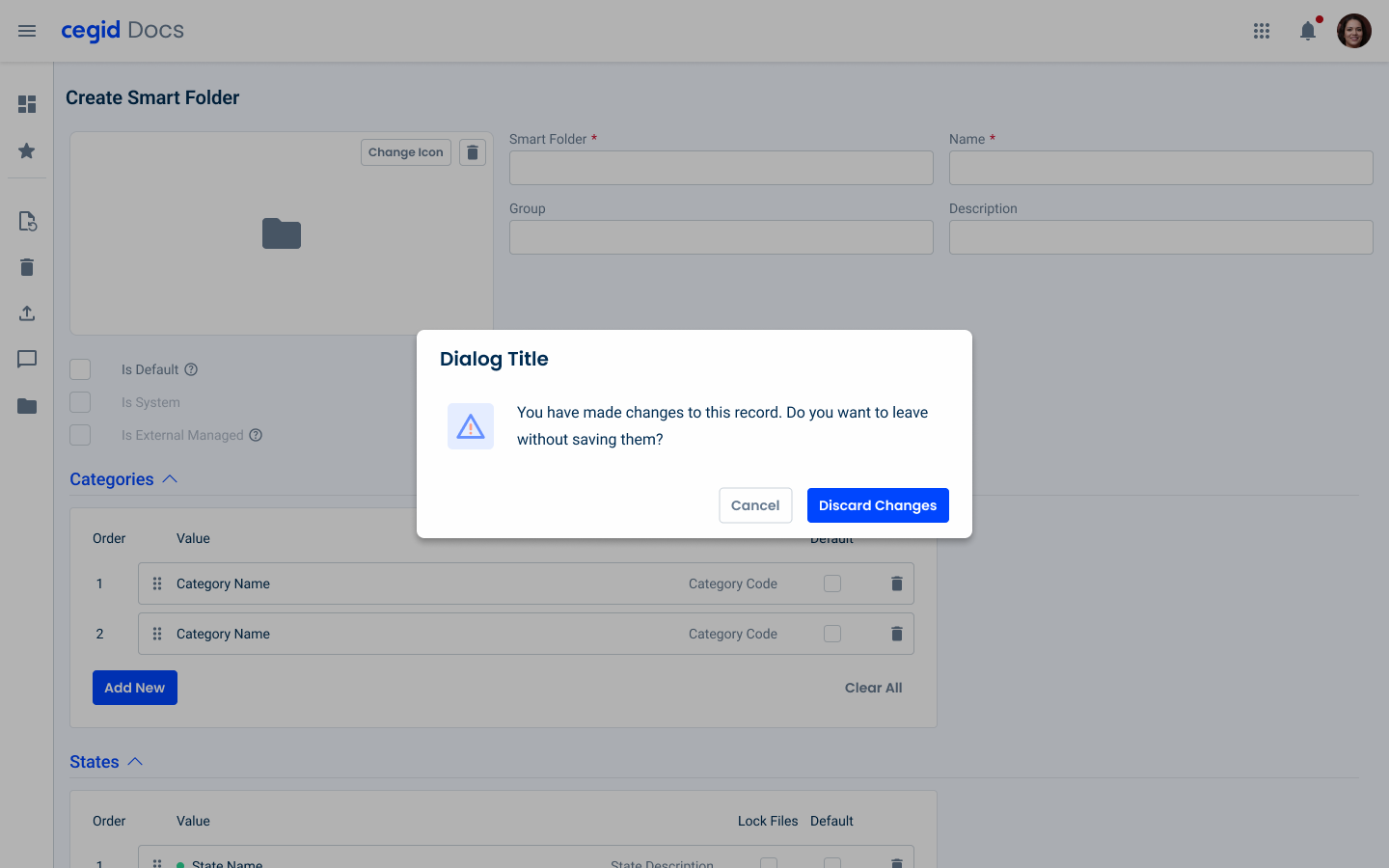
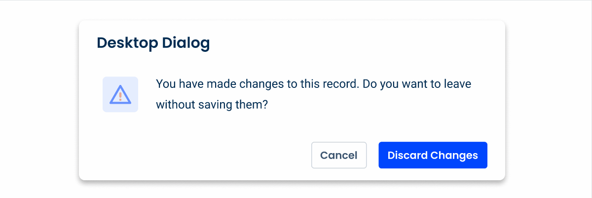
Care must be taken when using a dialog on top of another overlay window. They can be used when discarding edits or creating entities/items.
Since dialogs are used to provide critical information, they should not be designed with a close icon. Instead, add a close or cancel button.
Position
Desktop
When designing dialogs, it’s essential to consider the device and the context in which they appear to optimize user experience.
On desktop interfaces, dialogs are typically placed at the top or center of the screen, drawing immediate attention to the content without obstructing the user’s view. This central positioning helps to ensure that users focus on the content of the dialog, especially when the screen real estate is large.
Mobile (responsive)
On mobile devices, the dialog positioning strategy differs from that used on the desktop, due to the smaller screen size and user interaction patterns. On mobile devices, dialogs often appear at the bottom or center of the screen, with bottom positioning being particularly suitable for confirmation dialogs.
This approach takes advantage of the ease of thumb reach, allowing users to access buttons and make quick decisions with minimal effort. By adapting dialog placement to the device and user context, designers can enhance accessibility and usability across platforms.

Variations
Checkbox
A checkbox was added to the dialog pattern in order to confirm destructive changes, and so, it only applies to the error and warning states.
In certain cases this checkbox can have multiple lines, that’s why we need additional space for it, for that reason, the checkbox is inserted after the description of the dialog.
For the responsive mobile case, an extra padding was added in order to increase the touch area of the actual checkbox.
In the responsive version, make sure that the checkbox follows the aligment of the content.
Voice-Over
For general guidelines on screen reader compatibility, see the following blog post on best practices: Designing the Invisible: How to Make Your Interfaces Work Without a Screen.
Tell users they have entered a Dialog.
After closing the Dialog, return screen reader users to the same place they were on the page.
Overload the Dialog with too much content.
Forget to tell the users how to close the Dialog.
Trap users inside the Dialog.
Let screen readers read what’s behind the Dialog. No background elements outside the Dialog should be focusable/readable by the screen reader.
Reading Order
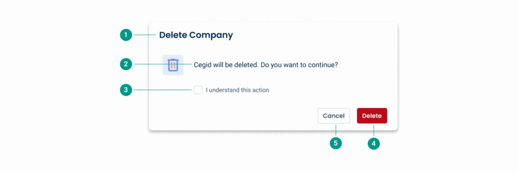
| Reading Order | Element | Screen Reader Reading |
| 1 | Title | Delete company |
| 2 | Description | The Test Company data will be deleted, do you want to continue? |
| 3 | Checkbox | I understand this action, checkbox unchecked |
| 4 | Primary button | Delete, button, primary action |
| 5 | Secondary button | Cancel, button, secondary action |
Case Studies
Usage of overlay types within a product
What Changes?
The component has received some significant changes to its appearance to make it more suitable for small screens. It doesn’t use decorative elements (such as the Accent Icons) and the Buttons use their text variations, resulting in a very compact design.
They are also designed to be placed in the center of the screen, ensuring maximum visibility. If you want to place them at the bottom to improve user flow (or if you simply need to add more than two actions), consider using an Action Sheet.
This is the extension of the Dialog changes. The remaining functionalities, use cases and guidelines are identical in both versions.
Demo
Access the Figma file and inspect the element using Dev Mode.
Case Studies

Handling Background Tasks

Read Mode: Making Content Feel Effortless and Understandable
