
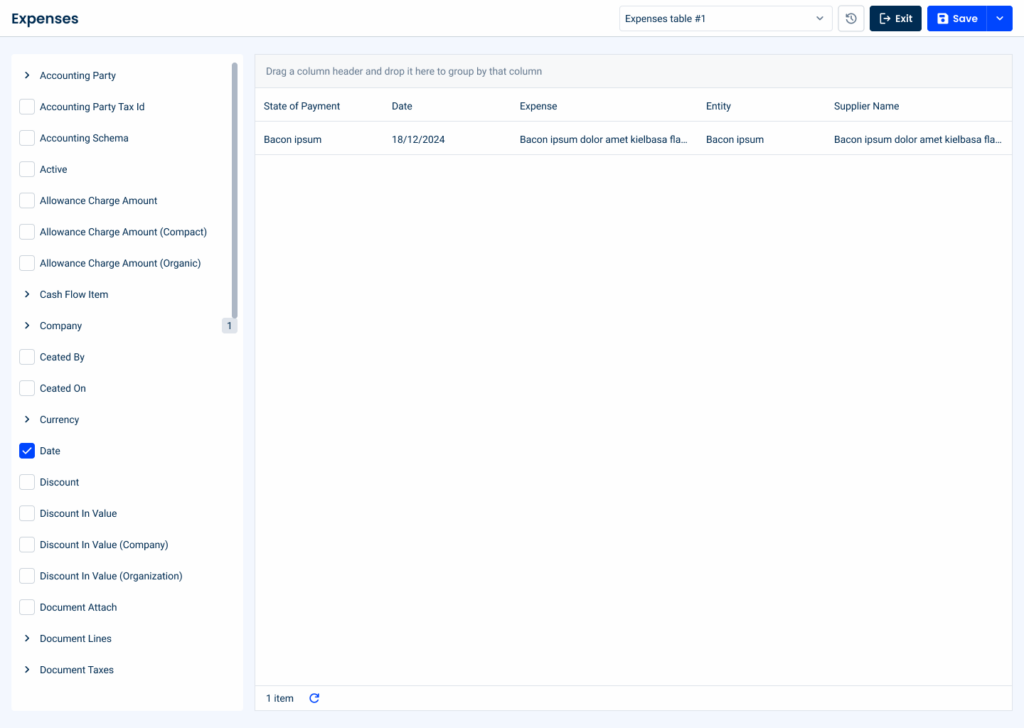
Data Grid
Data Grids are used to efficiently organize information and make it easier for users to consult it.

- Overview
- Specs
- Guidelines
Pattern
The Data Grid pattern is a versatile and dynamic tool designed to display structured data in a clear and organized manner.
It presents information in a grid format, allowing users to easily comprehend and analyze complex datasets with efficiency and precision.
Whether used in web applications, data visualization platforms, or enterprise systems, this component offers unparalleled flexibility and functionality.

- A: Regular Style;
- B: Compact Style;
- 1: Checkbox;
- 2: Dedicated Filter;
- 3: Hover Actions;
- 4. Overflow Menu;
- 5: Cell;
- 6: Items to Show;
- 7: No. of Items;
- 8: Group by Columns.

Used for:
Displaying large datasets
Data Grids excel at presenting large volumes of data in a structured and easily consumable format. They allow users to effectively visualize, scroll through and navigate large data sets.
Sorting and filtering
Data Grids enable users to dynamically sort and filter data based on specific criteria, allowing them to quickly find relevant information and customize the view.
Pagination
Data Grids offer built-in pagination and virtual scrolling features to efficiently manage large datasets, optimizing performance by incrementally loading data.
Don’t use for:
Limited data complexity
If your application deals with simple or straightforward data that does not require extensive sorting, filtering, or manipulation, consider using cards instead.
Graphical data representation
When the data is primarily visual or graphical in nature, such as charts, diagrams, or maps, a Data Grid may not be the most effective way to present the information, consider using the dashboard widget instead.

Demo
Access the Figma file and inspect the element using Dev Mode.

What’s New?


- Updated color variables;
Variations
Line
Regular

.Regular {
  height: 48px;
  background: var(--grey-1);
  stroke: var(--grey-4);
  checkbox: var(--small-enabled);
  overflow-menu: var(--regular-enabled);
}
Compact

.Compact {
  height: 32px;
  background: var(--grey-1);
  stroke: var(--grey-4);
  checkbox: var(--small-enabled);
  overflow-menu: var(--small-enabled);
}
Cells
Regular

.Default {
  height: 48px;
  color: var(--grey-1);
  text: var(--grey-8);
}

.Info {
  height: 48px;
  color: var(--info-10);
  text: var(--info-highlight);
}

.Warning {
  height: 48px;
  color: var(--warning-10);
  text: var(--warning-highlight);
}

.Error {
  height: 48px;
  color: var(--error-10);
  text: var(--error-highlight);
}

.Success {
  height: 48px;
  color: var(--success-10);
  text: var(--success-highlight);
}
Compact

.Default {
  height: 32px;
  color: var(--grey-1);
  text: var(--grey-8);
}

.Info {
  height: 32px;
  color: var(--info-10);
  text: var(--info-highlight);
}

.Warning {
  height: 32px;
  color: var(--warning-10);
  text: var(--warning-highlight);
}

.Error {
  height: 32px;
  color: var(--error-10);
  text: var(--error-highlight);
}

.Success {
  height: 32px;
  color: var(--success-10);
  text: var(--success-highlight);
}
Advanced Filters
Enabled

.Enabled {
  height: 130px;
  color: var(--grey-2);
  stroke: var(--grey-4);
  text-field: var(--regular-enabled);
  checkbox: var(--small-enabled);
  buttons: var(--tertiary-small-disabled, --primary-small-disabled);
}
Focus

.Focus {
  height: 130px;
  color: var(--grey-2);
  stroke: var(--grey-4);
  text-field: var(--regular-active);
  checkbox: var(--small-enabled);
  buttons: var(--tertiary-small-enabled, --primary-small-enabled);
}
Active

.Active {
  height: 48px;
  color: var(--grey-2);
  stroke: var(--grey-4);
  text: var(--grey-8);
  tags: var(--selectable-enabled);
  buttons: var(--tertiary-small-enabled);
}
Useful links

Consult our Figma file to access our assets and inspect them in dev mode.

This component is or will be provided by the Polygon framework. See its documentation to learn more.

This element is in line with the guidelines of the CDS (Cegid Design System). Find out more.
Column Resizing
The width of the columns can be adjusted by dragging the right edge of the column or double-clicking on the right edge of the column and the size will be adjusted automatically.

Multi-Selection
This type of list makes it possible to apply bulk actions, i.e. actions that can be applied to several items.
When at least one row in the list is selected, the options that can be applied in bulk become active in the action bar and the number of selected items and the Clear Selection option are displayed at the bottom of the list.
It is possible to quickly select or deselect all rows using the general checkbox.

Line Processing
The line processing feature in the DataGrid is intended to give users immediate visual feedback when an action triggers updates to one or more rows. This is particularly important in bulk operations—such as approving, marking as reviewed, or updating status—where showing the affected rows helps build clarity and trust in the system.
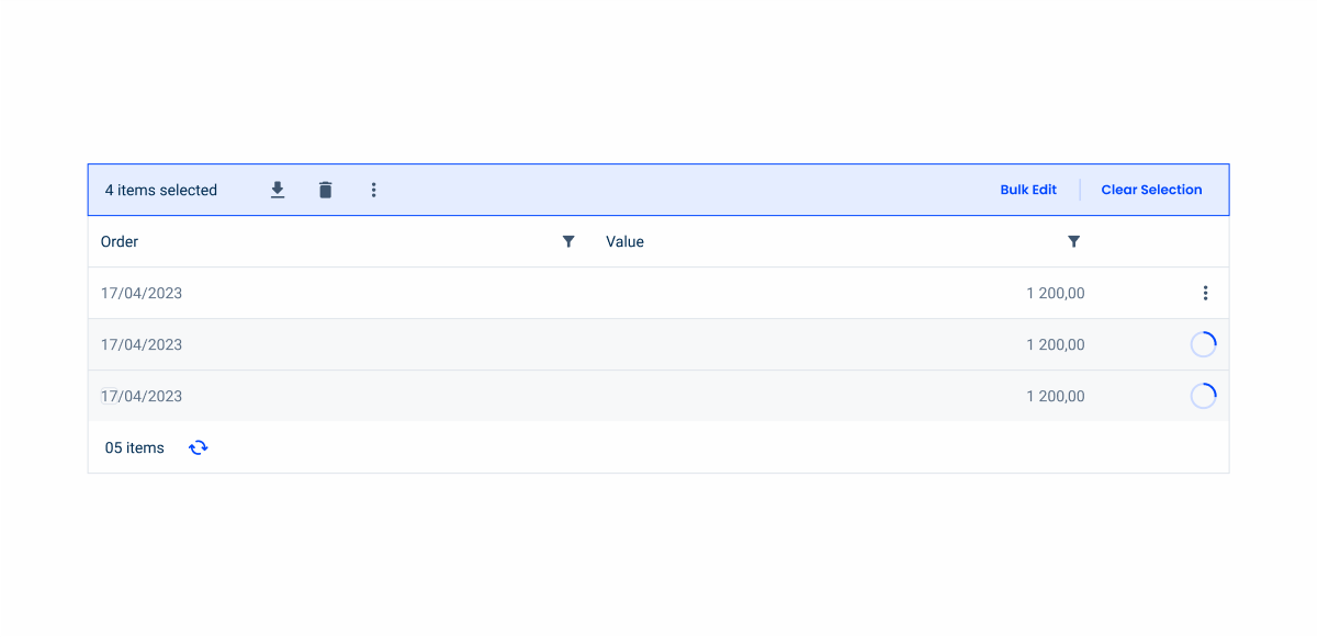
Once the action is triggered, each affected row should immediately enter a visible loading state. This can be represented by an inline spinner or shimmer effect, without hidding any of the row’s main content. The loading indicator should be subtle but clear, avoiding large overlays or full-table spinners that could obscure context.
Sorting
Columns can be sorted by clicking on the label and the sort arrow. By default, the ascending sort is the first to be displayed.
One or more columns can be sorted and the number of the sort order is displayed.
Sorting can have these variations:
- No sorting;
- Hover in column header;
- Sorting in ascending order;
- Sorting in descending order;
- Multiple sorting.

Moving Columns
Columns can be moved to display the Data Grid according to the user’s needs and preferences.

Filtering
The Data Grid can be filtered using various filtering methods. Filters are displayed at the top of the Data Grid and in the columns to provide a robust and extensive search.
- Search Field
The search field allows searching by text and selecting various parameters present in the Data Grid. The search results should appear dynamically in the table, depending on what the user types.
The search field can have the following states:
- Enabled;
- Hover;
- Focus;
- Select search parameter;
- Active.

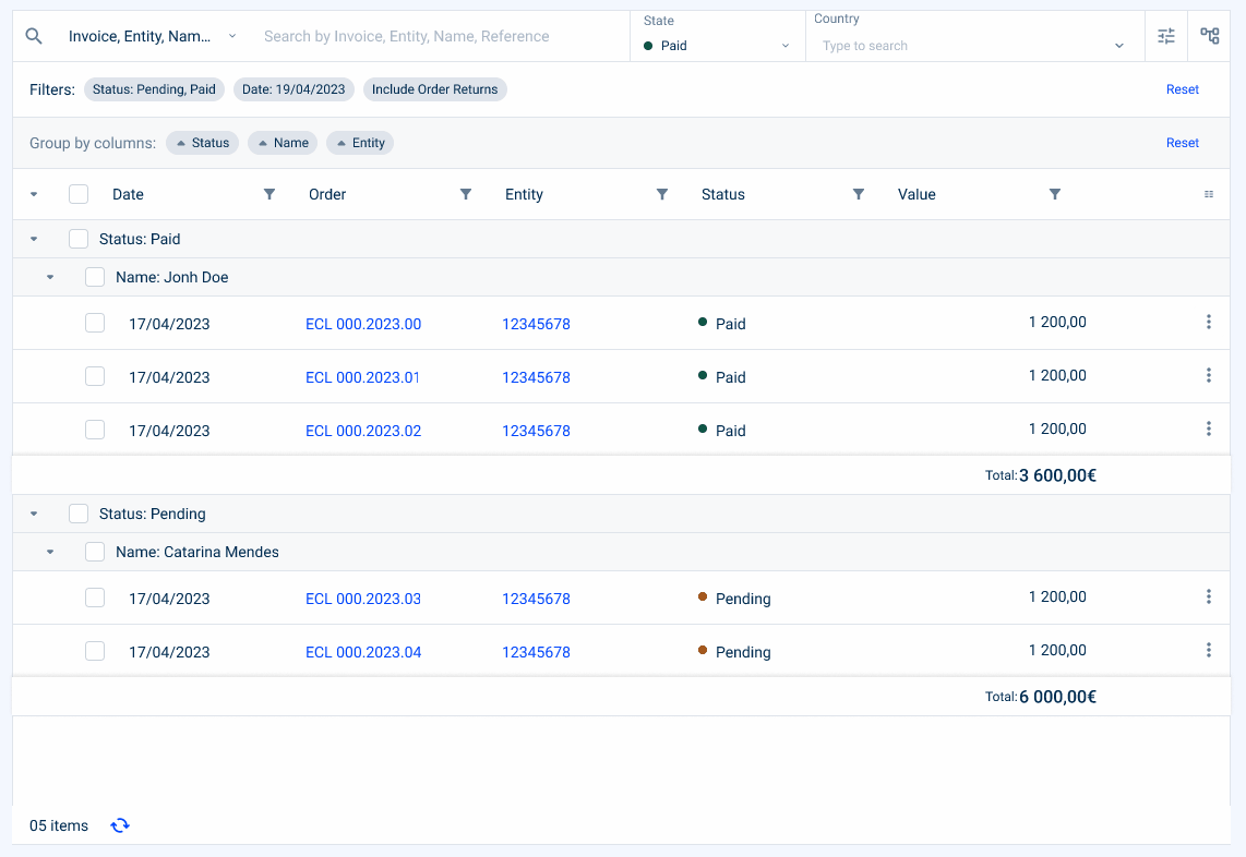
- Highlighted Filter
A maximum of two filters can be highlighted. The date filter should be preferred in lists with start and end date. If you have any doubts as to which filters are most important to the user, you can consult analytical data on their use.
Keep in mind that these filters must remain consistent with the content of the table, which is a crucial filter for the user.
Currently, we have the following highlighted filters:
- Status Filter (which indicates, in the case of an invoice, whether it is paid, pending or unpaid);
- Date Filter (which indicates a date range);
- Select box Filter (which can indicate a choice from a list, for example, a country);
- Value Range Filter (which can indicate a range of values, for example, a price of an invoice).
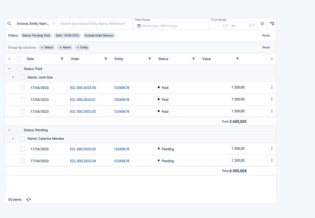
- Advanced Filters
This section allows advanced filtering using filters that are not present or are hidden in the table columns.

- Column Filtering
You can add a filter to each column, depending on its type of values. This can include text fields, checkboxes, date pickers and radio buttons.

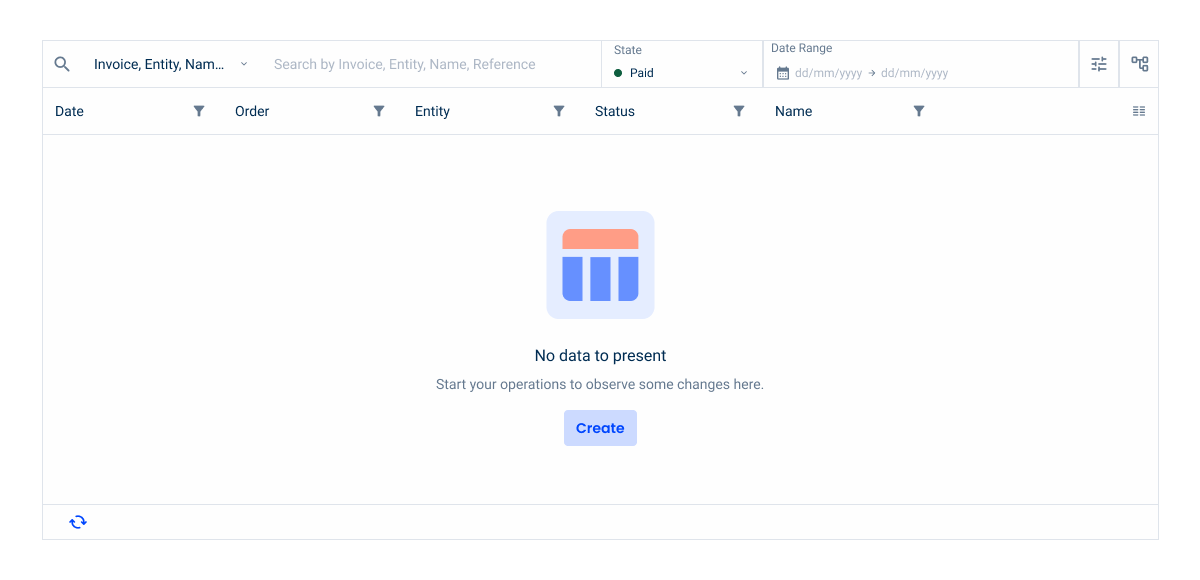
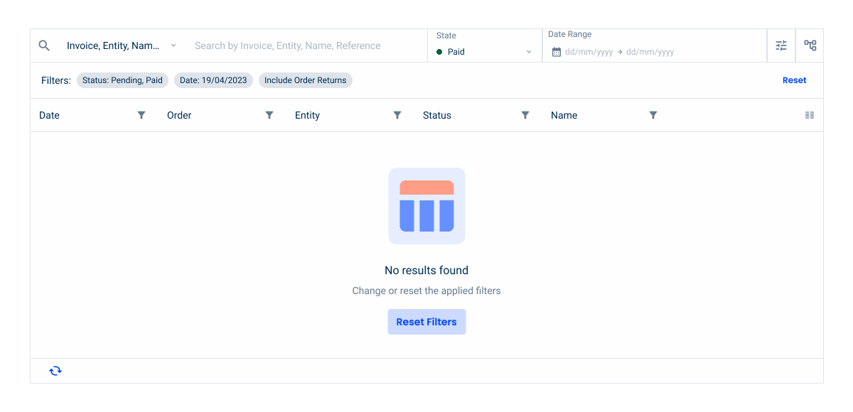
Empty State
Since both cases already have a primary action available elsewhere — such as a Create button — the empty state button should only be applied with the secondary variation.
Using a secondary button variation for actions like Create or Reset Filters helps to maintain a clear visual hierarchy. This prevents users from confusing the empty state button with the main call to action, keeping the interface balanced and intuitive.
- No data to present: this empty state is displayed when no items are being loaded into the list.
- No results found: this empty state is displayed when a filter is run, but there are no results to display.
Column Grouping
Grouping columns enables the table to have several levels of columns in the form of headers and the columns to be expanded or reduced within the group. You can group one or more columns according to your needs.

Grouping with Totalizers
It is also possible to present totalizers and subtotalizers by column groupings. These can be displayed for a better understanding of the data.

Advanced Interactions
The table has advanced interactions present in each row of the table. These interactions can be either by hovering the specific row or being fixed at the end of the row.
For specific cells, such as status indicators and icons, a tooltip will be available to help the user understand the value or action that is associated with the cell.
The overflow menu shows the other actions associated with the row, as well as the two highlighted actions. If the label exceeds the maximum width, the text should be truncated and a tooltip with the full label should appear. Both the highlighted actions and the overflow menu must be pinned if there is a side scroll in the table.
Hover Actions
By default this is the approach used with the “View” and “Edit” actions. These actions tend to be more common to all datagrids, and navigates to another page.
Fixed Actions
Depending on the use case, fixed actions can be used for recurring actions, such as downloading an attachment related to an invoice, for example. These actions tend to be direct actions that don’t necessarily navigates the user to another page.


Apply a tooltip over the icon or status indicator to avoid losing context.

Apply a tooltip above the icon or status indicator;
Navigation with Flyout
In certain specific scenarios, we have the ability to directly edit entries from a data grid using a flyout. When working in the Data Grid, users can easily select another entry with just one click, which instantly updates the content displayed in the flyout. However, to prevent accidental data loss, if any changes have been made to the data contained in the flyout but not yet saved, a dialog box will appear. This dialog serves as a confirmation step, ensuring that users are aware of unsaved changes and have the opportunity to save or discard them before proceeding with the new selection. This approach helps maintain data integrity and provides protection against unintentional editing.
Cell Width Sizes
To maintain consistency across all products, a list of predefined width sizes for the cells was created. Keep in mind that the most important is to maintain the incremented value, which is 40px.
| Size | Recommended Content |
| 40px | Icons |
| 80px | Short codes or countries initials |
| 120px | Simple dates |
| 160px | Short serial numbers or complex dates (range) |
| 200px | Regular serial numbers or progress bars |
| 240px | Large serial numbers |
| 280px or plus | Descriptions |
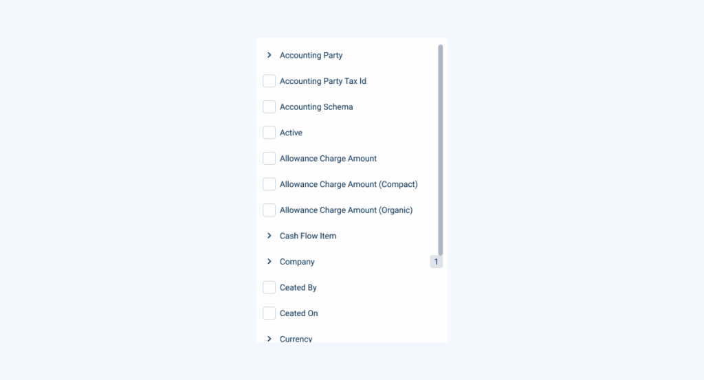
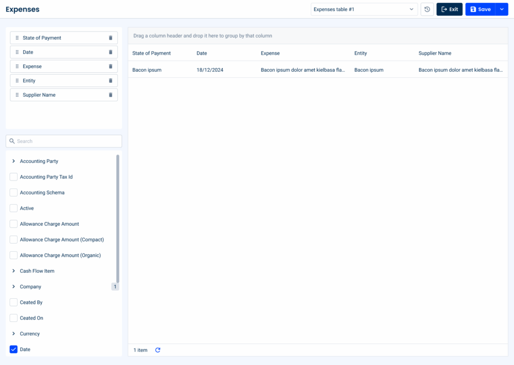
List Configurator
The list configurator is a powerful feature designed to give users full control over the appearance and functionality of the datagrid. It allows users to customize which columns are displayed and how they are organized, ensuring the datagrid meets their specific needs and preferences.
Key Features of the List Configurator:
Treeview for Column Selection
Users can navigate through a hierarchical treeview to select the columns they want to display in the datagrid. This structured approach is particularly beneficial when dealing with grouped or nested data, allowing for clear and logical customization.
Draggable List for Column Organization
A draggable list allows users to rearrange the order of columns or remove them completely from the datagrid. This feature ensures that the data displayed is aligned with the user’s priorities, offering a seamless way to customize the grid layout.

Page Title for Options
At the top of the page, users can set their own customized configurations for the datagrid. This feature also includes an option to reset the table to its default settings, offering flexibility and ensuring a quick recovery should changes need to be undone.

By integrating the list configurator into the datagrid pattern, users gain unparalleled flexibility and efficiency in customizing their data views. This feature not only improves usability, but also aligns with modern requirements for customizable and dynamic user interfaces.Keep in mind that it is also possible to have a simpler version without the draggable list.
Dos & Dont’s

No more than two highlighted actions should be used per line;

If necessary, only one action can be highlighted per line;
Voice-Over
For general guidelines on screen reader compatibility, see the following blog post on best practices: Designing the Invisible: How to Make Your Interfaces Work Without a Screen.
Before entering the grid, inform users what type of information it contains and how much data is expected. Briefly summarize the grid’s content. For example: “Product orders table: five columns, six rows“.
When reading a cell, make sure that the screen reader indicates which column it refers to. For example, instead of just announcing “€20.00,” make sure it announces “Price (column), €20.00 (cell).”
Prevent users from knowing that a grid they have just entered is filtered by default. Clearly announce its status when the user enters it.
Do not group unrelated content on the same row.
Skip columns or cells, and do not let the focus jump from one place to another in a disorderly manner.
Reading Order
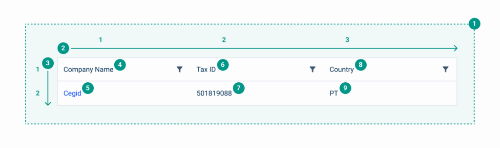
| Reading Order | Element | Screen Reader Reading |
| 1 | Table name | Table of companies |
| 2 | Table general description | Three columns, one row |
| 3 | Row 1 – column 1 | Company name, Cegid, Link |
| 4 | Row 1 – column 2 | Tax ID, 501819088 |
| 5 | Row 1 – column 3 | Country, PT |
Case Studies

Handling Background Tasks

Read Mode: Making Content Feel Effortless and Understandable
