Action Bar
An Action Bar is a UI element at the top of interfaces, which offers quick access to essential actions relevant to the current task
- Overview
- Specs
- Guidelines
Pattern
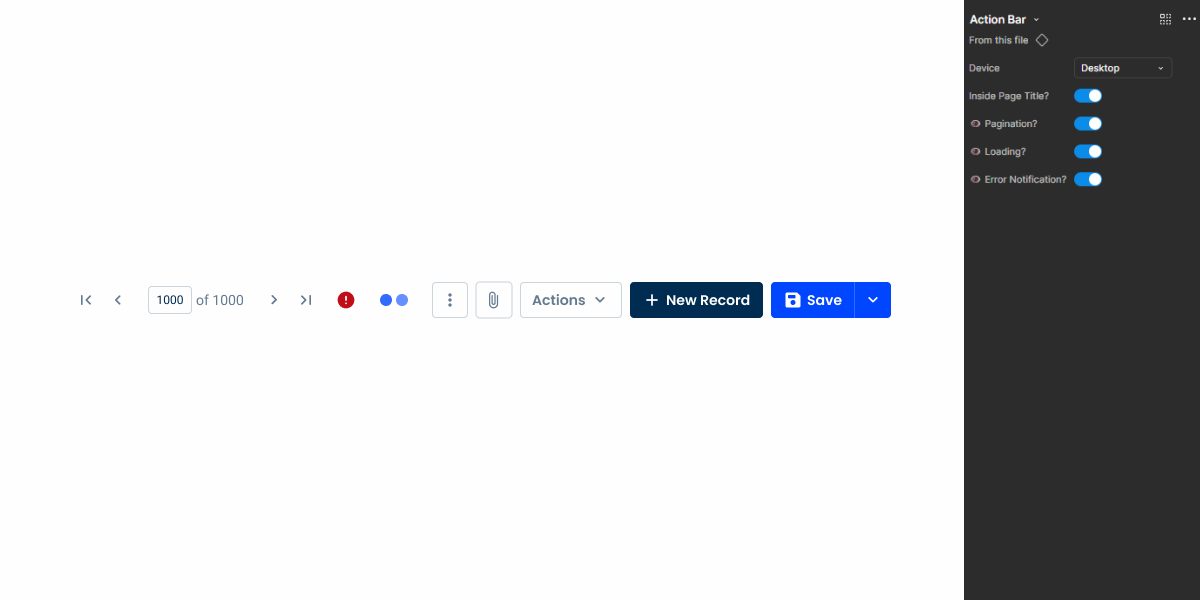
The Action Bar pattern is a user interface element typically located at the top of a digital interface, providing users with quick access to essential actions, commands, or controls relevant to the current context or task.
It serves as a centralized hub for primary actions, enabling users to efficiently interact with the interface and easily perform key tasks. The Action Bar often contains icons and buttons. By presenting the essential functionalities needed per view, it increases user productivity, makes tasks easier and contributes to a smooth and intuitive user experience.
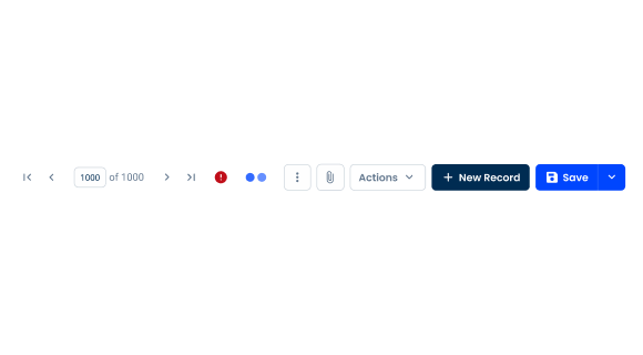
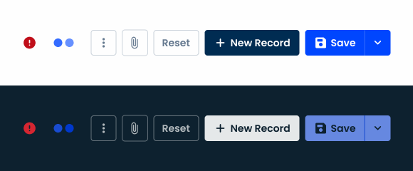
A: Desktop Variation
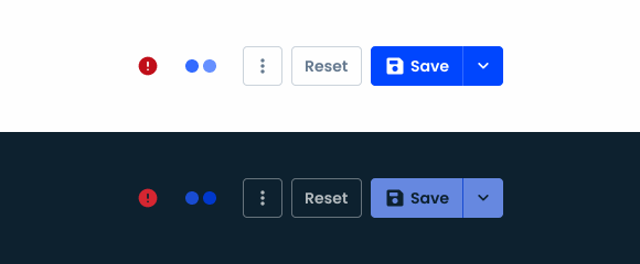
B: Tablet Variation
C: Mobile Variation
1: Split Button
2: Button
3: Icon Button
4: Loading Button
5: Error Icon
6: Pagination
Used for:
Forms
Applied alongside the page title pattern, the Action Bar placed at the top has actions related to the form, such as saving or editing when in read mode;
Table views
Applied alongside the page title pattern, the Action Bar placed at the top has actions related to the table views, such as creating a new entry or editing an existing one;
Modals (form variation)
As with forms, Action Bars can be placed inside modals if they are in their form variation;
Centralized access
An Action Bar provides a centralized location to access essential actions, reducing the user’s search for features.
Don’t use for:
Flyouts
In the case of flyouts with limited space in the smaller variations, the Action Bar is not used in simple form edits, instead only a group of buttons is used;
Modals (info variation)
Unlike the form variation, when modals only have simple information, such as a confirmation to delete a client form, only a simple group of buttons is used, as in the flyout;
Space constraints
In interfaces with limited screen space, such as mobile applications or small screens, an Action Bar takes up valuable space and hinders the visibility of essential content or functionalities.
Demo
Access the Figma file and inspect the element using Dev Mode.
Last Update
- Added outside page title variation.
- Added pattern guidelines.
Related
Behavior
Devices
Depending on the screen, certain variations have been created to be applied. There are three variations that have been created for each device and breakpoint, namely: Desktop, Tablet and Mobile. For each of these variations, the number of buttons changes:
- Desktop: two split buttons, one button, one button icon and one overflow menu;
- Tablet: one split button, one button and one overflow menu;
- Mobile: one split button and one overflow menu.
Keep in mind that depending on the needs of each product, the split or regular buttons can be swapped, but the overall number of elements should remain the same. Additionally, keep in mind that this Action Bar must be applied within the Page Title guidelines as well.

Pagination
In the case of the Desktop variation, a pagination can be inserted next to the Action Bar to quickly navigate between pages within the same context (e.g. data grid with filtered data, list of clients in the same country).
Position
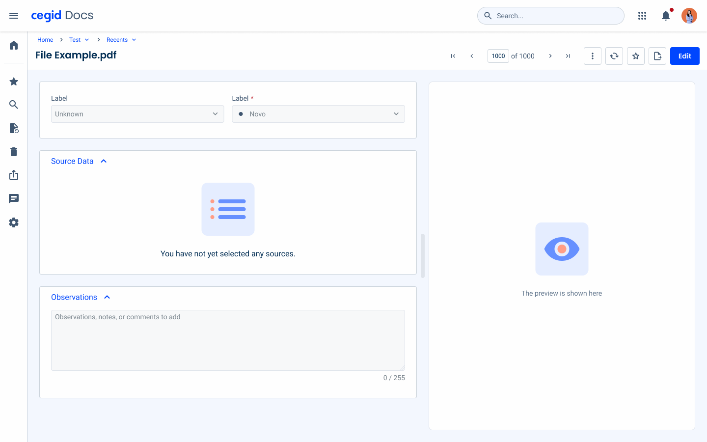
The Action Bar pattern ensures the Action Bar is consistently positioned at the top of the page, just below the topbar.
This guideline enhances usability by maintaining a predictable location for primary actions, improving user navigation and efficiency. By keeping the Action Bar at the top, users can quickly access important functions without unnecessary scrolling, contributing to a seamless and intuitive user experience.
This positioning is also in line with common user expectations, since Action Bars at the top of the page are a standard in many interfaces.
Hierarchy
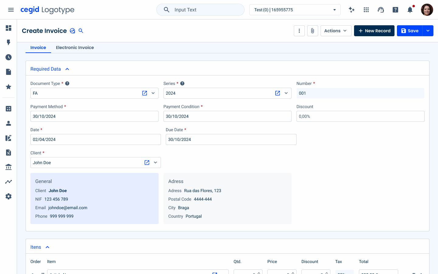
By default, the primary action appears first as a button or split button in the primary variation, ensuring high visibility for key tasks.
Then follows a secondary action, usually presented as a primary gray button or a split button in a secondary variation for less critical but still important actions.
Supporting actions are placed next using tertiary button icons, providing quick access to additional functions without overwhelming the interface.
Finally, any remaining actions are consolidated into an overflow menu, maintaining a clean and organized layout while ensuring all options remain accessible.
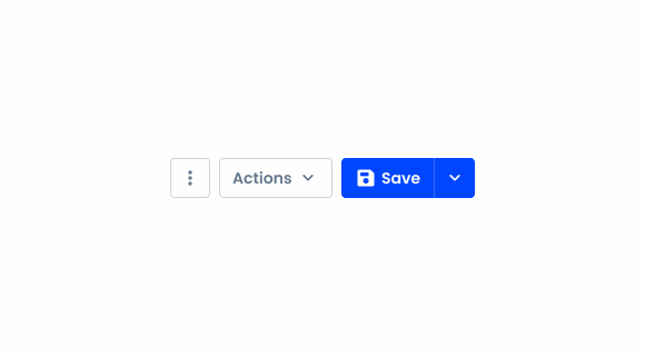
Respect the hierarchy guidelines for the different elements of the Action Bar.
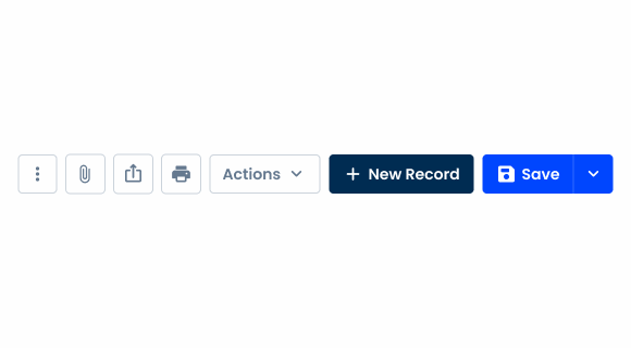
Add more than five buttons to the Action Bar.
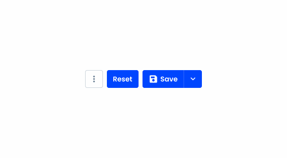
Apply more than two buttons with the color theme.
Variations
Outside Page Title
By default, the action bar is applied within the page title, as it is the concentrated place to gather all the actions of the page.
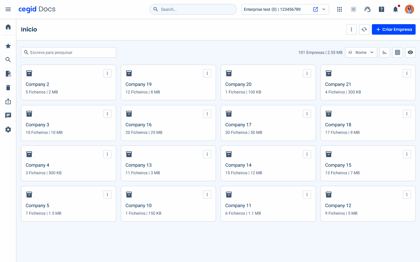
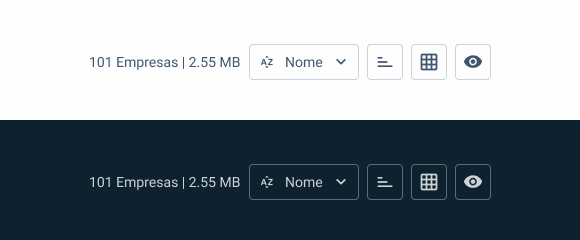
But for certain cases where the actions apply to only certain elements of the page, a variation of the pattern has been added, the Outside page title. The variation contemplates the base elements for filtering per example.
This variation can be composed by three button icons and one chip or selectbox at maximum. The buttons icons are applied with the tertiary grey variation and the chip with the selectable variation.
For the choice between a chip or the selectbox, what determines the usage of one or another is the scalability, the usage of chip is better for the number of options is defined, on the other hand, the usage of selectbox is better if the number of options is dynamic.
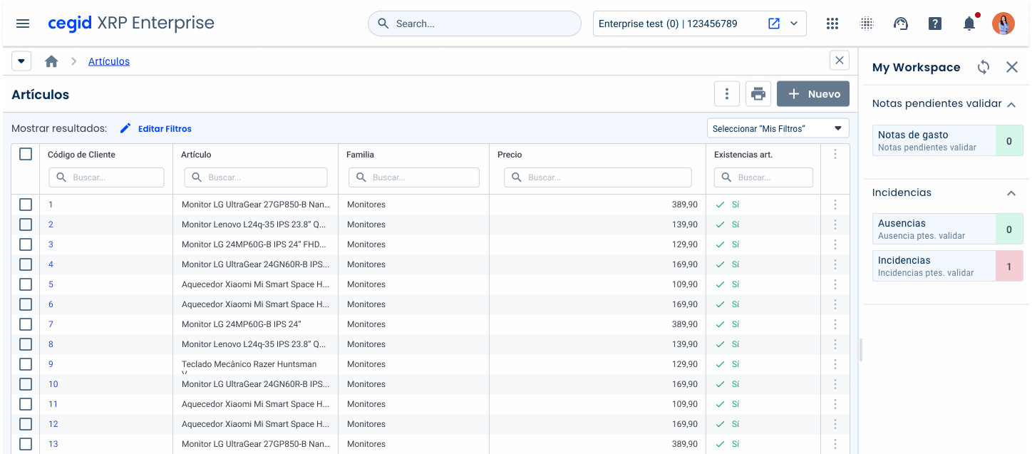
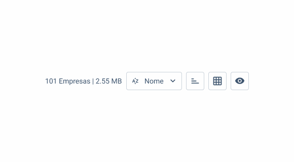
For certain informative cases, we can have a label to inform the user.
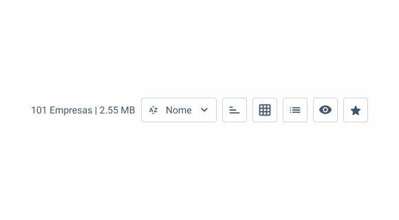
Add more than four elements to this variation.
States
Loading
The loading state offers clear feedback during ongoing processes initiated through the Action Bar. For example, when users trigger actions like saving, uploading, or processing data, the loading state visually communicates that the system is actively working.
This prevents users from repeating actions due to perceived inactivity, reducing errors and improving efficiency.

Error
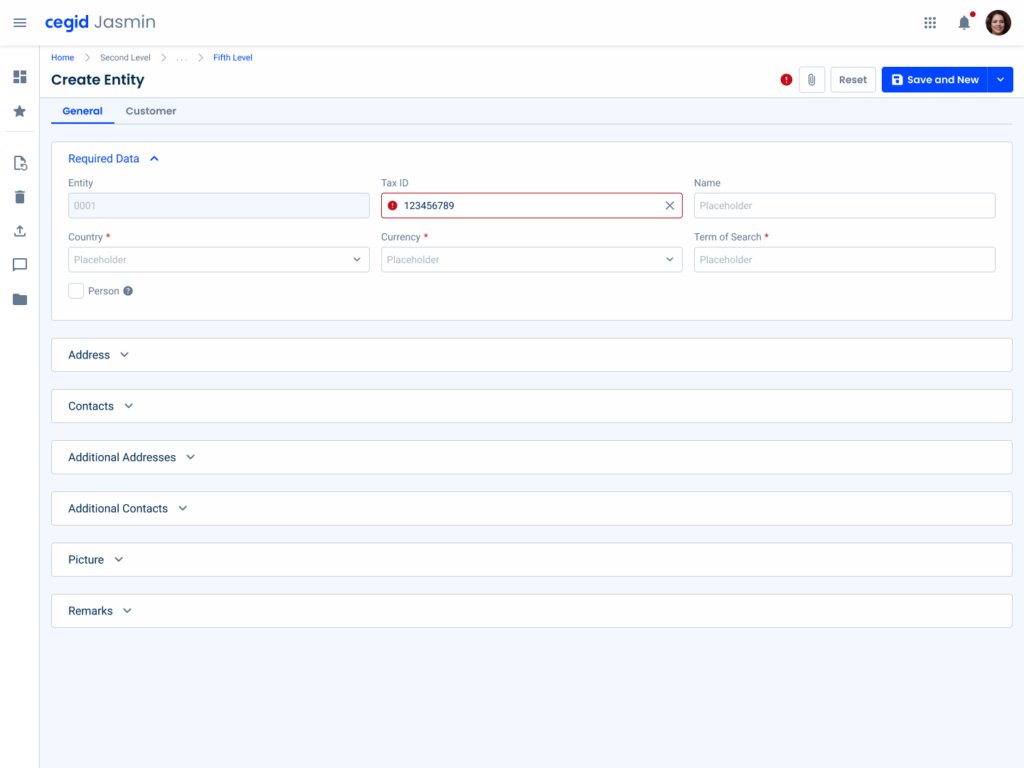
The error state is represented by a simple icon in the Action Bar, serving as a visual cue to indicate the presence of errors on the page. Instead of detailing specific issues in the Action Bar itself, this state directs users to inspect the page for additional error information.
Its minimalistic design ensures the Action Bar remains uncluttered while still signaling the need for attention.
Case Studies
Usage of overlay types within a product
Variations

Inside Page Title
Desktop
.desktop {
  spacement: var(--spacing-16);
  spacementBtns: var(--spacing-8);
  BtnSize: var(--regular);
  height: 36px;
}
Tablet
.tablet {
  spacement: var(--spacing-8);
  spacementBtns: var(--spacing-8);
  BtnSize: var(--regular);
  height: 36px;
}
Mobile

.mobile {
  spacement: var(--spacing-8);
  spacementBtns: var(--spacing-8);
  BtnSize: var(--regular);
  height: 36px;
}
Outside Page Title
Unique variation
.mobile {
  spacement: var(--spacing-8);
  spacementBtns: var(--spacing-8);
  btnSize: var(--regular);
  chipsSize: var(--regular);
  labelSize: var(--regular);
  height: 36px;
}Useful links

Consult our Figma file to access our assets and inspect them in dev mode.

This component is or will be provided by the Polygon framework. See its documentation to learn more.

This element is in line with the guidelines of the CDS (Cegid Design System). Find out more.