
Label
A Label serves as a crucial element for enhancing the clarity and usability of a digital interface.

- Overview
- Specs
- Guidelines
Component
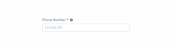
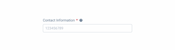
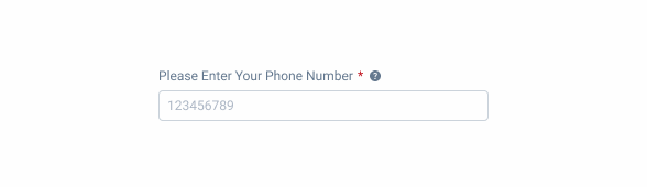
A Label serves as a crucial element for enhancing the clarity and usability of a digital interface. It is primarily used to provide a clear and concise description or instruction related to an associated input element, such as a text field, checkbox, radio button, or drop-down menu.
Labels ensure that users understand the purpose and expected input for each form element, thereby reducing the likelihood of user errors and increasing the efficiency of data entry.

- A: Left Alignment Variation;
- B: Center Alignment Variation;
- C: Right Alignment Variation;

Used for:
Clarifying input purpose
In cases where it is necessary to have clear information about the input, a Label is used.
Helper text
In cases where it is necessary to have additional information to help the user, a Label is used.
Enhancing accessibility
Labels are crucial for accessibility, enabling screen readers to convey the purpose of form fields to visually impaired users.
Don’t use for:
Headings
For page titles, for example, a Label doesn’t have either the size or the weight required to be viewed as a heading.
Subtitles
For sections’ titles, for example, a Label doesn’t have either the size or the weight required to be viewed as a subtitle.

Glossary
If you’d like, you can check the input fields glossary which contains a multilingual set of labels as well as their corresponding placeholders and error messages.
Demo
Access the Figma file and inspect the element using Dev Mode.

What’s New
- Added fill container option;
- Added large, regular and small sizes ;
Related
Sizes

Small

.small {
  label: var(--label-small);
  color: var(--grey-8);
}
Regular

.regular {
  label: var(--label-regular);
  color: var(--grey-8);
}
Large

.large {
  label: var(--label-large);
  color: var(--grey-8);
}
Useful links

Consult our figma file to access our assets and inspect them in dev mode.

This component is or will be provided by the Polygon framework. See its documentation to learn more.

This element is in line with the guidelines of the CDS (Cegid Design System). Find out more.
Behavior
Error Validation
By default, a validation is applied when the input status changes from focus to active.
We can also use a mechanism to validate the content as the user enters it. This validation should be avoided because, when excessive, it causes friction for the user. It is recommended to use it when you need to create a unique name, for example.
After this validation is done, if a error is reported, an helper text can be added.

Use clear Labels that accurately describe the associated form fields
Avoid using ambiguous or confusing Labels that may lead to user misunderstanding
Avoid using lengthy or redundant Labels that add unnecessary words and impede quick reading.
Case Studies

Creating Context-Aware Notifications for a Better Experience

Read Mode: Making Content Feel Effortless and Understandable
