
Color Picker
The Color Picker is a component meant to enhance user experience through customization, by allowing the selection of colors that suit individual preferences.

- Overview
- Specs
- Guidelines
- Mobile
Component
As a tool designed simply to select a color, the Color Picker is a flexible component that can be integrated into many interfaces that allow or require customization.
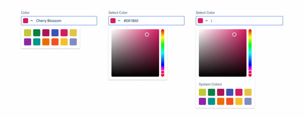
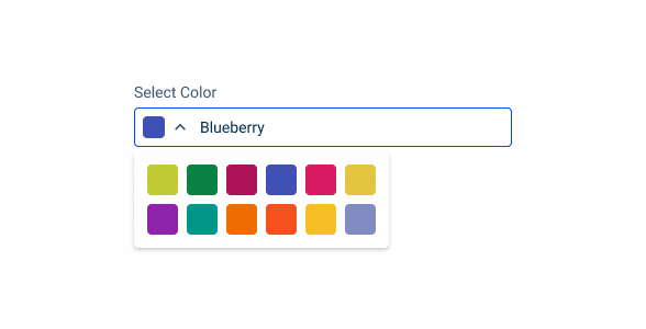
Users can either pick from a list of pre-selected colors, or manually chose the color they want using a gradient.
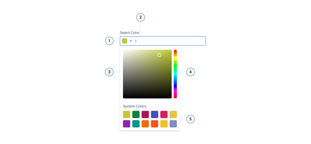
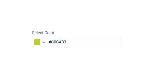
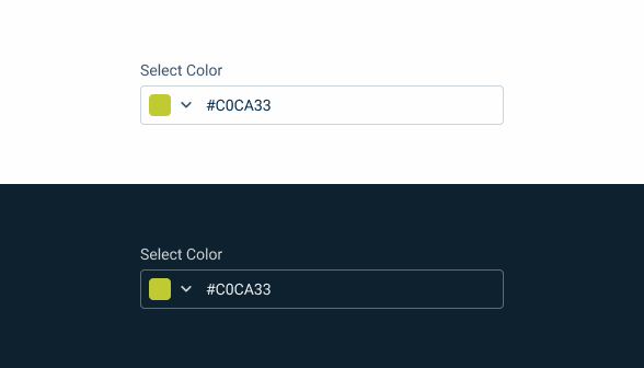
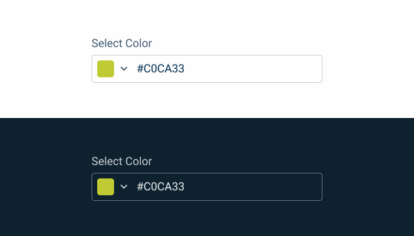
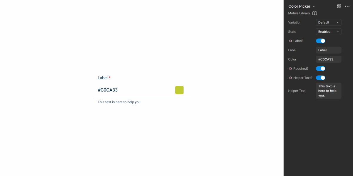
- 1: Selected color
- 2: Color name or HEX code
- 3: Color field
- 4: Hue slider
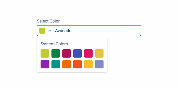
- 5: Design system accent colors
Used for:
Color selection
The main function of the Color Picker is to allow users to choose colors, varying their application according to need.
Customizable content
The Color Picker allows users to customize their experience, not being limited to the colors of the Design System.
Category sorting
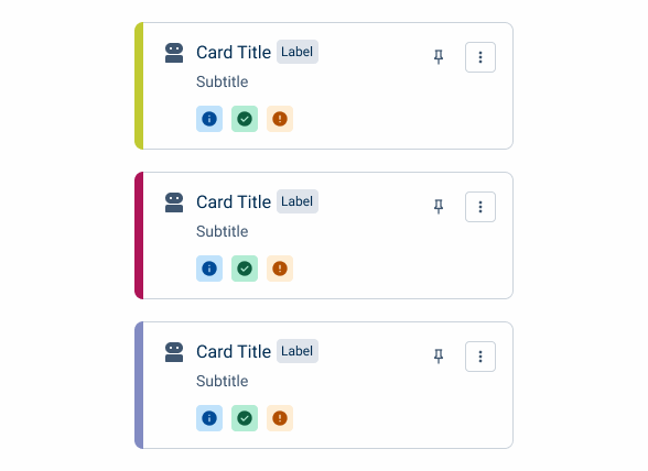
Allowing users to change the colors associated with the components used for categorization – such as cards and chips – can help improve their experience.
Don’t use for:
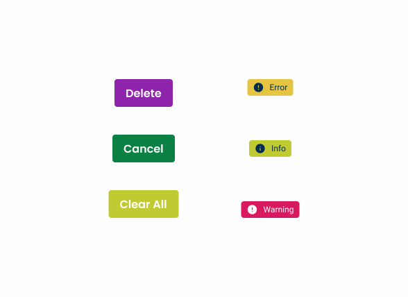
Providing feedback
Many components and patterns – such as Buttons or status indicators – use colors to provide feedback to users. Their colors should never be customizable.
Branding
Allowing users to fully customize the interface colors can break visual consistency throughout Cegid products.
Efficiency-focused tasks
Asking users to select a color can be time consuming. The Color Picker should be avoided in tasks where users are expected to finish quickly.
Demo
Access the Figma file and inspect the element using Dev Mode.
Last Update
- Added new tab for the mobile version of the component.
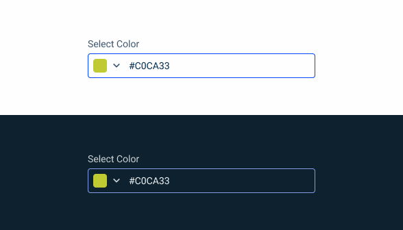
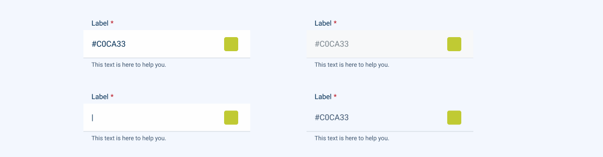
States
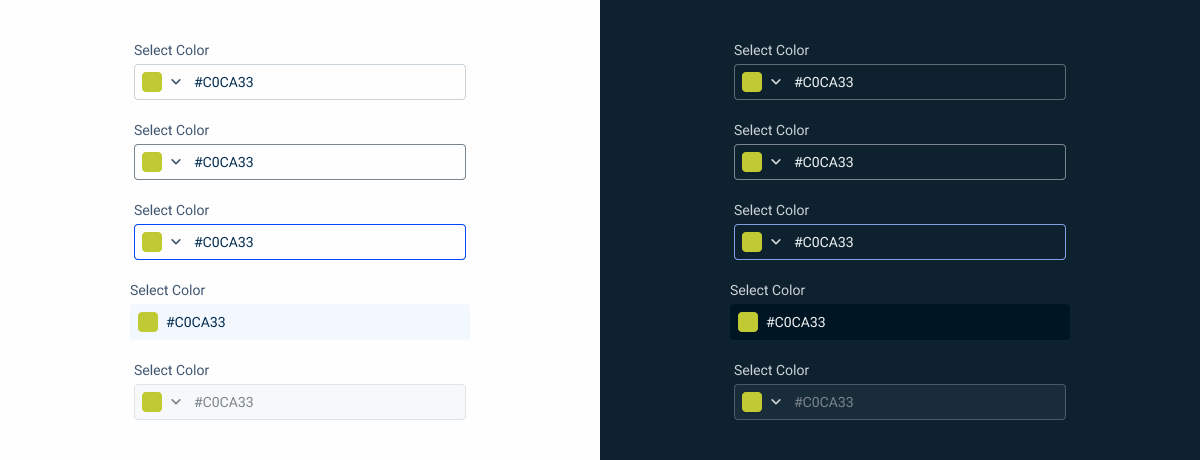
Enabled

.enabled {
  label: var(--grey-8);
  input-border: var(--grey-5);
  input-background: var(--grey-1);
  hex-code: var(--grey-9);
  icon: var(--grey-8);
}
Hover
.hover {
label: var(--grey-8);
input-border: var(--grey-6);
input-background: var(--grey-1);
hex-code: var(--grey-9);
icon: var(--grey-8);
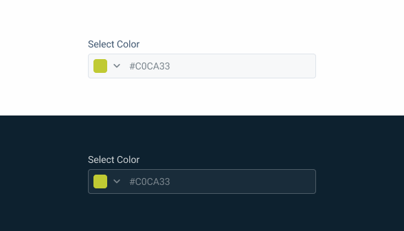
}Focus
.focus{
  label: var(--grey-8);
  input-border: var(--theme-100);
  input-background: var(--grey-1);
  hex-code: var(--grey-9);
  icon: var(--grey-8);
}
Read Only
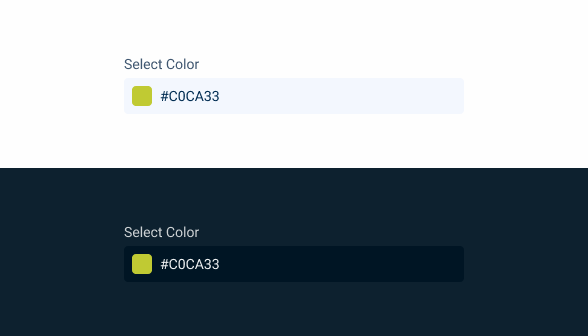
.read-only {
  label: var(--grey-8);
  input-background: var(--grey-3);
  hex-code: var(--grey-9);
  }
Disabled
.disabled {
  label: var(--grey-8);
  input-border: var(--grey-4);
  input-background: var(--grey-2);
  hex-code: var(--grey-6);
  icon: var(--grey-6);
}
Sizes
Small
.small {
  label: var(--label-small);
  input-height: 28px;
  input-border: var(--x-small-radius);
  input-gap: 8px;
  input-padding: var(0, --spacing-4);
  selected-color-indicator: 16px;
  hex-code: var(--label-small);
  hex-code-padding: var(0, --spacing-4)
}
Regular
.regular {
  label: var(--label-regular);
  input-height: 36px;
  input-border: var(--x-small-radius);
  input-gap: 8px;
  input-padding: var(0, --spacing-4);
  selected-color-indicator: 20px;
  hex-code: var(--label-regular);
  hex-code-padding: var(0, --spacing-4)
}
Large
.regular {
  label: var(--label-large);
  input-height: 40px;
  input-border: var(--x-small-radius);
  input-gap: 8px;
  input-padding: var(0, --spacing-4);
  selected-color-indicator: 24px;
  hex-code: var(--label-large);
  hex-code-padding: var(0, --spacing-4)
}
Variations
No Text Field
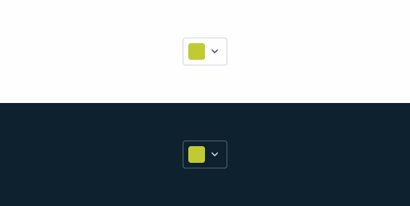
.no-text-field {
width: flex; /* small:56px, regular:60px, large:64px */
horizontal-padding: 8px;
object-gap: 4px;
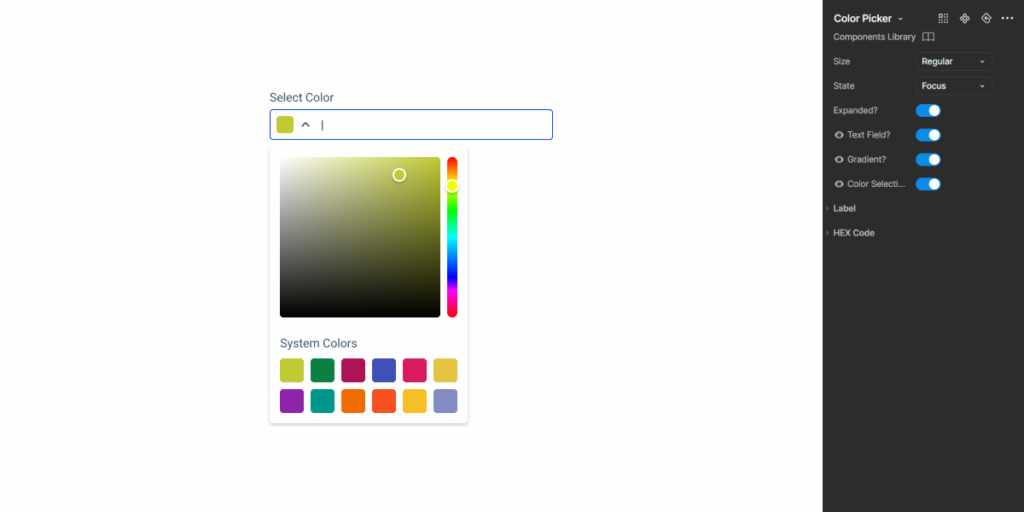
}Dropdown
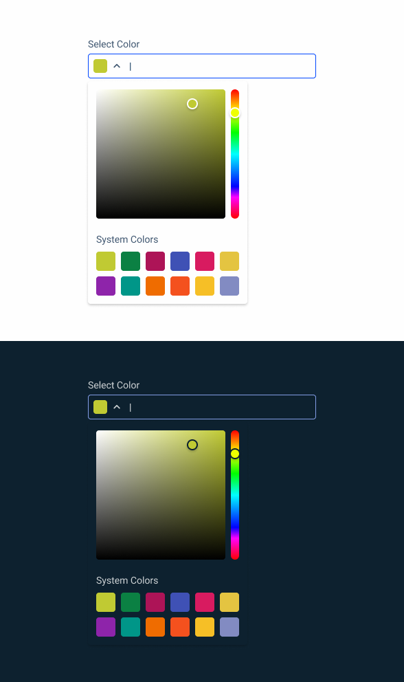
.dropdown{
  padding: 12px;
  vertical-gap: 20px;
  gradients {
    padding: 8px;
    color_field {
      height: 188px;
      width: 188px;
      }
    hue_slider {
      height:188px;
      width: 12px;
      }
    }
  system_colors {
    padding: 8px;
    color-indicator: 28px;
    }
  }
Useful links

Consult our Figma file to access our assets and inspect them in dev mode.

This component is or will be provided by the Polygon framework. See its documentation to learn more.

This element is in line with the guidelines of the CDS (Cegid Design System). Find out more.
Usage
Color Pickers are often implemented in forms in a similar way to Text Fields or SelectBoxes. This means they must be equally responsive and have their width adjusted according to the size of the interface, as well as having the correct size variation applied.
Responsiveness
The Color Picker was designed with variations that make it easier to implement in different contexts.
When it is intended to be used outside of forms or when space is limited, the text field can be omitted.
Similarly, many products will not benefit from having an overly complex color picker that includes a gradient. In fact, as mentioned in the overview, its implementation can sometimes slow users down and lead to frustration.
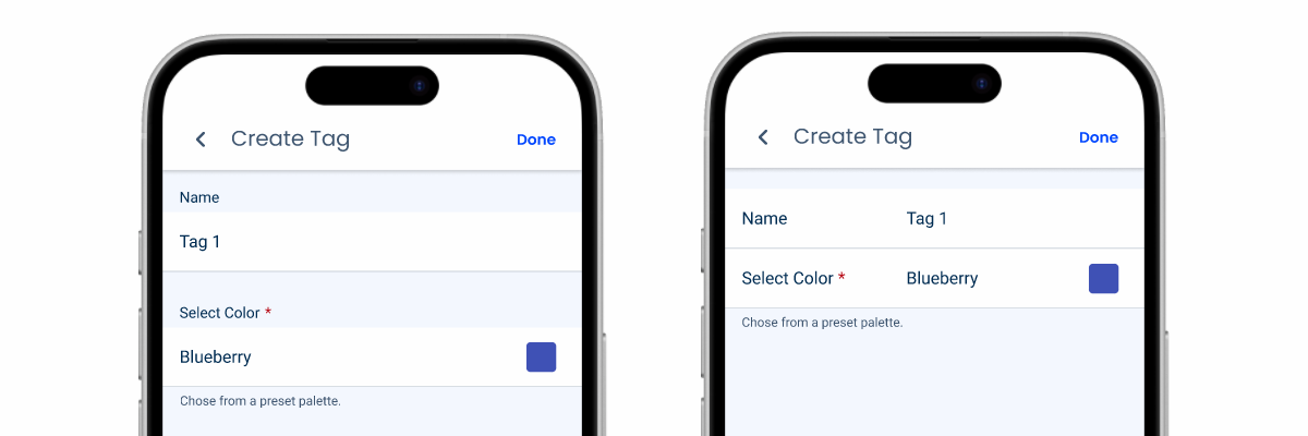
In such cases, it is best to limit users to a limited selection of colors, such as the accent colors in the Cegid Design System.
Show the name of the color instead of its HEX code when using Design System colors.
Add a label to the pre-selected colors when the color field and hue slider are hidden.
Voice-Over
For general guidelines on screen reader compatibility, see the following blog post on best practices: Designing the Invisible: How to Make Your Interfaces Work Without a Screen.
Always announce the current color selection so users don’t know where they are.
Provide immediate feedback so users receive confirmation that they have successfully selected a color.
Provide users with color description. Users with difficulty perceiving colors can benefit from that clear distinction.
Make it easy for users to reset their choice. Since users may have vision impairments, they may accidentally choose the wrong color and want to change their selection.
Make screen readers skip the gradient since they cannot interact with it.
Provide default colors for selection whenever and only if it is crucial for the actions that users are performing. Also, provide description for them whenever possible and needed.
Use complex or confusing color names, such as ‘grape’ (which can be purple or green).
Rely solely on color, as screen readers cannot perceive or announce colors. Therefore, it is essential to use descriptive labels whenever necessary.
Reading Order

| Reading Order | Element | Screen Reader Reading |
| 1 | Field name | Select color |
| 2 | Selected color | Light green, selected |
| 3 | HEX code | HEX code [only when strictly essential] |
| 4 | Label | System colors |
| 5 | Default color focused | Light green, click enter to select |
Case Studies

Read Mode: Making Content Feel Effortless and Understandable

A Visual Recap of 2025: how we enhanced chatbot communication
Designing the Invisible: How to Make Your Interfaces Work Without a Screen
What Changes?
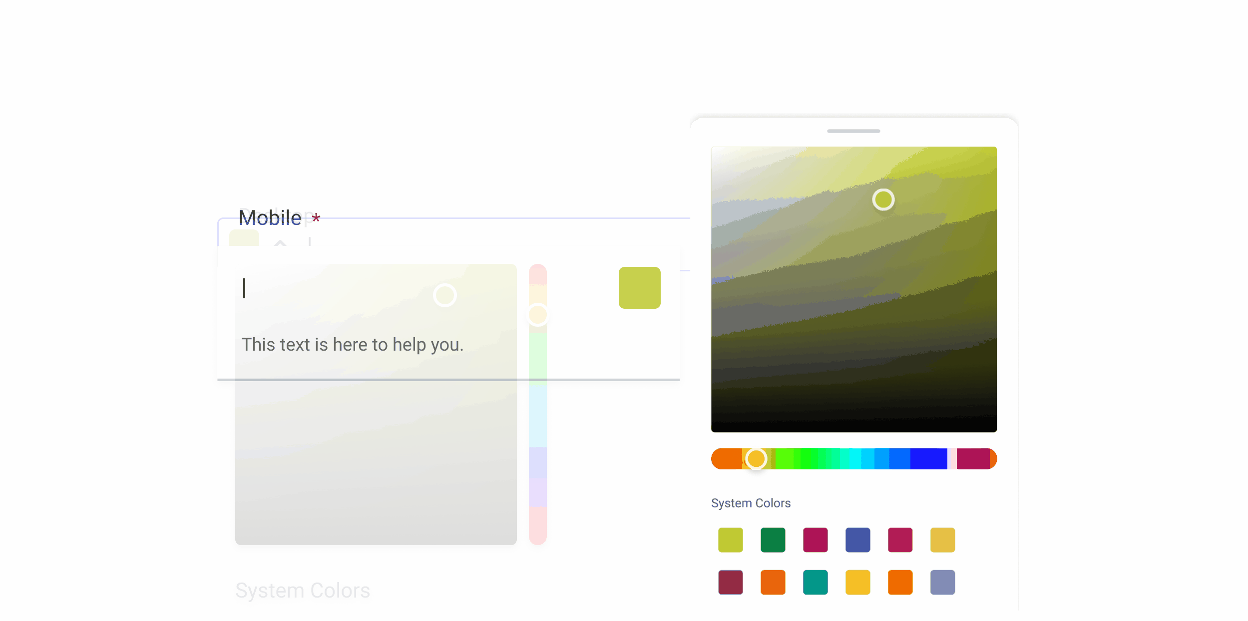
When developing the mobile version of the Color Picker, we followed the same principles used for components with similar looks, such as the Text Field and the Select Box. Our goal was to make it blend in with pre-established elements of the design system, while serving the same purpose it does on desktop.
The color field, gradient and selector have undergone some minor adjustments that improve their usability on small screens. However, the most important difference lies in how they are implemented in an interface. We will explain these changes in a later section of this article.
Demo
Access the Figma file and inspect the element using Dev Mode.
Touch Targets
The Color Picker is a component that requires users to be precise, whether they’re selecting a color on the gradient, or picking one from the preselected palette. To avoid frustration, it is extremely important that all elements have adequate touch targets (at least 44 x 44 px) and are sufficiently spaced apart from each other.

Behavior
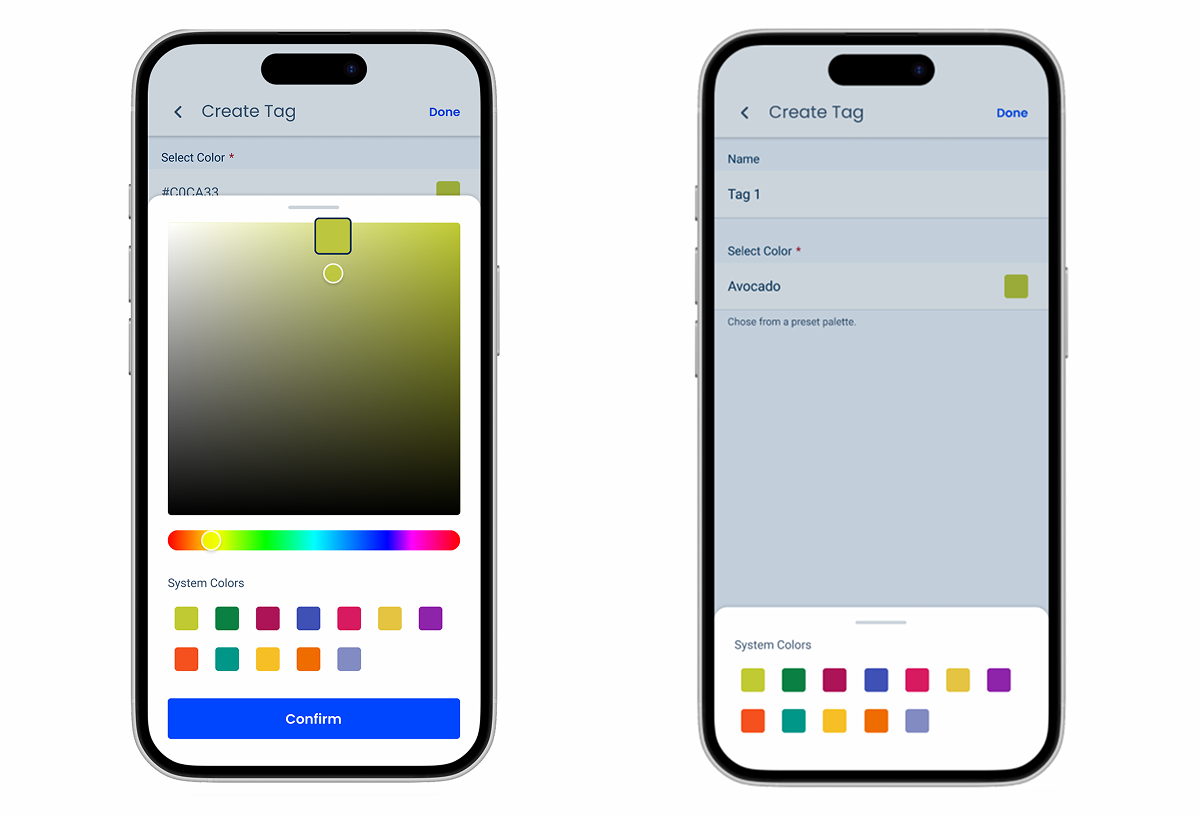
Selection Menu
The desktop version of the Color Picker uses an Overflow Menu to show the color selection menu. However, this behavior can be awkward on mobile, as it will easily cover important interface elements and be difficult to dismiss. For this reason, by default, the color selection menu should be displayed via a Bottom Sheet Modal.
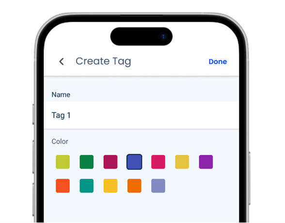
Consider using Color Pickers without Modals when the interface is simple and there is no need to optimize space, as unnecessary use of overlays can frustrate users.
Indicator
When using the color field or gradient, users are very likely to cover the indicator with their thumbs. To ensure that users have no difficulty seeing the color being selected, the mobile version of the indicator should display a preview of the color whenever it is pressed, as exemplified in the images below.


Variations and States
To blend in with similar components, such as the Text Field, the Color Picker has been given two matching variations – Default and Horizontal.
Like all other components that have a mobile counterpart, states that cannot be used on touch screens (such as Hover or Focus) aren’t used.
The Pressed state of the color indicator has been changed to ensure that it is always visible when users interact with it.

Case Studies
Read Mode: Making Content Feel Effortless and Understandable
A Visual Recap of 2025: how we enhanced chatbot communication