
Our current highlight…
-

Read Mode: Making Content Feel Effortless and Understandable
The reading experience on a screen doesn’t have to be chaotic, cluttered, and distracting. Learn how clean design, clear writing, and a friendly tone make reading easy and pleasant.
-

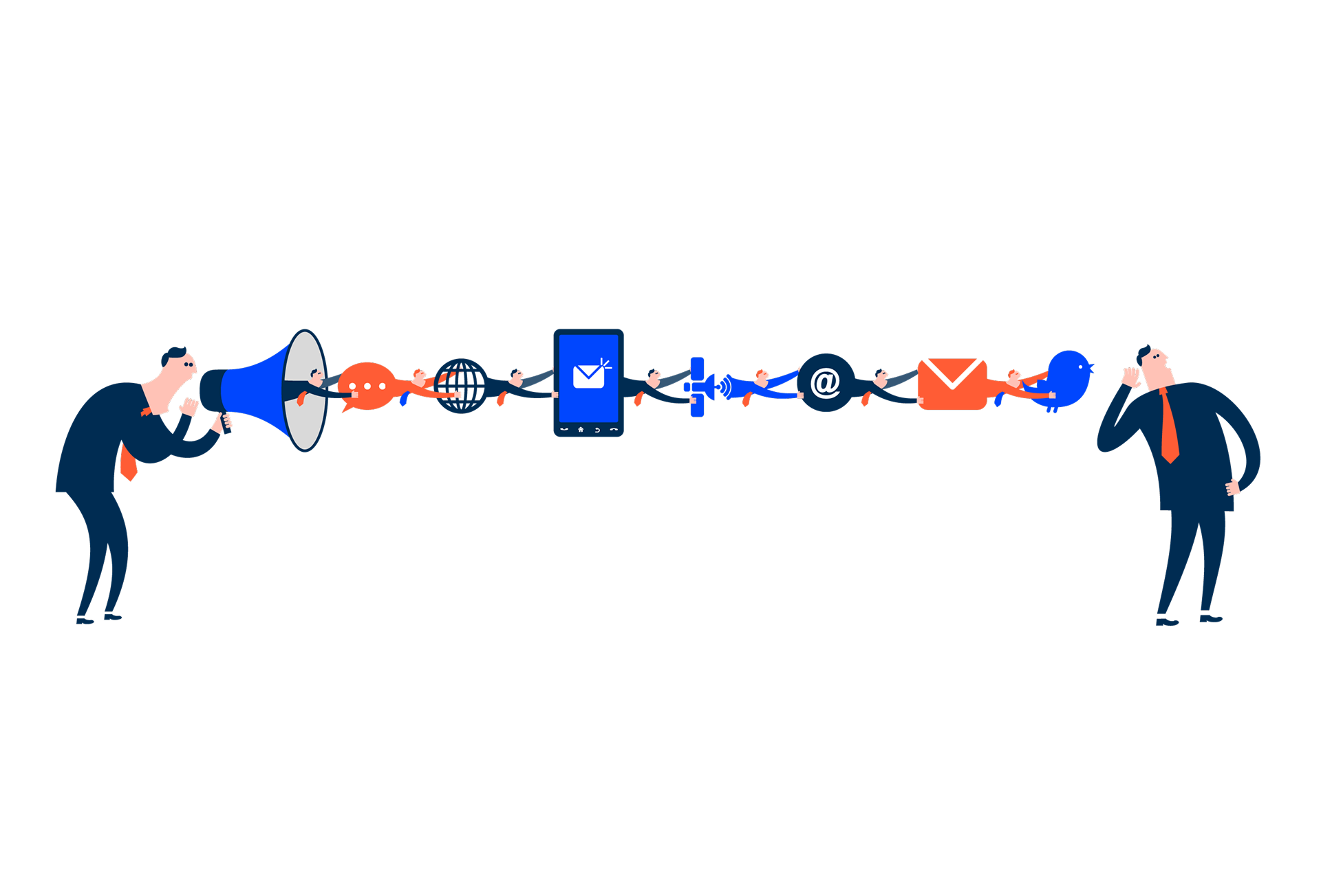
Release v1.5
Overview Compose Design 1.5 is here! This update has a strong emphasis on usability improvements to our components, as well as making their guidelines clearer. Here’s some of its highlights: As always, we’re eager to know your thoughts. Let us know if your have any feedback! Bettered Foundations Improvements to Skeletons Through your feedback, we…
-

Writing for Everyone: Every Word Counts in Accessibility
Writing for everyone is an essential part of any digital product. It can and does make a big difference to other people’s lives. This article compiles a set of best practices to take into account to make communication inclusive, ensure that everyone can navigate digital products and leave no user behind.
Last Newsletters…

Autumn 2024

Summer 2024

Spring 2024

December 2023
-
Designing the Invisible: How to Make Your Interfaces Work Without a Screen
Designing for screen readers means creating the best experience even when there is no screen to see. This article shares essential guidelines to help you create truly accessible and understandable components.
-

Why Web Accessibility Matters – And How to Start
Web accessibility is about designing inclusive digital experiences that benefit everyone, guided by four key principles and driven by the commitment to equal access.
-

Understanding the Disabled State
The disabled state indicates that a UI element is not interactive. When used correctly, it prevents users from making common mistakes while still being able to access important information.
-

Driving to a new destination without GPS?
Having help systems/guides that explain the actions within the product can help demystify doubts and increase form adoption.
-

Datagrids Demystified: A Deep Dive into Functionalities
Explore key datagrid functionalities—filters, column grouping, and customization options—and discover how to enhance data management workflows.
-

Discover the different types of Responsive Design
Explore responsive, adaptive, and fluid design: key approaches to ensure seamless web experiences across diverse devices and screen sizes.
-

Building a new Seamless User Experience
Using a design system is like having a set of building blocks for creating digital products. It ensures everything looks and works the same way, making it easier for users to understand and trust your product.
-

Benefits of a Design System
A design system is a collection of reusable components and guidelines that ensure consistency and efficiency in building digital products and applications.
-

Key Principles for Keyboard Navigation and Shortcuts
This article covers essential principles for designing keyboard navigation and shortcuts, helping create accessible, efficient, and consistent user experiences.
-

Discover how AI is applied in a chatbot
Explore how AI enhances chatbots in UX/UI, improving user interactions through natural language processing, personalized responses, and seamless interfaces.
-

Accessible design, a way to be inclusive
Accessible design ensures inclusivity by making digital content suitable for all, regardless of their abilities, creating equal opportunities in the digital world.
-

Documentation Debt
Bad content in the user experience will cost you more than good content. Then why not start creating a culture of content-oriented design for your products? Let’s imagine that a food chain doesn’t put the ingredients of the food on the packaging. It’s not calling the end product into question, but it is damaging the…