
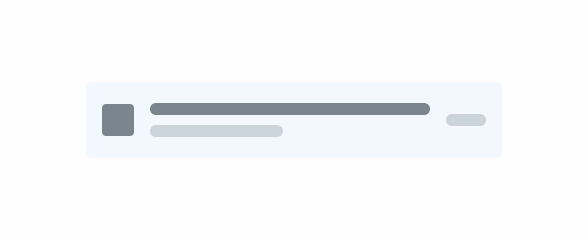
List Item
List Items are used to sort content for users, allowing for straightforward interactions. They are especially useful for vertical navigation and are therefore very common in mobile interfaces.
Overview
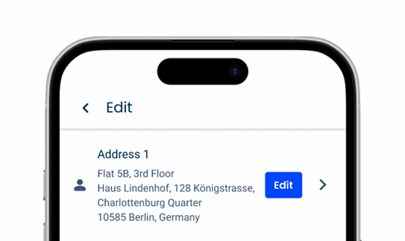
The List Item is a common component used to list information in a vertical layout. It can also be used to trigger actions such as opening a new page or show hidden content.
These qualities make it an essential asset when designing interfaces meant for mobile devices.
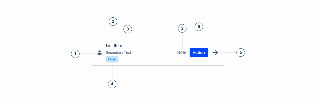
1: Adornment
2: List Item Title
3: Optional, complementary text
5: Custom Action
6: Action Icon
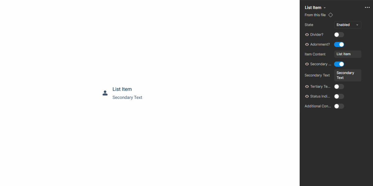
Demo
Access the Figma file and inspect element using Dev Mode.
Guidelines
When creating lists with several items, readability should be the primary concern. Avoid using too much text (especially in the title of the List Item) as well as adding too many actions.
If you’re designing for a product that requires detailed descriptions for each item, consider using a divider.

Even with optimized user flows, lists often end up being long. For this reason, it is important that items are sorted in a logical way. When unsure on how to sort them, sort them alphabetically.


Using columns can be helpful in some cases, but doing it inappropriately may cause the layout to look awkward.
Adding too many elements to a List Item will negatively impact its readability.
Last Update
- Added component to Design System.
Related