
Expander
The Expander pattern organizes content into expandable panels, improving navigation and usability with smooth animations and clear interactive cues.

- Overview
- Specs
- Guidelines
- Mobile
Pattern
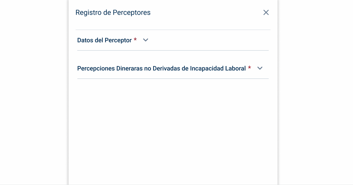
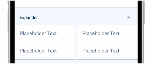
The expander pattern is a smart way to keep your interface tidy while managing a lot of content.
It lets you click on panels to expand or collapse them, making it easier to explore details without getting overwhelmed. You’ll often see data tables, text fields, and forms in these panels.
Visual clues, like little arrows, help guide you through each section. Moreover, the smooth animations make the transitions feel natural and keep everything flowing nicely.
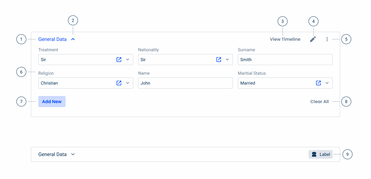
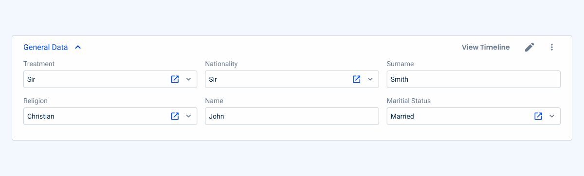
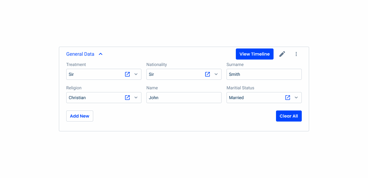
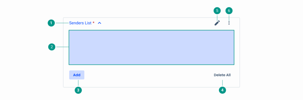
- 1: Expander icon
- 2: Expander label
- 3: Button
- 4: Icon
- 5: Overflow menu
- 6: Content
- 7: Secondary button
- 8: Text button
- 9: Informative chip
Used for:
Forms
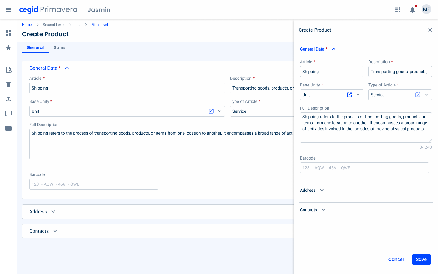
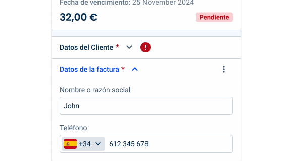
Expanders can be applied to forms to divide related information (e.g., bank data, personal information);
Modals (form variation)
As with forms, Expanders can be used to divide related information;
Organization
Expanders help break down complex information into manageable sections, making it easier for users to navigate and understand.
Don’t use for:
High frequency of use
In interfaces where users frequently access all the sections, requiring them to constantly expand and collapse the panels can be frustrating and inefficient;
Complex interactions
If interactions in each section are complex or require multiple steps, an Expander can complicate the user experience and increase cognitive load.
All content is equally important
If all sections of the content are equally important and need to be visible at the same time, Expanders may hide critical information from the user.

Demo
Access the Figma file and inspect the element using Dev Mode.

Last Update

- Added new tab for the mobile version of the pattern.
Related
Variations
Desktop

.Desktop {
  title: var(--subtitle-1);
  stroke: var(--grey-5, all);
  icons: 24px;
  border-radius: var(--x-small-radius);
  padding: var(--spacing-8, --spacing-24, --spacing-24, --spacing-32);
}
Overlay

.Overlay {
title: var(--subtitle-1);
stroke: var(--grey-5, top);
icons: 24px;
border-radius: var(--x-small-radius);
padding: var(--spacing-8, --spacing-4, --spacing-4, --spacing-16);
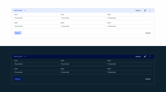
}States
Enabled
.Enabled {
  background-color: var(--grey-1);
  stroke: var(--grey-5);
  icon: var(--grey-8);
  label: var(--grey-9);
  chip: var(--chip-informative-regular);
}
Hover

.Hover {
background-color: var(--grey-2);
  stroke: var(--grey-5);
  icon: var(--grey-8);
  label: var(--grey-9);
  chip: var(--chip-informative-regular);
}Focus

.Focus{
  background-color: var(--grey-1);
  stroke: var(--grey-9);
  icon: var(--grey-8);
  label: var(--grey-9);
  chip: var(--chip-informative-regular);
}Pressed

.Pressed {
  background-color: var(--theme-10);
  stroke: var(--grey-5);
  icon: var(--grey-8);
  label: var(--grey-9);
  chip: var(--chip-informative-regular);
}
Error

.Error {
  background-color: var(--grey-1);
  stroke: var(--grey-5);
  icon: var(--grey-8);
  label: var(--grey-9);
  errorIcon: var(--error-100, error_circle);
  chip: var(--chip-informative-regular);
}
Active

.Active {
  background-color: var(--grey-1);
  stroke: var(--grey-5);
  icon: var(--theme-100);
  label: var(--theme-100);
  button: var(--textButton-grey-regular);
  icon: var(--grey-8);
  overflowMenu: var(--regular);
  bottomButtonLeft: var(--secondary-theme-regular);
  bottomButtonRight: var(--textButton-grey-regular);
}
Active Hover

.ActiveHover {
  background-color: var(--grey-1);
  header-color: var(--grey-2);
  stroke: var(--grey-5);
  icon: var(--theme-100);
  label: var(--theme-100);
  button: var(--textButton-grey-regular);
  icon: var(--grey-8);
  overflowMenu: var(--regular);
  bottomButtonLeft: var(--secondary-theme-regular);
  bottomButtonRight: var(--textButton-grey-regular);
}
Active Pressed
.ActivePressed {
  background-color: var(--theme-10);
  stroke: var(--grey-5);
  icon: var(--theme-100);
  label: var(--theme-100);
  button: var(--textButton-grey-regular);
  icon: var(--grey-8);
  overflowMenu: var(--regular);
  bottomButtonLeft: var(--secondary-theme-regular);
  bottomButtonRight: var(--textButton-grey-regular);
}
Useful links

Consult our Figma file to access our assets and inspect them in dev mode.

This component is or will be provided by the Polygon framework. See its documentation to learn more.

This element is in line with the guidelines of the CDS (Cegid Design System). Find out more.
Behavior
Expanders, often used in forms to organize content into collapsible sections, enhance user experience by reducing visual clutter and focusing attention on relevant information.
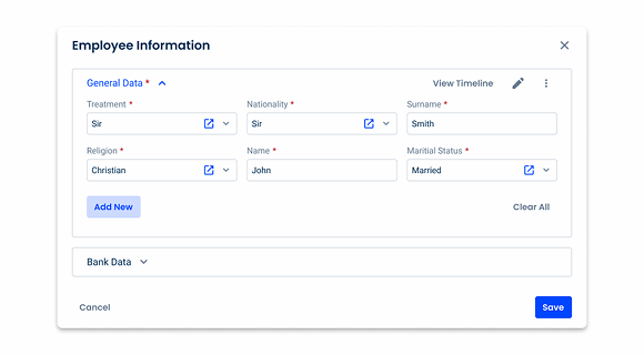
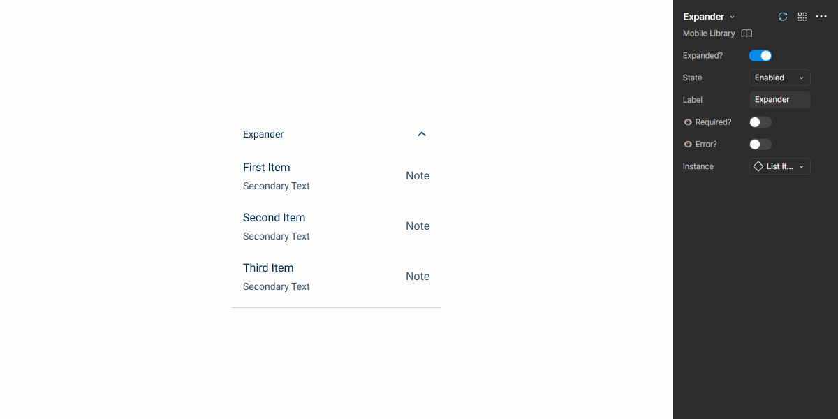
By default, the first Expander is usually set to open and immediately display important or introductory content to the user, while the remaining Expanders are kept closed. This default behavior ensures that users can quickly access essential information while still having the flexibility to explore additional details as needed.
Users can click on the header of an Expander to toggle between its open or closed status, allowing them to control the visibility of each section according to their preferences. This dynamic interaction not only makes the form more manageable but also guides users through the form in a logical and intuitive way.
When including required text fields in an expander, be sure to add a red asterisk next to the title to make sure users don’t accidentally skip them.
Additional Actions
When the Expander is closed
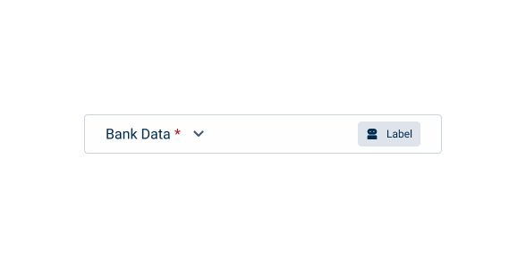
Chips are often used to provide brief, informative summaries or indicators that remain visible even when an Expander is closed. These chips can convey important information, such as the status or count of items in the Expander, giving users a quick overview without having to open the section.

Change the position of the icon to open or close the Expander.
Use + or – instead of the defined icons.

Display more than one chip at a time within expanders.
When the Expander is open
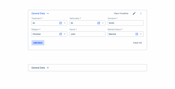
Several interactive elements become available to facilitate user’s actions. A primary button can be included for related key actions, whilst an icon, such as an edit icon, allows users to perform specific tasks efficiently.
An overflow menu can be used for secondary actions, ensuring that less frequently used options are available without cluttering the interface. Additionally, bottom buttons are commonly used to create new entries within the Expander, enabling users to add new content seamlessly.
Respect the buttons hierarchy (for example, do not apply primary variations to the header button).
Error handling
The Expander handles errors efficiently by showing an error icon in the closed Expander when there are problems with fields in it. This icon acts as a visual indicator, alerting the user to the presence of errors without the need to immediately open the Expander.
However, once the Expander is open, the error icon disappears, as the fields themselves now directly display their respective error states.
This approach prevents redundancy by ensuring that the error is only communicated once, either via the icon, when the Expander is closed, or through the field’s error message, when the Expander is open, keeping a clean and focused user interface.

Desktop vs Overlay
The Expander adapts seamlessly to both desktop and overlay experiences, with specific variations tailored to each platform. On the desktop, the Expander is usually embedded into the main bodies of the forms, allowing users to interact with additional sections of content while maintaining a structured layout.
In contrast, on the overlay variation, the Expander is used within mobile and overlays, such as flyouts or modals, optimizing for limited screen space. This overlay variation ensures the Expander doesn’t overload the interface, allowing users to focus on a section at a time, giving access to deeper layers of content as needed.
Apply the desktop variation in flyouts or modals.

Apply more than one button in the overlay variation.
When applying the overlay variation in mobile, no gaps are needed to divide the expanders.
Voice-Over
For general guidelines on screen reader compatibility, see the following blog post on best practices: Designing the Invisible: How to Make Your Interfaces Work Without a Screen.
Ensure users can navigate back to expanded sections without triggering automatic collapse.
Use inconsistent wording for a pair of actions, for example, do not use the pair “Expand/Close”.
Use different wording for the same action, for example, do not use “Expand” in one expander and “Show Details” in another one on the same form.
Reading Order
| Reading Order | Element | Screen Reader Reading |
| 1 | Title and Expander | Bank Data, expanded, required |
| 2 | Body | Expander body (e.g. form, etc.) |
| 3 | Primary action | Add, button |
| 4 | Secondary action | Delete All, button |
| 5 | Button icon | Edit, button |
| 6 | Overflow Menu | Menu, button |
Case Studies
Enhancing Lists within Flyouts with image previews
The usage of Illustrations in UX Design
What Changes?
The mobile version of the Expander has received some changes to its appearance, making it similar to the desktop Overlay variation. It has also been designed to match the mobile versions of other elements, such as Text Fields, which helps it to blend seamlessly in any interface in which it is used.

It doesn’t have a border surrounding its content, which makes it more suitable for small screens. For the same reason, its header doesn’t contain any additional elements, such as Chips or Button Icons.
Finally, only the Enabled and Pressed states are used, as the others aren’t applicable on touch screens.

Distribute Expander content horizontally. This leaves smartphone users with very little space to work with.
Demo
Access the Figma file and inspect the element using Dev Mode.
Case Studies

Creating Context-Aware Notifications for a Better Experience

Read Mode: Making Content Feel Effortless and Understandable
