
Top Bar
The Top Bar is a top-anchored component that provides context for the screen and facilitates easy navigation through different flows. Users depend on this Top Bar to navigate and orient themselves within your UI, and this pattern highlights the qualities that make a Top Bar consistent, familiar, and user-friendly.

- Overview
- Specs
- Guidelines
Pattern
The Top Bar is a vital component of a product’s user interface, providing a stable and accessible area for both product-specific and system-wide features. Like the Menu Bar in macOS or the Start Bar in Windows, it offers a reliable place for local navigation and quick access to universal features like system settings, notifications, and cross-product navigation.
This pattern details the basics of using Compose components for both internal and cross-product navigation and offers strategies for maintaining consistency across various products.

- 1: Main Menu
- 2: Header Name
- 3: Search
- 4: Selector
- 5: Utilities

Used for:
Consistent navigation
You want to provide a consistent navigation experience across all pages of your app or website.
Access to key features
You need a space for essential features like search, notifications, user profile, or settings.
Branding
You want to prominently display your brand logo or name.
Global utilities
You need a fixed place for global utilities that users can access from any page, such as help or account management.
Don’t use for:
Context-specific actions
The primary actions are highly context-specific and vary significantly from page to page, making a Top Bar less useful.
Simple single-page apps
Your app or website is a simple single-page application with minimal navigation needs, so Top Bar provides little benefit.
Single-purpose tools
Tools designed for a single, focused task (e.g. calculators, timers) typically don’t benefit from a Top Bar since navigation is minimal or non-existent.

Demo
Access the Figma file and inspect the element using Dev Mode.

Last Updated


- Updated with new logo variation.
Related
Usage
The Top Bar plays a key role in enhancing the user experience. It is always placed at the top, which means it is highly visible. It is also present on all product pages.
This means it can enhance branding while providing users with quick access to frequently used features, making it a key element for navigation.
For these reasons, the Top Bar is applied to most products, as also mentioned in the Overview. Consequently, there are universal elements that are expected to be found in it.
Logo Variations
The Top Bar supports two controlled logo variations: Legacy Logo and Default Logo.
- Legacy Logo – used during periods of migration, rebranding, or brand coexistence. The period of use must be defined and validated by the Brand team. This is not a permanent solution.
- Default Logo – the official and stable version of the brand used on the product. It’s used after rebranding is complete and must be in full compliance with brand guidelines. This is the system’s default logo.
A: Default Logo
B: Legacy Logo
Logo Size & Behavior
To ensure visual consistency and balance in the Top Bar, respect the following restrictions:
- Maximum height: 32 px
- Maximum width: 432 px
- Responsiveness: for tablet and mobile versions, use only the brand logo.
If the brand name exceeds the recommended width, adjustments must be approved by the Brand team.
A: Desktop
B: Tablet
C: Mobile
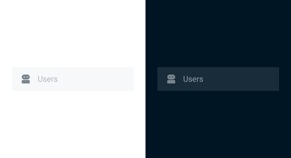
Main Menu
This element helps users access items in the side Bar. It is especially important in smaller interfaces where items are hidden or collapsed.
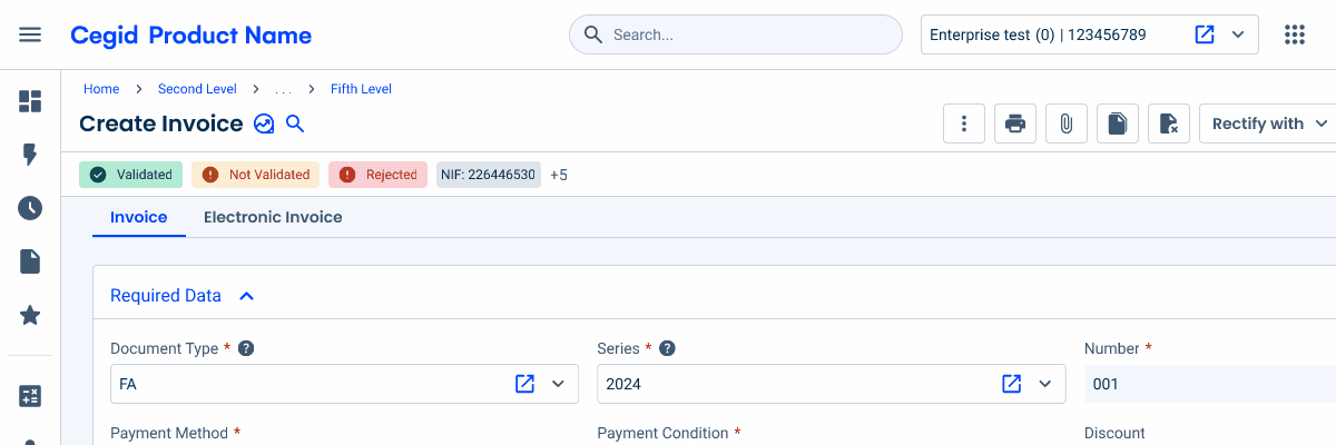
Header Name
The header name has the Cegid logo, followed by the product name. It should exclusively link users to the home page.
Search
The Search Bar allows users to quickly find pages or items within a product. It should provide a list of suggestions as users type.

Selector
Some products allow users to manage multiple subscriptions or companies. The selector allows for quick switching without having to log out or go through the account settings.

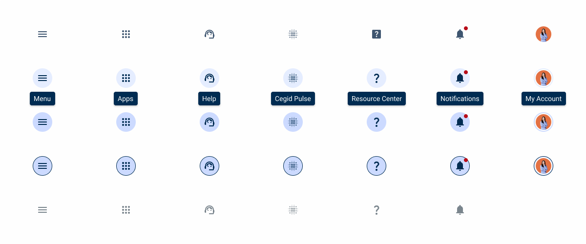
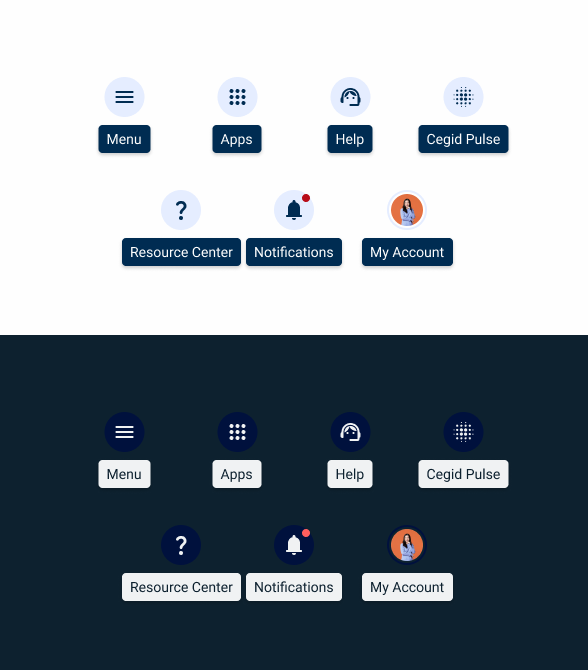
Utilities
The remaining space can be used to implement other product-related actions that users are likely to access frequently. Some common examples are:
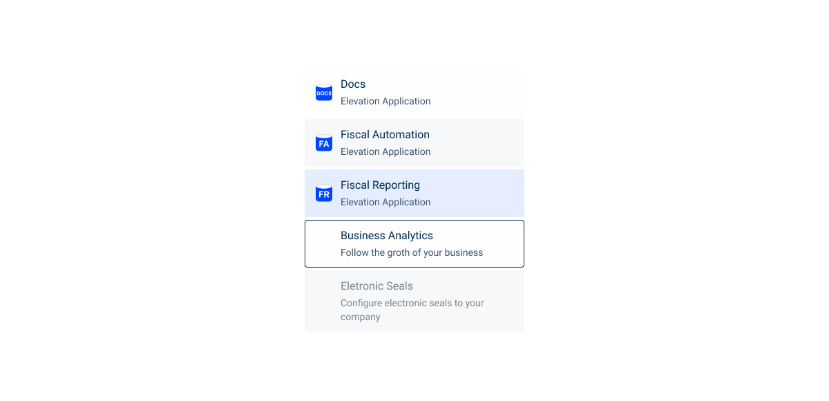
Switcher – used to redirect users to other related Cegid products or systems. If the list is manageable, it should include all apps or products available in the system.
Cegid Pulse – opens the Cegid Pulse chat, which allows users to quicky get assistance.
Notifications – where users check notifications for the product they are using, usually through a Flyout.
User Area – typically represented by an Avatar, this section gives users access to product settings, account and subscription management, and may also include links to helpful resources such as the Help Center.


When adding additional actions in the Top Bar, make sure it remains organized and uncluttered.

Change the icons used in the Top Bar.

Use the Top Bar for page-specific features.

Overload the Top Bar with interactive elements such as links or buttons.

Adjust the layout and visibility of elements based on screen size.
Voice-Over
For general guidelines on screen reader compatibility, see the following blog post on best practices: Designing the Invisible: How to Make Your Interfaces Work Without a Screen.
Clearly indicate a logo by the name of the entity to which it refers and indicate that it is an image and also a link to the home page, for example.
Clearly indicate the purpose of the Resource Center and Cegid Pulse icons.
Announce the user area on the top bar as such, instead of simply announcing it as the user initials or as an image.
Related
Importance of Non-Productive Environments on Products
Spacing
Structure

Logo
Default Logo
The Default Logo is standardized as a text-based implementation in the Top Bar. It must follow these rules:
- Render as running text – do not implement as an image;
- Use the Gelion font family with Semi Bold weight;
- Use Theme-100 color, dynamically adapted to the active theme.
A: Primary
B: Secondary
Legacy Logo
The Legacy Logo combines the official brand logo with a product name in text format.
- The brand logo must be used as an image asset and the product name must be rendered as text;
- Use the Poppins font family with Regular weight;
- Use Grey-7 color, dynamically adapted to the active theme.
A: Primary
B: Secondary
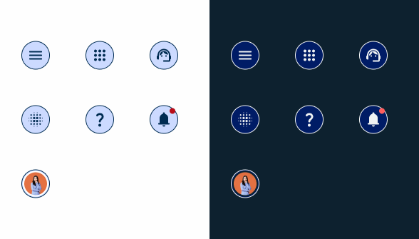
Apps menu

User profile

States
Icons
Enabled

.enable{ncolor: var(u002du002dGreys-Grey-8);n}Hover
.hover{ncolor: var(u002du002dGreys-Grey-9);nborder-radius: var(u002du002dBorder-Radius-rounded);nbackground: var(u002du002dTheme-Theme-10);n}Pressed
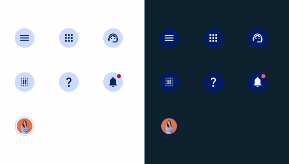
.pressed{ncolor: var(u002du002dGreys-Grey-9);nborder-radius: var(u002du002dBorder-Radius-rounded);nbackground: var(u002du002dTheme-Theme-20);n}Focus
.focus{ncolor: var(u002du002dGreys-Grey-9);nborder-radius: var(u002du002dBorder-Radius-rounded);nborder: 1px solid var(u002du002dGreys-Grey-9);nbackground: var(u002du002dTheme-Theme-20);n}Disabled
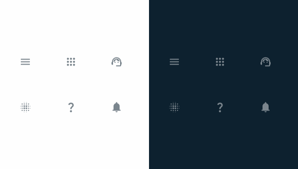
.disable{
color: var(--Greys-Grey-6);
}
App menu
Enabled

.enable{nbackground: var(u002du002dGreys-Grey-1);ntitle: var(u002du002dGreys-Grey-9);nsubtitle: var(u002du002dGreys-Grey-8);n}Hover

.hover{nbackground: var(u002du002dGreys-Grey-2);ntitle: var(u002du002dGreys-Grey-9);nsubtitle: var(u002du002dGreys-Grey-8);n}Pressed

.pressed{ncolor: var(u002du002dTheme-Theme-10);ntitle: var(u002du002dGreys-Grey-9);nsubtitle: var(u002du002dGreys-Grey-8);n}Focus

.focus{nborder-radius: var(u002du002dBorder-Radius-x-small-radius);nborder: 1px solid var(u002du002dGreys-Grey-8);nbackground: var(u002du002dGreys-Grey-1);ntitle: var(u002du002dGreys-Grey-9);nsubtitle: var(u002du002dGreys-Grey-8);n}Disabled

.disable{
background: var(--Greys-Grey-2);
title: var(--Greys-Grey-6);
subtitle: var(--Greys-Grey-6);
}
User Profile

Enabled

.enable{nbackground: var(u002du002dGreys-Grey-1);nicon: var(u002du002dGreys-Grey-8);ntitle: var(u002du002dGreys-Grey-9);n}Hover
.hover{nbackground: var(u002du002dGreys-Grey-2);nicon: var(u002du002dGreys-Grey-8);ntitle: var(u002du002dGreys-Grey-9);n}Pressed
.pressed{nbackground: var(u002du002dTheme-Theme-10);nicon: var(u002du002dGreys-Grey-8);ntitle: var(u002du002dGreys-Grey-9);n}Focus

.focus{nborder-radius: var(u002du002dBorder-Radius-x-small-radius, 4px);nborder: 1px solid var(u002du002dGreys-Grey-9);nbackground: var(u002du002dGreys-Grey-1);nicon: var(u002du002dGreys-Grey-8);ntitle: var(u002du002dGreys-Grey-9);n}Disabled
.disable{
background: var(--Greys-Grey-2);
color: var(--Greys-Grey-6);
icon: var(--Greys-Grey-6);
title: var(--Greys-Grey-6);
}
Useful links

Consult our Figma file to access our assets and inspect them in dev mode.

This component is or will be provided by the Polygon framework. See its documentation to learn more.

This element is in line with the guidelines of the CDS (Cegid Design System). Find out more.