
Thumbnail
The Thumbnail pattern displays static image previews in a simple layout, allowing users to add, replace, or delete images for products, employees, or entities.

- Overview
- Specs
- Guidelines
Pattern
The Thumbnail pattern is a element designed to display small image previews of products, employees, or other entities in a fixed layout. Each thumbnail represents a single image that gives users a quick visual reference without additional navigation.
This component also provides essential management functionality. Users can add new images by uploading them directly to the grid, as well as change or update any existing image by replacing it. If an image is no longer relevant, it can be easily deleted with a simple action.

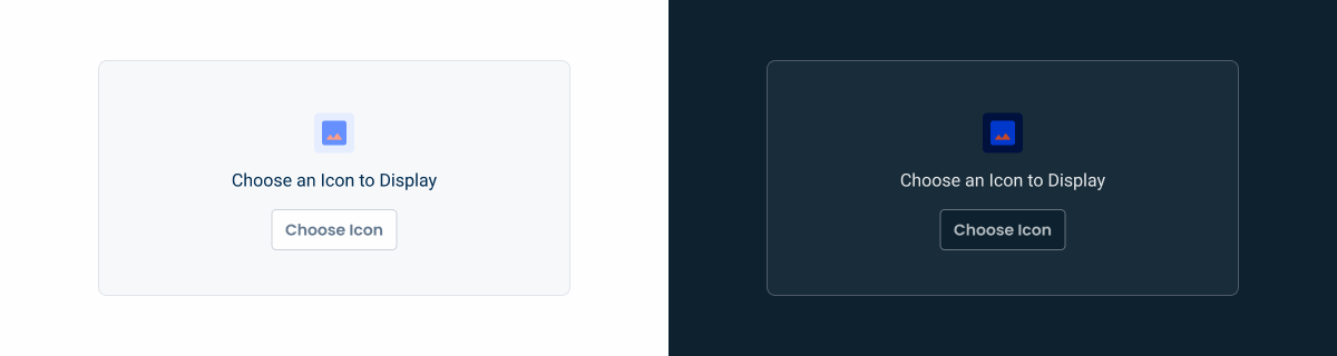
- A: Regular Size;
- B: Small Size;
- 1: Accent Icon;
- 2: Description;
- 3: Button;
- 4: Delete Button Icon;
- 5: Button;
- 6: Applied Image/Icon;

Used for:
Product forms
Allow users to update or add product images to give a visual appearance of the product itself;
Entity forms
Allow users to update or add the entity’s logo to give a visual appearance of the entity itself;
Employee configuration
Allows users to update or add a profile picture to give a visual appearance of the employee themselves;
Don’t use for:
Multi-file management
For scenarios requiring more than one image, such as reports, an image uploader would be more suitable;
Performance Concerns
A large number of thumbnails can slow down page load times and affect performance.
Need for Detailed Image Views
Thumbnails lack the detail needed for tasks like zooming or close inspection.

Demo
Access the Figma file and inspect the element using Dev Mode.
Last Update

- Added Empty State;
Variations
Button
Enabled
.enabled {
  bg: var(--grey-1);
  stroke: var(--grey-4);
  emptyState: var(--custom-regular);
  /* accent-icon: image, 48x48px;
     description: label-regular;
     button: tertiary-regular-grey; */
  border-radius: var(--small-radius);
}
Hover
.hover {
  bg: var(--grey-2);
  stroke: var(--grey-5);
  emptyState: var(--custom-regular);
  /* accent-icon: image, 48x48px;
     description: label-regular;
     button: tertiary-regular-grey; */
  border-radius: var(--small-radius);
}
Active

.active {
  bg: var(--grey-1);
  stroke: var(--grey-4);
  icon: 48px; // if aplicable
  topActions{
    padding: var(--spacing-8, --spacing-8);
    buttonIcon: var(--tertiary-small-grey, delete);
    button: var(--tertiary-small-grey);
  }
}
Button Icon
Enabled

.enabled {
  bg: var(--grey-1);
  stroke: var(--grey-4);
  emptyState: var(--custom-regular);
  /* accent-icon: image, 48x48px;
     description: label-regular;
     button: tertiary-regular-grey; */
  border-radius: var(--small-radius);
}
Hover
.hover {
  bg: var(--grey-2);
  stroke: var(--grey-4);
  emptyState: var(--custom-regular);
  /* accent-icon: image, 48x48px;
     description: label-regular;
     button: tertiary-regular-grey; */
  border-radius: var(--small-radius);
}
Active

.active {
  bg: var(--grey-1);
  stroke: var(--grey-4);
  icon: 48px; // if aplicable
  topActions{
    padding: var(--spacing-8, --spacing-8);
    buttonIcon: var(--tertiary-small-grey, delete);
    buttonIcon: var(--tertiary-small-grey, edit);
  }
}
Sizes
Regular
.regular {
  width: 424px; //Correspond to 4 columns in a 1440px screen
  height: 212px; //Correspond to 3 rows of fields
  border-radius: var(--small-radius, 8px);
}
Small

.small {
  width: 204px; //Correspond to 2 columns in a 1440px screen
  height: 212px; //Correspond to 3 rows of fields
  border-radius: var(--small-radius, 8px);
}
Useful links

Consult our Figma file to access our assets and inspect them in dev mode.

This component is or will be provided by the Polygon framework. See its documentation to learn more.

This element is in line with the guidelines of the CDS (Cegid Design System). Find out more.
Behavior
Small or Regular?
The Thumbnail pattern is designed with two distinct sizes: small and regular, each offering a different layout to accommodate varying needs.
By default, the component is displayed in a regular size, using a four-column layout that provides a spacious and organized view of the images. However, in specific scenarios where a more compact presentation is required—for example, for employee pictures —the component switches to a smaller size, featuring a two-column layout.
This flexibility ensures that the component can adapt to different types of content and display requirements, while maintaining both visual clarity and usability across a variety of contexts.


By default, apply the normal size. Apply the small size only in specific cases.
Left or Right?
When integrating the Thumbnail pattern with a form, the default positioning should be to the left of the form fields. This positioning complies with the Gutenberg principle, which suggests that users process visual elements more easily than text-based content.
By placing the Thumbnail on the left, users are first presented with a visual preview, which is cognitively lighter and more engaging when compared to the denser form fields. This arrangement not only improves the overall user experience, but also enhances the usability of the form, since the visual context provided by the Thumbnail can help users understand and interact more easily with the accompanying form elements.
Furthermore, in certain flows, it’s useful to have a real-time update (e.g., creating a smart folder in Docs)
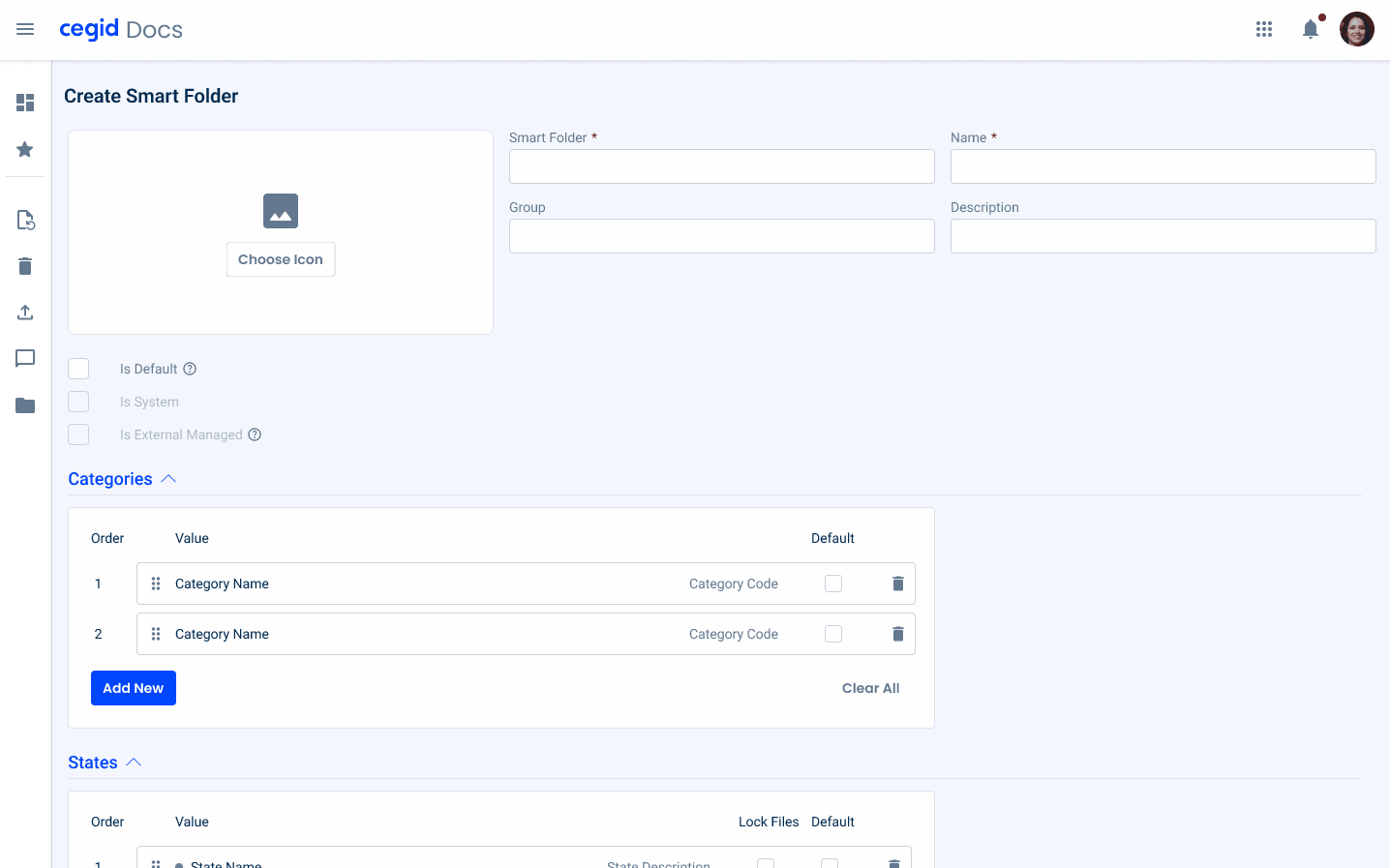
Image Uploader or Thumbnail
The Image Uploader and Thumbnail patterns share a common objective: to display an image. However, they serve distinct purposes and are designed to address different use cases.
The Image Uploader pattern is primarily concerned with the entire process of adding an image in a form. This includes handling the selection, uploading, and possibly editing or validating the image before it is finally inserted into the form. It’s a comprehensive solution for managing images as part of user input, ensuring that users can seamlessly incorporate images as needed.
In contrast, the Thumbnail pattern is more focused on displaying small, representative images or icons that serve a specific purpose. For example, Thumbnails are often used for selecting icons, such as when creating smart folders, where a user might choose an icon to represent the folder. Additionally, Thumbnails can be used to provide a quick preview of an image associated with a field, such as when setting up fields on a form.

Apply more than one image to the Thumbnail.
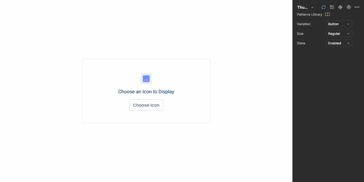
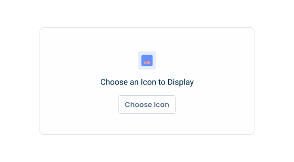
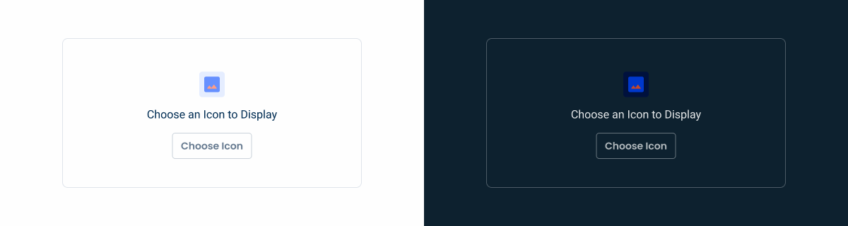
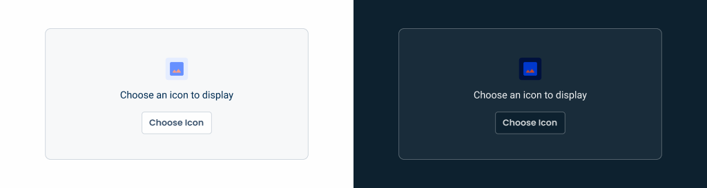
Empty State
In the Thumbnail pattern, the empty state is displayed by default in both the enabled and hover states. This decision ensures a consistent visual language across components, reducing the need for additional states or transitions that might overcomplicate the user experience.
By maintaining consistency with other design elements, users can quickly recognize and interact with thumbnails without confusion.

Case Studies