
Side Bar CD v1.0
The Sidebar is the side section containing navigation menus between applications or product pages.

- Overview
- Specs
- Guidelines
Pattern
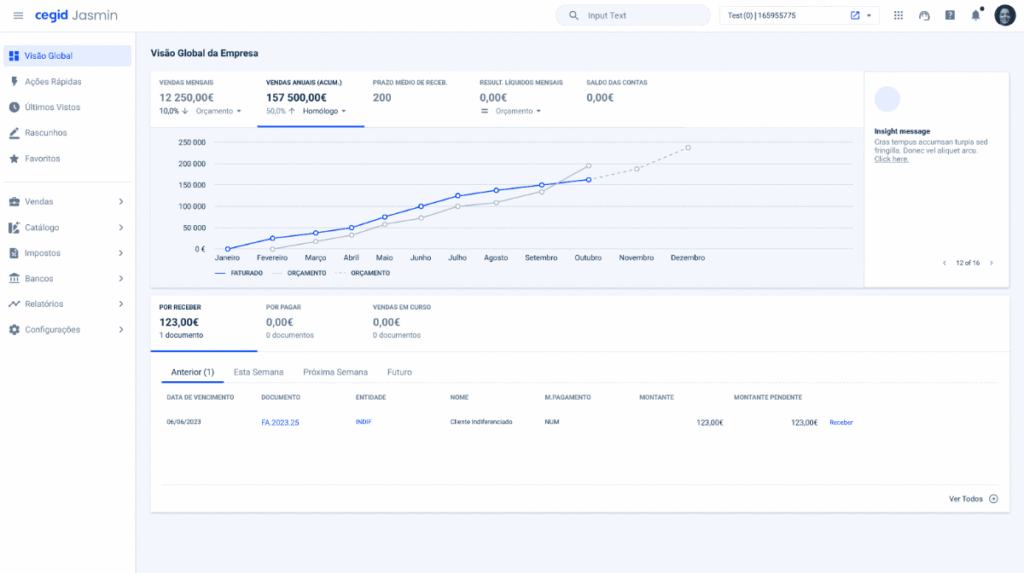
The Sidebar is the main navigation component in the product. It is dynamic and adaptable to the reality of each product or portal and can contain menus up to three levels of hierarchy, a quick actions area, a last seen section, drafts and favorites.
The Sidebar can be collapsed to give the user horizontal working space. To do so, when you open the portal, the sidebar is shown expanded, but when you click to change page, it automatically collapses. It is then displayed above the page, but the expanded menu can be fixed by clicking on the last vertical icon in the sidebar.

- A: Closed variation;
- B: Extended variation;
- 1: First level element;
- 2: Divider;
- 3: Second level element;
- 4: Third level element;

Used for:
Desktop navigation
When the product has more than one menu entry, use the Side Bar, which has a dedicated space.
Mobile navigation
When the product has more than one menu entry, use the Side Bar, which has a dedicated space when you open the hamburger menu icon.
Don’t use for:
Dynamic content
For pages where the content frequently changes or dynamically updates, a Side Bar might not be the best choice as it can cause layout shifts or require frequent adjustments.
Alternative navigation
Users may prefer other forms of navigation, such as top navigation bars or drop-down menus, which can be more intuitive in certain contexts.

Demo
Access the Figma file and inspect the element using Dev Mode.

What’s New
- Added device variations;
- Added Last Seen;
Variations

Side Bar Item
Enabled

.Enabled {
  background: var(--grey-1);
  icon: var(--grey-7);
  label: var(--grey-7);
}
Hover

.Hover {
  background: var(--grey-2);
  icon: var(--grey-7);
  label: var(--grey-7);
}
Active

.Active {
  background: var(--grey-1);
  icon: var(--theme-100);
  label: var(--theme-100);
}
Focus

.Focus {
  background: var(--grey-1);
  stroke: var(--theme-100);
  icon: var(--grey-7);
  label: var(--grey-7);
}
Selected

.Selected {
  background: var(--theme-10);
  icon: var(--theme-100);
  label: var(--theme-100);
}
Selected Focus

.SelectedFocus {
  background: var(--theme-10);
  stroke: var(--theme-100);
  icon: var(--theme-100);
  label: var(--theme-100);
}
Selected Hover

.SelectedHover {
  background: var(--theme-20);
  icon: var(--theme-100);
  label: var(--theme-100);
}
Size
Side Bar
Closed

.Closed {
  width: 56px;
  padding: var(--spacing-16, --spacing-8);
  gap: var(--spacing-8);
}
Extended

.Closed {
  width: 256px;
  padding: var(--spacing-16, --spacing-8);
  gap: var(--spacing-8);
}
Side Bar Item
Level 1

.Level1 {
  height: 40px;
  padding: var(--spacing-8);
  gap: var(--spacing-8);
  icon: 24px;
  label: var(--label-large);
}
Level 2

.Level2 {
  height: 36px;
  indent_padding: var(--spacing-32);
  padding: var(--spacing-8);
  gap: var(--spacing-8);
  icon: 20px;
  label: var(--label-regular);
}
Level 3

.Level3 {
  height: 34px;
  indent_padding: var(--spacing-40);
  padding: var(--spacing-8);
  gap: var(--spacing-8);
  label: var(--label-small);
}
Icon
.Icon {
  height: 40px;
  padding: var(--spacing-8);
  icon: 24px;
}
Useful links

Consult our Figma file to access our assets and inspect them in dev mode.

This component is or will be provided by the Polygon framework. See its documentation to learn more.

This element is in line with the guidelines of the CDS (Cegid Design System). Find out more.
Behavior
Trimming
The maximum number of characters allowed for our menu items is 26. This value has been set taking into account the available space in a text line and to allow for larger titles, but without distorting the Side Bar.
When the menu is longer than one text line, even if it has less than 26 characters, trimming will be applied along with a tooltip with the entire name.
If 26 characters is not enough, it may be necessary to use abbreviations.

Scroll
If there is no vertical height to display all the menu content, a scroll should be applied in the area of the menu items.
The section on the left with the categories is always fixed. The same applies to the selector, if there is one.
Mobile
On smaller devices, the Side Bar will be hidden and belong to the header. It will have the traditional behavior of a hamburger menu, but with the same content as the desktop version.

Dos & Dont’s
Always apply icons to first-level menu items, and these must be accompanied by the chevron if they are of a lower level. Fill-style icons should be favored to maintain consistency between other elements;
Do not use the same icon to represent different menus;
Don’t change the order of the elements. The highlighted elements are always presented after the home, followed by quick actions, last seen, drafts and then favorites;
Case Studies

Handling Background Tasks

Read Mode: Making Content Feel Effortless and Understandable
