
Side Bar
The Sidebar is the side section containing navigation menus between applications or product pages.

- Overview
- Specs
- Guidelines
Pattern
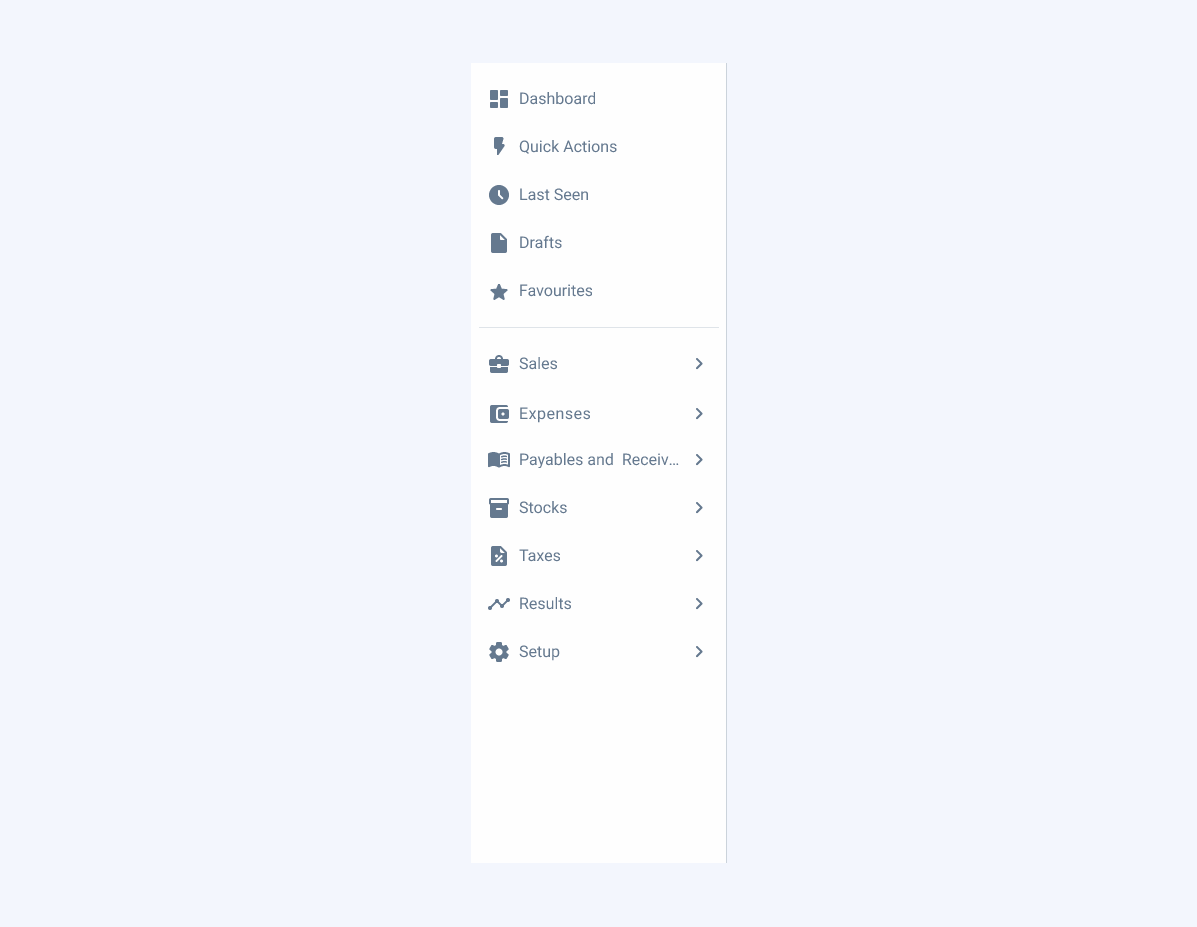
The Side Bar is the main navigation component in the product. It is dynamic and adaptable to the reality of each product or portal and can contain menus up to three levels of hierarchy, a quick actions area, a last seen section, drafts and favorites.
The Side Bar can be collapsed to give the user horizontal working space. To do so, when you open the portal, the Side Bar is shown expanded, but when you click to change page, it automatically collapses. It is then displayed above the page, but the expanded menu can be fixed by clicking on the last vertical icon in the Side Bar.

- A: Closed variation;
- B: Extended variation;
- 1: First level element;
- 2: Divider;
- 3: Second level element;
- 4: Third level element.

Used for:
Desktop navigation
When the product has more than one menu entry, use the Side Bar, which has a dedicated space.
Mobile navigation
When the product has more than one menu entry, use the Side Bar, which has a dedicated space when you open the hamburger menu icon.
Don’t use for:
Dynamic content
For pages where the content frequently changes or dynamically updates, a Side Bar might not be the best choice as it can cause layout shifts or require frequent adjustments.
Alternative navigation
In modals, for example, when navigation is possible, a Sidebar has elements that are not necessary for the user, so we recommend using side navigation in this case.

Demo
Access the Figma file and inspect the element using Dev Mode.

Last Update


- Added guidelines for first page namings;
- Added examples of Side Bars applied.
Variations

Sidebar Item
Enabled

.Enabled {n background: var(u002du002dgrey-1);n icon: var(u002du002dgrey-8);n label: var(u002du002dgrey-8);n}Hover

.Hover {n background: var(u002du002dgrey-2);n icon: var(u002du002dgrey-8);n label: var(u002du002dgrey-8);n}Active

.Active {n background: var(u002du002dgrey-1);n icon: var(u002du002dtheme-100);n label: var(u002du002dtheme-100);n}Focus

.Focus {n background: var(u002du002dgrey-1);n stroke: var(u002du002dtheme-100);n icon: var(u002du002dgrey-8);n label: var(u002du002dgrey-8);n}Selected

.Selected {
  background: var(--theme-10);
  icon: var(--theme-100);
  label: var(--theme-100);
}
Selected Focus

.SelectedFocus {
  background: var(--theme-10);
  stroke: var(--theme-100);
  icon: var(--theme-100);
  label: var(--theme-100);
}
Selected Hover

.SelectedHover {
  background: var(--theme-20);
  icon: var(--theme-100);
  label: var(--theme-100);
}
Size
Sidebar
Closed

.Closed {
  width: 56px;
  padding: var(--spacing-8, --spacing-8);
  gap: var(--spacing-8);
}
Extended

.Closed {
  width: 256px;
  padding: var(--spacing-8, --spacing-8);
  gap: var(--spacing-8);
}
Sidebar Item
Level 1

.Level1 {
  height: 40px;
  padding: var(--spacing-8);
  gap: var(--spacing-8);
  icon: 24px;
  label: var(--label-large);
}
Level 2

.Level2 {
  height: 36px;
  indent_padding: var(--spacing-32);
  padding: var(--spacing-8);
  gap: var(--spacing-8);
  icon: 20px;
  label: var(--label-regular);
}
Level 3

.Level3 {
  height: 34px;
  indent_padding: var(--spacing-40);
  padding: var(--spacing-8);
  gap: var(--spacing-8);
  label: var(--label-small);
}
Icon
.Icon {
  height: 40px;
  padding: var(--spacing-8);
  icon: 24px;
}
Useful links

Consult our Figma file to access our assets and inspect them in dev mode.

This component is or will be provided by the Polygon framework. See its documentation to learn more.

This element is in line with the guidelines of the CDS (Cegid Design System). Find out more.
Namings
In the Side Bar, the choice between Dashboard and Home as the first page title is guided by the type of content and user focus. Each serves a distinct purpose based on the data being presented:
- Dashboard: best suited for pages that display more complex, analytical data, such as reports, metrics, or insights that require immediate attention and action;
- Home: ideal for providing users with common or frequently accessed data, such as personalized content, favorites, or quick links to essential features.
By differentiating these two elements, the user experience is optimized to present relevant information in a clear and intuitive way from the very first interaction.


Resources
Below are the translations applied for the first page labels (Dashboard and Home) in different languages to ensure consistency and clarity across all locales and products.
| English | Spanish | Portuguese |
| Dashboard | Panel | Dashboard |
| Home | Inicio | Início |
Don’t change the order of the elements. The highlighted elements are always presented after the home, followed by quick actions, last seen, drafts and then favorites.
Trimming
The maximum number of characters allowed for our menu items is 26. This value has been set taking into account the available space in a text line and to allow for larger titles, but without distorting the Side Bar.
When the menu is longer than one text line, even if it has less than 26 characters, trimming will be applied along with a tooltip with the entire name.
If 26 characters is not enough, it may be necessary to use abbreviations.

Scroll
If there is not enough vertical height to display all the menu content, a scroll should be applied to the area of the menu items.
The section on the left with the categories is always fixed. The same applies to the selector, if there is one.
Use deeply nested menus or too many levels inside the sidebar.
Icons
Always apply icons to first-level menu items. These must be accompanied by the chevron if they are of a lower level.
Do not use the same icon to represent different menus.
Fill-style icons should be favored to maintain consistency between other elements.
Mobile
On smaller devices, the Side Bar will be hidden and will belong to the header. It will have the traditional behavior of a hamburger menu, but with the same content as the desktop version.

Voice-Over
For general guidelines on screen reader compatibility, see the following blog post on best practices: Designing the Invisible: How to Make Your Interfaces Work Without a Screen.
Ensure that users can easily exit the sidebar and proceed to the main content without additional steps and without getting stuck there.
Use icons alone without text labels.
Case Studies

Handling Background Tasks

Read Mode: Making Content Feel Effortless and Understandable
