
Search v2
A Search component enhances user experience by enabling quick, intuitive, and refined information retrieval.

- Overview
- Specs
- Guidelines
Component
A Search component is a user interface element that allows users to input queries to find specific information in an application or website. It is designed to enhance user experience by providing quick access to relevant data based on the user’s input.
To enhance user experience, the Search component often includes a responsive design for optimal use on multiple devices, accessibility features for users with disabilities, and error handling to efficiently manage scenarios without results.

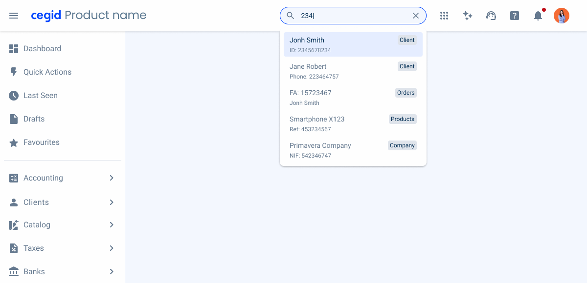
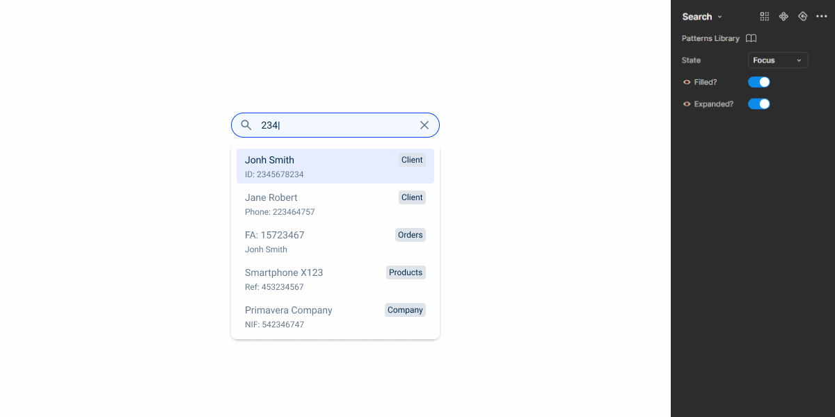
1: Search Icon
2: Search Value
3: Clear Icon
4: 1st Level Information
5: 2nd Level Information
6: Chip
Used for:
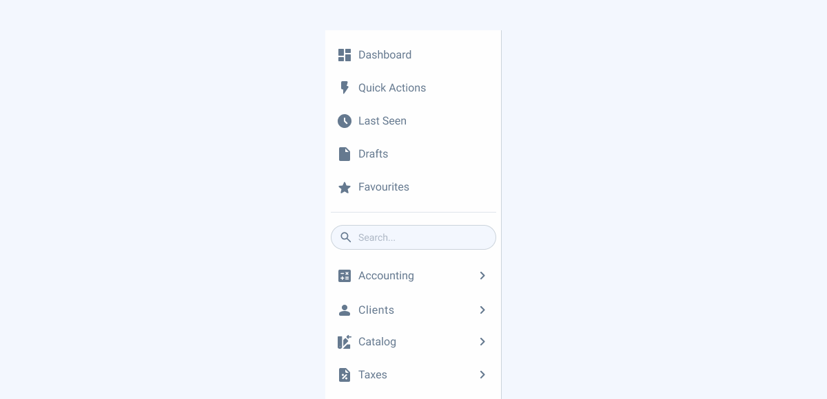
Topbar
To maintain consistency across all views, the Search Bar is placed inside the topbar pattern.
Data Grid
In order to filter more easily, a Search Bar is integrated into the topbar.
Ease of Use
A Search Bar offers a familiar and intuitive interface for users, making it easier to understand and interact with in different applications and platforms;
Don’t use for:
Sidebar
A Search Bar should not be inserted in a sidebar, as the search for menu entries is already covered by the search in the top bar.
Limited Use
If the app or website has a very specific and limited set of tasks users can perform, a Search Bar might not be necessary. A well-designed interface with clear calls to action can be more efficient for users who know exactly what they need to do.
Demo
Access the Figma file and inspect the element using Dev Mode.
What’s New

- Added empty state guidelines;
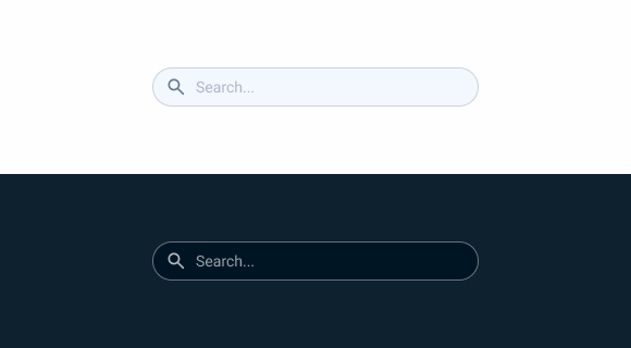
Search Bar states
Enabled

.enabled {
  search-border: var(--grey-5);
  search-background: var(--grey-3);
  icon: var(--grey-7);
  placeholder: var(--grey-6);
}
Hover

.hover {
  search-border: var(--grey-6);
  search-background: var(--grey-3);
  icon: var(--grey-7);
  placeholder: var(--grey-6);
}
Focus
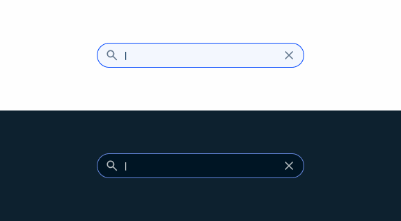
.focus {
  search-border: var(--theme-100);
  search-background: var(--grey-3);
  icons: var(--grey-7);
  input: var(--grey-8);
}
Size
Unique Size
.uniqueSize {
  height: 36px;
  padding: var(--spacement-8, --spacement-12);
  gap: var(--spacement-8);
}
Useful links

Consult our figma file to access our assets and inspect them in dev mode.

This component is or will be provided by the Polygon framework. See its documentation to learn more.

This element is in line with the guidelines of the CDS (Cegid Design System). Find out more.
Behavior
AutoComplete
The AutoComplete feature in a Search component enhances user experience by providing real-time suggestions as users type their queries.
As the user inputs each character, the component processes the current input to find and display a list of matching suggestions below the Search field, updating dynamically with each keystroke.
Users can navigate through the suggestions using the keyboard or mouse, and when they select a suggestion, the Search field is filled in and the Search usually starts.
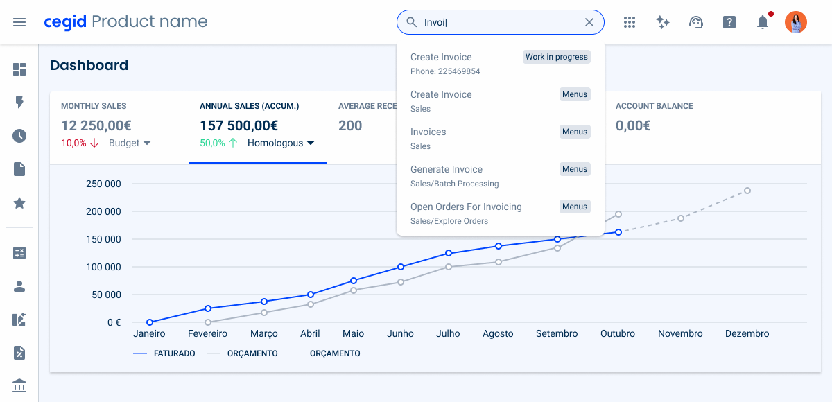
Begin the AutoComplete when the first character is inserted;
Use different list variations in the same drop-down;
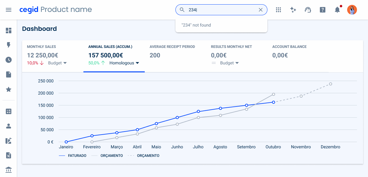
Empty State
When a search query produces no results, the ‘[searched input] not found‘ message provides clear feedback to users. To enhance usability, consider offering helpful guidance, such as suggesting broader keywords or removing filters.
Since the search component already includes a clear icon to reset the input, additional actions should be avoided to keep the interface clean and focused.
Case Studies
Why Web Accessibility Matters – And How to Start
Writing for Everyone: Every Word Counts in Accessibility