Page Title
The Page Title pattern offers users a comprehensive and intuitive navigation experience.

- Overview
- Specs
- Guidelines
Pattern
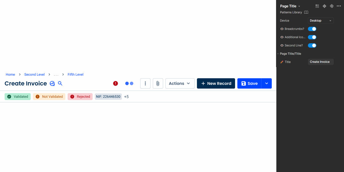
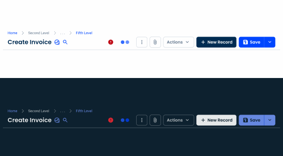
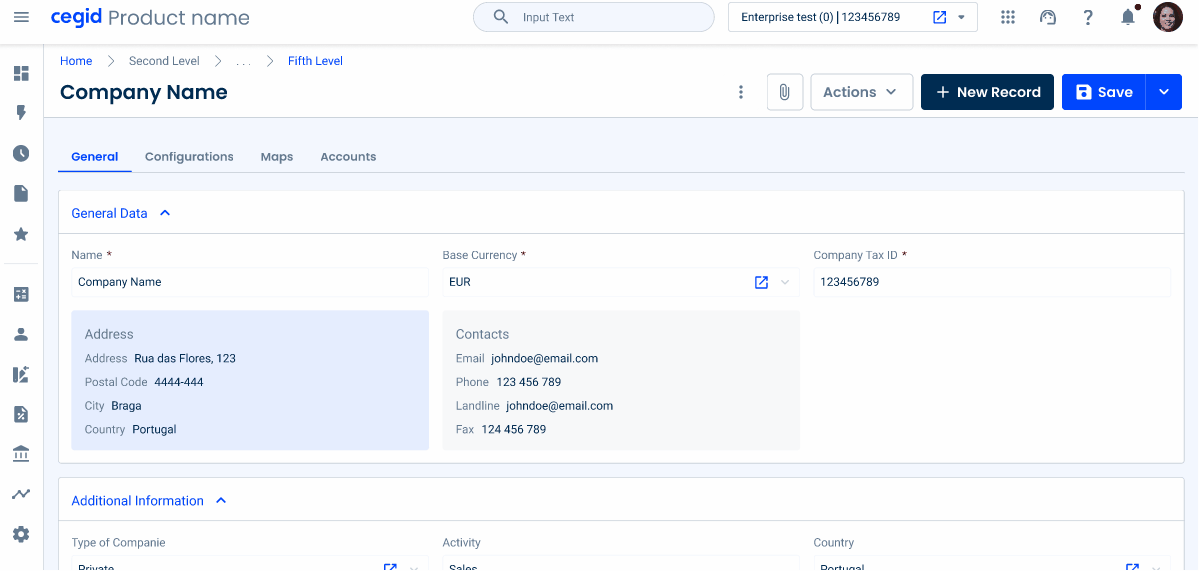
The Page Title pattern contains breadcrumbs, the title of the page and action bar components. These provide users with a comprehensive and intuitive navigation experience.
Breadcrumbs serve as a roadmap, guiding users through the hierarchical structure of the website or application, allowing them to easily backtrack or explore related content.
The Page Title provides a clear and concise summary of the page’s purpose or content, helping users quickly understand the context without the need for extensive exploration.
Furthermore, the inclusion of action bar components allows users to effectively interact with the page. Whether it’s through buttons for common actions, dropdown menus for sorting or filtering options.
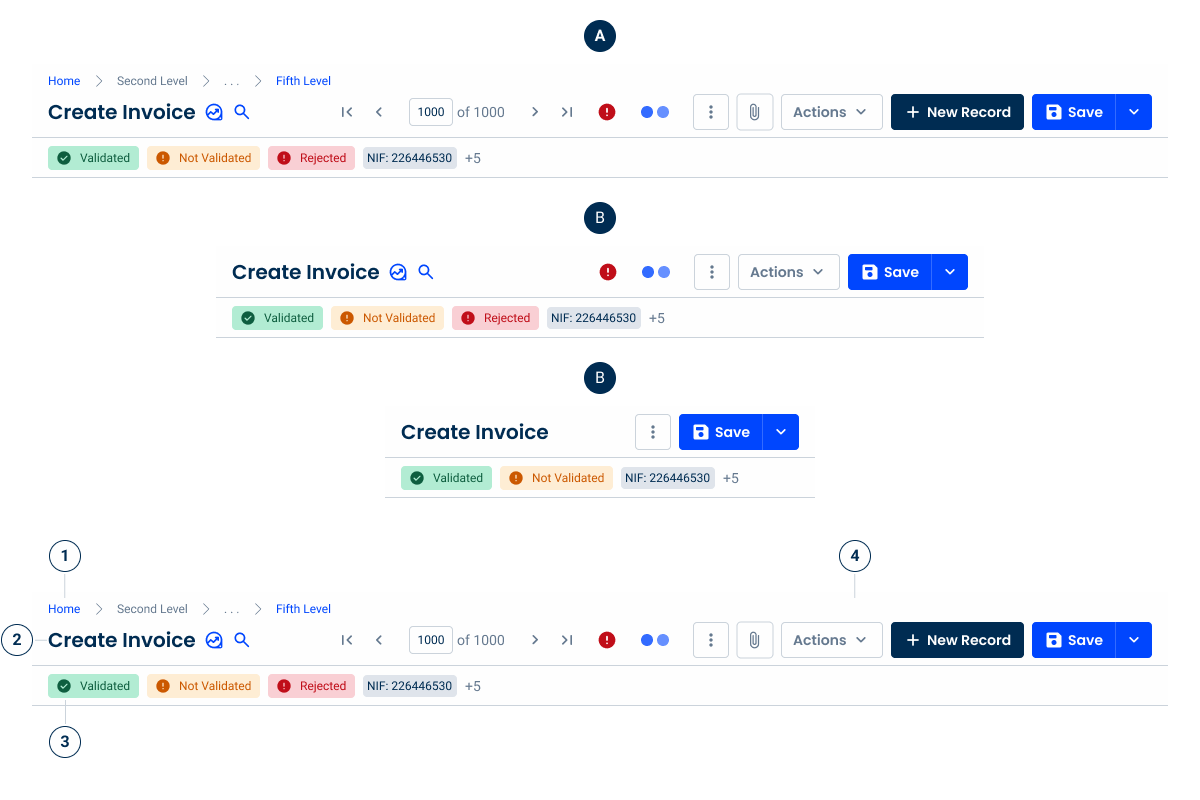
- A: Desktop Variation
- B: Tablet Variation
- C: Mobile Variation
- 1: Breadcrumbs
- 2: Page Title
- 3: Second Line
- 4: Action Bar

Used for:
Views with lists
When the user is in a list view with a dedicated page and actions, the Page Title pattern should be used.
Forms
When a user is inside a form with a dedicated page and actions, the Page Title pattern should be used.
Reports
When the user is inside a report view on a dedicated page and actions, the Page Title pattern should be used.
Don’t use for:
Dashboards
In dashboards where no dedicated actions are available, the Page title pattern should not be used.
Modals
In modals where the layout is managed differently, the Page Title pattern should not be used.
Flyouts
In flyouts where the layout is managed differently, the Page Title pattern should not be used.

Demo
Access the Figma file and inspect the element using Dev Mode.
Last Updated


- Updated and improved guidelines referring to breadcrumbs;
- Updated component to reflect these changes.
Related
Variations
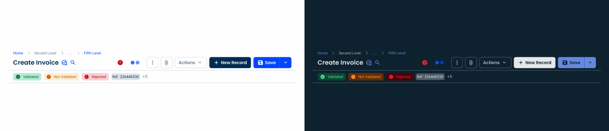
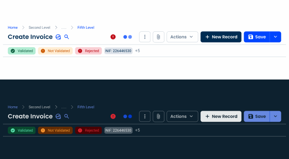
Desktop
.Desktop {
  background: var(--grey-1);
  bottom-stroke: var(--grey-5);
  breadcrumbs: var(--breadcrumbs-trimmed);
  pageTitle: var(--h6);
  pageTitle-icon: 20px;
  actionBar: var(--action-bar-desktop);
}
Tablet

.Tablet {
  background: var(--grey-1);
  bottom-stroke: var(--grey-5);
  pageTitle: var(--h6);
  pageTitle-icon: 20px;
  actionBar: var(--action-bar-tablet);
}
Mobile
.Mobile {
  background: var(--grey-1);
  bottom-stroke: var(--grey-5);
  pageTitle: var(--h6);
  pageTitle-icon: 20px;
  actionBar: var(--action-bar-mobile);
}
Size
Breadcrumbs on

.uniqueSize {
  height: 78px;
  padding: var(--spacement-8, --spacement-16);
  vertical-gap: var(--spacing-4);
  horizontal-gap: var(--spacing-16);
}
Breadcrumbs off

.uniqueSize {
  height: 56px;
  padding: var(--spacement-8, --spacement-16);
  vertical-gap: var(--spacing-4);
  horizontal-gap: var(--spacing-16);
}
With second line

.uniqueSize {
  height: 118px;
  padding: var(--spacement-8, --spacement-16);
  vertical-gap: var(--spacing-4);
  horizontal-gap: var(--spacing-16);
}
Without second line
.uniqueSize {
  height: 78px;
  padding: var(--spacement-8, --spacement-16);
  vertical-gap: var(--spacing-4);
  horizontal-gap: var(--spacing-16);
}
Useful links

Consult our Figma file to access our assets and inspect them in dev mode.

This component is or will be provided by the Polygon framework. See its documentation to learn more.

This element is in line with the guidelines of the CDS (Cegid Design System). Find out more.
Behavior
Elements
Breadcrumbs: help users navigate efficiently by providing a clear path of their location in the system. This simplifies navigation and improves orientation within complex workflows.

Note that not all products require breadcrumbs. In such cases, the height of the Page Title should be adjusted so that it takes up less space than necessary.
However, if the product uses breadcrumbs, but not in all situations, such as on the Home Page, make sure the height of the Page Title remains consistent with all the elements aligned in the center. This helps to avoid interface elements changing their position as users navigate through the pages.


Hide the breadcrumbs when working with smaller interfaces, such as tablet and mobile.
Action Bar: centralizes key interactions, containing all buttons, pagination controls, and important system feedback. It includes loading states to indicate ongoing processes and an error state to signal issues on the page without disrupting the layout.
Please consult the Action Bar article in order to respect the different guidelines related to this element.

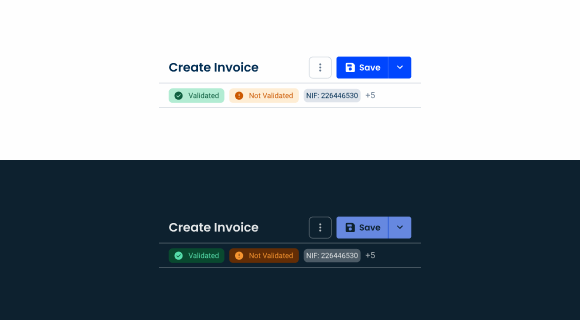
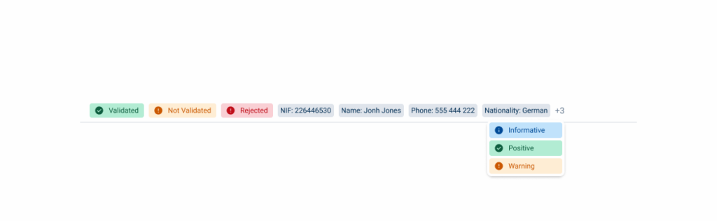
Second Line: Positioned below the page title, this area displays status indicators or chips to provide additional context, such as workflow stages, system alerts, or other relevant metadata.
Please note that this element can bring some impact to the form itself, as the amount of chips and their state can retract the attention from the form. If you need to implement this element, please contact the eXA Team.
Responsive
In order to maintain the best ratio and density of elements throughout the products, the three breakpoints present in our design system have their own specific variation, adapting the content showed.
Respect the guidelines of the components that are present in this pattern.
Application
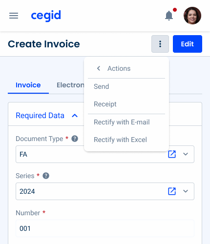
Overflow Menu & Split Button
The Overflow Menu and Split Button have been improved to support multiple levels, allowing for better organization of nested options and improved navigation in complex menus.
Additionally, they have been optimized for mobile devices, including tablets and smartphones, ensuring a seamless and responsive experience across different screen sizes.

Second Line
The second line in the Page Title pattern has been improved to effectively manage the overflow. When status indicators or chips exceed the available space, a + number of remaining items indicator appears, providing access to the hidden items via a dropdown.
History Timeline
A dropdown that appears when you click the title, providing a quick overview of the most recent changes made to the form. This helps users keep track of changes efficiently without having to navigate away from the current page.

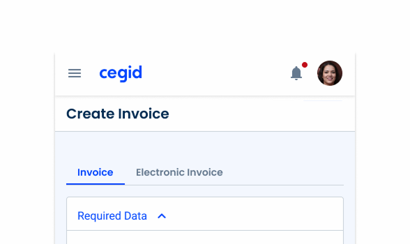
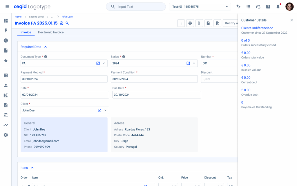
Context Screen
Represented by an icon, this feature displays additional data in a flyout related to the form, when applicable. For example, when viewing an invoice, the context screen can show customer details, ensuring easy access to relevant information.
Search
Also represented by an icon, this feature enables users to quickly search and navigate between records within a modal, for example, this can be applied to the entities form, making it easier to locate and switch between related records efficiently.

Case Studies
Datagrids Demystified: A Deep Dive into Functionalities
Discover the different types of Responsive Design