
Notification Panel
This pattern allows users to access and read all notifications in one place, without them piling up on the desktop.

- Overview
- Specs
- Guidelines
Pattern
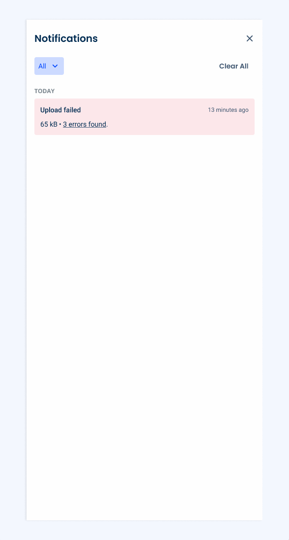
This panel is a notification center that displays system-generated messages to users. To access it, simply click on the Notifications button in the Header.
It consolidates all incoming notifications in a structured and chronological manner, providing users with a streamlined way to stay informed without interrupting their current activity.
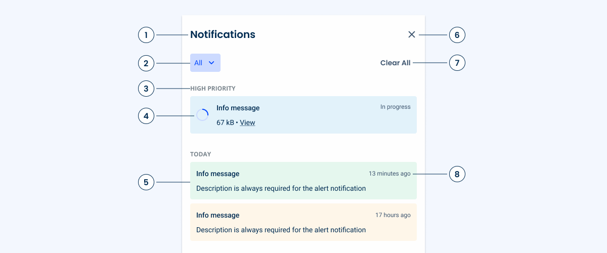
1: Panel Title
2: Filter Chip
3: Notification Group
5: Notification Card
6: Close
7: Clear All Button
8: Notification Date Indicator
Used for:
Centralized information hub
Notification Panels serve as a central location where users can quickly access all their notifications, ensuring they don’t miss any important updates.
User engagement
By providing timely and relevant notifications, users are more likely to engage with the app or service. This can be particularly useful for reminding users of tasks, messages, or updates.
Non-intrusive alerts
Unlike pop-up notifications or alerts that interrupt the user’s workflow, Notification Panels offer a more subtle way to keep users informed. Users can check their notifications at their convenience.
Don’t use for:
Sensitive data
Don’t display sensitive information that users may not want to see on their screens. This can be particularly problematic in shared or public environments.
Redundancy
If an application is already integrated with system-level notification services (such as push notifications on mobile OS), adding an additional Notification Panel within the app may be redundant and confusing to users.
Overwhelming the user
Too many notifications can lead to user fatigue. This may cause users to ignore or disable notifications altogether.
Demo
Access the Figma file and inspect the element using Dev Mode.
Last Update
- Component reworked to better suit the product’s needs::
1. Added a navigation level;
2. Increased size;
3. Filters now use a Chip instead of Tabs;
4. Added “High Priority” section meant for important notifications or ongoing tasks;
5. Updated font type and size.
Notification Panel
Variations
Filled

.filled {
  background-color: var(--grey-1);
  title-color: var(--grey-9);
  close-icon: var(--grey-8);
  day-color: var(--grey-6);
}Empty
.empty{
background-color: var(--grey-1);
title-color: var(--grey-9);
close-icon: var(--grey-8);
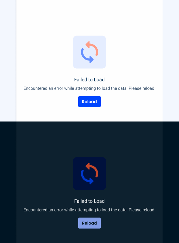
emptyState: var(--FailedToLoad);
}Size
Unique Size
.uniqueSize {
  width: 480 px;
  padding: var(--spacing 24 16);
  gap: var(--spacing-24);
  gap-body: var(--spacing-32);
  gap-cards: var(--spacing-8);
}Notification Panel Cards
State
Enabled

.StateColors{
  background: var(--state-10);
  title: var(--grey-9);
  time-ago: var(--grey-8);
  description: var(--grey-9);
  close: var(--grey-8)
}

.Insight{
  background: var(--grey-1);
  stroke: var(--grey-4);
  title: var(--grey-9);
  time-ago: var(--grey-8);
  description: var(--grey-9);
  close: var(--grey-8)
}
Hover

.StateColors{
  background: var(--state-20);
  title: var(--grey-9);
  time-ago: var(--grey-8);
  description: var(--grey-9);
  close: var(--grey-8)
}

.Insight{
  background: var(--grey-2);
  stroke: var(--grey-4);
  title: var(--grey-9);
  time-ago: var(--grey-8);
  description: var(--grey-9);
  close: var(--grey-8)
}
Focus

.StateColors{
  background: var(--state-10);
  stroke: var(--grey-9);
  title: var(--grey-9);
  time-ago: var(--grey-8);
  description: var(--grey-9);
  close: var(--grey-8)
}

.Insight{
  background: var(--grey-1);
  stroke: var(--grey-9);
  title: var(--grey-9);
  time-ago: var(--grey-8);
  description: var(--grey-9);
  close: var(--grey-8)
}
Useful links

Consult our Figma file to access our assets and inspect them in dev mode.

This component is or will be provided by the Polygon framework. See its documentation to learn more.

This element is in line with the guidelines of the CDS (Cegid Design System). Find out more.
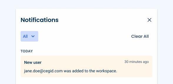
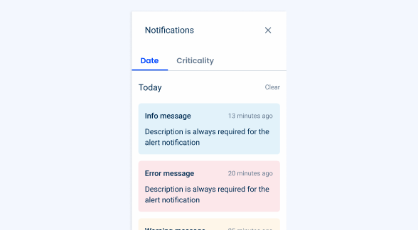
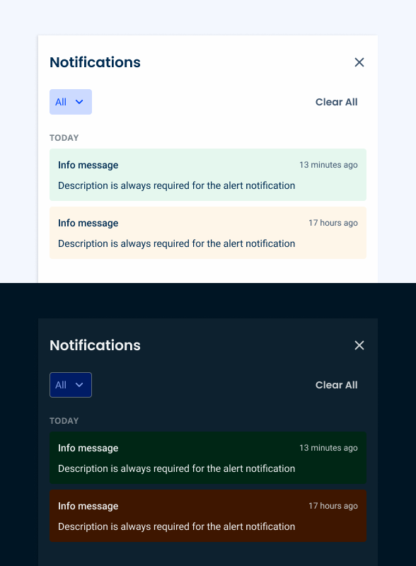
Notification Groups
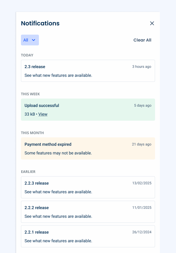
The Notification Panel is designed to display content chronologically. To improve readability, notifications can be grouped into categories, based on when they first appeared. By default, these groups are:
- Today;
- This Week;
- This Month;
- Earlier.
Notification groups can be adjusted according to the product’s needs. For example, platforms that rarely notify users probably don’t need groups.
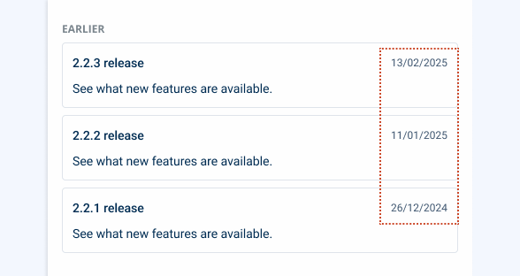
For notifications older than a month, instead of indicating how long ago they were created, display the full date.
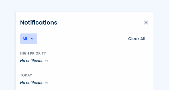
Use notification groups when they’re empty. Instead, simply omit them.
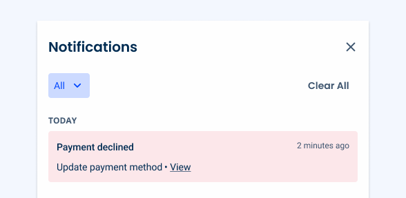
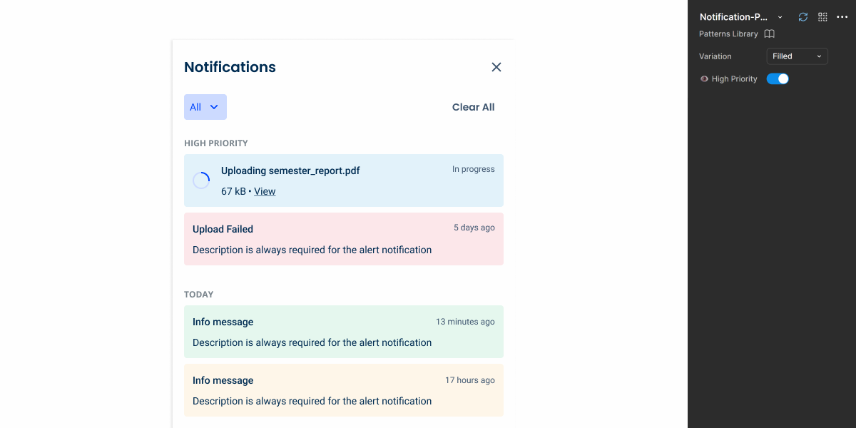
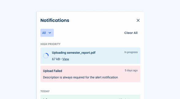
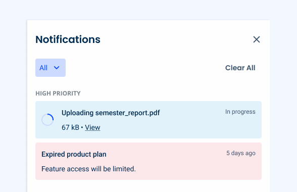
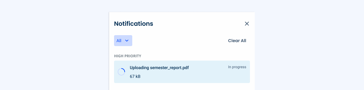
High Priority Notifications
Not all notifications are equally important. A disadvantage of sorting them chronologically that the most relevant notifications get “hidden” as new ones move to the top of the panel.
To address this, a “High Priority” group can be used, which always remains at the top of the Notification Panel. Only notifications with a significant impact on the user experience should appear here. Some examples include:
- Tasks in progress, such as a file being uploaded;
- Critical errors or warnings.
Card Variations
Progress Circle
Time-consuming tasks can be frustrating, so it is important to notify users when they occur. For this reason, notification cards have a variation that includes a Progress Circle in their Indeterminate state.
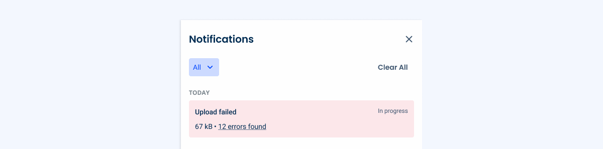
Text Hyperlink
By default, users can click on notification cards to access the content they refer to. However, in some cases, an additional navigation method may be necessary. In such cases, a text hyperlink can be added to the card, as shown in the example below.
This is especially useful when dealing with a single process that needs to generate several notifications, such as an error report (explained in another section of this article).
Nested Notifications
Some tasks may require the generation of several notifications, which can lead to a cluttered Notification Panel. To address this, we have designed a navigation experience that allows multiple messages to be grouped together.
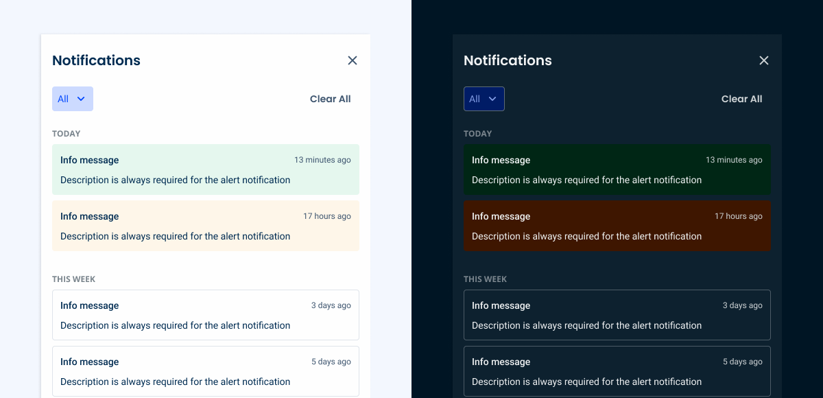
Filtering
The Notification Panel includes a Selectable Chip that allows users to filter content by notification type.
By default, all of them should be visible.
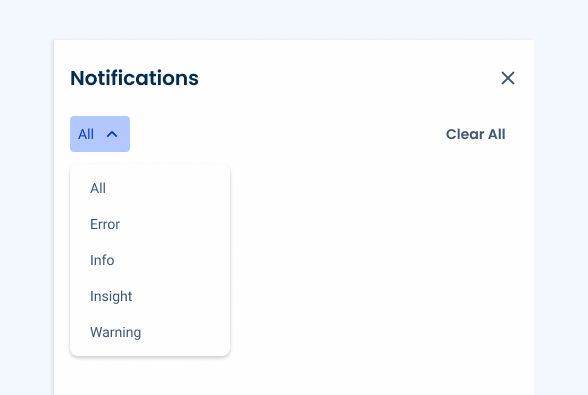
Info vs Insight
Info Messages are designed to keep users updated on new versions, releases, and features, ensuring they stay up to date with the latest developments.
Conversely, Insight Messages provide users with actionable recommendations and useful information and analytics that can optimize their use of the system.
This clear distinction ensures that users can quickly identify updates and guidelines and act accordingly.
Related