
Image Uploader
A simple image uploader for quick and easy uploads, offering a seamless user experience for adding images without disrupting the main interface.

- Overview
- Specs
- Guidelines
Pattern
The Uploader pattern is a user interface design approach that facilitates the seamless uploading of images into an application.
This pattern is particularly useful in scenarios where users need to upload content without navigating away from their current task, ensuring a smooth and uninterrupted experience.
Whether you’re changing profile pictures, or adding product images, the Image Uploader pattern simplifies the process. By embedding the Uploader in a modal or expander, users can easily access it when needed, while keeping the interface clean and organized when it’s not in use.

- A: Modal version;
- B: Section variation;
- 1: Modal title;
- 2: Close;
- 3: Text button;
- 4: Primary button;
- 5: Empty State;

Used for:
Uploading profile picture
Allows users to update their profile picture via a modal, keeping them on the same page;
Product image upload
In our products, users can add product images through an Uploader in a modal while filling out the product details.
Don’t use for:
Complex file management
For scenarios requiring extensive file management, such as organizing, renaming, or categorizing files, the Uploader pattern may be too limited. A full-fledged file management interface would be more appropriate;
Limited screen space
In very small or mobile interfaces where screen space is constrained, embedding an Uploader within a modal or expander could overcrowd the UI, making the experience cumbersome;
Security-sensitive environments
In highly secure environments, where file uploads require additional checks, monitoring, or user confirmations, a dedicated and more controlled process may be required instead of a simple built-in Uploader.

Demo
Access the Figma file and inspect the element using Dev Mode.
Last Update


- Added Empty State;
Variations
Uploader – Modal
Enabled
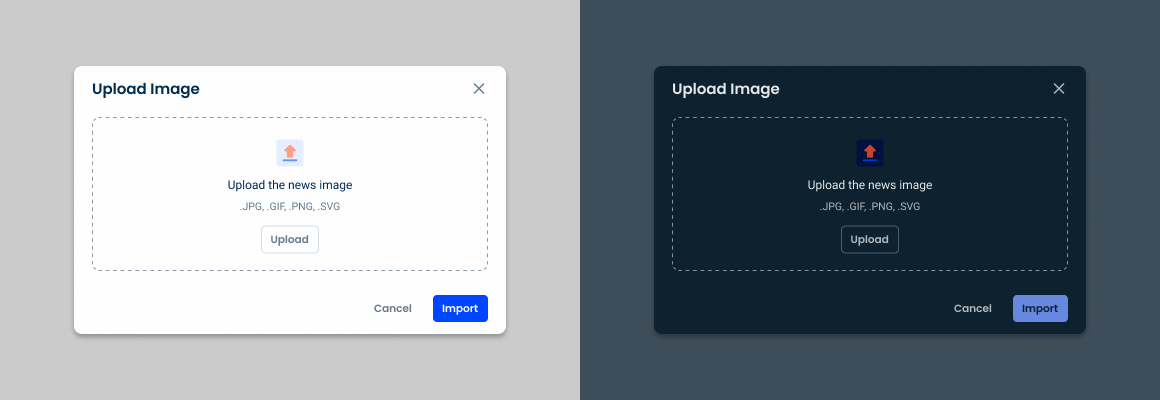
.enabled {
  modal-bg: var(--grey-1);
  close: var(--regular-enabled);
  dropZone: var(--enabled);
  primaryButton: var(--primary-theme-regular);
  textButton: var(--textButton-grey-regular);
}
Crop Image

.cropImage{
  modal-bg: var(--grey-1);
  close: var(--regular-enabled);
  dropZone: var(--enabled);
  image: width: 528px;
  rotateButton: var(--tertiary-theme-regular);
  primaryButton: var(--primary-theme-regular);
  textButton1: var(--textButton-theme-regular);
  textButton2: var(--textButton-grey-regular);
}
Uploader – Sections
Single Selection
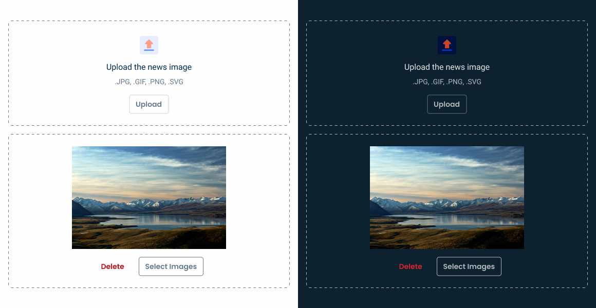
.SingleSelection_enabled {
  dropZone: var(--enabled);
}

.SingleSelection_upload {
  dropZone: var(--imagePreview);
}
Multiple Selection
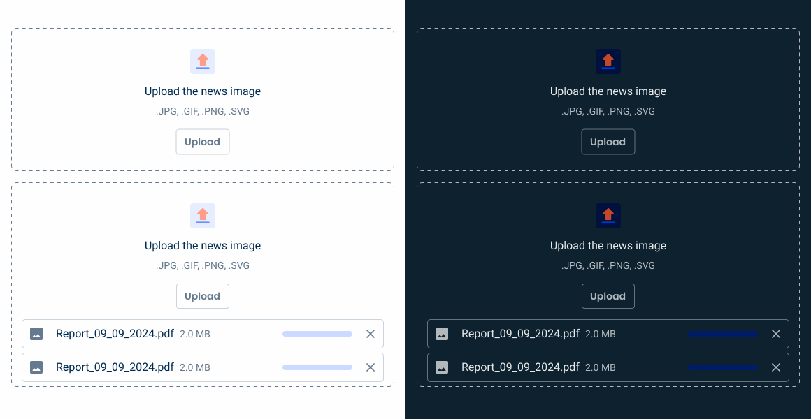
.MultipleSelection_enabled {
  dropZone: var(--enabled);
}

.MultipleSelection_upload {
  dropZone: var(--enabledMultiple);
  cardUpload1: var(--enabled);
  cardUpload2: var(--enabled);
  cardUpload3: var(--enabled);
}
Useful links

Consult our Figma file to access our assets and inspect them in dev mode.

This component is or will be provided by the Polygon framework. See its documentation to learn more.

This element is in line with the guidelines of the CDS (Cegid Design System). Find out more.
Variations
The Uploader pattern offers flexibility through single and multiple selection variations, catering for different user needs. Single selection is ideal for tasks that only require one image, such as updating a profile picture, ensuring both focus and simplicity.
On the other hand, multiple selection enables users to upload several files simultaneously, which is ideal for situations such as adding several photos to a gallery. Choosing between these variations depends on the specific context and desired user workflow in the application.
These are the states after adding the image(s).
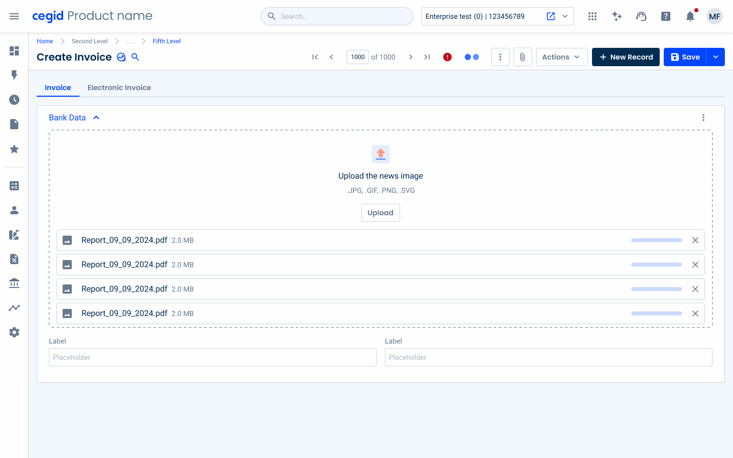

Show the loading progress.
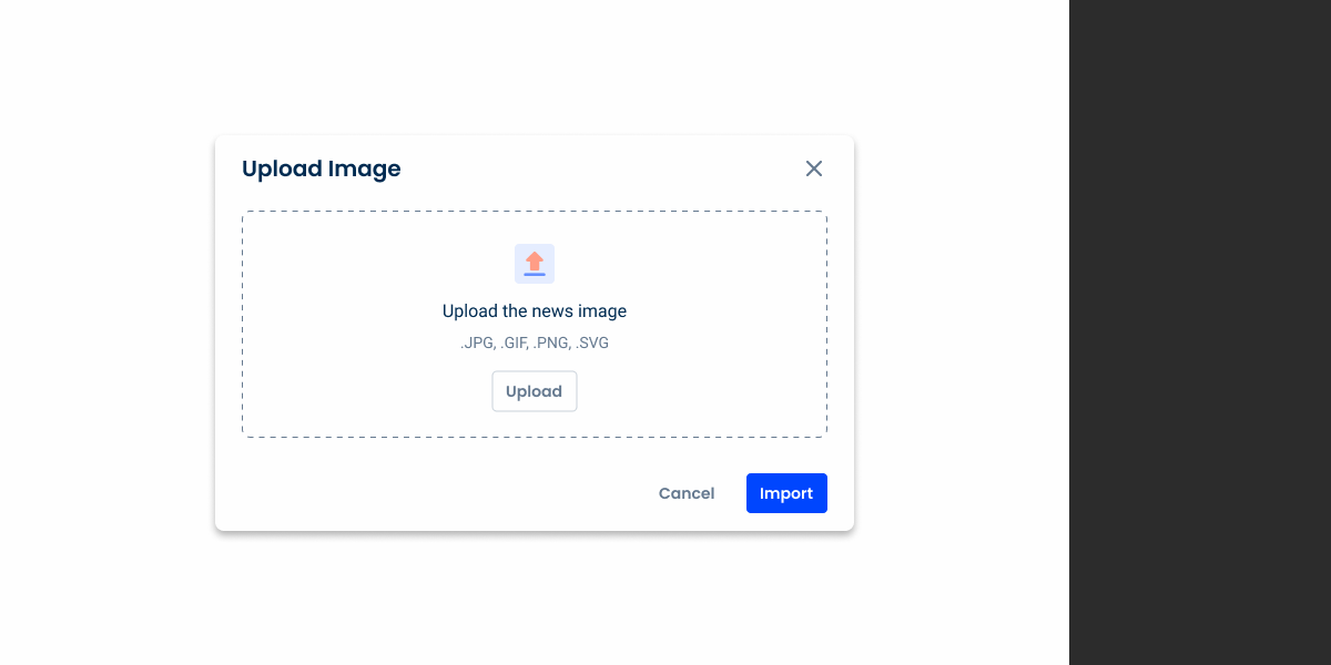
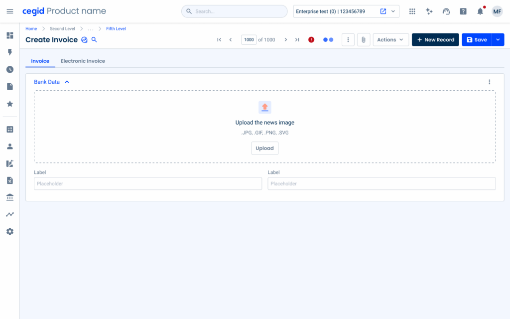
Modal
The modal variation of the Uploader pattern provides a focused and confined space for users to upload images without leaving their current workflow. By opening the Uploader in a modal, users can quickly complete the task at hand while keeping the rest of the interface intact.
This approach is particularly effective for maintaining a clean and organized layout, as it temporarily makes it possible to view the Uploader without cluttering the main interface. The modal variation enhances user experience by balancing accessibility with minimal disruption.
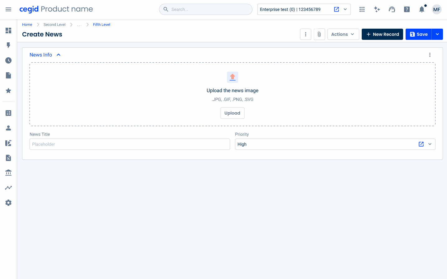
Empty State
In the Image Uploader pattern, the empty state is displayed by default in both the enabled and hover states in the drop-zone. This decision ensures a consistent visual language across components, reducing the need for additional states or transitions that might overcomplicate the user experience.
By maintaining consistency with other design elements, users can quickly recognize and interact with thumbnails without confusion.
The image upload button must have a text or label that correctly describes the button’s action.
Voice-Over
For general guidelines on screen reader compatibility, see the following blog post on best practices: Designing the Invisible: How to Make Your Interfaces Work Without a Screen.
Inform users of the progress and status of the upload.
Provide feedback on errors that may occur.
Leave users with no progress information about their upload.
Reading Order
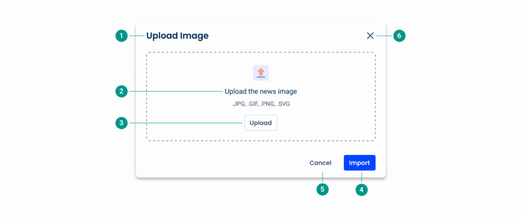
| Reading Order | Element | Screen Reader Reading |
| 1 | Title | Upload image |
| 2 | Description | Upload the news image; .JPG, .GIF, .PNG, .SVG |
| 3 | Upload button | Upload, button |
| 4 | Primary button | Import, button |
| 5 | Secondary button | Cancel, button |
| 6 | Close button | Close modal button |
Case Studies

Handling Background Tasks

Read Mode: Making Content Feel Effortless and Understandable
