
Flyout
Flyout is used to show additional information about the page content, make additional settings, see notifications…

- Overview
- Specs
- Guidelines
Pattern
A flyout pattern is a dynamic interface element that expands or “flies out” from a designated area when triggered, typically by a user interaction such as a click or hover. This pattern provides additional options, menus, or details without navigating away from the current screen, enhancing user experience by maintaining context.
Flyouts are often used for secondary actions or detailed information, offering a clean, uncluttered interface while still providing quick access to relevant functionality.

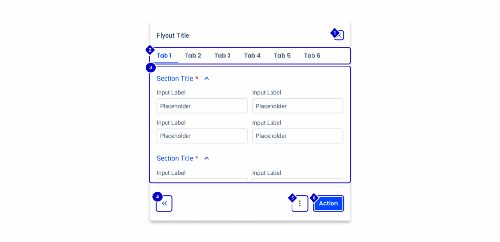
- Title.
- Icons.
- Status Indicator.
- Main Content.
- Primary Button.
- Secondary Button.
- Button Icon.
- Expand/Collapse Button.

Used for:
Additional options
When there are secondary actions or options that supplement the primary action, a flyout can neatly present these without cluttering the main interface.
Contextual information
Flyouts are ideal for displaying extra information or details about an item without navigating away from the current page, ensuring users stay engaged with their primary task.
Forms and input
Flyouts can be used to present form fields or input options in a compact manner, expanding to collect user input and then collapsing back to save space.
Notifications and alerts
Flyouts can be used to display notifications or alerts in a non-intrusive manner, allowing users to view them without disrupting their current activity.
Don’t use for:
Overcomplication
Flyouts can add unnecessary complexity to an interface, especially if the same information or actions can be presented more simply in a static layout.
Context loss
Flyouts that require significant user input or decision-making can cause users to lose the context of their main task, leading to confusion when the flyout is closed.
Cluttered interaction
If overused, multiple flyouts can lead to a cluttered and overwhelming interface, causing users to lose track of where they are or what they were doing.

Demo
Access the Figma file and inspect the element using Dev Mode.

Last Update

- Updated with new sizes for small, regular and large;
- Added accessibility guidelines;
Related
Notification Panel
Variations

Sizes
Small

.regular {
  width: 320px;
  height: 850px;
  title: var(--subtitle-1);
  icons: var(--regular);
  statusIndicator: var(--extended);
  gapTitleStatus: var(--spacing-8);
  gap: var(--spacing-16);
  paddingTop: var(--spacing-24, --spacing-16, 0);
  paddingContent: var(0, --spacing-16);
  buttonIcon: var(--tertiary-theme-regular);
  primaryButton: var(--primary-theme-regular);
secondaryButton: var(--textButton-theme-regular);Regular

.regular {
  width: 480px;
  height: 850px;
  title: var(--subtitle-1);
  icons: var(--regular);
  statusIndicator: var(--extended);
  gapTitleStatus: var(--spacing-8);
  gap: var(--spacing-16);
  paddingTop: var(--spacing-24, --spacing-16, 0);
  paddingContent: var(0, --spacing-16);
  buttonIcon: var(--tertiary-theme-regular);
  primaryButton: var(--primary-theme-regular);
  secondaryButton: var(--textButton-theme-regular);
}Large

.large {
  width: 720px;
  height: 850px;
  title: var(--subtitle-1);
  icons: var(--regular);
  statusIndicator: var(--extended);
  gapTitleStatus: var(--spacing-8);
  gap: var(--spacing-16);
  paddingTop: var(--spacing-24, --spacing-16, 0);
  paddingContent: var(0, --spacing-16);
  buttonIcon: var(--tertiary-theme-regular);
  primaryButton: var(--primary-theme-regular);
secondaryButton: var(--textButton-theme-regular);Focus order
When a flyout opens, focus should automatically move to the first meaningful interactive element inside the flyout. This could be the flyout’s heading, a primary input field, or the close button. Moving focus ensures that users relying on a keyboard or screen reader can immediately begin interacting with the flyout without having to navigate through other elements on the page.
When a flyout opens, move focus to the first interactive element inside (e.g., a heading, input field, or the Close button).
When the flyout closes, return focus to the trigger element that opened it. This ensures a predictable experience for keyboard and screen reader users.
Avoid trapping focus (if it requires the user to complete the interaction before returning to the page).
Keyboard navigation
All interactive elements within a flyout must be fully keyboard accessible. Users should be able to navigate through buttons, links, form fields, and any other controls using the Tab and Shift+Tab keys. The navigation order should follow a logical and meaningful sequence that reflects the visual layout of the interface.
| Keys | Actions |
|---|---|
| Tab or Shift+Tab keys | Focus lands on (non-disabled) icon button |
| Space or Enter | Activates the (non-disabled) icon button |
| Escape (Esc) | Close the flyout |
Ensure all interactive elements (buttons, links, inputs) inside the flyout are reachable with Tab/Shift+Tab.
Avoid hiding essential actions inside hover-only menus, which are inaccessible via keyboard.
Useful links

Consult our Figma file to access our assets and inspect them in dev mode.

This component is or will be provided by the Polygon framework. See its documentation to learn more.

This element is in line with the guidelines of the CDS (Cegid Design System). Find out more.
Sizes
Flyouts are a powerful UI pattern that let users interact with content without losing context from the main screen. They’re ideal for quick edits, form entries, and workflows that don’t require a full-page takeover.
We provide three standardized flyout sizes: Small, Regular, and Large. Each size is tailored for specific use cases and designed to balance usability with contextual awareness.
Depending on the flyout size, some UI elements may need to adapt due to space constraints. For example, if an expand/collapse icon button is used within a small flyout alongside three additional buttons, not all buttons may be visible. In these cases, a Split Button or Overflow Menu is used to consolidate secondary actions and maintain accessibility.
| Size | % of Viewport Width | Recommended Width |
|---|---|---|
| Small | 20% | 320 |
| Regular | 30% | 480 |
| Large | 50% | 720 |
Small
Compact and focused, small flyouts are ideal for quick actions or simple forms with minimal inputs. They reduce cognitive load and maintain maximum context from the main screen, keeping interactions lightweight and efficient.
- For simple forms with only a few fields (e.g., 2–4 inputs).
- When the user is expected to complete the interaction quickly without needing additional guidance.
- Ideal for single-task workflows such as:
- Renaming an item.
- Changing a status or toggling a setting.
- Entering a short note or comment.
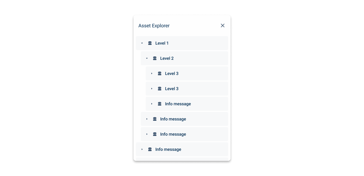
- Simple treeview selections.
- Notification panels.
- Avoid small flyouts for multi-step processes or forms with complex logic (use medium or large instead).
- Don’t use when additional contextual information, help text, or validation errors could clutter the layout.
Regular
Balanced and versatile, the medium flyout is ideal for standard workflows and moderately complex forms. It provides enough space for clarity while maintaining context, allowing users to focus without feeling like they’ve left the main screen.

- For forms with 5–10 fields or moderate interaction complexity.
- When the user needs some context from the main page but also space for clear input and labels.
- Ideal for single-step workflows that require:
- Editing multiple attributes of an item (e.g., user profile settings).
- Creating a new item with light-to-moderate details (e.g., create task, edit event).
- Adding content where a preview isn’t necessary.
- Avoid medium flyouts for multi-step processes, dense content, or rich previews (use large).
- Don’t use if the form could require dynamic help text or inline validation that might expand content beyond a comfortable scroll.
Large
Spacious and powerful, the large flyout is best suited for complex workflows, multi-step processes, or rich content like previews, tables, and media. It offers ample space for detailed interactions without forcing users to leave their current context.

- For forms with more than 10 fields or requiring multiple sections/groups.
- For multi-step workflows where the user completes a process (e.g., onboarding, wizards).
- When the user needs to see large previews, tables, or media (e.g., images, attachments).
- Ideal for:
- Creating or editing detailed content (e.g., Formula editor).
- Configuring settings with nested options.
- Avoid large flyouts for quick interactions or simple confirmations (use small or medium).
- Don’t use large flyouts if most of the space would be empty (this creates visual imbalance).
Responsive
Tablet (768–1024px wide):
- Flyouts can scale proportionally (~60–80% of viewport width).
- Consider switching to a full-screen slide-over for large flyouts.
Mobile (<768px wide):
- Small & Medium → Use full-width slide-in panels (100% width).
- Large → Default to full-screen modal or page for better usability.
Behaviors
Closing
Clicking outside the flyout (on the backdrop) should close it only if there are no unsaved changes. If unsaved changes are detected, display a confirmation dialog to prompt the user to save or discard their work before closing.
Ensure keyboard support by allowing users to dismiss the flyout with the Escape (Esc) key. If unsaved changes exist, pressing Esc should also trigger the confirmation dialog rather than closing immediately.
Expand/Collapse
When expanded, the flyout adjusts to occupy two-thirds of the screen width, providing a larger viewing area for the content. For example, on a screen with a width of 1440 px, the expanded flyout will stretch to 960 px, ensuring efficient use of space while maintaining a balanced and user-friendly interface. By default, a flyout can show two fields per line; in the expanded version, three fields will be shown.
If the user is inside the tablet breakpoint, when the flyout is expanded, it will occupy the entire width of the screen.

In views with forms, all the fields should be adjusted so that they don’t overlap with the Flyout (with the exception of the notifications panel).
Flyouts should only contain information that is not required reading.
Related