
Empty State
Empty States signify a condition in which there is no content to display or, alternatively, convey a message intended to inform the user.
- Overview
- Specs
- Guidelines
- Mobile
Pattern
This design pattern serves to represent a state within an interface where no content is currently available for display. It is often utilized to indicate to users that there is no data or information to present at the moment.
This deliberate absence of content serves as a visual cue, prompting users to take appropriate actions, such as initiating a search, creating new content, or navigating to alternative sections within the application.
By incorporating the Empty State pattern into the design system, we ensure a consistent and intuitive user experience when faced with these scenarios in various interfaces and applications..

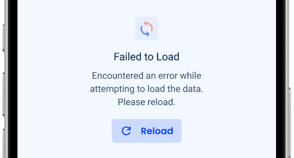
1: Accent Icon
2: Title
3: Description
4: Button

Used for:
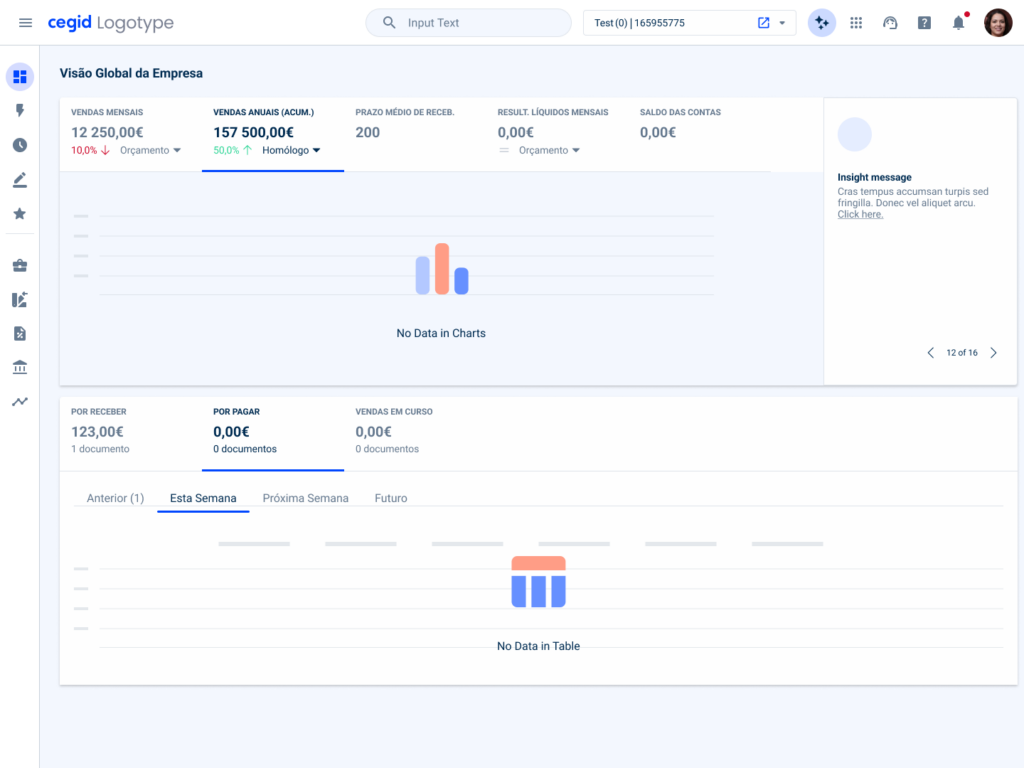
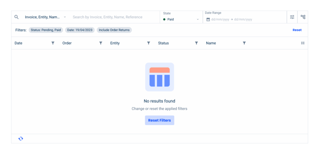
No data to show
When there is no data to show in a table or chart, an Empty State is used to inform the user. There is also a possibility to show a button;
No permissions
When a user doesn’t have permissions to access a certain file or page/view, an Empty State is displayed where the user can request access;
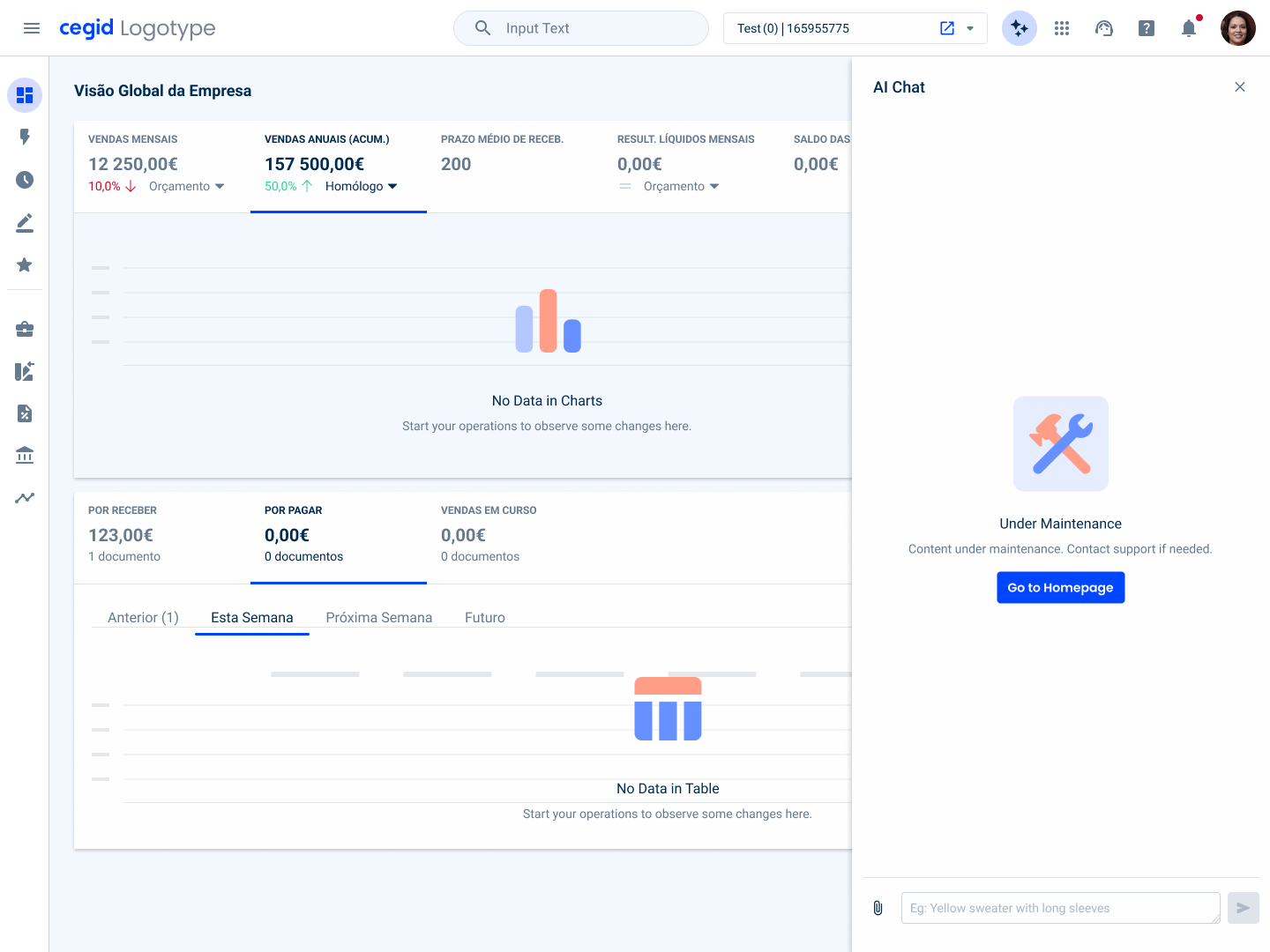
Areas under maintenance
When some view or area on the application is under maintenance, we must inform the users, using an Empty State;
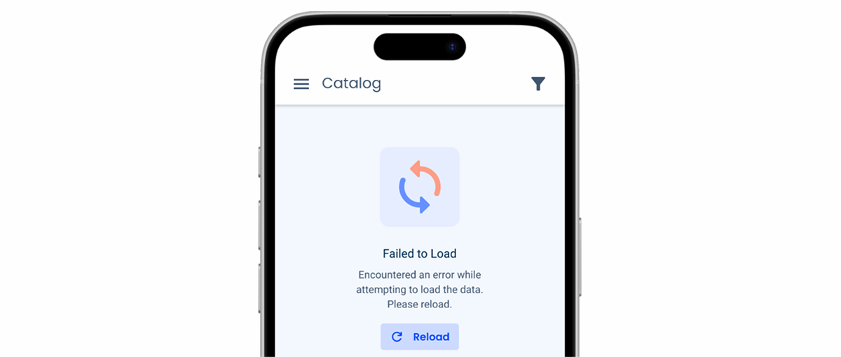
Loading failed
When for some reason the page/view or modal/flyout has failed to be loaded, an Empty State will be displayed with a button to reload the content;
Don’t use for:
Page error
When the whole page has an error such as a 404 error, another template is used which is the page error pattern;
Contextual irrelevance
If the absence of content doesn’t occur naturally within the user flow or doesn’t serve a meaningful purpose, implementing an Empty State might confuse users rather than helping them;
Unnecessary interruption
In some cases, interrupting the user experience with an Empty State may not be necessary, especially if users are engaged in a task where the absence of content is expected or inconsequential;
Limited screen space
In interfaces with limited screen space, such as mobile applications, prioritizing the display of content over Empty States may be more beneficial to optimize the user experience.

Demo
Access the Figma file and inspect the element using Dev Mode.

Last Update

- Added new tab for the mobile version of the component.
Related
Accent Icons
Variations

With Button
.WithButton {n title: var(u002du002dsubtitle-1,u002du002dgrey-9);n description: var(u002du002dbody-2,u002du002dgrey-8);n button: var(u002du002dprimary-theme-regular);n}Without Button
.WithoutButton {n title: var(u002du002dsubtitle-1,u002du002dgrey-9);n description: var(u002du002dbody-2,u002du002dgrey-8);n}Size
Unique Size
.UniqueSize {
  accentIcon: 144px;
  gapTop: var(--spacing-8);
  gap: var(--spacing-16);
}
Useful links

Consult our Figma file to access our assets and inspect them in dev mode.

This component is or will be provided by the Polygon framework. See its documentation to learn more.

This element is in line with the guidelines of the CDS (Cegid Design System). Find out more.
Behavior
Alignment
In order to improve readability and comprehension of the written content, the Empty State pattern should always be center aligned. Users can quickly and easily understand the message being conveyed without having to scan across the screen, which could be the case if the content was aligned to the left or right.
Center alignment creates a sense of balance and symmetry in the design as well. This can make the Empty State feel intentional and integrated with the overall design aesthetic, rather than looking like an afterthought.

Usage
Elements
The Empty State pattern consists of essential and optional elements that provide clarity and usability. While some elements are required to ensure consistency, others are secondary and should only be included when they add value to the experience.
Required Elements
Accent Icon: a visual indicator that helps users quickly recognize the empty state. It reinforces the message and ensures clarity.
Title: a concise text that communicates the empty state clearly, ensuring users understand why no data is displayed. When a title is a description, the text should follow the capitalization guidelines.
Secondary Elements
Description: additional text that provides context or guidance, helping users understand what actions they can take next. It should only be included if necessary.
Button: an actionable element that allows users to respond to the Empty State, such as adding new data or adjusting filters. It should only be used when a clear next step is available.
The description should not exceed two lines.
Application
When to Add Actions
If it is possible to create a new entry in the dedicated area (dashboards cannot have such a button, for example, because it is an area for viewing data rather than creating or editing);
If there is a clear next step for the user, since an Empty State represents an opportunity for the user to add new data to the datagrid, for example;
Choosing a Button Variation
1. Primary
If there aren’t any other primary actions on the page, and this is going to be the primary one, the primary variation should be used;
2. Secondary
If the action is the same as the main action of the page, or if the action is simply secondary (e.g., Reset Filters);
If there are multiple Empty States on the same page, use the secondary button instead of the primary button;
3. Tertiary
If the action is part of an optional field (e.g., Thumbnail, Image & File Uploader);
Apply the Text Button variation to the Empty State pattern.
Case Studies

Handling Background Tasks

Read Mode: Making Content Feel Effortless and Understandable

A Visual Recap of 2025: how we enhanced chatbot communication
References
What Changes?
Since the desktop version of the Empty State already has a font size suitable for small screens, in addition to having a straightforward and universal use, its mobile version is almost identical.
Some adjustments have been made to its size constraints – making it easier to fit into less spacious interfaces – and the button has been replaced with the one developed for the mobile library.
Demo
Access the Figma file and inspect the element using Dev Mode.

Case Studies
Handling Background Tasks
Read Mode: Making Content Feel Effortless and Understandable