Carousel
The Carousel is an eye-catching UI element that allows items to be displayed horizontally while focusing on the one users have selected.

Overview
Mobile user flows tend to rely on vertical navigation because it is more natural and intuitive on small screens. However, horizontal scrolling should still be used used as a way of organizing interfaces or saving space. The Carousel is an UI element that, in addition to incorporating these positive aspects, also aims to create an attention-grabbing experience.
Carousels enable a side-scrolling experience designed to contain various items, such as images, Cards or List Items.

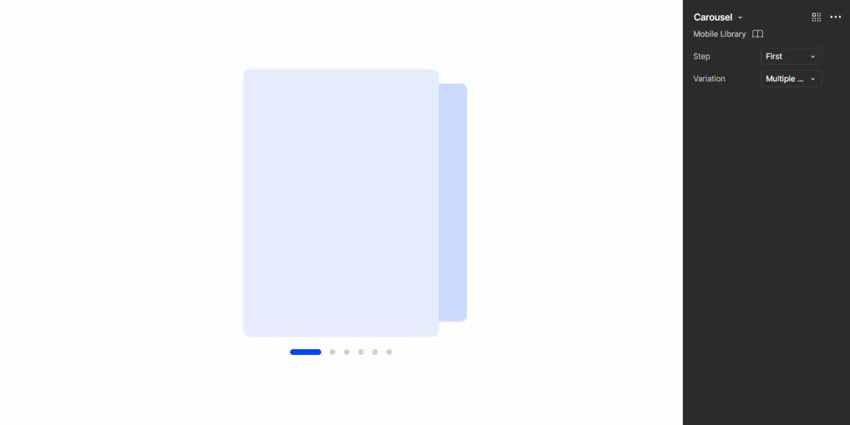
A: Multiple Slide variation
B: Single Slide variation
1: Carousel slide
2: Preview of the previous slide
3: Preview of the next slide
4: Slide Indicator
Demo
Access the Figma file and inspect the element using Dev Mode.
Guidelines
Variations
The key difference in behavior of both variations of the Carousel is the display (or not) of a preview for other items, as shown in the Overview section of this article.
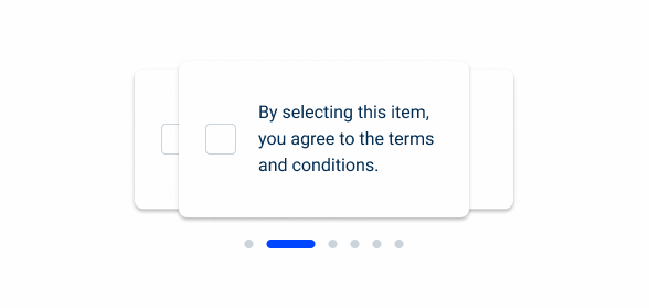
The Multiple Slide variation allows users to see which content was displayed previously, as well as what’s coming next. Although more informative, it takes significantly more space. It’s ideal for images and cards with few elements. For more complex items, consider using the Single Slide variation instead.

Usage
The Carousel is designed to be an eye-catching, interactive interface element that can contain all sorts of items. As such, it should be used when you want to provide users with highly visible and non-critical information, making it ideal for displaying features, short tutorials or minor information about the product.
Since Carousels hide most of the elements they contain, users are forced to swipe through them to see all the content. For this reason, it is necessary for all items to be on the same topic. This prevents frustrating scenarios where users struggle to find information.
Furthermore, it is important to bear in mind that their interactive nature will slow down navigation. As such, they should not be used with long lists of items or to display critical information.

Use Carousels to introduce users to new features.
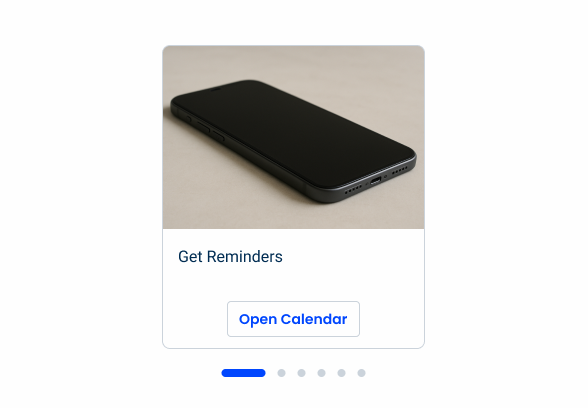
Use carousels in onboarding to help users learn about the product.

Add too many slides to a Carousel. Instead of forcing users to swipe endlessly, it might be better to simply allow horizontal scrolling.
Add critical actions to Carousel slides.

When adding too many elements to a slide. Carousels are not intended for extensive reading or decision-making.
Last Update
- Added component to the Design System.