
Cards
Cards are boxes that group together a set of related information.

- Overview
- Specs
- Guidelines
- Mobile
Pattern
Cards are boxes that group together a set of related information.
A Card can contain different types of elements, from images and icons to actions, and is used to provide an overview of more detailed information.
They should be easy to analyze in order to obtain relevant and actionable information..

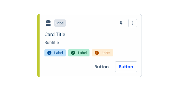
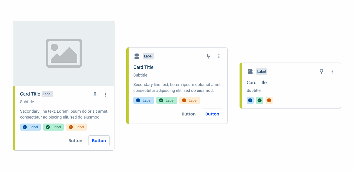
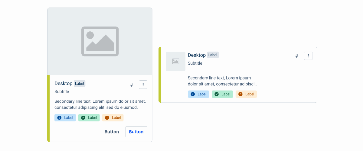
- A: Portrait style
- B: Lanscape style
- 1: Image or Adornment
- 2: Title
- 3: Subtitle
- 4: Description
- 5: Informative Chip
- 6: Color bar
- 7: Status indicators
- 8: Additional actions
- 9: Buttons

Used for:
Favorites
Display the user’s favorites on the product dashboard.
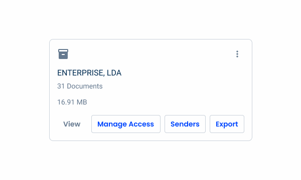
File Management
Cards can represent individual files or stored documents.
Don’t use for:
Complex data visualization
Do not use cards as the only method for presenting complex data visualizations or analyses.

Demo
Access the Figma file and inspect the element using Dev Mode.

Last Update

- Added new tab for the mobile version of the pattern.
Related
Status Indicator
States
Enabled
.enabled {
border: 1px solid var(--Greys-Grey-5, #CBD3DB);
background: var(--Greys-Grey-1, #FEFEFE);
}
Hover

.hover {nborder: 1px solid var(u002du002dGreys-Grey-5, #ADB7C5);nbackground: var(u002du002dGreys-Grey-2, #F7F8F9);n}Selected
.selected {
border: 1px solid var(--Theme-100, #ADB7C5);
background: var(--Theme-10, #F7F8F9);
}
Focus

.focus{
border: 1px solid var(--Theme-100, #ADB7C5);
background: var(--Greys-Grey-1, #FEFEFE);
}
Disabled

.disabled {
border: 1px solid var(--Greys-Grey-4, #DFE4EB);
background: var(--Greys-Grey-2, #F7F8F9);
}
Active Disabled
.activeDisabled {
border: 1px solid var(--Theme-60, #B3C8FF);
background: var(--Greys-Grey-2, #F3F7FE);
}
Useful links

Consult our Figma file to access our assets and inspect them in dev mode.

This component is or will be provided by the Polygon framework. See its documentation to learn more.

This element is in line with the guidelines of the CDS (Cegid Design System). Find out more.
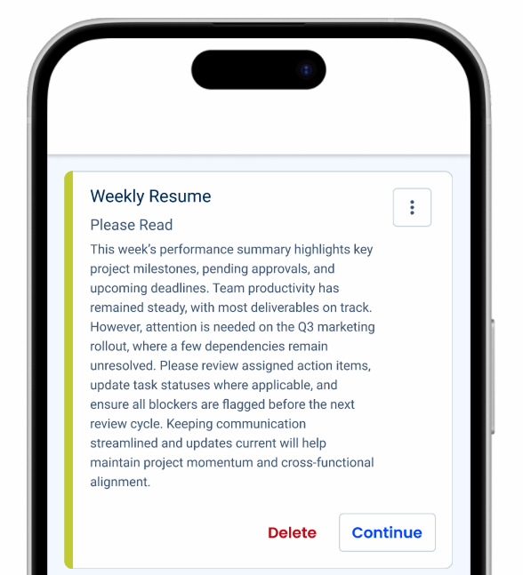
Structure
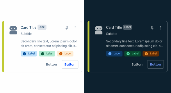
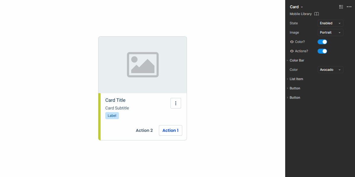
The Card pattern has at least two compulsory elements, namely the title and an image/adornment to make a visual distinction between other cards.
Here are some complementary elements that cards can have:
- Subtitle;
- Description;
- Chip Informative;
- Status Indicators;
- Actions.
Text Content
To ensure a consistent and readable experience, the textual content of cards must be concise and easy to scan. Well-structured text helps maintain visual hierarchy and prevents information overload.
- Titles and subtitles must fit in a single line;
- Descriptions are limited to two lines if there is a subtitle;
- If there is no subtitle, descriptions can be up to three lines long.
This limit promotes clarity, readability and visual consistency between the components. Text that is too long makes it difficult to read quickly, creates visual clutter, and compromises the overall harmony of the layout.
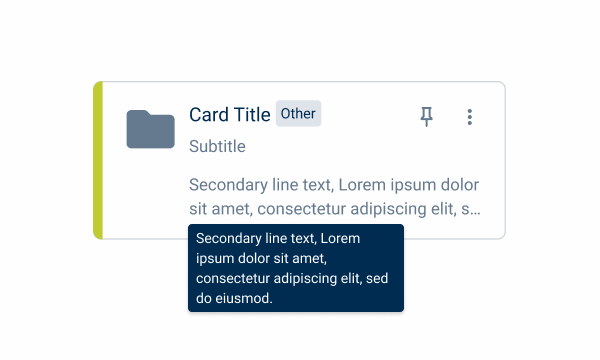
Use the Tooltip for longer texts that need to be displayed.

Use up to three lines for the description, only if the card doesn’t have a subtitle.

Using the lanscape variation only with a title. Use the compact variation instead.
Variations
- Portrait;
- Landscape;
- Compact.
To meet the different needs of the products, the Card pattern has been divided into three variations:

Portrait
The name of this variation derives from the display style of the card. In this case, portrait means that the elements will be placed vertically.
This variation is for cases with a lot of content on a card.

Landscape
The name of this variation derives from the display style of the card. In this case, landscape means that the elements will be placed horizontally.
This variation is for cases without too much information or to be displayed as a list.

Compact
Compared to the two previous variations, the compact variation can only be applied if the content type is an adornment, but it can be applied in portrait or landscape style.
This variation is more common in cases where a large number of cards need to be shown, for example in the case of Ekon’s favorites.

Behavior
Scaling & Alignment
Cards can be resized to fit the screen and should not exceed 1/3 of the screen.
Cards and text elements must always be left-aligned. Only actions should be right-aligned.

For more than two additional actions, use the overflow menu instead of buttons.
Use more than two buttons.
Multi Selection
The Multi Selection feature allows users to select multiple cards simultaneously, which can be useful for actions such as organizing, moving or deleting items in bulk.
This interaction is particularly effective when visual distinction is important – for example, when selecting folders or content types, where a visual representation helps the user to identify and select items more intuitively.
However, this feature should only be used when it truly enhances the user experience. In cases where the visual context is less important, such as forms, it’s more appropriate to use components such as select boxes or checkboxes.
Chips VS Status Indicators
Chips are used to represent categories, filtering, or additional metadata. They help to classify or provide quick context for the user.
Status Indicators are used to visually represent the current status of an item, often with an associated color mode.

Organization
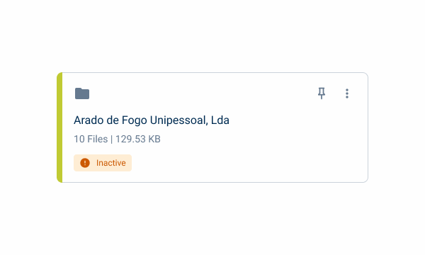
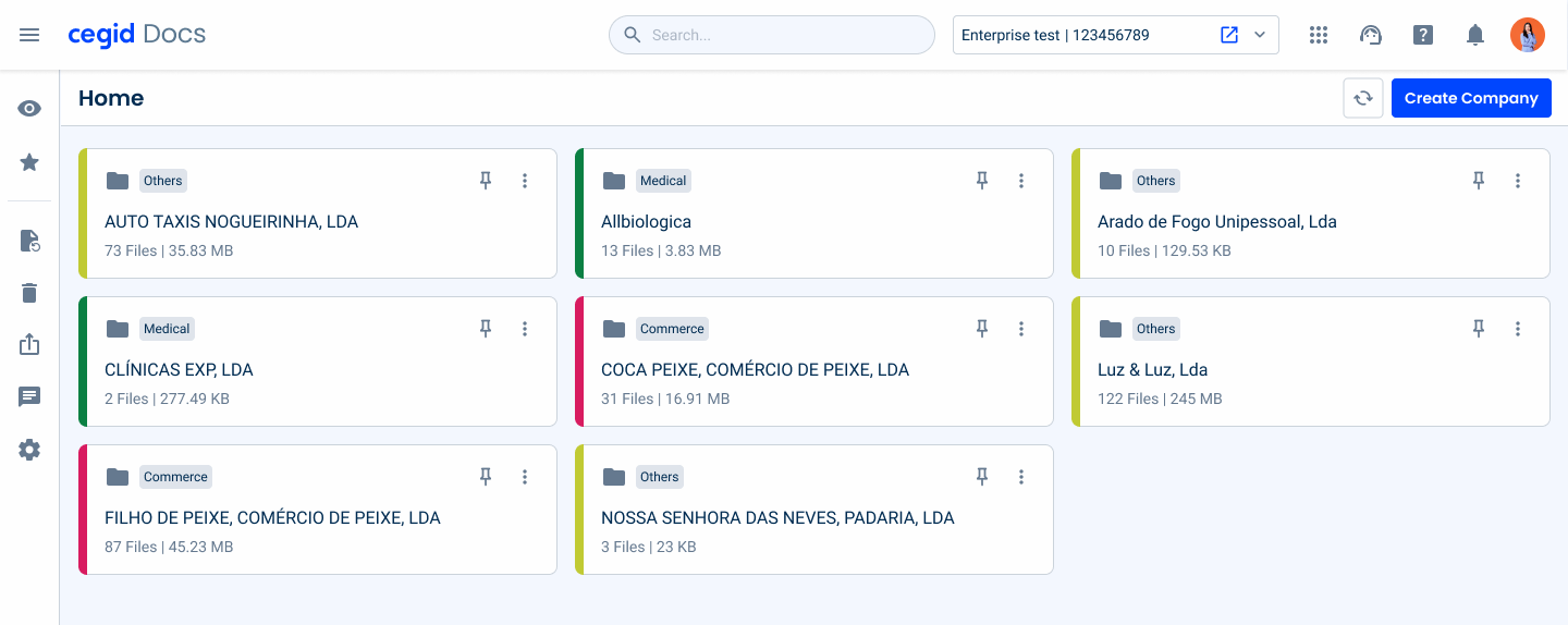
To meet the need to organize the cards for specific cases, a color bar has been added to the left-hand side of the card. This color bar can be used in all variations (portrait, landscape and compact) and styles (adornment and image).
This color bar is only used for the purpose of organizing shared folders. For example, if you want to add a status to a card, a status indicator would be recommended.
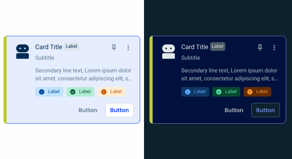
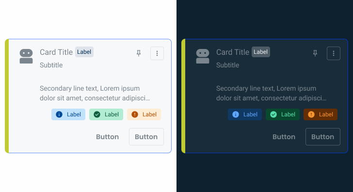
The colors applied are the accent colors, which are adapted to either light or dark mode.
Voice-Over
For general guidelines on screen reader compatibility, see the following blog post on best practices: Designing the Invisible: How to Make Your Interfaces Work Without a Screen.
Describe the menu button (1) as “menu, button” instead of “three-dot icon”.
Ensure the screen reader reads the entire description, even if the visible text is visually trimmed.

| Reading Order | Element | Screen Reader Reading |
| 1 | Title | Cegid |
| 2 | Chip – informative | Tag: recent |
| 3 | Description | Zero files, zero bytes |
| 4 | Status indicator | Status: demo |
| 5 | Tertiary button | Edit, button |
| 6 | Overflow menu | Menu, button |
| 7 | Icon button | Pin, button |
Case Studies
Enhancing Lists within Flyouts with image previews
The usage of Illustrations in UX Design
What Changes?
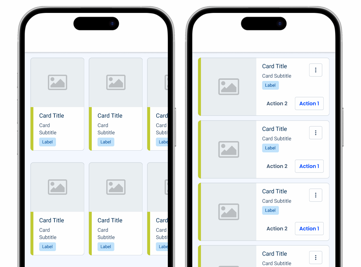
Cards serve similar purposes on mobile, which means there are few changes to their appearance. They do receive some adjustments to their layout, making them better suited for small screens.
The mobile version of the Card uses the List Item component, which allows it to include items such as Status Indicators and Buttons.
Decorative elements like icons are removed. The same applies to states that aren’t applicable on mobile, such as Hover and Focus.
Demo
Access the Figma file and inspect the element using Dev Mode.
Size
The dimensions of the Card can be adjusted according to the need, as shown in the image below.
The portrait variation is ideal for cases where horizontal scrolling is needed- such as carousels – while the opposite applies to the landscape variation.

Group different Card variations together.
Add long strings of text to cards. They’re designed to be compact and, in mobile interfaces,it is not advisable to trim the text as the tooltips can be difficult to implement.
Case Studies

Handling Background Tasks

Read Mode: Making Content Feel Effortless and Understandable
