
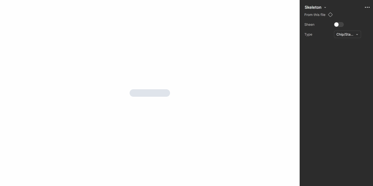
Skeletons
Skeletons serve as visual placeholders that guide user expectations while content is loading, enhancing the perceived responsiveness of the interface.

- Overview
- Specs
- Guidelines
Overview
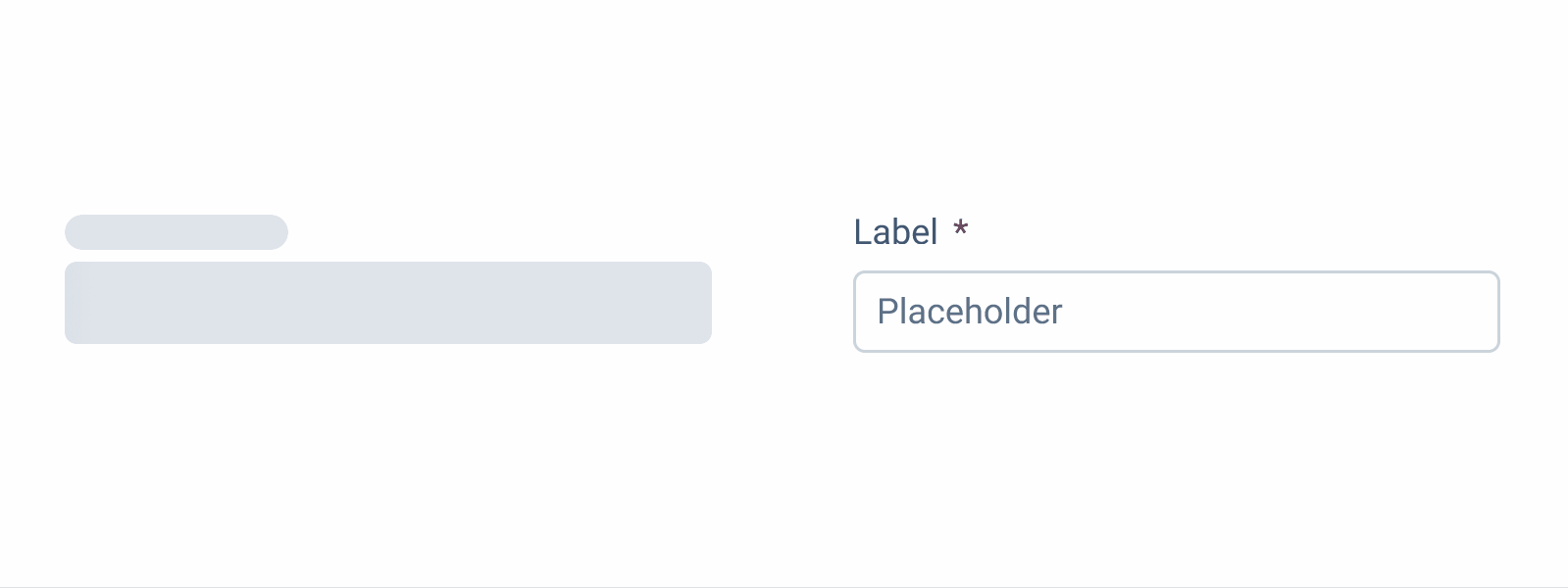
Skeletons are placeholder elements that represent the layout of content that is still loading. Instead of displaying a spinner or leaving an empty space, they show a simplified visual structure that mimics the page layout.
The purpose of Skeletons is to improve perceived performance by giving users a sense of progress and maintaining visual stability while asynchronous data is being fetched. They help set expectations and avoid layout changes, especially in interfaces where the structure is known and consistent.

Demo
Access the Figma file and inspect the element using Dev Mode.
Last Update
- Updated Skeleton’s visuals;
- Updated available templates and guidelines to better address product needs;
- Added new variations to the component used to design Skeletons, making templates more varied.
Animation
The animation should be triggered when the content loading time exceeds 1 second.
The shimmer effect should run from left to right to achieve a vertical effect and its duration per loop should be between 1.2 and 1.5 seconds.

Colors
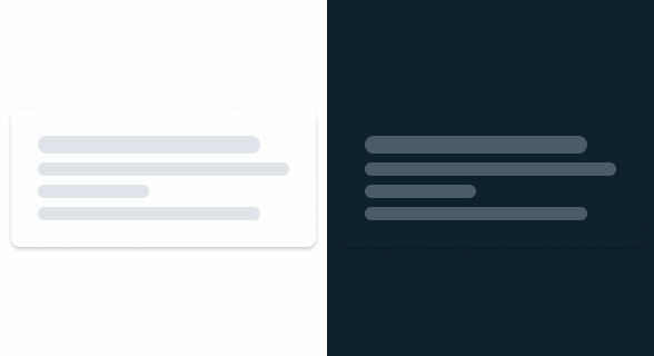
.animation-start-color: --grey-4 100%;
.animation-end-color: --grey-4 0%;Useful links

Consult our Figma file to access our assets and inspect them in dev mode.

This component is or will be provided by the Polygon framework. See its documentation to learn more.

This element is in line with the guidelines of the CDS (Cegid Design System). Find out more.
Usage
The primary goal of a Skeleton is to create the illusion that a certain page is loading faster. For this reason, it should only be used when loading times exceed 1 second.
It’s also important to know the type of content Skeletons are meant to convey. This allows for the display of a template representing what’s about to be loaded, providing users with an appropriate preview.
Also, most users don’t expect Skeletons to be extremely accurate. Additionally, they are displayed for a short period of time and, therefore, we do not recommend relying on or designing Skeletons that are too literal.

When creating skeletons using an interface as a reference, their appearance can be adjusted to suit different elements. For example, to represent spacious media items or Text Areas, more angular shapes should be used. On the other hand, when wanting to represent text, round shapes of different sizes are preferable.
Use Skeletons for isolated items that are loading. In these cases, consider components such as the Progress Circle or the Progress Bar.
Some elements, such as the Action Bar, will change depending on the content of the page. However, since they are usually isolated from most interface elements, they don’t need their own Skeleton, as this adds little to the user experience.
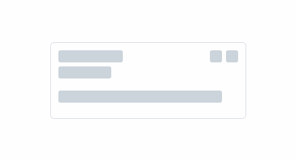
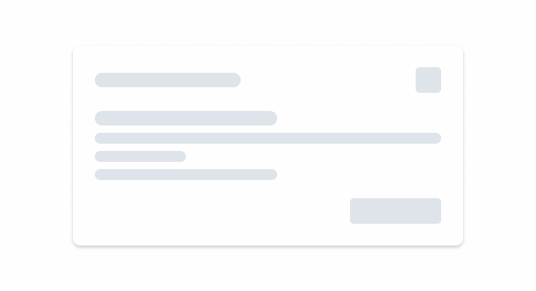
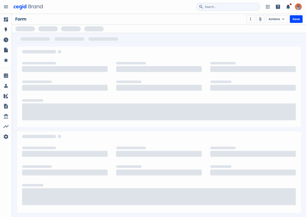
Templates
Skeletons are ideal for interfaces that have several repeating elements, such as Data Grids and Dashboards. Due to their frequent use in Cegid products, we have designed some templates that can be used in such cases, all available in Figma.
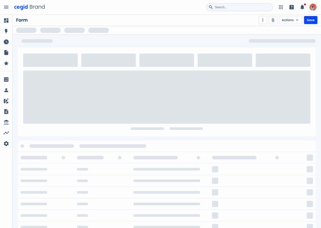
Form
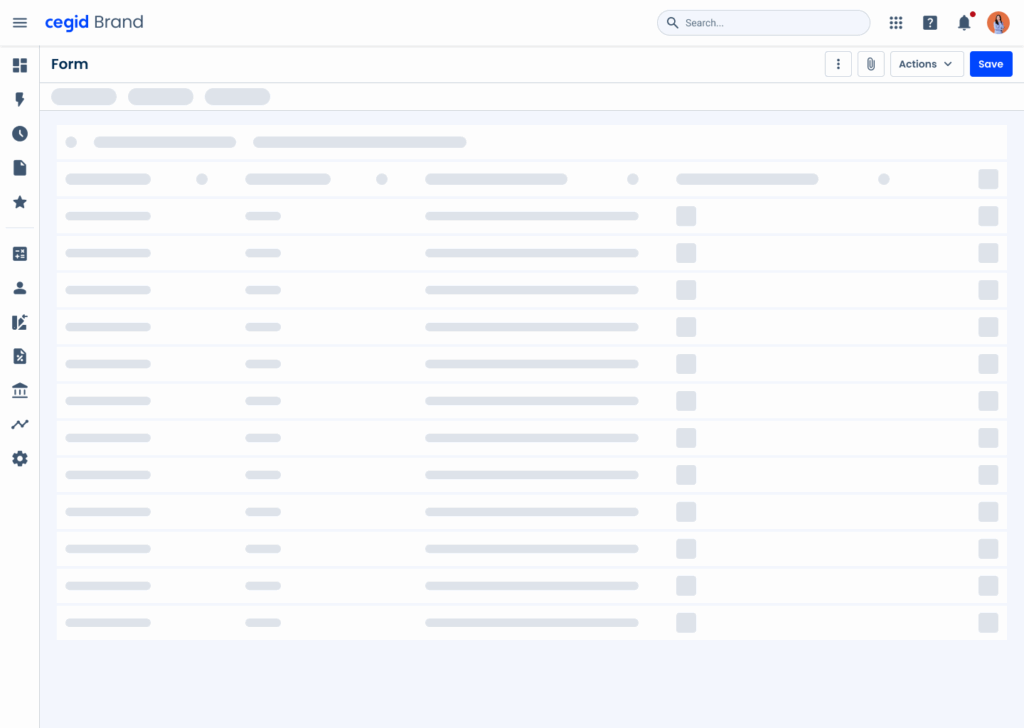
List

Dashboard
Data Grid
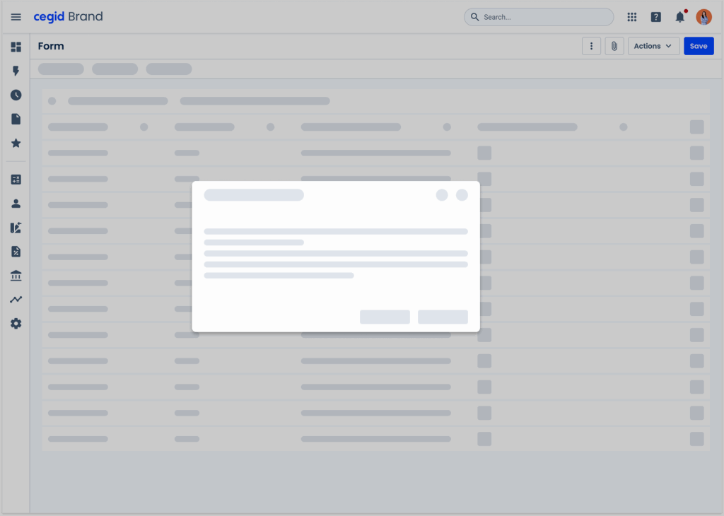
Modal
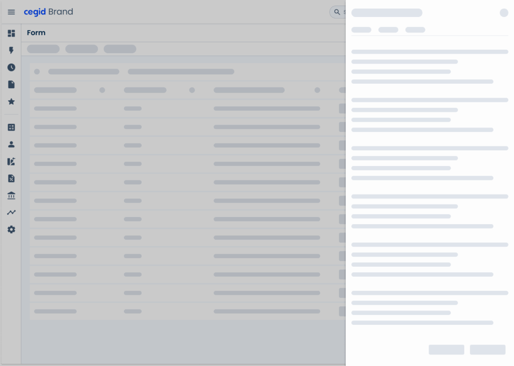
Flyout
Case Studies
Why Web Accessibility Matters – And How to Start
Writing for Everyone: Every Word Counts in Accessibility