
Shadows
Shadows give surfaces a sense of depth, direction and movement. This is determined by their elevation and relationship to other surfaces.

- Overview
- Specs
- Guidelines
The concept of elevation in design involves the apparent distance between an item and its backdrop, achieved through the manipulation of shadows and light.
Elevating UI elements serves to establish visual cues, enhance scannability, and communicate varying degrees of significance.
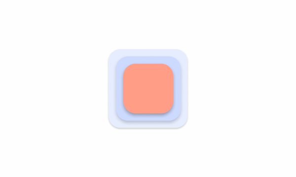
Shadow System
Since they are directly linked to the hierarchy of elements, these should be used consistently throughout the product according to their elevation when compared to other elements present in the interface.
With that in mind, we use our primary shadow as the main one, followed by the secondary, and only the tertiary in overlay or modal situations, for example. In summary, the primary is intended for surfaces closer to the plane and the tertiary for those farther away.

Types of Shadows
Components
We offer distinct shadows tailored to the components, with each type of component using one of our three shadow variants: primary, secondary, or tertiary.
Primary
Mainly used for widgets, header;

Light
X Axis = 0;
Y Axis = 2;
Blur Axis = 4;
Opacity = 20%;
Hex = #000000.

Dark
X Axis = 0;
Y Axis = 2;
Blur Axis = 4;
Opacity = 30%;
Hex = #000000.
Secondary
Mainly used for toasts, dropdowns;

Light
X Axis = 0;
Y Axis = 4;
Blur Axis = 8;
Opacity = 20%;
Hex = #000000.

Dark
X Axis = 0;
Y Axis = 4;
Blur Axis = 8;
Opacity = 30%;
Hex = #000000.
Tertiary
Mainly used for modals, FAB;

Light
X Axis = 0;
Y Axis = 4;
Blur Axis = 8;
Opacity = 30%;
Hex = #000000.

Dark
X Axis = 0;
Y Axis = 4;
Blur Axis = 8;
Opacity = 40%;
Hex = #000000.
Fixed Sides
There are also specific shadows for fixed areas or panels adjacent to another element. Depending on their position, a shadow projected for left, right, top, or bottom should be applied.
Left
Mainly used for sidebar;

Light
X Axis = 2;
Y Axis = 0;
Blur Axis = 4;
Opacity = 10%;
Hex = #000000.

Dark
X Axis = 2;
Y Axis = 0;
Blur Axis = 4;
Opacity = 20%;
Hex = #000000.
Bottom
Mainly used for fixed table bottom.

Light
X Axis = 0;
Y Axis = -2;
Blur Axis = 4;
Opacity = 10%;
Hex = #000000.

Dark
X Axis = 0;
Y Axis = -2;
Blur Axis = 4;
Opacity = 20%;
Hex = #000000.
Right
Mainly used for the notifications panel;

Light
X Axis = -2;
Y Axis = 0;
Blur Axis = 4;
Opacity = 10%;
Hex = #000000.

Dark
X Axis = -2;
Y Axis = 0;
Blur Axis = 4;
Opacity = 20%;
Hex = #000000.
Top
Mainly used for fixed table header;

Light
X Axis = 0;
Y Axis = 2;
Blur Axis = 4;
Opacity = 10%;
Hex = #000000.

Dark
X Axis = 0;
Y Axis = 2;
Blur Axis = 4;
Opacity = 20%;
Hex = #000000.
Last Update

- Added Guidelines tab;
- Added Polygon Framework variables;
Related
Components
Widgets & Headers
/* Light Theme */
.primary-shadow{
	box-shadow: 0px 2px 4px #00000033;
}

/* Dark Theme */
.primary-shadow{
	box-shadow: 0px 2px 4px #0000004D;
}
Toasts & Dropdowns
/* Light Theme */

.secondary-shadow{
	box-shadow: 0px 4px 8px #00000033;
}

/* Dark Theme */
.secondary-shadow{
	box-shadow: 0px 4px 8px #0000004D;
}
Modals & FAB
/* Light Theme */
.tertiary-shadow{
	box-shadow: 0px 4px 8px #0000004D;
}

/* Dark Theme */
.tertiary-shadow{
	box-shadow: 0px 4px 8px #00000066;
}
Fixed Sides
Sidebar
/* Light Theme */

.left-shadow{
	box-shadow: 2px 0px 4px #0000001A;
}

/* Dark Theme */
.left-shadow{
	box-shadow: 2px 0px 4px #00000033;
}
Notifications panel
/* Light Theme */
.right-shadow{
	box-shadow: -2px 0px 4px #0000001A;
}

/* Dark Theme */
.right-shadow{
	box-shadow: -2px 0px 4px #00000033;
}
Table Header fixed
/* Light Theme */
.top-shadow{
	box-shadow: 0px 2px 4px #0000001A;
}

/* Dark Theme */
.top-shadow{
	box-shadow: 0px 2px 4px #00000033;
}
Table Bottom fixed.
/* Light Theme */
.bottom-shadow{
	box-shadow: 0px -2px 4px #0000001A;
}

/* Dark Theme */
.bottom-shadow{
	box-shadow: 0px -2px 4px #00000033;
}
Useful links

Consult our Figma file to access our assets and inspect them in dev mode.

This component is or will be provided by the Polygon framework. See its documentation to learn more.

This element is in line with the guidelines of the CDS (Cegid Design System). Find out more.
Polygon FW
The following variables are from Polygon Framework. They are optimised to work from pixels to rem values and ordered from the larger to smaller sizes.
| Polygon Variable | Compose Design |
|---|---|
| $shadow-1 | var(–primary-shadow) |
| $shadow-2 | var(–secondary-shadow) |
| $shadow-3 | var(–tertiary-shadow) |
| $shadow-4 | var(–right-shadow) |
Discover all Polygon SCSS styles here.
Case Studies

Creating Context-Aware Notifications for a Better Experience

Read Mode: Making Content Feel Effortless and Understandable
