Icons
Icons are visual metaphors used to represent objects, actions or ideas.
- Overview
- Specs
- Guidelines
Overview
Icons serve as visual metaphors, representing actions, objects, or concepts in a simplified and universally recognizable way. They help users quickly understand the purpose or function of various elements within an interface, such as buttons, menus, or controls.
By leveraging familiar shapes and symbols, icons reduce cognitive load and make it easier for users to navigate complex interfaces. For example, a magnifying glass icon usually represents search functionality, while a gear icon is often associated with settings or preferences.
Beaterial is an iconic composition that establishes consistency and harmony in our products’ interface. While the Beat alludes to Compose Design’s rhythm and harmony, the Terial represents Google’s icon font, which is Cegid’s official icon font.
Last Update
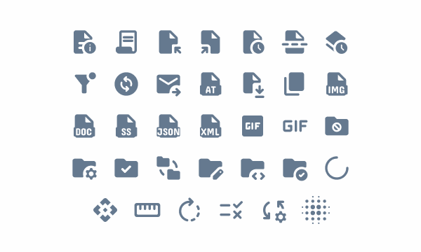
- Added add_comment icon;
- Unicodes reviewed for the icons: diamond, equipment, leaderboard, location_on, route, share_square, star_reset, sync and tools.
Related
Accent Icons
List
List of all available icons with their names and unicodes.
Use the search to find the icon you’re looking for. By right-clicking on the icon, you can download it as an svg.
Useful links

Consult our Figma file to access our assets and inspect them in dev mode.

This component is or will be provided by the Polygon framework. See its documentation to learn more.

This element is in line with the guidelines of the CDS (Cegid Design System). Find out more.
Design principles
Clarity
Clear icons are instantly recognizable, making it easier for users to understand their meaning without needing to read accompanying text. This enhances user experience by reducing cognitive load and speeding up interaction.


Consistency
Consistent icons create a predictable user experience. When users encounter familiar icons across different interfaces or applications, they can rely on their prior knowledge to understand the function or action associated with each icon. This reduces cognitive load and makes navigation more intuitive.


Icon Layout
Icon Baseline & Sizes
An icon baseline, in the context of design, refers to a horizontal guideline or imaginary line that defines the bottom alignment of icons within a set. It establishes a consistent visual reference point for the bottom edge of icons, ensuring that they appear aligned when displayed together.
In our design system, the available sizes are:
| Icon | Size |
|---|---|
| 12px | |
| 16px | |
| 20px | |
| 24px (baseline) | |
| 28px | |
| 32px | |
| 40px | |
| 48px | |
| 56px |
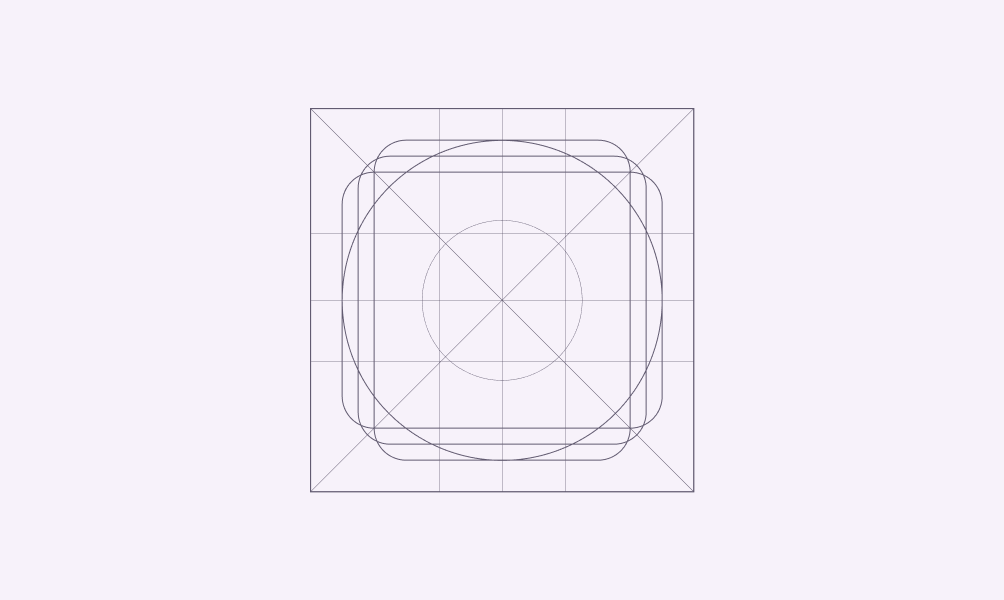
Icon grid and keyline
An icon grid and keyline are important aspects of icon design, particularly in digital and graphic design contexts. They help maintain consistency, alignment, and scalability within icon sets.
An icon grid is a structural framework used to organize and align icons within a design system. It consists of evenly spaced horizontal and vertical lines that define the boundaries and positioning of individual icons.
Keylines are typically used to ensure that icons maintain a consistent visual weight and shape across different sizes and resolutions. They help designers maintain clarity and readability, especially when icons are scaled down or displayed on lower-resolution screens.
