
Color
Colors infuse life and dynamism into interfaces, expressing emotions and setting the tone for communication.

- Overview
- Specs
- Guidelines
The color system was designed to bring clarity to interfaces and support information hierarchy. It consists of customizable colors for each product/platform and others that are consistent across the entire system.
The following concepts provide the foundation as we strive to achieve balance and harmony through our User Interface design.
Brand Colors
These are the default color variables we apply to components in our Design System. This color will be updated according to the product in which the component is used.
Primary
Theme colors are applied throughout the product, with the primary color being the main one used in screens and components. Variations enhance readability and distinction. There are seven theme colors, with Theme-100 being the primary. In the light theme, colors get lighter from Theme-Highlight to Theme-10. In the dark theme, colors get darker, with the highlight being the lightest.
Light Theme

Theme-Highlight
—-
#0038CC
rgb(0, 56, 204)

Theme-100
—
#0046FE
rgb(0, 70, 254)

Theme-80
—
#2E67FF
rgb(46, 103, 255)

Theme-60
—
#6690FF
rgb(102, 144, 255)

Theme-40
—-
#B3C8FF
rgb(179, 200, 255)

Theme-20
—
#CCDAFF
rgb(204, 218, 255)

Theme-10
—
#E5EDFF
rgb(229, 237, 255)
Dark Theme

Theme-Highlight
—-
#99AFEB
rgb(153, 175, 235)

Theme-100
—
#829DE6
rgb(130, 157, 230)

Theme-80
—
#6385E0
rgb(99, 133, 224)

Theme-60
—
#0038CC
rgb(0, 56, 204)

Theme-40
—-
#00278F
rgb(0, 39, 143)

Theme-20
—
#001C66
rgb(0, 28, 102)

Theme-10
—
#00113D
rgb(0, 17, 61)
Secondary
Secondary colors are used for accent icons and are less common in screens and system components. They come in seven variations, with Secondary-100 being the main one. In the light theme, Secondary-10 is the lightest, while Secondary-Highlight is darker. These colors are set by default for components in our Design System and will adjust based on the product context.
Light Theme

Secondary-Highlight
—-
#B43F24
rgb(180, 63, 36)

Secondary-100
—
#CC492A
rgb(204, 73, 42)

Secondary-80
—
#E6502C
rgb(230, 80, 44)

Secondary-60
—
#FF5C35
rgb(255, 92, 53)

Secondary-40
—-
#FF9D86
rgb(255, 157, 134)

Secondary-20
—
#FED6CC
rgb(255, 157, 134)

Secondary-10
—
#FCF7F6
rgb(252, 247, 246)
Dark Theme

Secondary-Highlight
—-
#FFBEAE
rgb(255, 190, 174)

Secondary-100
—
#FF9D86
rgb(255, 157, 134)

Secondary-80
—
#FF6C49
rgb(255, 108, 73)

Secondary-60
—
#FF5C35
rgb(255, 92, 53)

Secondary-40
—-
#B34025
rgb(179, 64, 37)

Secondary-20
—
#802E1A
rgb(128, 46, 26)

Secondary-10
—
#4D1C10
rgb(77, 28, 16)
Beware
Incorporate brand-specific hues strategically throughout different sections of the interface to enhance visual prominence and immerse users in unique product experiences. However, exercise restraint to avoid saturating the design with brand colors, particularly on large expanses, as this could obscure hierarchy and impede smooth navigation.

Use brand colors mainly to communicating important messages or actions.

Avoid using brand colors for decorative purposes.
Neutral Colors
These are the system’s default colors, which remain consistent across products and components to maintain group coherence and visual identity.
The neutral palette comprises black, white, and shades of gray, providing a fundamental backdrop for the interface.
These colors are applied to surfaces, text, and layout elements. Within components, they frequently signify a change of state.
Black and White
Black and white don’t change between light and dark themes..
They were created for specific situations where there is a desire to maintain white or black, regardless of the theme.
In the header search, the icon and the placeholder use white to ensure readability over the colors in the header group.
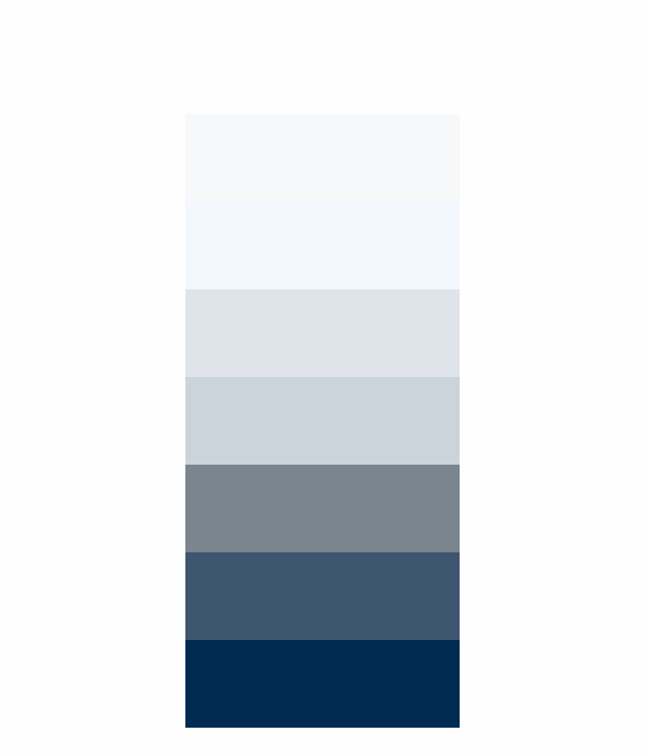
Greyscale
It consists of an eight-color scale, with variations between the light and dark themes. In the light theme, the scale ranges from lightest to darkest, while in the dark theme, the opposite occurs.
The color grey-3 in the dark theme is intentionally darker than grey-2 and grey-1 due to its specific use.
For more information on modifying it, please refer to Light vs Dark Theme
Light Theme

Grey-1
—-
#FEFEFE
rgb(254, 254, 254)

Grey-2
—
#F7F8F9
rgb(247, 248, 249)

Grey-3
—
#F3F7FE
rgb(243, 247, 254)

Grey-4
—
#DFE4EB
rgb(223, 228, 235)

Grey-5
—-
#CBD3DB
rgb(203, 211, 219)

Grey-6
—
#7A858D
rgb(122, 133, 141)

Grey-7
—
#5E7187
rgb(94, 113, 135)

Grey-8
—
#3F5670
rgb(63, 86, 112)

Grey-9
—
#002C52
rgb(0, 44, 82)
Dark Theme

Grey-1
—-
#0D212F
rgb(13, 33, 47)

Grey-2
—
#192C3A
rgb(25, 44, 58)

Grey-3
—
#001524
rgb(0, 21, 36)

Grey-4
—
#4C5B66
rgb(76, 91, 102)

Grey-5
—-
#5D6B74
rgb(93, 107, 116)

Grey-6
—
#7A858D
rgb(122, 133, 141)

Grey-7
—
#CDD2D4
rgb(205, 210, 212)

Grey-8
—
#F0F2F3
rgb(240, 242, 243)
States
State colors convey immediate information by leveraging real-world associations, such as red for danger, yellow for caution, and green for positive feedback. Consistent usage and pairing with other indicators reinforce these contexts, reducing cognitive load.
Info
States solely for information, novelty, or minimal impact.
Light Theme

Info-Highlight
—-
#003063
rgb(0, 48, 99)

Info-100
—
#004B98
rgb(0, 75, 152)

Info-80
—
#44A5FD
rgb(68, 165, 253)

Info-60
—
#71BBFD
rgb(113, 187, 253)

Info-40
—-
#9ED1FC
rgb(158, 209, 252)

Info-20
—
#C0E2FB
rgb(192, 226, 251)

Info-10
—
#E2F2FA
rgb(226, 242, 250)
Dark Theme

Info-Highlight
—-
#9FCBFF
rgb(159, 203, 255)

Info-100
—
#5FA8FF
rgb(95, 168, 255)

Info-80
—
#3E85D8
rgb(62, 133, 216)

Info-60
—
#2E6BB1
rgb(46, 107, 177)

Info-40
—-
#1F528A
rgb(31, 82, 138)

Info-20
—
#0F3863
rgb(15, 56, 99)

Info-10
—
#001F3C
rgb(0, 31, 60)
Error
Situations where critical errors or warnings are triggered.
Light Theme

Error-Highlight
—-
#710815
rgb(0, 48, 99)

Error-100
—
#B80D19
rgb(184, 13, 25)

Error-80
—
#DB3646
rgb(219, 54, 70)

Error-60
—
#F18894
rgb(241, 136, 148)

Error-40
—-
#F6B8BF
rgb(246, 184, 191)

Error-20
—
#F9CFD4
rgb(249, 207, 212)

Error-10
—
#FCE7EA
rgb(252, 231, 234)
Dark Theme

Error-Highlight
—-
#FF8C8C
rgb(255, 140, 140)

Error-100
—
#FF5E5E
rgb(255, 94, 94)

Error-80
—
#FF4646
rgb(255, 70, 70)

Error-60
—
#F32323
rgb(243, 35, 35)

Error-40
—-
#800D0F
rgb(128, 13, 15)

Error-20
—
#4B0305
rgb(75, 3, 5)

Error-10
—
#3C0001
rgb(60, 0, 1)
Warning
Intermediate states of validation or pending status.
Light Theme

Warning-Highlight
—-
#913300
rgb(145, 51, 0)

Warning-100
—
#B24F00
rgb(178, 79, 0)

Warning-80
—
#F8A326
rgb(248, 163, 38)

Warning-60
—
#FBC87D
rgb(251, 200, 125)

Warning-40
—-
#FDDFB3
rgb(253, 223, 179)

Warning-20
—
#FEEDD4
rgb(254, 237, 212)

Warning-10
—
#FEF6E9
rgb(254, 246, 233)
Dark Theme

Warning-Highlight
—-
#FAB875
rgb(250, 184, 117)

Warning-100
—
#F79530
rgb(247, 149, 48)

Warning-80
—
#D17214
rgb(209, 114, 20)

Warning-60
—
#AC5B0F
rgb(172, 91, 15)

Warning-40
—-
#88440A
rgb(136, 68, 10)

Warning-20
—
#632D05
rgb(99, 45, 5)

Warning-10
—
#3E1600
rgb(62, 22, 0)
Success
Used following the validation or completion of an action.
Light Theme

Success-Highlight
—-
#07422A
rgb(7, 66, 42)

Success-100
—
#0E5E3F
rgb(14, 94, 63)

Success-80
—
#397D62
rgb(57, 125, 98)

Success-60
—
#7CCFAE
rgb(124, 207, 174)

Success-40
—-
#97E8C7
rgb(151, 232, 199)

Success-20
—
#B2ECD3
rgb(178, 236, 211)

Success-10
—
#E5F7EE
rgb(229, 247, 238)
Dark Theme

Success-Highlight
—-
#91E7C4
rgb(145, 231, 196)

Success-100
—
#56DEAB
rgb(86, 222, 171)

Success-80
—
#24B780
rgb(36, 183, 128)

Success-60
—
#1FA371
rgb(31, 163, 113)

Success-40
—-
#1A5D42
rgb(26, 93, 66)

Success-20
—
#09492F
rgb(9, 73, 47)

Success-10
—
#002615
rgb(0, 38, 21)
Accent
This is the thematic set of colors to be used in categories and events as informative markers. These colors are optimized to work in light and dark themes. There is no distinction between themes to make it easier for the user to identify the type, regardless of the theme being used.
More colors may exist, if needed, to cover a broader range of content.

Tangerine
—-
#F4511E
rgb(244, 81, 30)

Pumpkin
—
#EF6C00
rgb(239, 108, 0)

Eucalyptus
—
#009688
rgb(0, 150, 136)

Grape
—
#8E24AA
rgb(142, 36, 170)

Citron
—-
#E4C441
rgb(228, 196, 65)

Cherry-Blossom
—
#D81B60
rgb(216, 27, 96)

Blueberry
—
#3F51B5
rgb(63, 81, 181)

Beetroot
—
#AD1457
rgb(173, 20, 87)

Basil
—-
#0B8043
rgb(11, 128, 67)

Avocado
—
#C0CA33
rgb(192, 202, 51)

Lavender
—
#828BC2
rgb(130, 139, 194)
Charts
This is the thematic set of colors to be used in charts. These colors are optimized to work in light and dark themes. There is no distinction between themes to make it easier for the user to identify the type, regardless of the theme being used. In the other hand a colorful version is available.
Main
Chart 1 – 4 data

Chart-2
—-
#4372D3
rgb(67, 114, 211)

Chart-5
—
#9EACE2
rgb(158, 172, 226)

Chart-10
—
#F3D497
rgb(243, 212, 151)

Chart-11
—
#EBBB4A
rgb(235, 187, 74)
Chart 5 – 8 data

Chart-1
—-
#1C4EB7
rgb(28, 78, 183)
Chart-2
—
#4372D3
rgb(67, 114, 211)
Chart-5
—
#9EACE2
rgb(158, 172, 226)

Chart-6
—
#C6CCE8
rgb(198, 204, 232)

Chart-8
—-
#FAEDD7
rgb(250, 237, 215)
Chart-10
—
#F3D497
rgb(243, 212, 151)
Chart-11
—
#EBBB4A
rgb(235, 187, 74)

Chart-13
—
#DDA82D
rgb(221, 168, 45)
Chart 9 – 13 data
Chart-1
—-
#1C4EB7
rgb(28, 78, 183)
Chart-2
—
#4372D3
rgb(67, 114, 211)

Chart-3
—
#6690E6
rgb(102, 144, 230)

Chart-4
—
#8BA1E6
rgb(139, 161, 230)
Chart-5
—-
#9EACE2
rgb(158, 172, 226)
Chart-6
—
#C6CCE8
rgb(198, 204, 232)

Chart-7
—
#EFEFEF
rgb(239, 239, 239)
Chart-8
—
#FAEDD7
rgb(250, 237, 215)

Chart-9
—-
#F8E1B9
rgb(248, 225, 185)
Chart-10
—
#F3D497
rgb(243, 212, 151)
Chart-11
—
#EBBB4A
rgb(235, 187, 74)

Chart-12
—
#E2B243
rgb(226, 178, 67)
Chart-13
—-
#DDA82D
rgb(221, 168, 45)
Colorful
Chart 1 – 4 data

Chart-2
—-
#598EF8
rgb(89, 142, 248)

Chart-5
—
#A378F8
rgb(163, 120, 248)

Chart-10
—
#F3D497
rgb(255, 92, 53)

Chart-11
—
#FE8E49
rgb(254, 142, 73)
Chart 5 – 8 data

Chart-1
—-
#0046FE
rgb(0, 70, 254)

Chart-2
—
#598EF8
rgb(89, 142, 248)

Chart-5
—
#A378F8
rgb(163, 120, 248)

Chart-6
—
#6F43C0
rgb(111, 67, 192)

Chart-8
—-
#E61A61
rgb(230, 26, 97)

Chart-10
—
#F3D497
rgb(255, 92, 53)

Chart-11
—
#FE8E49
rgb(254, 142, 73)

Chart-13
—
#FFE081
rgb(255, 224, 129)
Chart 9 – 13 data

Chart-1
—-
#0046FE
rgb(0, 70, 254)

Chart-2
—
#598EF8
rgb(89, 142, 248)

Chart-3
—
#7FADF0
rgb(127, 173, 240)

Chart-4
—
#B1C5FF
rgb(177, 197, 255)

Chart-5
—-
#A378F8
rgb(163, 120, 248)

Chart-6
—
#6F43C0
rgb(111, 67, 192)

Chart-7
—
#BC004B
rgb(188, 0, 75)

Chart-8
—
#E61A61
rgb(230, 26, 97)

Chart-9
—-
#FF4E7C
rgb(255, 78, 124)

Chart-10
—
#FF5C35
rgb(255, 92, 53)

Chart-11
—
#FE8E49
rgb(254, 142, 73)

Chart-12
—
#FEC55C
rgb(254, 197, 92)

Chart-13
—-
#FFE081
rgb(255, 224, 129)
Last Update

- New variation on the grey scale: the new grey-7;
- Grey-7 and grey-8 have changed to grey-8 and grey-9, respectively.
Related
Token names
For easy identification, token names inherently convey their purpose, aiding in their correct application. The initial segment of a token name indicates the designated theme for the UI element, such as –Light-Mode or –Dark-Mode. The subsequent segment denotes its distinct color role within the element group, such as GreyScale or Theme. Furthermore, tokens conclude with a state specification to define the desired color grade, such as grey-7 or Theme-40.

Usage
In the –theme map, each key denotes a color group, also known as a swatch. The value of each entry is a Map that includes color grades as keys along with their respective hexadecimal codes. For example:
Primary
/* Light Theme: */
--theme-highlight:#0038CC;
--theme-100: #0046FE;
--theme-80: #2E67FF;
--theme-60: #6690FF;
--theme-40: #B3C8FF;
--theme-20: #CCDAFF;
--theme-10: #E5EDFF;

/* Dark Theme: */
--theme-highlight: #99AFEB;
--theme-100: #829DE6;
--theme-80: #6385E0;
--theme-60: #0038CC;
--theme-40: #00278F;
--theme-20: #001C66;
--theme-10: #00113D;
Secondary
/* Light Theme: */
--secondary-highlight: #B43F24;
--secondary-100: #CC492A;
--secondary-80: #E6502C;
--secondary-60: #FF5C35;
--secondary-40: #FF9D86;
--secondary-20: #FED6CC;
--secondary-10: #FCF7F6;

/* Dark Theme: */
--secondary-highlight:#FFBEAE;
--secondary-100: #FF9D86;
--secondary-80: #FF6C49;
--secondary-60: #FF5C35;
--secondary-40: #B34025;
--secondary-20: #802E1A;
--secondary-10: #4D1C10;
Neutral Colors
/* Light Theme: */
--grey-1: #FEFEFE;
--grey-2: #F7F8F9;
--grey-3: #F3F7FE;
--grey-4: #DFE4EB;
--grey-5: #CBD3DB;
--grey-6: #7A858D;
--grey-7: #5E7187;
--grey-8: #3F5670;
--grey-9: #002C52;

/* Dark Theme: */
--grey-1: #0D212F;
--grey-2: #192C3A;
--grey-3: #001524;
--grey-4: #4C5B66;
--grey-5: #5D6B74;
--grey-6: #7A858D;
--grey-7: #A9B4B8;
--grey-8: #CDD2D4;
--grey-9: #F0F2F3;
States
/* Light Theme: */

--info-highlight: #003063;
--info-100: #004B98;
--info-80: #44A5FD;
--info-60: #71BBFD;
--info-40: #9ED1FC;
--info-20: #C0E2FB;
--info-10: #E2F2FA;

--error-highlight: #710815;
--error-100: #B80D19;
--error-80: #DB3646;
--error-60: #F18894;
--error-40: #F6B8BF;
--error-20: #F9CFD4;
--error-10: #FCE7EA;

--warning-highlight: #913300;
--warning-100: #B24F00;
--warning-80: #F8A326;
--warning-60: #FBC87D;
--warning-40: #FDDFB3;
--warning-20: #FEEDD4;
--warning-10: #FEF6E9;

--success-highlight: #07422A;
--success-100: #0E5E3F;
--success-80: #397D62;
--success-60: #7CCFAE;
--success-40: #97E8C7;
--success-20: #B2ECD3;
--success-10: #E5F7EE;

/* Dark Theme: */

--info-highlight: #9FCBFF;
--info-100: #5FA8FF;
--info-80: #3E85D8;
--info-60: #2E6BB1;
--info-40: #1F528A;
--info-20: #0F3863;
--info-10: #001F3C;

--error-highlight: #FF8C8C;
--error-100: #FF5E5E;
--error-80: #FF4646;
--error-60: #F32323;
--error-40: #800D0F;
--error-20: #4B0305;
--error-10: #3C0001;

--warning-highlight: #FAB875;
--warning-100: #F79530;
--warning-80: #D17214;
--warning-60: #AC5B0F;
--warning-40: #88440A;
--warning-20: #632D05;
--warning-10: #3E1600;

--success-highlight: #91E7C4;
--success-100: #56DEAB;
--success-80: #24B780;
--success-60: #1FA371;
--success-40: #1A5D42;
--success-20: #09492F;
--success-10: #002615;
Charts
/* Main: */

--chart-1: #1C4EB7;
--chart-2: #4372D3;
--chart-3: #6690E6;
--chart-4: #8BA1E6;
--chart-5: #9EACE2;
--chart-6: #C6CCE8;
--chart-7: #EFEFEF;
--chart-8: #FAEDD7;
--chart-9: #F8E1B9;
--chart-10: #F3D497;
--chart-11: #EBBB4A;
--chart-12: #E2B243;
--chart-13: #DDA82D;

/* Colorful: */

--chart-1: #0046FE;
--chart-2: #598EF8;
--chart-3: #7FADF0;
--chart-4: #B1C5FF;
--chart-5: #A378F8;
--chart-6: #6F43C0;
--chart-7: #BC004B;
--chart-8: #E61A61;
--chart-9: #FF4E7C;
--chart-10: #FF5C35;
--chart-11: #FE8E49;
--chart-12: #FEC55C;
--chart-13: #FFE081;
Accent Colors
--avocado: #C0CA33;
--basil: #0B8043;
--beetroot: #AD1457;
--blueberry: #3F51B5;
--cherry-blossom: #D81B60;
--citron: #E4C441;
--grape: #8E24AA;
--eucalyptus: #009688;
--pumpkin: #EF6C00;
--tangerine: #F4511E;
--banana: #F6BF26;
--lavender: #828BC2;
Useful links

Consult our Figma file to access our assets and inspect them in dev mode.

This component is or will be provided by the Polygon framework. See its documentation to learn more.

This element is in line with the guidelines of the CDS (Cegid Design System). Find out more.
Accessibility
Implementing intricate color relationships can pose a challenge.
Presented here are various methods and techniques to assist in addressing your product’s color and theming requirements.
The background and text should at least pass the AA contrast for large text in buttons and status indicators (3:1 contrast rate)
Make sure text contrasts well with background colors. Prioritize light colors to be the background and darker colors as text.
Avoid placing low-contrast colors on interactive elements like buttons, especially for important actions.
Color Roles
Color roles describe the intention behind the color. For example, color roles are applied to buttons to differentiate between primary, secondary, warning, or dangerous actions.
| Role | Description |
|---|---|
 | Use for primary actions or elements that communicate the CEGID brand. |
 | Use for accent icons primarely . |
 | Use for informative UI, such as an information icon, or UI that communicates something is in progress. |
 | Use to communicate a favorable outcome, such as a success message. |
 | Use for UI that communicates caution to prevent a mistake or error from occurring. |
 | Use for UI that communicates danger or serious error states. |
 | Use for section and component backgrounds. |
 | Use for highlights, animations, and states. |
 | Use for main page or area backgrounds. |
 | Use for disable elements with fill color. |
 | Use for borders, dividers and states. |
 | Use for low-importance content or disabled elements. |
 | Use for placeholder text in input fields. |
 | Use for secondary and larger-scale content. |
 | Use for important titles and labels. |
Incorporate neutral colors like white, gray, and black help balance more vivid hues. This helps to create a visual hierarchy.
Limit your use of accent colors to keep the interface clean. Too many attention-grabbing colors can overwhelm the user.
Color Layering
Our products are ready to switch between light and dark themes almost instantly. We maintain the same variable name but retrieve its value from another stylesheet.
All color variables, with the exception of the Accent group, are optimized to work in the dark theme. When designing new components or elements, it’s necessary to validate colors for both themes.
Components

Grey-1 dropdown on a Grey-3 background.

Avoid use of midtones.
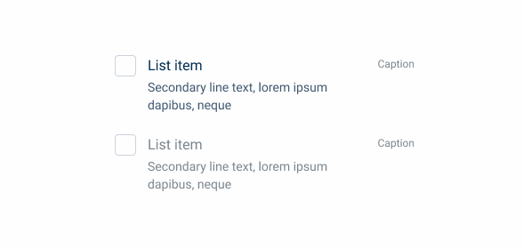
Labels
Using different colors to prioritize information:
- grey-9: Headings or highly relevant content;
- grey-8: Descriptions or larger blocks of text;
- grey-7: Placeholder text;
- grey-6: Disabled elements;
- theme-100; state-100: Annotations, links, and highlights.

Use the correct colors to create an hierarchy.

Avoid using the same color for types of information with different levels of importance.

Using text on backgrounds darker than grey-3 may compromise readability. We advise against using greys darker than grey-7 for text on backgrounds darker than grey-3.
Backgrounds
Utilize grey-3 for large-scale backgrounds (e.g., page) and grey-1 for widget or section backgrounds. Apply a drop shadow to enhance the legibility of section boundaries.
Use grey-4 border as an alternative to the drop shadow mentioned in the previous example. This border should be used as a secondary option and for smaller sections or within others.

Grey-1 widget section on a Grey-3 background.

Using a grey-6 background over a grey-4 background compromises the readability of the text content within the section and diminishes the clear distinction between light and dark themes.
Disabled State
The disabled state is used in a large number of our components and patterns. It is important for users to know that they cannot interact with a certain item to avoid frustration, and this is done mainly by changing its colors.
We have established rules to ensure that the colors of the disabled state remain consistent throughout our design system.
Main Content
Text, icons and other key elements should all be represented in Grey 6. This is the main color used in disabled items and is present in all of them.
Secondary Content
Button backgrounds and decorative elements, such as borders, should use Grey 4.
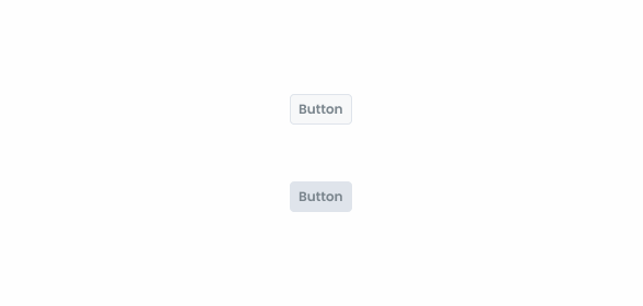
Backgrounds
By default, disabled items should use Grey 1 as their background. Components with borders use Grey 2 instead.
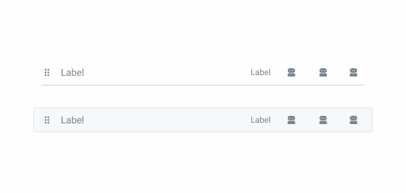
Selected Components
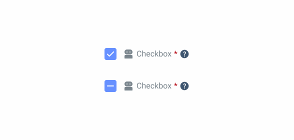
Some components, such as the checkbox, can be disabled when selected. It is important that this information is conveyed to users, which can be difficult using exclusively greyscale tones. In these cases, use Theme 60 and Theme 20.
Nested Components
Some patterns that can be disabled contain components that cannot. In these cases, the component must keep their original appearance.
Polygon FW
The following variables are from the Polygon Framework. On the table, there’s an example of each color group, for the rest just change the value (e.g. $theme-80: var(–theme-80)).
| Polygon Variable SCSS | Compose Design CSS |
|---|---|
| $theme-100 | var(–theme-100) |
| $secondary-100 | var(–secondary-100) |
| $grey-1 | var(–grey-1) |
| $info-100 | var(–info-100) |
| $error-100 | var(–error-100) |
| $warning-100 | var(–warning-100) |
| $success-100 | var(–success-100) |
| $avocado-accent | var(–avocado) |
| $chart-1 | var(–chart-1) |
Discover all Polygon SCSS styles here.
Case Studies
Usage of notification types within a product