Accent Icons
Accent Icons in UX serve as graphical representations of concepts, actions, or objects, enhancing user understanding and interaction within digital interfaces.
- Overview
- Specs
- Guidelines
Overview
Accent icons are graphical elements used in user interface design to draw attention to specific actions, features, or information within a digital interface. They typically feature distinctive visual characteristics such as color, size, or styling to differentiate them from other icons and elements, helping users quickly identify and interact with important components.
These icons serve as focal points that guide user attention, highlight key functionalities, and enhance overall usability and engagement within the interface. In our use case, the accent icons serve to represent empty states.
View all available accent icons at Specs tab.
Last Update


- Updated naming to snake_case;
Library
Useful links

Consult our Figma file to access our assets and inspect them in dev mode.

This component is or will be provided by the Polygon framework. See its documentation to learn more.

This element is in line with the guidelines of the CDS (Cegid Design System). Find out more.
Design principles
Size & Shape
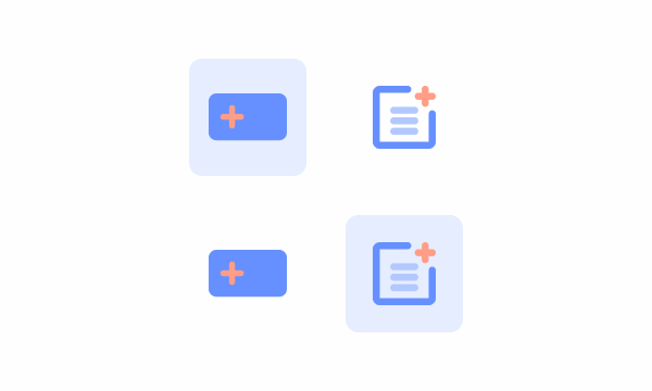
The base size of the Accent icons is 144x144px, having an additional 18px padding to the background shape, which has a base size of 108x108px.
The background shape can be either visible or not, depending on the applied color. In Grey-1 (#FEFEFE) backgrounds, the background shape is visible, on the other hand on Grey-3 (#F3F7FE) backgrounds, the background shape is not visible, only the accent icon on itself.
Icon Layout
Icon Baseline
An icon baseline, in the context of design, refers to a horizontal guideline or imaginary line that defines the bottom alignment of icons within a set. It establishes a consistent visual reference point for the bottom edge of icons, ensuring that they appear aligned when displayed together.
In the Accent Icons, the icon baseline is 72px, to maintain the ratio between all accent icons.


