
Tree View
A Tree View is a hierarchical structure that visually represents the relationship between levels and sub-levels.

- Overview
- Specs
- Guidelines
Component
A Tree View component is a hierarchical navigation interface commonly used to display and interact with structured data in a nested, tree-like format.
Visually, a Tree View typically consists of a vertical list of expandable/collapsible nodes, where each node represents a parent item that may contain one or more child items.
Users can interact with the nodes by expanding or collapsing them to reveal or hide their child nodes, enabling them to navigate through multiple levels of data hierarchy.
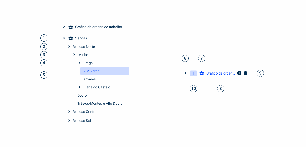
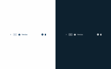
- 1: First Level Entry
- 2: Second Level Entry
- 3: Third Level Entry
- 4: Forth Level Entry
- 5: Fifth Level Entry
- 6: Expand/Collapse Icon
- 7: Node Icon
- 8: Label
- 9: Advanced Interactions
- 10: Tag
Used for:
Hierarchical Data
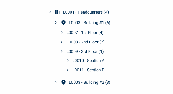
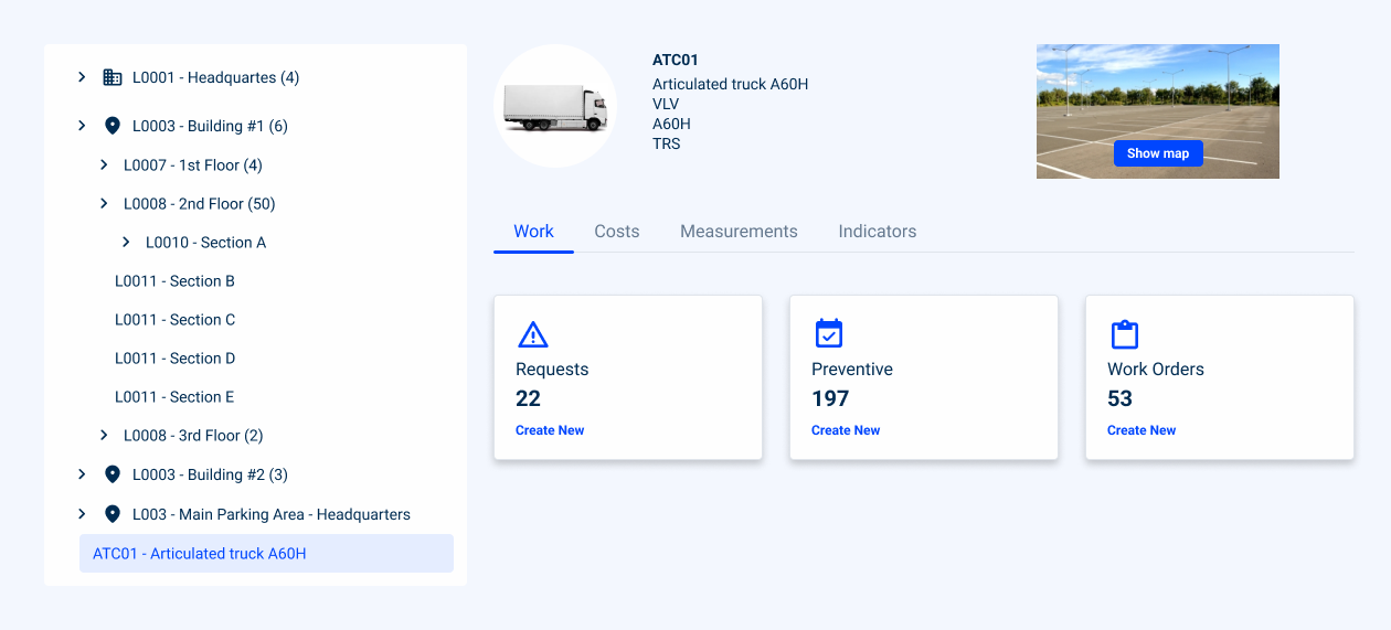
When your application needs to display data with hierarchical relationships, such as file directories, organizational structures, a Tree View provides a clear and intuitive way to visualize and navigate through the data.
Multi-Level Navigation
Tree Views are ideal for representing data with multiple levels of depth. They allow users to expand and collapse nodes to drill down into subcategories or navigate back to higher-level parent nodes. To ensure clarity, icons are displayed only at the first two levels of the hierarchy. Deeper levels remain text-based to avoid visual clutter.
Customization
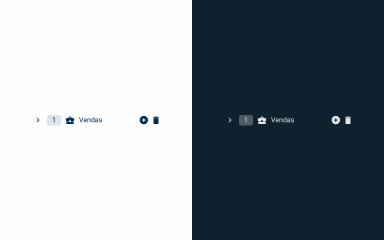
Tree Views can be customized to match the visual style and branding of your application, with options to customize node appearance, icons, tooltips, and contextual actions.
Visual Hierarchy
Tree Views visually represent the hierarchy of data, making it easy for users to understand the relationships between different levels of information and providing a clear overview of the overall structure of the dataset.
Don’t use for:
Flat data structures
If your dataset has a flat or shallow structure with no meaningful hierarchical relationships, using a Tree View may introduce unnecessary complexity.
Complexity overload
In some cases, presenting data in a hierarchical format may overwhelm users, especially if the hierarchy is deep or complex. If users struggle to understand or navigate the data hierarchy effectively, consider simplifying the presentation.
Performance concerns
Tree Views can impose performance overhead, particularly when dealing with large datasets or complex interactions. If performance is a critical concern, consider using a load more button for incremental data addition.
Demo
Access the Figma file and inspect the element using Dev Mode.

Last Update


- Added sizes;
- Updated selected and hover selected states;
- Added guidelines for horizontal scroll;
- Added load more guidelines.
Variations

Tree View Item
Enabled
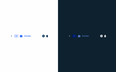
.enabled {n colapse-icon: var(u002du002dgrey-9);n tag-background: var(u002du002dgrey-4);n tag-text: var(u002du002dgrey-9);n icon: var(u002du002dgrey-9);n text: var(u002du002dgrey-9);n}Hover
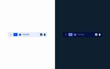
.hover {n colapse-icon: var(u002du002dgrey-9);n tag-background: var(u002du002dtheme-20);n tag-text: var(u002du002dtheme-100);n icon: var(u002du002dtheme-100);n text: var(u002du002dtheme-100);n}Selected
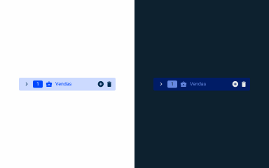
.selected {
  background: var(--theme-10);
  colapse-icon: var(--grey-9);
  tag-background: var(--theme-100);
  tag-text: var(--grey-1);
  icon: var(--theme-100);
  text: var(--theme-100);
}
Hover Selected
.hoverSelected {
  background: var(--theme-20);
  colapse-icon: var(--grey-9);
  tag-background: var(--theme-100);
  tag-text: var(--grey-1);
  icon: var(--theme-100);
  text: var(--theme-100);
}
Advanced Interactions
Enabled

.enabled {n .delete-icon {n icon: delete;n size: 16px;n color: var(u002du002dgrey-9);n }n .add-icon {n icon: add_circle;n size: 16px;n color: var(u002du002dgrey-9);n }n}Hover

.hover {n .delete-icon {n icon: delete;n size: 16px;n color: var(u002du002dtheme-100);n tooltip-background: var(u002du002dgrey-9);n tooltip-text: var(u002du002dgrey-1);n }n .add-icon {n icon: add_circle;n size: 16px;n color: var(u002du002dtheme-100);n tooltip-background: var(u002du002dgrey-9);n tooltip-text: var(u002du002dgrey-1);n }n}Pressed

.pressed {
  .delete-icon {
    icon: delete;
    size: 16px;
    color: var(--theme-100);
  }
  .add-icon {
    icon: add_circle;
    size: 16px;
    color: var(--theme-100);
  }
}
Size
Large
.large {
  height: 40px;
  padding: var(--spacing-8, --spacing-8, --spacing-8, --spacing-12);
  icon: 24px;
  tag: 24px;
}
Regular

.regular {
  height: 36px;
  padding: var(--spacing-8, --spacing-8, --spacing-8, --spacing-12);
  icon: 20px;
  tag: 20px;
}
Small
.small {
  height: 34px;
  padding: var(--spacing-8, --spacing-8, --spacing-8, --spacing-12);
  icon: 16px;
  tag: 16px;
}
Useful links

Consult our Figma file to access our assets and inspect them in dev mode.

This component is or will be provided by the Polygon framework. See its documentation to learn more.

This element is in line with the guidelines of the CDS (Cegid Design System). Find out more.
Behavior
Positioning and Sizing
The Tree View should not take up more than one third of the screen width.
As for the height, if the available size is not sufficient, a scroll is applied to the component.
By default, the sub-levels are individually closed and opened and the Tree View can be closed completely.

Avoid using icons from the third level onwards.

Use the same icons for menus that represent different things.

Use icons up to the second level.
Trigger the Tree View
When the user has not yet created any nodes in the tree, it is important to provide a starting point. We suggest displaying a button, for example Create Menu, above the Tree View. This button allows the user to create the first node, working in the same way as the creation buttons available on each node in the tree.
However, there may be scenarios where the tree can be triggered in some other way, such as a button on the action bar.

Scalability
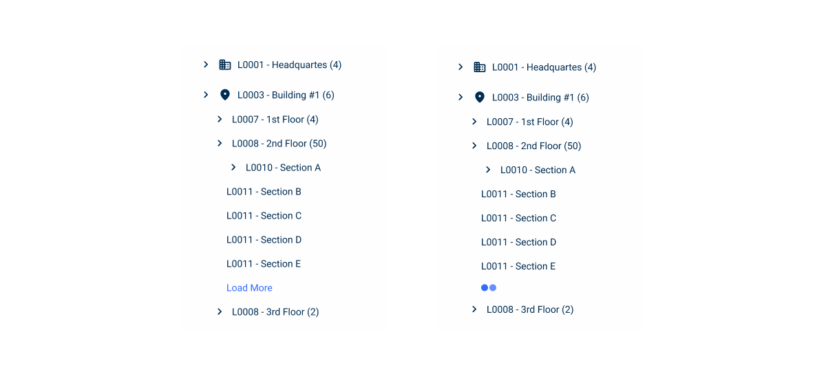
Load More
When a Tree View node contains a large number of sub-nodes, it is recommended to use the Load More Button to display the remaining elements. This approach allows the user to load content gradually, only when necessary, avoiding visual overload and keeping navigation more fluid.
This button should be displayed at the end of the list of sub-nodes currently available, clearly indicating that there are more elements to load. As the user interacts, new sub-nodes are loaded and added to the hierarchy in a continuous and natural way.
Horizontal Scroll
Horizontal scrolling allows lateral navigation through content that extends beyond the width of the container.
When using this pattern, it’s important to consider a few aspects to ensure a good user experience:
- Selected state: this should occupy the entire width of the container so that the user maintains visual context when scrolling horizontally;
- Actions next to the label: the actions associated with the node should be placed next to the label, so that the user does not have to scroll the entire width of the container to access them.

Expand Lines
Expand lines are visual elements used to improve readability by helping to easily identify the level of each node in the hierarchy. They act as visual guides that help users maintain context, especially in deep structures.
These lines are optional, but particularly useful in multi-level trees, as they provide a clearer structure and improve navigation. They should be considered in complex hierarchies, where they can significantly enhance readability and overall user experience.

Case Studies

Read Mode: Making Content Feel Effortless and Understandable

A Visual Recap of 2025: how we enhanced chatbot communication