
Top App Bar
The Top App Bar is a mobile component meant to help with navigation, as well as providing quick access to important actions.
Overview
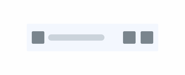
Similar to the Desktop Page Title and Top Bar components, the Top App Bar is an element placed at the top of an interface, providing users information about the page they are currently on, as well as navigation buttons and other relevant actions.

1: Button Icon with navigation-related action;
2: Page Title
3: Actions
4: Avatar
5: Subtitle
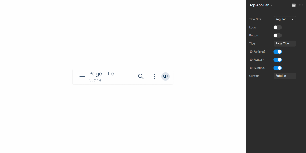
Demo
Access the Figma file and inspect element using Dev Mode.
Guidelines
Behavior
The Top App Bar takes up a considerable amount of space on an interface. If you want to increase the space available for other items, consider hiding it when users scroll, as show in the example below. It should reappear whenever users scroll in the opposite direction.

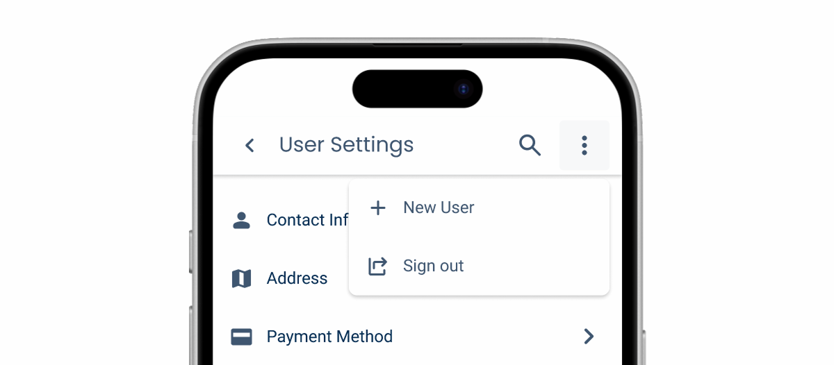
Actions
Although its primary purpose is to help with navigation, the Top App Bar’s ability to contain actions makes it very flexible. It is therefore important to bear in mind that space is limited on mobile interfaces, so placing too many actions can have a negative impact, making the interface cluttered or cropping the page title too soon.
When you need to add more than three actions to the Top App Bar, consider using a Menu, as shown in the example below.
Place actions in the Top App Bar as your first resort. The top area of the screen is hard to reach without straining the thumb. This can also create visual imbalance, as the upper area is saturated with elements.

Use the Button Icon on the left to help with navigation.
Last Update
- Added component to Design System.