
Tooltip
Tooltips are used to provide additional information about elements or functionalities on a page.

- Overview
- Specs
- Guidelines
Component
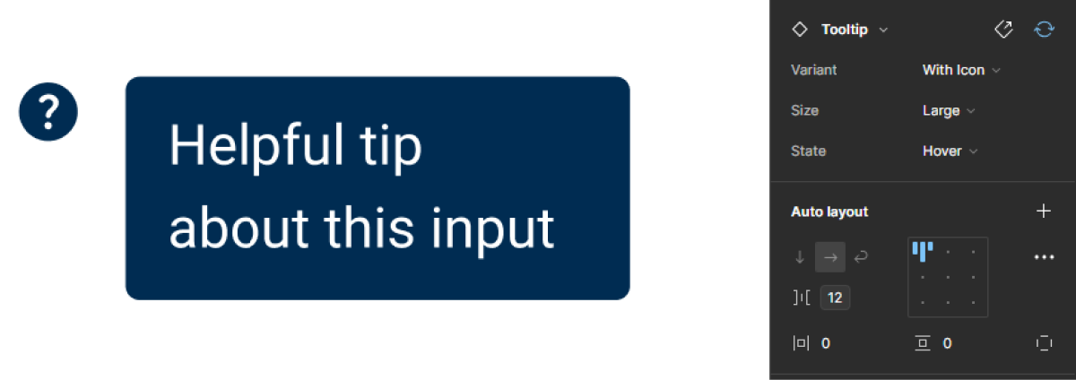
Tooltips show details about an interface element (text, button or image) and are visible in the Hover state of that element (applicable on desktop).
Tooltips contain short, very specific information describing the functionality of the UI element to which they belong. They can be positioned at the top, bottom, left or right of the element in question.

A: With Icon Variation
B: Only Tooltip Variation
1: Icon
2: Tooltip Description

Used for:
Hover
When some labels need additional context, a Tooltip can be used to give a more precise explanation ;
Trimming
As some buttons labels can exceed the max width defined by the design system, a tooltip is used to show the entire label;
Only icon
For components that only use icons, a Tooltip can be required to explain the context of the assigned action ;
Abbreviated labels
In cases where certain labels are abbreviated, the use of Tooltips is primordial, as they will give the extra context for the user;
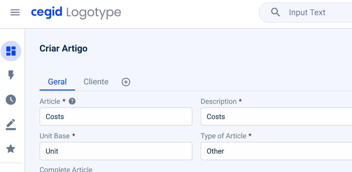
Error information
To warn users and prevent them from making an error on a form again, and especially in a text-field, a Tooltip is displayed when hovering over the warning icon to explain the error made;
Don’t use for:
Important messages
For important messages or messages that are of imperative reading, consider using Inline messages;
Mobile devices
On touch based devices, such as smartphones or tablets with no hover capability, Tooltips may not be accessible or practical for the users;
User interruption
Unexpectedly or intrusively, they can interrupt users’ workflow and impede task completion, leading to frustration;
Overuse
When Tooltips are excessively used or used for every element in the interface, they can overwhelm users with information and diminish their effectiveness.

Demo
Access the Figma file and inspect the element using Dev Mode.
Last Update


- Updated typography;
- Updated state color variables;
Related
Variations

With Icon
Enabled

.enabled {
  icon-color: var(--grey-8);
}
Hover

.hover {
  icon-color: var(--grey-9);
  background-color: var(--grey-9);
  label-color: var(--grey-1);
}
Tooltip Only
Enabled

.enabled {
  background-color: var(--grey-9);
  label-color: var(--grey-1);
}
Size
Small

.small {
  gap: var(--spacing-8);
  icon: 12px;
  tooltip-padding: var(--spacing-4, --spacing-8);
  tooltip-radius: var(--x-small-radius);
  label: var(--Others-caption);
}
Regular

.regular {
  gap: var(--spacing-8);
  icon: 16px;
  tooltip-padding: var(--spacing-4, --spacing-8);
  tooltip-radius: var(--x-small-radius);
  label: var(--label-regular);
}
Large

.large {
  gap: var(--spacing-12);
  icon: 20px;
  tooltip-padding: var(--spacing-8, --spacing-12);
  tooltip-radius: var(--x-small-radius);
  label: var(--label-large);
}
Useful links

Consult our Figma file to access our assets and inspect them in dev mode.

This component is or will be provided by the Polygon framework. See its documentation to learn more.

This element is in line with the guidelines of the CDS (Cegid Design System). Find out more.
Behavior
Icon assigned
The icon assigned should always be the same, so the user can more easily identify the icon and its use, without needing to understand it beforehand, which is why the icon used is a question mark.
Text Overflow
When the label is too long for the available space, the text will wrap up to another line. This overflow is done to facilitate readability for the user, while respecting the different rules for unjustified text.
The description should be brief and to the point.
Tooltips should not contain redundant information.
The text should always be a Wildcard to allow the different teams to adapt the text.
Case Studies

Handling Background Tasks

Read Mode: Making Content Feel Effortless and Understandable
