
Toast
Quick, small notifications that appear in the top right corner of the page. These notifications can automatically disappear after five seconds, or be dismissed by the user.

- Overview
- Specs
- Guidelines
- Mobile
Component
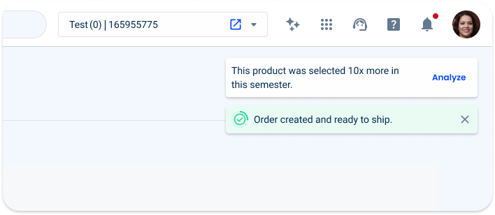
Toasts are messages that provide short, temporary information to the user, giving feedback on an action taken. They inform users of a process that an app has performed or will perform.
This format is characterized by quick, short messages that slide across the top right of the page.
There are two main variations of this component:
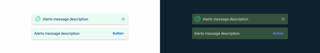
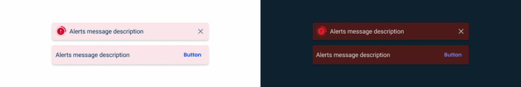
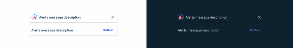
- Closable: the toast disappears at the end of the timer or when the user clicks on the close button;
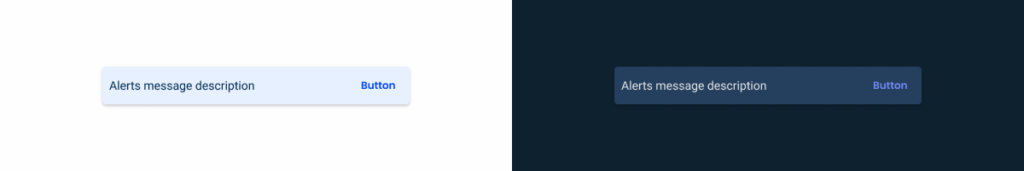
- With action: it has a button, but the button is not closable, it requires a user action to close it.

A: Closable
B: With Action
1:- Timer
2: Label
3: Close
4: Action

Used for:
Informative
designed to provide users with important updates, announcements or relevant information within the interface or platform.
Positive
Notifies users when they have successfully completed an action or task, such as submitting a form or completing a transaction, improving the user experience and providing immediate feedback.
Alert
Warns users of critical information, warnings or errors, ensuring they are informed of important updates or issues in a timely manner.
Negative
Alerts users of errors, unsuccessful actions or critical issues, facilitating immediate user awareness and potentially leading to corrective action or resolution.
Insight
Provides users with valuable information, tips or suggestions to enhance their understanding or experience within the digital platform.
Don’t use for:
Sensitive or confidential information
Avoid using toast components to display sensitive or confidential information, such as passwords, personal identification numbers (PINs) or financial details, as it may be visible to unintended users.
Legal notices
It’s not appropriate to display legal notices, terms of service updates, or privacy policy changes, as these often require explicit consent or more prominent display to ensure users are adequately informed.
Emergency alerts
Should not be used for emergency or critical alerts, such as natural disasters or security breaches, as they may not attract sufficient attention or urgency from users.
Long-form content
Toast components are intended for short messages or notifications; therefore, they should not be used to display long content such as articles, user agreements, or detailed instructions, as users may not have sufficient time or space to digest the information effectively.
Overuse
It’s not advisable to use toast components excessively or for trivial notifications, as this can lead to user annoyance, distraction and a cluttered interface, reducing their effectiveness in conveying important messages.
Demo
Access the Figma file and inspect element using Dev Mode.

Last Update


- Added new tab for the mobile version of the component.
Related
Variations
Closable

.toast {
    width: 360px;
    padding: var(--spacing-8);
    gap: var(--spacing-16);
    border-radius: var(--x-small-radius);
    progress-circle: regular;
    icon: 20px;
    color: var(--grey-9);
    close: regular;
    box-shadow: var(--primary);
   :
}
Consult close and progress circle components for more specs.
With Action
.toast {
    width: 360px;
    padding: var(--spacing-8);
    gap: var(--spacing-16);
    border-radius: var(--x-small-radius);
    color: var(--grey-9);
    button: text-button, theme, regular;
    box-shadow: var(--primary);
}
Consult button component for more specs.
State
Informative

.info {
    background: var(--Info-10);
    progress-cirlce: info;
    icon: var(--info-100), 'info-circle';
}
Consult label component for more specs.
Informative
.sucess {
    background: var(--success-10);
    progress-cirlce: success;
    icon: var(--succeess-100), 'success';
}
Warning

.warning {
    background: var(--warning-10);
    progress-cirlce: warning;
    icon: var(--warning-100), 'alert';
}
Error
.error {
    background: var(--error-10);
    progress-cirlce: error;
    icon: var(--error-100), 'alert';
}
Insight
.insight {
    background: var(--grey-1);
    progress-cirlce: theme;
    accent-icon: 24px, 'bar-chart';
}
Useful links

Consult our Figma file to access our assets and inspect them in dev mode.

This component is or will be provided by the Polygon framework. See its documentation to learn more.

This element is in line with the guidelines of the CDS (Cegid Design System). Find out more.
Behavior
Closable
If the toast is considered low priority, the closable option should be used as the information will automatically disappear.
The progress circle component shows how long the toast will be visible for, five seconds by default.
It appears in the top right corner, moving from right to left.
With Action
If the message requires the user’s attention, the toast should be used with action.
The toast will only disappear when the user clicks its button or refreshes the page.
For important error messages, it’s possible to use with-action toast variable to require user attention for later dismiss notification.
Label
Labels should be short and with clear updates on what has been done.

If possible, keep the label one line long.

If necessary, it is possible to have multi-line messages .
Responsive
Position
At desktop devices, the toast is placed in the right top corner. It’s under the topbar with a 16 pixels padding from the top and from the right. Between toasts the paddings are 12 pixels.
Trimming
The toast is optimized to work with a maximum of two lines of text.
It is not recommended to use large amounts of text specifically for the closable toast. As the notification disappears in five seconds, the user needs to be able to read the entire message before it disappears.
Also, it’s a floating action and sometimes more than one can be triggered at the same time, which would cause visual clutter and distraction.
If possible, keep the label one line long.

Use with-action variable to redirect for full details instead of writing large amounts of text.
Multi Toasts
It’s only possible to show two notifications at the same time.
If both alerts are with-action variable, one of them must have a ‘Dismiss’ button as an action, so that if there’s an additional closable toast, it can be displayed.
Remember that the user only has five seconds to read closable toasts, so if there are too many, the user will not read them.
The main goal is to complete the user flow, not to distract the user with constant alerts and notifications that take up screen space and sometimes hide important actions.

Do not use more than two toasts at the same time.
Adapt content to fit one or more notifications only in one.
Related
Usage of notification types within a product
What changes?
The mobile version of the Toast is nearly identical to its desktop counterpart, with minor size adjustments.

Demo
Access the Figma file and inspect the element using Dev Mode.

Size & Touch Area
Like other similar components created for mobile, the Toast has been increased in size. The width varies according to the screen size and the touch area is at least 44 x 44 px for all interactive elements.

Position
On mobile, the Toast appears centered at the top of the screen, overlaying the page content.
Case Studies

Handling Background Tasks

Read Mode: Making Content Feel Effortless and Understandable
