

- Overview
- Specs
- Guidelines
Component
Time Pickers are graphical user interface elements that allow users to select and set a specific time, typically in hours and minutes.

- Icon: A visual indicator that signifies a time-related input, providing additional context and support.
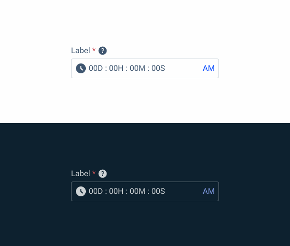
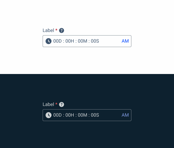
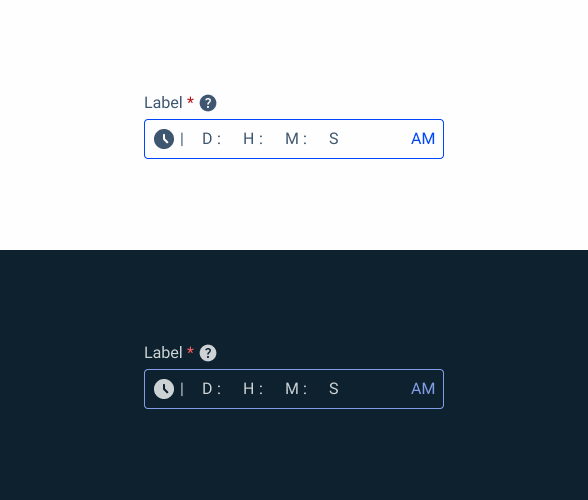
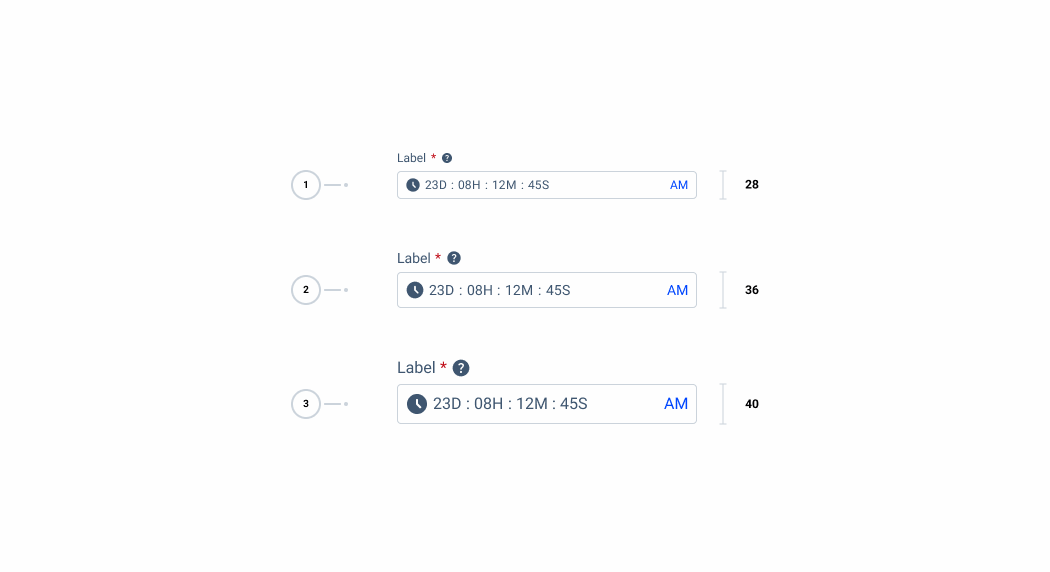
- Day, Hour, Minute, and Second Fields: Text input fields where users enter the days, hours, minutes, and seconds of the desired time.
- Label: Guides users on how to interact with the control.
- Date Field: A text input field allowing users to manually enter the date.
- AM/PM Selector: Allows users to choose the time period.

Used for
Task Management:
Time Pickers help users set deadlines or due times for tasks or assignments.
Time-based Settings:
In applications or devices, timepickers are used to configure time-based settings, such as alarm clocks or reminders.
Appointment Scheduling:
Timepickers allow users to select the exact time for appointments or meetings.
Don’t use for:
Non-time Related Inputs:
Time Pickers are not suitable for inputting non-time-related information, such as text or numerical data.
Date Selection:
While timepickers handle time-related inputs, they do not typically accommodate date selection. For that purpose, datepickers are more appropriate.
Complex Time Calculations:
Timepickers are designed for simple time selection and are not well-suited for complex time calculations or manipulations.

Demo
Access the Figma file and inspect the element using Dev Mode.

Related
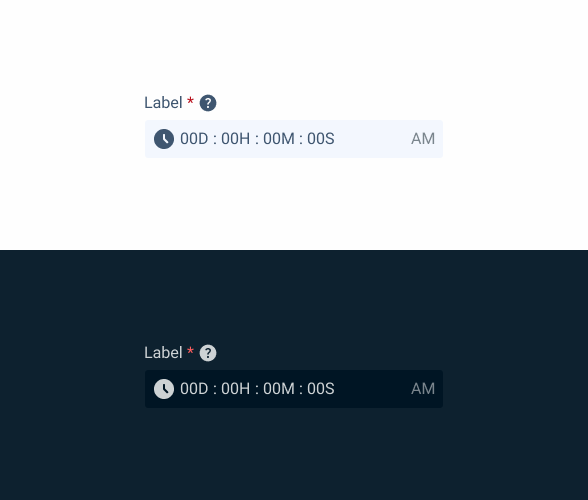
States
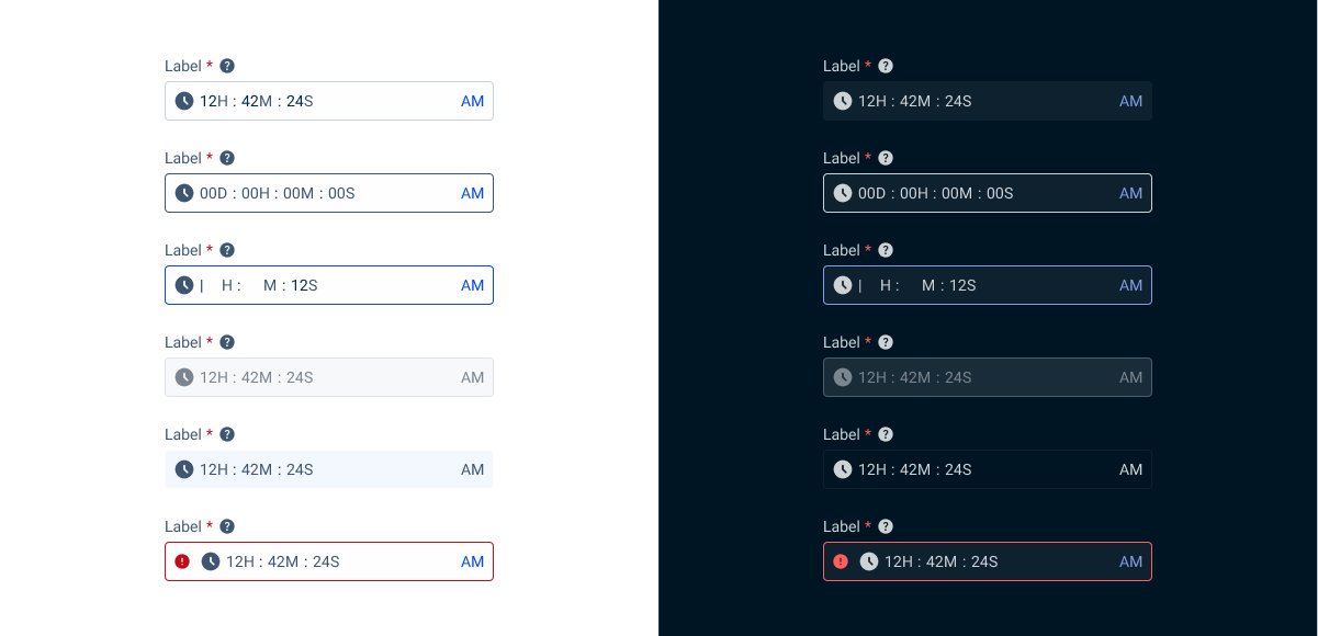
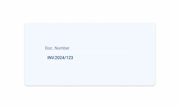
Enabled
.enabled {
  label: var(--grey-8);
  input-border: var(--grey-5);
  input-background: var(--grey-1);
  placeholder: var(--grey-8);
  icon: var(--grey-8);
}
Hover
.hover {
  label: var(--grey-8);
  input-border: var(--grey-6);
  input-background: var(--grey-1);
  placeholder: var(--grey-8);
  icon: var(--grey-8);
}
Focus
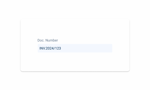
.focus {
  label: var(--grey-8);
  input-border: var(--theme-100);
  input-background: var(--grey-1);
  insert: var(--grey-9);
  icon: var(--grey-8);
}
Read-Only
.readonly {
  label: var(--grey-8);
  input-border: var(--grey-1);
  input-background: var(--grey-3);
  placeholder: var(--grey-8);
  icon: var(--grey-8);
}
}Disabled
.disabled {
  label: var(--grey-8);
  input-border: var(--grey-4);
  input-background: var(--grey-2);
  placeholder: var(--grey-6);
  icon: var(--grey-6);
}
Error
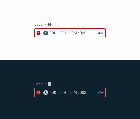
.error {
  label: var(--grey-8);
  input-border: var(--error-100);
  input-background: var(--grey-1);
  placeholder: var(--grey-8);
  icon: var(--error-100);
  icon: var(--grey-8);
}
Sizes
- Small: Use in situations where space is limited or when incorporating a drop-down within a lengthy and intricate form.
- Regular: This is the standard size and it’s widely used. When in doubt, opt for the medium size.
- Large: Opt for this size when you have plenty of space available. It’s commonly used in straightforward forms when isolated on a page, for example, for filtering purposes.
Small
.small{
  display: flex;
  width: 300px;
  height: var(--Spacing-spacing-28, 28px);
  padding: 0px var(--Sizing-x-small, 8px);
  align-items: center;
  gap: var(--Spacing-spacing-4, 4px);
  flex-shrink: 0;
  }
Regular
.regular{
  display: flex;
  width: 300px;
  height: 36px;
  padding: 0px var(--Sizing-x-small, 8px);
  align-items: center;
  gap: var(--Spacing-spacing-8, 8px);
  flex-shrink: 0;
}
Large
.large{
  display: flex;
  width: 300px;
  height: var(--Spacing-spacing-40, 40px);
  padding: 0px var(--Sizing-x-small, 8px);
  align-items: center;
  gap: var(--Spacing-spacing-8, 8px);
  flex-shrink: 0;
}
Useful links

Consult our Figma file to access our assets and inspect them in dev mode.

This component is or will be provided by the Polygon framework. See its documentation to learn more.

This element is in line with the guidelines of the CDS (Cegid Design System). Find out more.
Usage
Time Pickers allow users to enter a specific time value. They are displayed in dialogs and can be used to select hours, minutes, or periods of time.
Position
Input-type components must always be placed on grey-1 backgrounds (white) for optimal usability.
Avoid using them on grey-3 backgrounds (grey), as this can compromise the visibility of disabled and read-only states.
If placement on grey-3 backgrounds is necessary, ensure that disabled or read-only states are not utilized in these scenarios.
Avoid placing input-type components on grey-3 backgrounds to maintain optimal visibility and accessibility.
Input-type components should be placed over grey-1 backgrounds for optimal visibility and usability.
Time by days function
The time by days function of the Time Picker allows users to specify a number of days instead of having to calculate those days in hours.

24 or 12-hour time format
This selection is automatically assigned to the component depending on your Cegid ID configurations.
- Both the 12-hour and 24-hour time systems are supported.
- When using the 12-hour format, it must be accompanied by an AM/PM selection.
- Use uppercase letters and no periods for the AM and PM abbreviations.
- Specific times should include a timezone specification.
Universal behaviors
The behaviors outlined in this section apply universally across all variants. For variant-specific behaviors, refer to the corresponding sections for each component variant below.
States
Time Pickers are text inputs and have the same interactive states and behaviors.
| State | When to use |
|---|---|
| Enabled | When the date or Time Picker is active, but a user is not directly interacting with it. This is commonly referred to as the default or normal state of the component. |
| Hover | When a user’s mouse cursor is hovering over the field. |
| Focus | When a user tabs or clicks on the input, the field becomes focused, indicating the user has successfully navigated to the component. |
| Read-only | When the user can review but not modify the component. This state removes all interactive functions, as does the disabled state, but can still be focusable, accessible by screen readers, and passes the visual contrast test for readability. |
| Error | When the required field for a text input in the date or Time Picker component has not been filled in, or when a part of the Time Picker component does not have a selection. It can also be triggered due to a system error. This state requires a user response before data can be submitted or saved. |
| Disabled | When the user cannot interact with a component and all interactive functions have been removed. Unlike read-only states, disabled states are not focusable, are not read by screen readers, and do not need to pass the visual contrast test, making them inaccessible if they need to be interpreted. |
Validation
Invalid fields need to be clearly indicated. When dealing with pickers containing multiple fields, the invalid state should only be applied to the specific field causing the error. This helps users identify which aspect needs attention.

Variation
We also have a variation that includes the Time Picker within the Date Picker component. This usage is very specific to certain use cases, such as invoices that need to indicate the date and time. For this usage, the Time Picker doesn’t require a label, but an icon must be shown to indicate the expected data.

Internationalization
Internationalization, also referred to as globalization, refers to the adaptation of software to different languages, regional peculiarities, and technical requirements of a target location without additional code changes. This means that if the location is known, the formatting of a date or time can automatically change to the acceptable local format. You should always try to design for internationalization.
When to use
Use Time Pickers when a specific time needs to be scheduled, for example, to plan the time of a meeting.
Voice-Over
For general guidelines on screen reader compatibility, see the following blog post on best practices: Designing the Invisible: How to Make Your Interfaces Work Without a Screen.
Always announce the current time selection so users don’t feel lost.
Provide immediate feedback so users receive confirmation that they have successfully selected a time.
Don’t leave the users stuck in the Time Picker. Make it easy to dismiss/close.
Allow users to adjust each part of the time separately. For example, when the hour part is selected, make sure users are informed of the current time portion.
Reading Order

| Reading Order | Element | Screen Reader Reading |
| 1 | Field name | Choose time, required field. |
| 2 | Tooltip | Information, [tooltip content]. |
| 3 | Time field | Enter the time in the format day/hour/minute/second (if blank). [Read the selected day and time if there is a placeholder]. |
| 4 | Day input | [Read digits in real time as the user enters them]. |
| 5 | Hour input | [Read digits in real time as the user enters them]. |
| 6 | Minute input | [Read digits in real time as the user enters them]. |
| 7 | Second input | [Read digits in real time as the user enters them]. |
| 8 | Time period | AM, selected; click enter to change. |
Case Studies

Creating Context-Aware Notifications for a Better Experience

Read Mode: Making Content Feel Effortless and Understandable
