
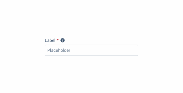
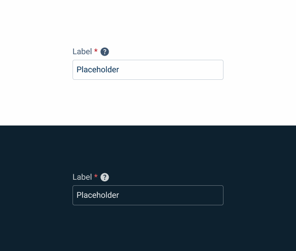
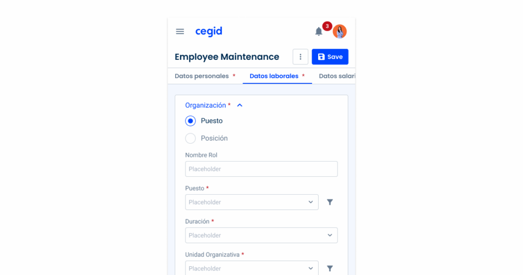
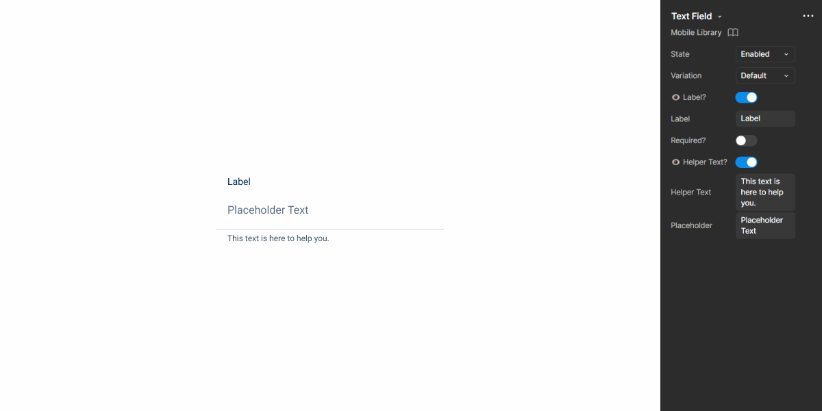
Text Field
A Text Field component in UX provides users with a space to input and edit text or alphanumeric characters.

- Overview
- Specs
- Guidelines
- Mobile
Component
A Text Field component is a fundamental user interface element that allows users to input and edit text or alphanumeric characters within an application or website.
Visually, a Text Field typically appears as a rectangular box or input field within the user interface, providing users with a clear and designated area to input text.
It often includes a border or background to distinguish it from surrounding elements and may feature additional visual cues such as placeholder text or icons to provide context or instructions to users.

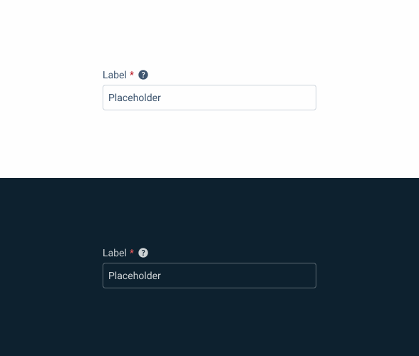
- A: Default Variation
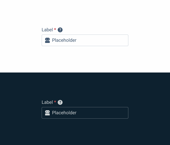
- B: Adornment Variation
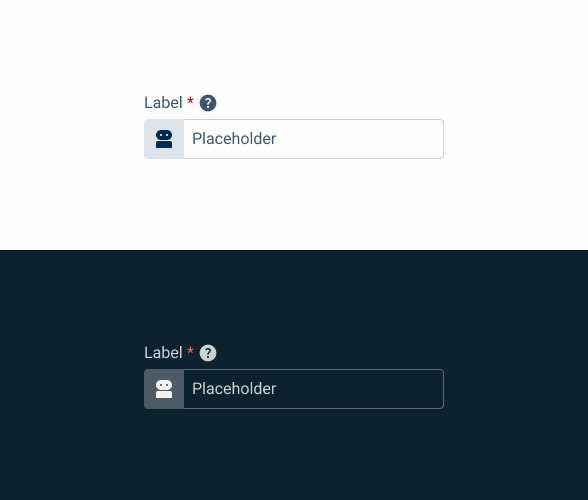
- C: Button Icon Variation
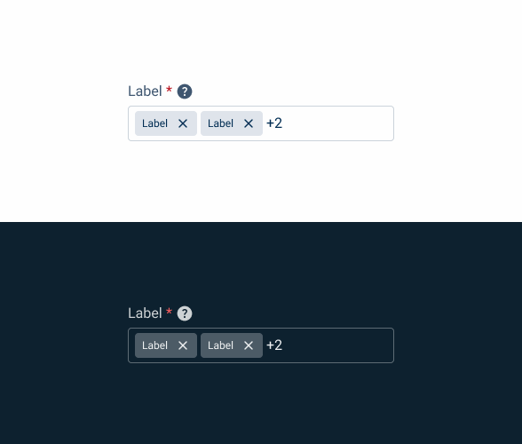
- D: Chips Variation
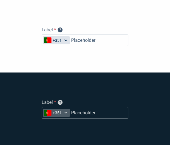
- E: Identifier Variation
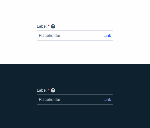
- F: Link Variation
- G: Select Variation
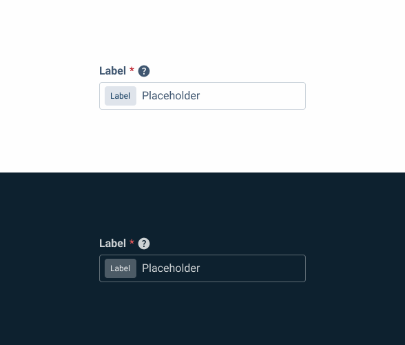
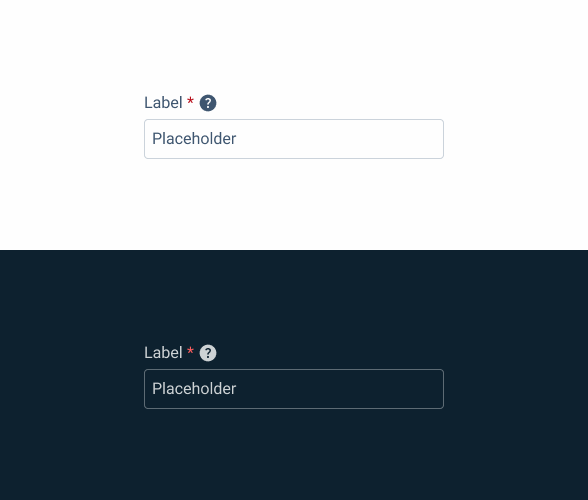
- 1: Label
- 2: Adornment
- 3: Button Icon
- 4: Closable Chip
- 5: Placeholder
- 6: Link
- 7. Selectable Chip

Used for:
Names
In cases where it is necessary to write the name of a client, an article or others, a Text Field should be used for this versatility;
Emails
In cases where it is necessary to insert an email, the correct component to use is a Text Field;
Entity number
In cases where it is necessary to show an entity number that is not modifiable, it is done by using the Text Field component in the read only state;
Street
In cases where it is necessary to insert a street name, due to the versatility of the input value, the recommended component to be used is the Text Field.
Don’t use for:
Choice input
When waiting for a user choice, make sure you show the different choices, for example with a radio button or a select box;
Complex data
For tasks involving extensive data entry or manipulation, Text Fields may not provide sufficient functionality or features to support complex data structures, calculations, or validations;
Data security
In contexts where sensitive or confidential information is being entered, such as passwords or personal identification numbers (PINs), consider using the password component.

Demo
Access the Figma file and inspect the element using Dev Mode.

Last Update
- Added new tab for the mobile version of the component.
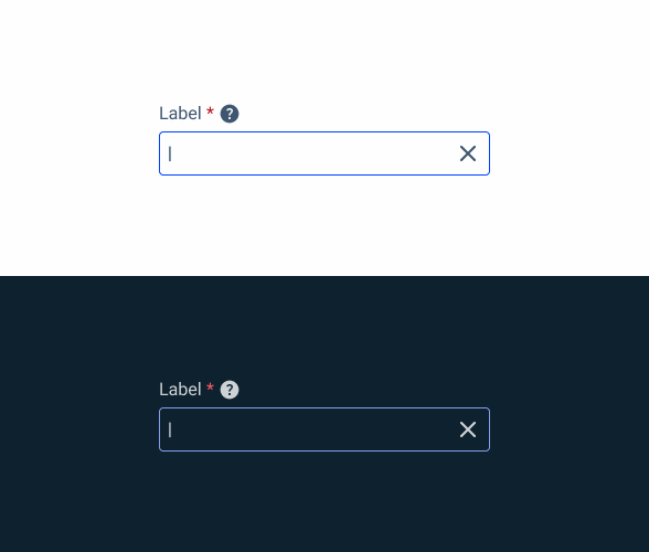
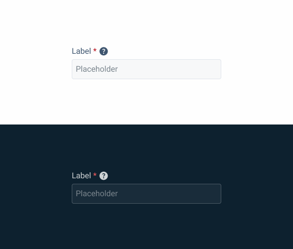
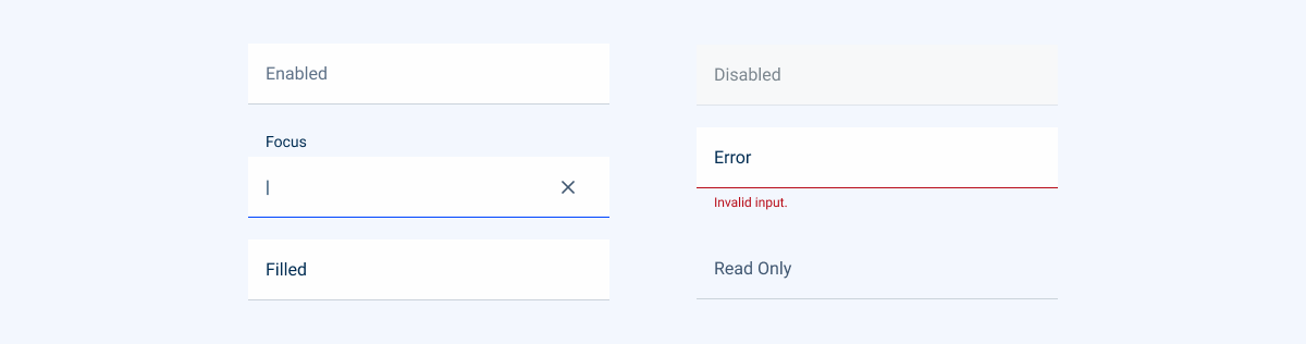
States
Enabled

.enabled {
  label: var(--grey-7);
  input-border: var(--grey-5);
  input-background: var(--grey-1);
  placeholder: var(--grey-7);
}
Hover
.hover {
label: var(--grey-7);
input-border: var(--grey-6);
input-background: var(--grey-1);
placeholder: var(--grey-7);
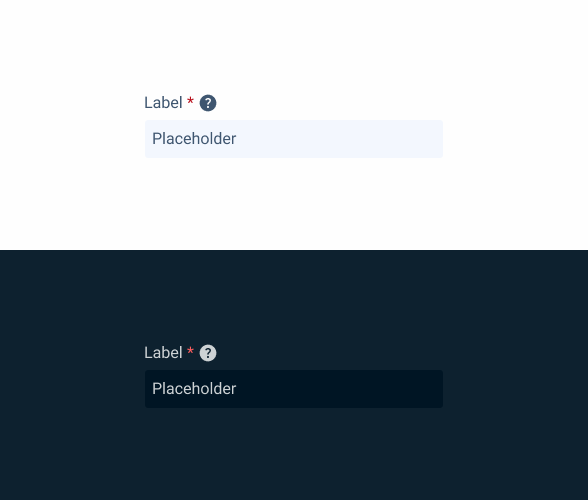
}Focus
.focus {
  label: var(--grey-7);
  input-border: var(--theme-100);
  input-background: var(--grey-1);
  insert: var(--grey-8);
  }
Read-only
.readonly {
  label: var(--grey-7);
  input-border: var(--grey-1);
  input-background: var(--grey-3);
  placeholder: var(--grey-7);
}
Disabled
.disabled {
  label: var(--grey-7);
  input-border: var(--grey-4);
  input-background: var(--grey-2);
  placeholder: var(--grey-6);
}
Error
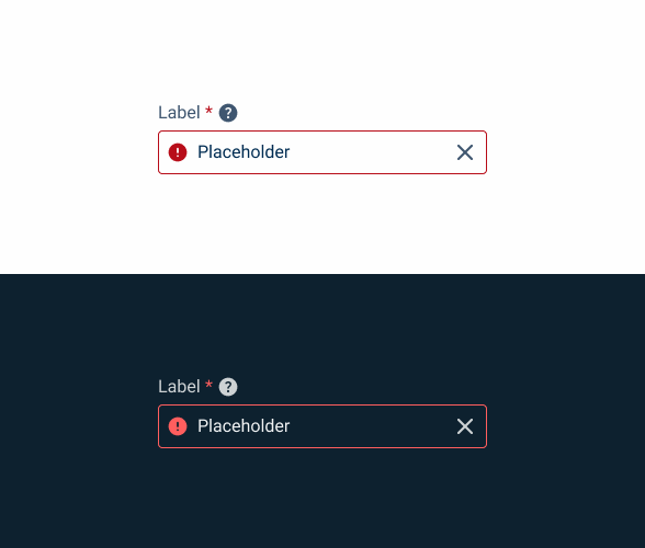
.error {
  label: var(--grey-7);
  input-border: var(--error-100);
  input-background: var(--grey-1);
  placeholder: var(--grey-8);
  icon: var(--error-100);
  }
Filled
.filled {
  placeholder: var(--grey-8);
}
Variations
Adornment
.adornment {
  label: var(--grey-7);
  input-border: var(--grey-5);
  input-background: var(--grey-1);
  placeholder: var(--grey-7);
  icon: var(--grey-7);
  }
Button Icon
.button_icon {
  label: var(--grey-7);
  input-border: var(--grey-5);
  input-background: var(--grey-1);
  placeholder: var(--grey-7);
  button-background: var(--grey-4);
  button-icon: var(--grey-8);
  }
Chips
.chips {
  label: var(--grey-7);
  input-border: var(--grey-5);
  input-background: var(--grey-1);
  placeholder: var(--grey-8);
  chip-background: var(--grey-4);
  chip-icon: var(--grey-8);
}
Identifier
.identifier {
  label: var(--grey-7);
  input-border: var(--grey-5);
  input-background: var(--grey-1);
  placeholder: var(--grey-7);
  chip-background: var(--grey-4);
  chip-text: var(--grey-8);
}
Link
.link {
  label: var(--grey-7);
  input-border: var(--grey-5);
  input-background: var(--grey-1);
  placeholder: var(--grey-7);
  link-color: var(--theme-100);
}
Select
.select {
  label: var(--grey-7);
  input-border: var(--grey-5);
  input-background: var(--grey-1);
  placeholder: var(--grey-7);
  chip-background: var(--grey-4);
  chip-text: var(--grey-8);
}
Size
Small

.small {
  label: var(--label-small);
  input-height: 28px;
  input-border: var(--x-small-radius);
  input-gap: 8px;
  input-padding: var(0, --spacing-8);
  placeholder: var(--label-small);
   For Chips
  padding-left: var(--sapcing-4);
  chip-size: var(--small);
}
Regular
.regular {
  label: var(--label-regular);
  input-height: 36px;
  input-border: var(--x-small-radius);
  input-gap: 8px;
  input-padding: var(0, --spacing-8);
  placeholder: var(--label-regular);
   For Chips
  padding-left: var(--sapcing-4);
  chip-size: var(--regular);
}
Large
.large {
  label: var(--label-large);
  input-height: 40px;
  input-border: var(--x-small-radius);
  input-gap: 8px;
  input-padding: var(0, --spacing-8);
  placeholder: var(--label-large);
   For Chips
  padding-left: var(--sapcing-8);
  chip-size: var(--regular);
}
Useful links

Consult our Figma file to access our assets and inspect them in dev mode.

This component is or will be provided by the Polygon framework. See its documentation to learn more.

This element is in line with the guidelines of the CDS (Cegid Design System). Find out more.
Behavior
Position
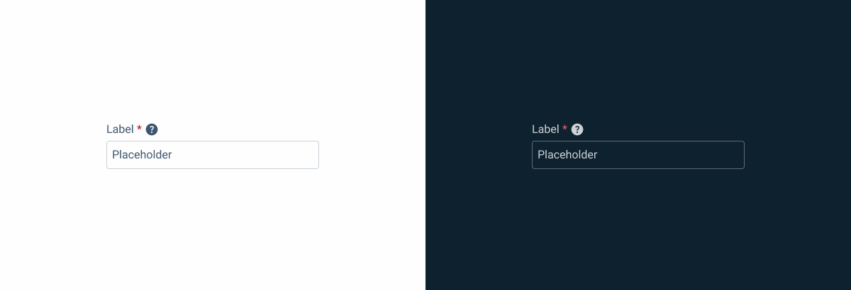
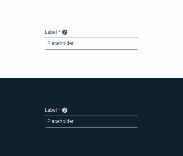
Input-type components must always be placed on grey-1 backgrounds (white) for optimal usability.
Avoid using them on grey-3 backgrounds (grey), as this can compromise the visibility of disabled and read-only states.
If placement on grey-3 backgrounds is necessary, ensure that disabled or read-only states are not utilized in these scenarios.
Avoid placing input-type components on grey-3 backgrounds to maintain optimal visibility and accessibility.
Input-type components should be placed over grey-1 backgrounds for optimal visibility and usability.
Clear
We can delete content when it is inserted in focus and state states.
We use this behavior to speed up the insertion or deletion of content.


Combine action or detail variations with help variations.
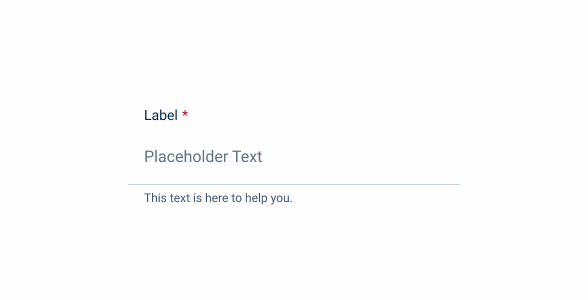
Validation
We have two possible validations for Text Fields.
By default, a validation is applied when the Text Field status changes from focus to active.
We can also use a mechanism to validate the content as the user enters it. This validation should be avoided because, when excessive, it causes friction for the user. It is recommended to use it when you need to create a unique name, for example.

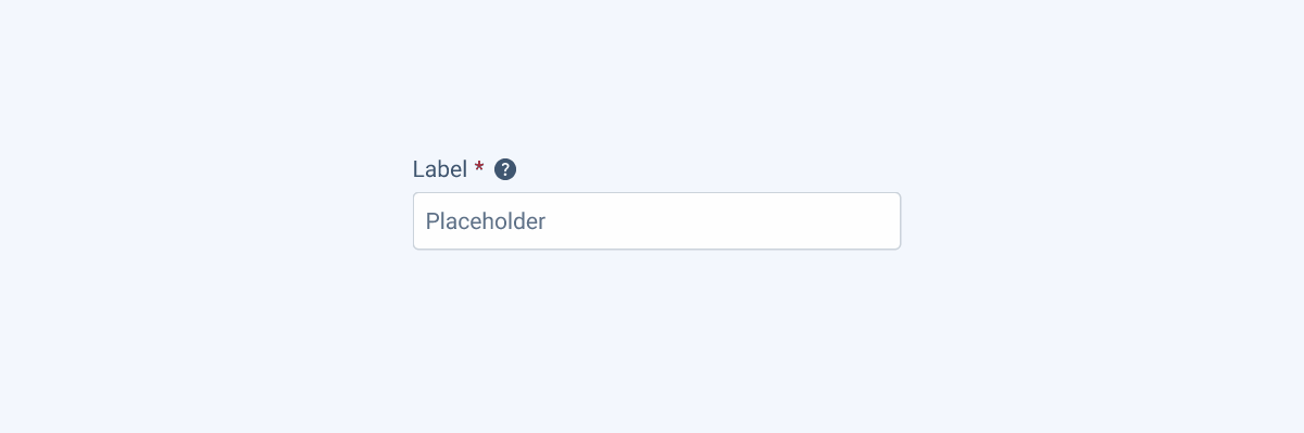
Required
When a Text Field is mandatory, we add an asterisk after its label. If it remains empty after submitting the form, it should trigger error validation.
This helps the user to have a reference on what is the most important and mandatory information in a form and to have fewer errors until form is presented correctly.


Use tooltips with help messages.
Hidden Required Text Fields
Text fields are very common UI elements, which means they are implemented frequently and in all sorts of interfaces. However, in some cases, they may not be immediately visible to users, for example when they are in a collapsed expander.
When required text fields are not immediately displayed, it is important that users know they are there. To this end, a red asterisk should be implemented in the UI element that is hiding the text field.
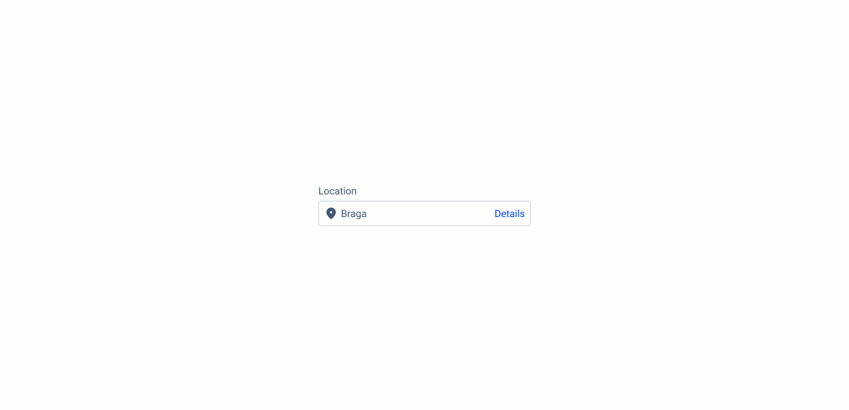
Link Variation
On the text field with link, an adornment can be used. The adornment is placed inside the text field before its label, providing visual context or reinforcing the meaning of the content.
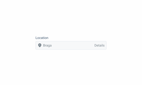
When the field is disabled, use grey-6 for the entire field, including the link.
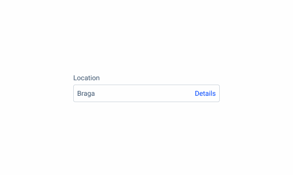
Using an adornment is not required.
Voice-Over
For general guidelines on screen reader compatibility, see the following blog post on best practices: Designing the Invisible: How to Make Your Interfaces Work Without a Screen.
Indicate clearly and unambiguously which fields are mandatory so that screen readers can indicate this to the user.
Ensure that Text Fields are clearly linked to their title, so users know what is expected from their input.
Do not allow the focus to shift away from the field after an error.
Shift content position while the user is in the field, since that can disorient them.
Rely on placeholder text as the only indication of the field purpose
Reading Order
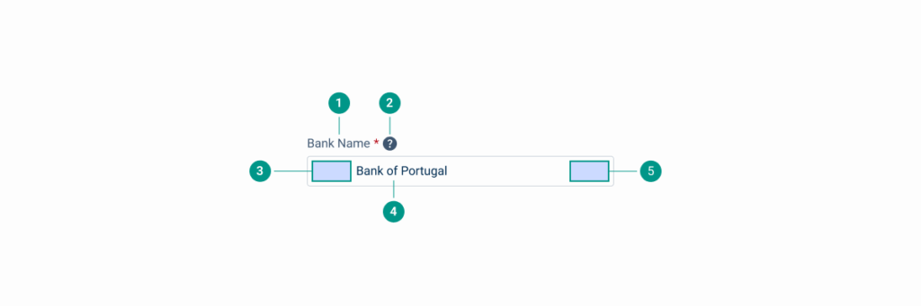
| Reading Order | Element | Screen Reader Reading |
| 1 | Field name | Bank name, required field. |
| 2 | Tooltip | Information, [tooltip content]. |
| 3 | Icon (if relevant) | [Icon alt text (e.g. Portuguese flag)]. |
| 4 | Body | Bank of Portugal, click space to edit. |
| 5 | Custom action | [Action], clickable. |
Case Studies

Handling Background Tasks

Read Mode: Making Content Feel Effortless and Understandable

A Visual Recap of 2025: how we enhanced chatbot communication
What Changes?
In order to accommodate small screen sizes, the mobile version of the Text Field has undergone some changes aimed at optimizing the space it occupies, which means there are some differences in its appearance.
Variations that don’t have a practical application on mobile have been removed and new ones added.
Lastly, due to their similarities on mobile, the Text Area is a variation of the Text Field.
Demo
Access the Figma file and inspect element using Dev Mode.
Size
In order to improve its touch target, the Text Field has increased height on mobile. Additionally, as horizontal space is limited, it has been designed to fill the entire width of the interface on which it sits.
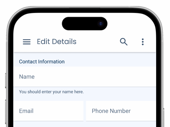
Place more than one Text Field in the same row.
Variations
The mobile version of the Text Field has three variations that aim to improve its flexibility.
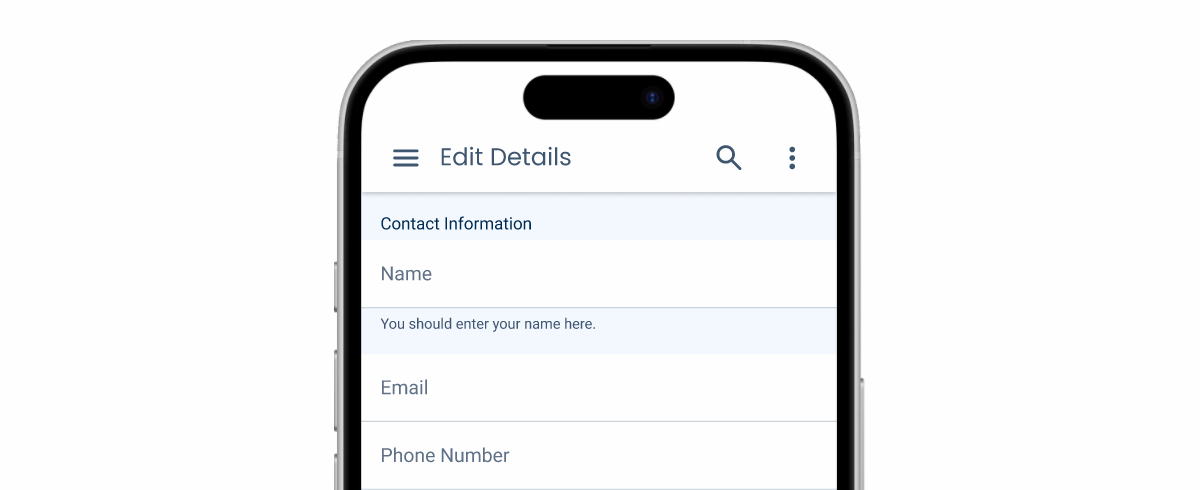
Default
The default variation is designed to be the most universal and commonly used. The label is placed over the input field, which ensures that the content is easy to interpret.
In cases where users can get enough context from the placeholder text alone, the label can be omitted to save space.
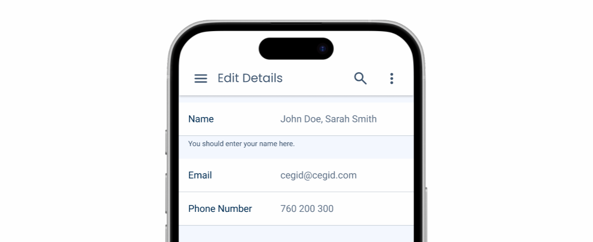
Horizontal
This variation is designed to take up as little space as possible, placing the label on the same row as the input field, at the expense of significantly reducing its size. It is ideal for forms that users can fill in quickly and that don’t require extensive typing.
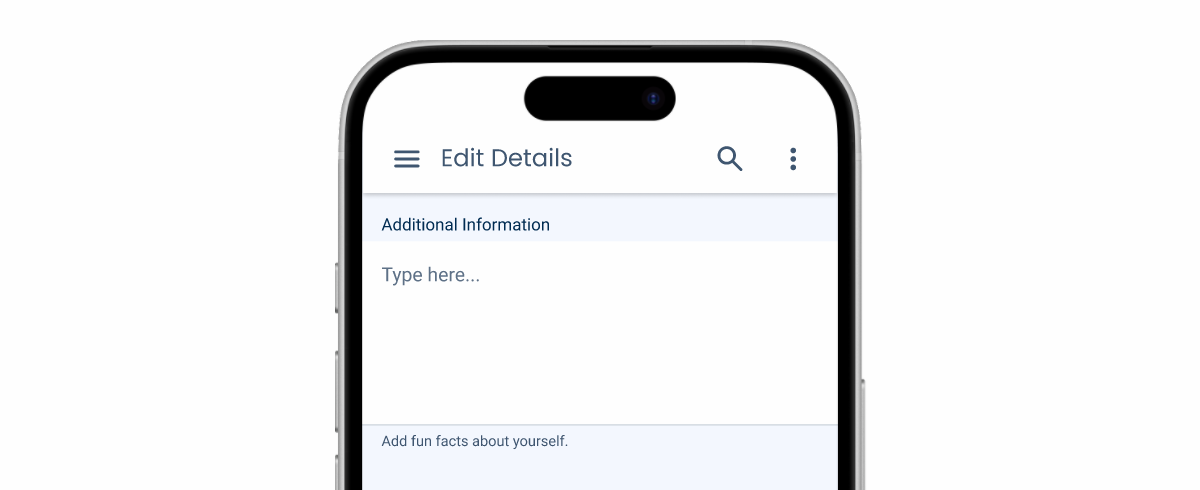
Text Area
This variation is similar to the default, but has a greater height. It should be used when you want to allow users to type large amounts of text.
States
For the most part, both versions of the Text Field share the same states, with the exception of Hover, which requires a cursor and therefore only exists on the desktop.
Case Studies
Handling Background Tasks
Read Mode: Making Content Feel Effortless and Understandable