
Text Area
A Text Area is a multi-line input field in UX, allowing users to enter and edit free-form text

- Overview
- Specs
- Guidelines
Component
A Text Area, in UX terms, refers to a user interface element that provides users with a larger, multi-line input field for entering and editing free-form text.
It typically appears as a rectangular box on the interface, allowing users to input and manipulate text content more flexibly when compared to single-line input fields.
Text areas are commonly used for tasks such as composing messages, writing comments, or entering lengthy descriptions. They offer features such as automatic text wrapping, scrollbars to navigate through longer text, and options for resizing the input area to accommodate varying amounts of content.

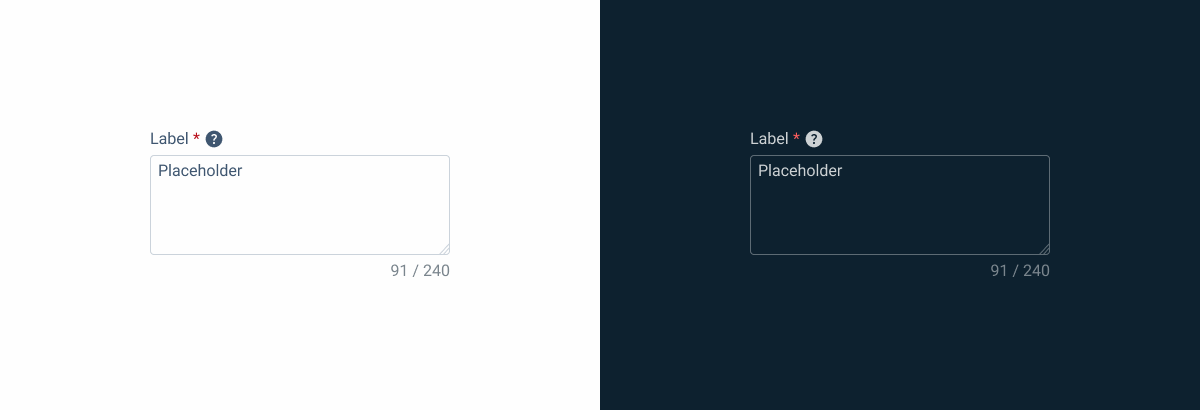
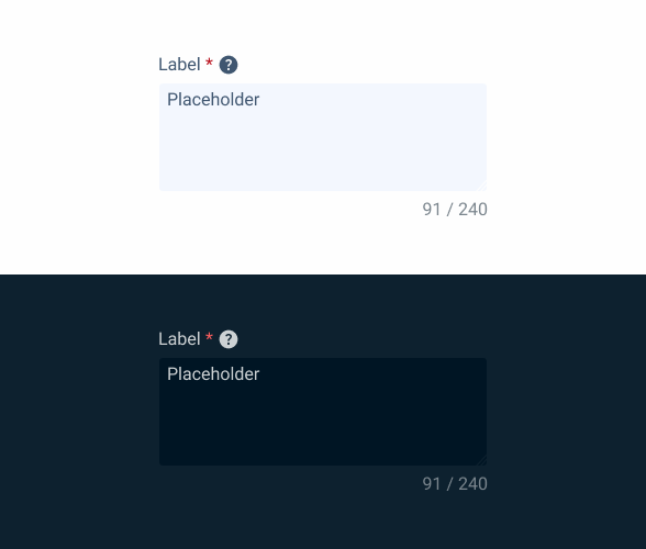
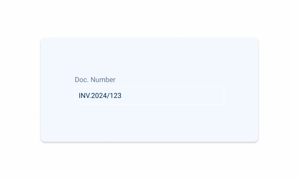
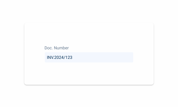
1: Label
2: Placeholder/Input
3: Counter
4: Resizer

Used for:
Observations
In invoices or articles, it is necessary to make a comment about a customer/article, a text area is used to have a free-text area;
Descriptions
When creating a certain article, a full description is part of the form, where the expected value is the description of article;
Notes
As with the other two cases, notes are a free space that allows the user to take notes on a specific page/view;
Flexible formatting
They allow users to enter text with line breaks and formatting, providing more flexibility when compared to single-line input fields.
Don’t use for:
Data entry precision
For tasks requiring precise data entry, such as entering numeric values or selecting from predefined options, a text area may not provide the necessary constraints or validation;
Input validation
If input validation requirements are strict and specific, using a text area may not be suitable for enforcing validation rules and ensuring data integrity;
Excessive complexity
For simple input tasks that don’t require longer text passages, implementing a text area may introduce unnecessary complexity and cognitive load for users.

Demo
Access the Figma file and inspect the element using Dev Mode.

Last Update


- Updated typography;
- Updated label;
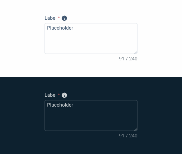
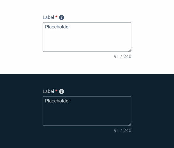
States
Enabled
.enabled {
  label: var(--grey-8);
  text-area-border: var(--grey-5);
  text-area-background: var(--grey-1);
  counter:var(--grey-6);
  placeholder: var(--grey-7);
}
Hover
.hover {
  label: var(--grey-8);
  text-area-border: var(--grey-6);
  text-area-background: var(--grey-1);
  counter:var(--grey-6);
  placeholder: var(--grey-7);
}
Focus
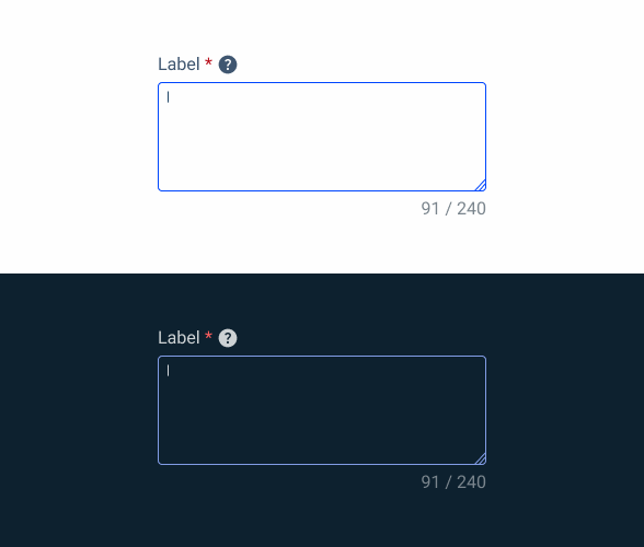
.focus {
  label: var(--grey-8);
  text-area-border: var(--theme-100);
  text-area-background: var(--grey-1);
  counter:var(--grey-6);
  insert: var(--grey-9);
}
Read-only
.readOnly {
  label: var(--grey-8);
  text-area-border: var(--grey-1);
  text-area-background: var(--grey-3);
  counter:var(--grey-6);
  placeholder: var(--grey-7);
}
Disabled

.disabled {
  label: var(--grey-8);
  text-area-border: var(--grey-4);
  text-area-background: var(--grey-2);
  counter:var(--grey-6);
  placeholder: var(--grey-7);
}
Error
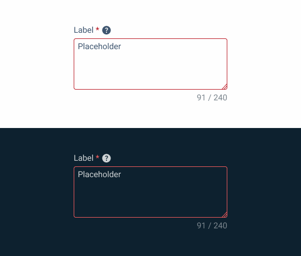
.error {
  label: var(--grey-8);
  text-area-border: var(--error-100);
  text-area-background: var(--grey-1);
  counter:var(--grey-6);
  placeholder: var(--grey-7);
}
Size
Small

.small {
  label: var(--label-small);
  counter: var(--label-small);
  gap: 4px;

  Field {
    padding: var(--spacing-4, 0, 0, --spacing-8);
    placeholder: var(--label-small);
  }
}
Regular
.regular {
  label: var(--label-regular);
  counter: var(--label-regular);
  gap: 4px;

  Field {
    padding: var(--spacing-4, 0, 0, --spacing-8);
    placeholder: var(--label-regular);
  }
}
Large
.large {
  label: var(--label-large);
  counter: var(--label-large);
  gap: 4px;

  Field {
    padding: var(--spacing-4, 0, 0, --spacing-8);
    placeholder: var(--label-large);
  }
}
Useful links

Consult our Figma file to access our assets and inspect them in dev mode.

This component is or will be provided by the Polygon framework. See its documentation to learn more.

This element is in line with the guidelines of the CDS (Cegid Design System). Find out more.
Behavior
Position
Input-type components must always be placed on grey-1 backgrounds (white) for optimal usability.
Avoid using them on grey-3 backgrounds (grey), as this can compromise the visibility of disabled and read-only states.
If placement on grey-3 backgrounds is necessary, ensure that disabled or read-only states are not utilized in these scenarios.
Avoid placing input-type components on grey-3 backgrounds to maintain optimal visibility and accessibility.
Input-type components should be placed over grey-1 backgrounds for optimal visibility and usability.
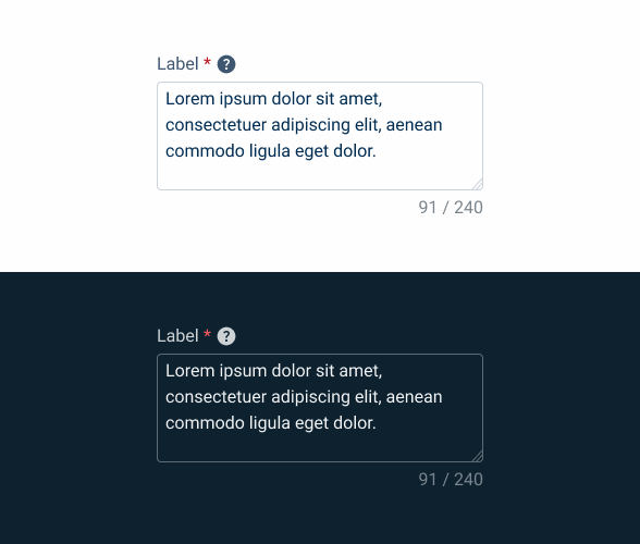
Minimum Height
By default, text areas tend to have larger values than other inputs, such as text fields or select boxes, so it is necessary to have a minimum and maximum height to apply to the component, which is applied by size:
- Minimum-height: 100px;
- Maximum-height: 500px;

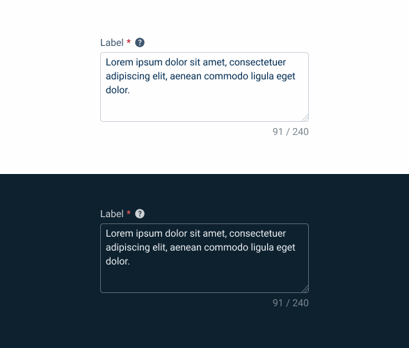
Counter
A counter with the number of characters used/maximum number of characters allowed is displayed in the top right-hand corner.
As the user types, the value is updated.


Display warning message when user tries to insert more content than allowed.

The use of a label and counter is mandatory.
Voice-Over
For general guidelines on screen reader compatibility, see the following blog post on best practices: Designing the Invisible: How to Make Your Interfaces Work Without a Screen.
Inform users in advance if there are rules they must follow, such as character limits or other specific instructions.
Ensure users never lose track of where they are, by always giving clear feedback when they move though the text.
Hide features from users. Ensure that clearing buttons, formatting options, etc. appear to the user before writing, rather than after.
Overwhelm users with unnecessary audio feedback. They only need to hear what they are typing, not how the interface is built.
Keep the layout stable. If the Text Area changes shape during text input, users may loose track of where they are.
Reading Order
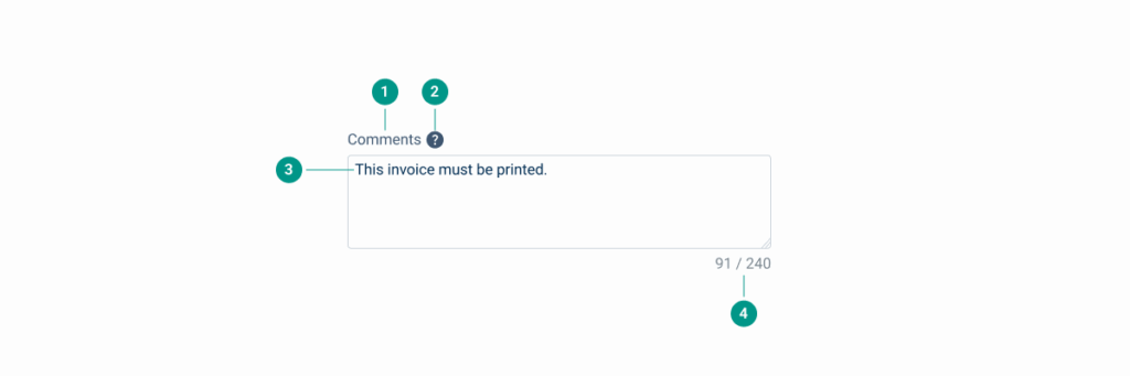
| Reading Order | Element | Screen Reader Reading |
| 1 | Field name | Comments. |
| 2 | Tooltip | Information, [tooltip content]. |
| 3 | Body | This invoice must be printed. Click space to edit. |
| 4 | Word counter | 91 of 240 words. |
Case Studies

Handling Background Tasks

Read Mode: Making Content Feel Effortless and Understandable
