
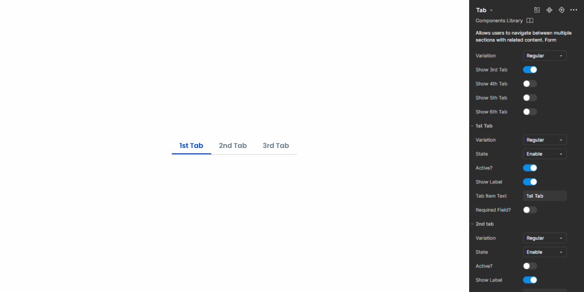
Tabs
Tabs organize content into manageable sections. Clear navigation and presentation for efficient user interaction.

- Overview
- Specs
- Guidelines
- Mobile
Component
Tabs are a versatile UI component used to organize content into distinct sections, facilitating navigation and enhancing user experience.
With intuitive tab labels and clear visual indicators, users can easily switch between different sections of content, such as categories, settings, or views.

A: Regular variation
B: Removable variation
C: More Options variation
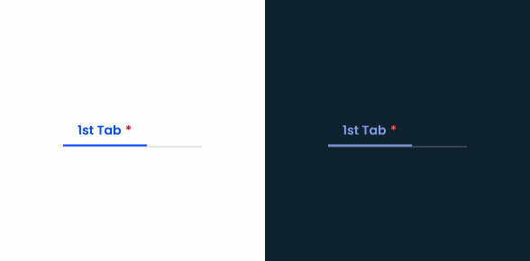
1: Selected indicator
2: Label
3: Required field indicator
4: Close
5: Error icon
Used for:
Forms
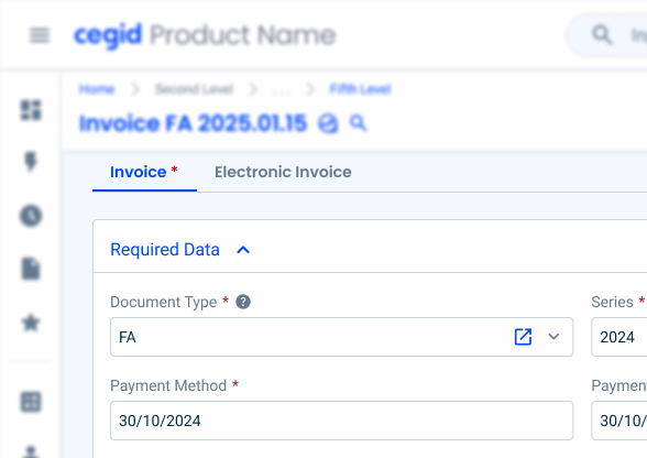
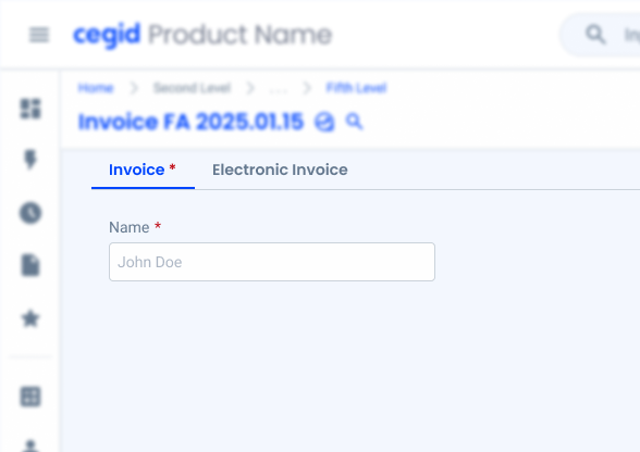
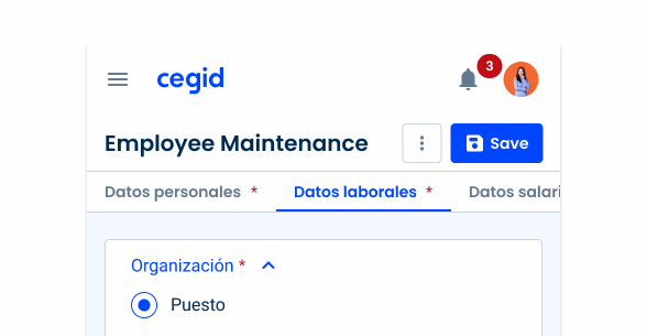
When a form has different sections that can be divided by categories, consider using Tabs;
Modals
When a modal has integrated forms, Tabs can also be used, for the same reasons as regular forms;
Conservation of screen space
Tabs help conserve screen space by allowing users to switch between content sections within the same viewport, minimizing the need to scroll or navigate to separate pages;
Contextual grouping
Tabs facilitate the contextual grouping of related content, allowing users to understand the relationship between different sections and access them seamlessly;
Progressive disclosure
Tabs support progressive disclosure by revealing additional content or functionality as users navigate between Tabs, helping to manage complexity and present information in a structured manner;
Don’t use for:
Limited content
If the content within each Tab is minimal or insufficient to warrant its own section, using Tabs may create unnecessary complexity. Consider using accordions in this case;
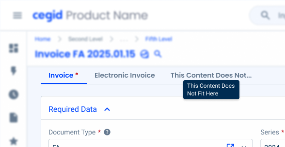
Confusing navigation
If the number of Tabs is excessive or if the Tab labels are unclear or ambiguous, users may struggle to understand the navigation structure;
Overlapping content
If the content within different Tabs overlaps significantly or if there is redundancy between Tabs, Tabs may not effectively organize the content and could confuse users;
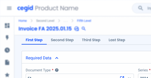
Sequential tasks
Tabs are not appropriate for guiding users through sequential tasks or linear processes where each step builds upon the previous one. In such cases, use a stepper.
Demo
Access the Figma file and inspect the element using Dev Mode.
Last Update


- Added new tab fo the mobile version of the component.
Related

Company Configuration
States

Not Active
Enabled

.enabled {n color: var(u002du002dgrey-8);n}Hover

.hover {n background-color: var(u002du002dgrey-3);n color: var(u002du002dgrey-9);n}Pressed

.pressed {n background-color: var(u002du002dgrey-4);n color: var(u002du002dgrey-9);n}Disabled

.disabled {
  color: var(--grey-6);
}
Focus

.focus {n background-color: var(u002du002dgrey-3);n border-color-bottom: var(u002du002dgrey-9);n color: var(u002du002dgrey-9);n}Active
Enabled

.enabled {
  border-color-bottom: var(--theme-100);
  color: var(--theme-100);
}
Hover

.hover {
  background-color: var(--theme-10);
  border-color-bottom: var(--theme-100);
  color: var(--theme-100);
}
Pressed

.pressed {
  background-color: var(--theme-20);
  border-color-bottom: var(--theme-100);
  color: var(--theme-100);
}
Disabled

.disabled {
  color: var(--grey-6);
}
Focus

.focus {
  background-color: var(--theme-10);
  border-color-bottom: var(--theme-100);
  color: var(--theme-100);
}
Size
Unique size

.uniqueSize {
  padding: var(--spacing-16, --spacing-8);
  gap: var(--spacing-8);
  label: var(--button-regular);
}
Icons
Removable

.removable {
  close: var(--close-small, --grey-8);
  add: var(--overflowmenu-small, --grey-7, add_cirlce);
}
Responsive
.removable {
  chevron: var (--grey-8, expand_more, 20px);
  divider: var (--grey-8);
}
Error

.error {
  errorIcon: var(--error-100, error_circle, 16px);
}
Required Field
.required {
  asterisk: var(--error-100);
}
Useful links

Consult our Figma file to access our assets and inspect them in dev mode.

This component is or will be provided by the Polygon framework. See its documentation to learn more.

This element is in line with the guidelines of the CDS (Cegid Design System). Find out more.
Variations
Tabs come with some variations that help improve their flexibility and usefulness.
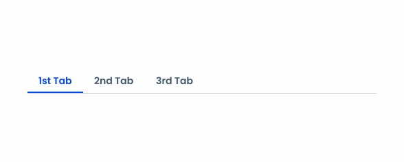
Regular
When no additional features are required, the regular variation is preferable as it takes up less space and helps prevent user confusion.
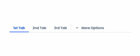
Responsive
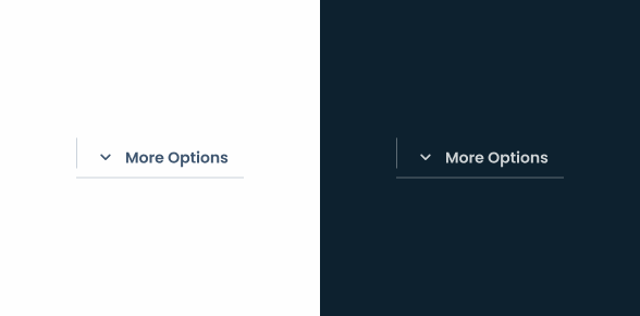
This variation allows Tabs to have a drop-down-like menu, which is primarily useful for helping with the component’s responsiveness.
Removable
Some products benefit from having customizable Tabs, allowing users to add and remove them according to their needs.

Responsiveness
Tabs should be under the page title to facilitate access and reduce space. However, this means that they may not fit in all interfaces. When this happens, a new Tab should be added at the end, using the More Options variation, and all excess Tabs should be moved to an overflow menu.

When including required text fields in a Tab, be sure to add a red asterisk next to its title to make sure users don’t accidentally skip them.
Labels should be short and concise, with a maximum of two words. If this is not possible, the text should be cut off and a tooltip should contain the full text (in the hover effect).
Use decorative icons.
Use Tabs to replace a flow.
Hidden Tabs
When the + icon is visible and enabled, it indicates that there are hidden Tabs that can be added. By using the removable variation on these Tabs, they become highly customizable, allowing users to have control over the sections they want to see.

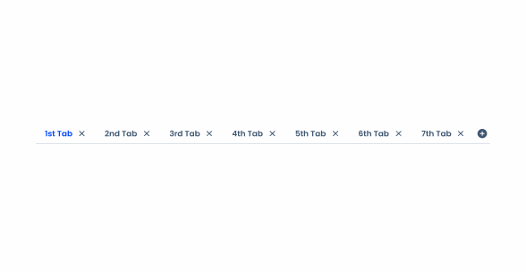
Avoid allowing more than six Tabs.
Case Studies

Handling Background Tasks

Read Mode: Making Content Feel Effortless and Understandable

A Visual Recap of 2025: how we enhanced chatbot communication
References
What Changes?
Compared to the desktop, the Tabs component has been intentionally enhanced with additional features to better suit mobile.
- Two variations: primary and secondary;
- Hover and Focus states were removed;
- Each variation behaves differently – the primary one is fixed and secondary one has horizontal scrolling.
In addition, adjustments have been made to improve usability on touch screens.
Demo
Access the Figma file and inspect the element using Dev Mode.

Variations
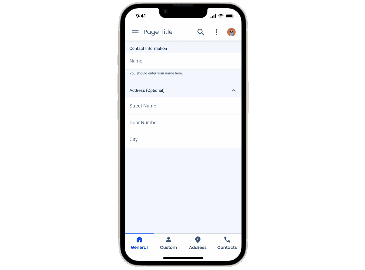
Primary Tabs are located at the bottom of the screen. They display the main content destinations and should only be used when a set of Tabs is required.
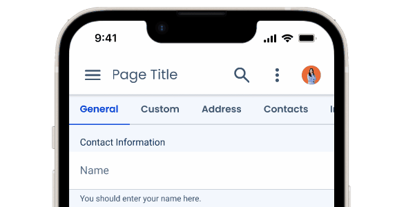
Secondary Tabs are used within a content area to further separate related content and establish hierarchy. Use secondary Tabs when a screen requires more than one level of Tabs.

A: Primary Tab
B: Secondary Tab
Behavior
Primary Tabs are fixed. The width of each tab adapts based on the number of items it contains – avoid using more than four tabs at a time.
For secondary Tabs, use scrollable Tabs when they do not fit on screen. Try not to use more than six Tabs, even though they can have longer labels.

States
The Focus and Hover states were not included in the mobile version of the Tabs as those two behaviors aren’t applicable.

A: Primary
B: Secondary
1: Enabled
2: Pressed
3: Disabled
4: Enabled Active
5: Pressed Active
Case Studies
Handling Background Tasks
Read Mode: Making Content Feel Effortless and Understandable