
Switch
A switch is a versatile toggle control for switching between two states seamlessly.

- Overview
- Specs
- Guidelines
- Mobile
Component
Used to navigate between tabs, filter content or activate/deactivate functionalities. Switches can be either clicked or dragged to change their value.
They allow intuitive and quick interaction, improving the user experience by customizing the content to their preferences or needs.

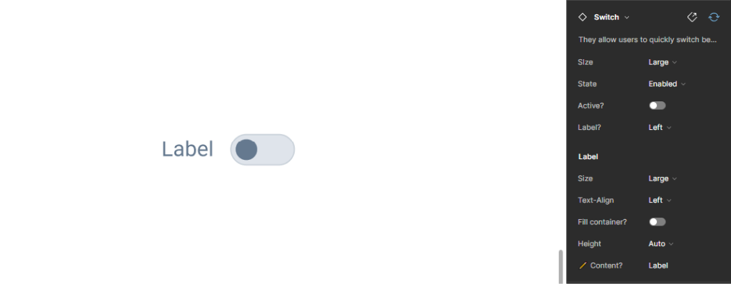
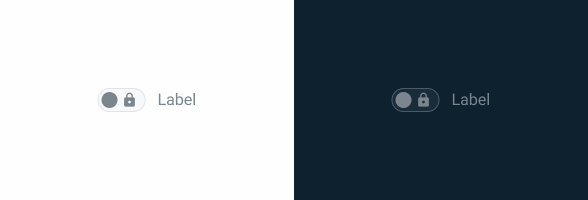
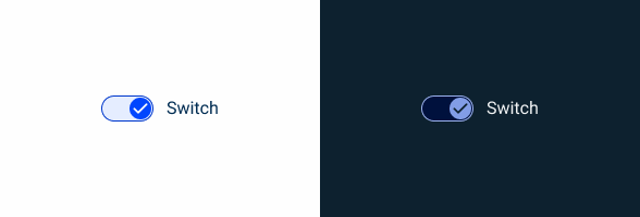
A: Non active variation
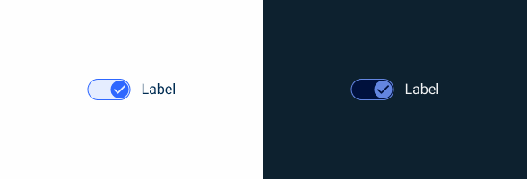
B: Active variation
1: Label
2: Switch
3: Icon

Used for:
Binary options
When presenting users with simple binary choices, such as on/off, active/inactive, enable/disable, switches offer a clear and intuitive way to indicate and control these states;
Settings and preferences
Switches are commonly used for toggling settings or preferences, allowing users to customize their experience by turning features on or off;
Consistency
Switches offer a consistent visual pattern for indicating and controlling binary options across different parts of an interface;
Mobile-friendly
With the rise of mobile devices, switches are particularly suitable for touch interfaces, as they offer a large, tappable area for users to interact with;
Real-time updates
Switches can trigger real-time updates or actions in the interface, providing immediate feedback to users.
Don’t use for:
Complex multi-state options
When options require more than two states or are not binary choices, switches may not be suitable. Consider using checkboxes or drop-downs;
Ambiguity in meaning
If the meaning of the switch state is ambiguous or subject to interpretation, it can lead to user confusion;
Inappropriate context
In contexts where switches are not intuitive or appropriate for the action being performed, it’s best to use alternative controls. For example, in a form where users are selecting from a range of options rather than toggling an on/off state. Consider using radio buttons in this case;
Overuse of switches
Avoid overloading the page with unnecessary switches, keeping them only when they provide clear value for the user experience.

Demo
Access the Figma file and inspect element using Dev Mode.
Last Update


- Added new tab for the mobile version of the component.
Related
States

Not Active
Enabled
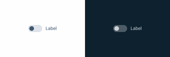
.enabled {
  border-color: var(--grey-5);
  background-color: var(--grey-4);
  color: var(--grey-8);
  label-color: var(--grey-8);
}
Hover
.hover {
  border-color: var(--grey-6);
  background-color: var(--theme-10);
  color: var(--grey-9);
  label-color: var(--grey-9);
}
Pressed
.pressed {
  border-color: var(--theme-100);
  background-color: var(--theme-10);
  color: var(--grey-9);
  label-color: var(--grey-9);
}
Disabled
.pressed {
  border-color: var(--grey-4);
  background-color: var(--grey-2);
  color: var(--grey-6);
  icon-color: var(--grey-6);
  label-color: var(--grey-6);
}
Focus

.focus {
  border-color: var(--grey-9);
  background-color: var(--grey-4);
  color: var(--grey-8);
  label-color: var(--grey-9);
}
Active
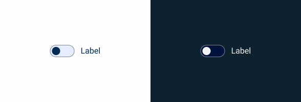
Enabled

.enabled {
border-color: var(--theme-40);
background-color: var(--theme-10);
color: var(--theme-100);
icon-color: var(--grey-1);
label-color: var(--grey-9);
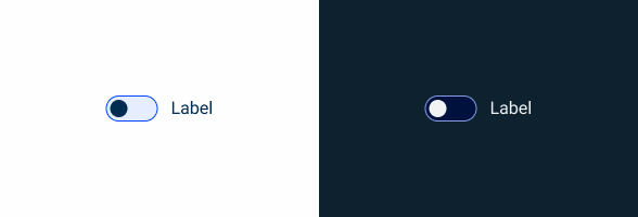
}Hover
.hover {
  border-color: var(--theme-80);
  background-color: var(--theme-10);
  color: var(--theme-highlight);
  icon-color: var(--grey-1);
  label-color: var(--grey-9);
}
Pressed
.pressed {
  border-color: var(--theme-highlight);
  background-color: var(--theme-10);
  color: var(--theme-highlight);
  icon-color: var(--grey-1);
  label-color: var(--grey-9);
}
Disabled
.disabled {
  border-color: var(--grey-4);
  background-color: var(--grey-2);
  color: var(--theme-60);
  icon-color: var(--grey-6);
  label-color: var(--grey-6);
}
Focus
.focus {
  border-color: var(--theme-highlight);
  background-color: var(--theme-10);
  color: var(--theme-100);
  icon-color: var(--grey-1);
  label-color: var(--grey-9);
}
Size
Small

.small {
  gap: var(--spacing-8);
  border-radius: var(--rounded);
  icon: icon: 12px;
  label: var(--Label-small);
  }
Regular
.regular {
  gap: var(--spacing-8);
  border-radius: var(--rounded);
  icon: icon: 16px;
  label: var(--Label-regular);
  }
Large
.large {
  gap: var(--spacing-12);
  border-radius: var(--rounded);
  icon: icon: 20px;
  label: var(--Label-large);
  }
Useful links

Consult our Figma file to access our assets and inspect them in dev mode.

This component is or will be provided by the Polygon framework. See its documentation to learn more.

This element is in line with the guidelines of the CDS (Cegid Design System). Find out more.
Behavior
Switch Status
The switch toggles between the disabled state and the active state with a click or an enter (when in Focus state).
The entire switch area, including the label, is clickable.
In the disabled state, the switch does not allow switching between states.


When a label is too long for the available space, a second line of text should be created.

To avoid accidental errors, do not use the switch for irreversible or critical actions without additional confirmation from the user.

Avoid using switches to control opposing options.
Case Studies

Handling Background Tasks

Read Mode: Making Content Feel Effortless and Understandable

A Visual Recap of 2025: how we enhanced chatbot communication
What Changes?
To better suit the mobile user experience, the Switch component has undergone some changes in size, as well as some adjustments to its states.
The Switch doesn’t come with a label on mobile either, as it can simply be inserted into a List Item, as shown in the image below.

Demo
Access the Figma file and inspect the element using Dev Mode.

Size & Touch Area
Like other similar components created for mobile, the Switch has been increased in size. Additionally, all variations have been placed in containers to ensure the touch area is at least 44 x 44 px, regardless of where they are placed.

States
The Focus and Hover states were not included in the mobile version of the Switch, as these two behaviors are not applicable.

Case Studies
Handling Background Tasks
Read Mode: Making Content Feel Effortless and Understandable