
Stepper
The Stepper component presents a sequence of milestones that outline a complex process or multi-step flow, such as an account creation journey. These progress steps are designed to guide and motivate users as they navigate through our applications.

- Overview
- Specs
- Guidelines
Component
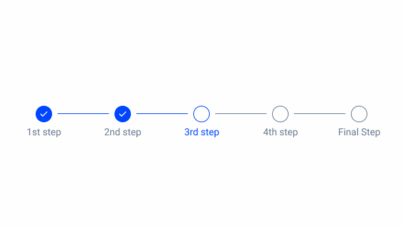
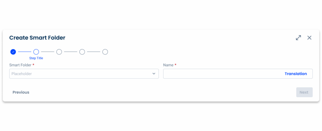
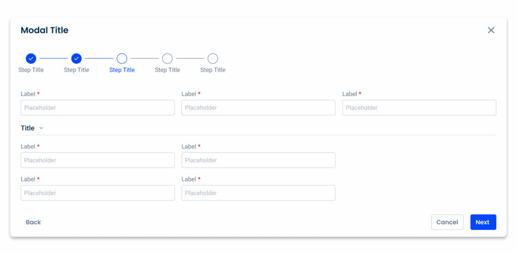
A Stepper is a UI component that guides users through a step-by-step process, such as a form or a wizard. It typically consists of a series of numbered or labeled steps that users can navigate sequentially. Each step may contain specific actions or inputs that the user needs to complete before moving on to the next step. Steppers help users understand their progress within a process and provide clear direction on what actions to take next.

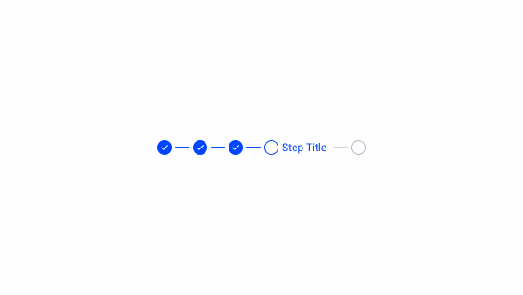
- 1: Status Indicator
- 2: Active Step Icon
- 3: Label
- 4: Inactive Step

Used for:
Tasks with three or more steps
Steppers balance structure and simplicity, effectively guiding users through multi-step workflows, such as sign-ups, checkouts, or onboarding experiences.
Progress tracking
When completing long forms, such as e-commerce checkouts, onboarding or visa applications, steppers help users track their progress.
Enhancing linear navigation
Steppers can help complement standard back/next navigation.
Validating inputs before progression
Steppers can be used when the user’s inputs must be validated before moving on to the next step.
Don’t use for:
Single-step processes
If a process or task can be completed in one or two steps without the need for further segmentation or guidance, the use of a Stepper may be unnecessary and could introduce unnecessary complexity.
Frequent updates or changes
If the steps in a process are subject to frequent updates or changes, maintaining a Stepper interface could become cumbersome. In such cases, a more flexible or dynamic navigation approach may be preferable.
Flexible navigation
If there is no order in which the process should be carried out, the implementation of a Stepper is probably unnecessary.
Overly granular tasks
Breaking a task into too many small steps can overwhelm users and hinder, rather than facilitate, their progress.

Demo
Access the Figma file and inspect the element using Dev Mode.

Last Update
- Updated Stepper component;
- Updated guidelines to reflect component changes.
Step Variations
Selected
Uncompleted Step
.selected-step{
  border-radius: var(--rounded);
  border-color: var(--Theme-Theme-100);
  fill: var(--Theme-Theme-100);
  label {
    color: var(--Theme-Theme-100);
  }
}
Completed Step
.filled-selected-step{
  border-radius: var(--rounded);
  border-color: var(--Theme-Theme-100);
  icon {
    icon: check;
    color: var(--Greys-Grey-1);
  }
  label {
    color: var(--Theme-Theme-100);
  }
}
Not selected
Uncompleted Step
.inactive-step{
  border-radius: var(--rounded);
  border-color: var(--Greys-Grey-8);
  label {
    color: var(--Greys-Grey-8);
  }
}
Completed Step

.filled-step{
  border-radius: var(--rounded);
  fill: var(--Theme-Theme-100);
  icon {
    icon: check;
    color: var(--Greys-Grey-1);
  }
  label {
    color: var(--Greys-Grey-7);
  }
}
States
Enabled
Inactive
inactive-step-enable{
  border-radius: var(--rounded);
  border-color: var(--Grey-Grey-6);
  label {
    color: var(--Greys-Grey-8);
  }
}
Current Step
selected-step-enable{
  border-radius: var(--rounded);
  border-color: var(--Theme-Theme-100);
  label {
    color: var(--Theme-Theme-100);
  }
}
Filled Current Step
filled-selected-step-enable{
  border-radius: var(--rounded);
  border-color: var(--Theme-Theme-100);
  icon {
    icon: check;
    color: var(--Theme-Theme-100);
  }
  label {
    color: var(--Theme-Theme-100);
  }
}
Filled Step
filled-step-enable{
  border-radius: var(--rounded);
  fill: var(--Theme-Theme-100);
  icon {
    icon: check;
    color: var(var(--Greys-Grey-1);
  }
  label {
    color: var(--Greys-Grey-7);
  }
}
Hover
Inactive Step
inactive-step-hover{
  border-radius: var(--rounded);
  border-color: var(--Greys-Grey-6);
  fill: var(--Theme-Theme-10);
  label {
    color: var(--Greys-Grey-8);
  }
}
Current Step

selected-step-hover{
  border-radius: var(--rounded);
  border-color: var(--Theme-Theme-80);
  fill: var(--Theme-Theme-10);
  label {
    color: var(--Theme-Theme-100);
  }
}
Filled Current Step
filled-selected-step-hover{
  border-radius: var(--rounded);
  border-color: var(--Theme-Theme-80);
  fill: var(--Theme-Theme-10);
  icon {
    icon: check;
    color: var(--Theme-Theme-100);
  }
  label {
    color: var(--Theme-Theme-100);
  }
}
Filled Step

filled-step-hover{
  border-radius: var(--rounded);
  fill: var(--Theme-Theme-80);
  icon {
    icon: check;
    color: var(var(--Greys-Grey-1);
  }
  label {
    color: var(--Greys-Grey-7);
  }
}
Pressed
Inactive Step

inactive-step-pressed{
  border-radius: var(--rounded);
  border-color: var(--Theme-Theme-100);
  fill: var(--Theme-Theme-10);
  label {
    color: var(--Theme-Theme-100);
  }
}
Current Step
selected-step-pressed{
  border-radius: var(--rounded);
  border-color: var(--Theme-Theme-Highlight);
  fill: var(--Theme-Theme-10);
  label {
    color: var(--Theme-Theme-100);
  }
}
Filled Current Step
filled-selected-step-pressed{
  border-radius: var(--rounded);
  border-color: var(--Theme-Theme-Highlight);
  fill: var(--Theme-Theme-10);
  icon {
    icon: check;
    color: var(--Theme-Theme-100);
  }
  label {
    color: var(--Theme-Theme-100);
  }
}
Filled Step
filled-step-pressed{
  border-radius: var(--rounded);
  fill: var(--Theme-Theme-Highlight);
  icon {
    icon: check;
    color: var(var(--Greys-Grey-1);
  }
  label {
    color: var(--Theme-Theme-100);
  }
}
Error
Inactive Step
inactive-step-error{
  border-radius: var(--rounded);
  border-color: var(--Error-Error-100);
  label {
    color:var(--Error-Error-100);
  }
}
Current Step
selected-step-error{
  border-radius: var(--rounded);
  border-color: var(--Error-Error-100);
  label {
    color:var(--Error-Error-100);
  }
}
Filled Current Step
filled-selected-step-error{
  border-radius: var(--rounded);
  border-color: var(--Error-Error-100);
  icon{
    icon: error;
    color: var(--Error-Error-100);
  }
  label {
    color:var(--Error-Error-100);
  }
}
Filled Step
filled-step-error{
  border-radius: var(--rounded);
  fill: var(--Error-Error-100);
  icon{
    icon: error;
    color: var(--Greys-Grey-1);
  }
  label {
    color:var(--Error-Error-100);
  }
}
Disabled
Without Icon

disabled {
  border-radius: var(--rounded);
  fill: var(--Greys-Grey-6);
  label {
    color:var(--Greys-Grey-6);
  }
}
With Error Icon
disabled-icon{
  border-radius: var(--rounded);
  fill: var(--Greys-Grey-6);
  icon{
    icon: error;
    color: var(--Greys-Grey-6);
  label {
    color: var(--Greys-Grey-6);
  }
}
Useful links

Consult our Figma file to access our assets and inspect them in dev mode.

This component is or will be provided by the Polygon framework. See its documentation to learn more.

This element is in line with the guidelines of the CDS (Cegid Design System). Find out more.
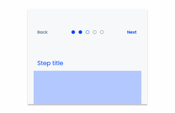
Navigation
As Steppers are tools intended to break tasks into multiple steps, it’s essential to allow users to navigate between them. This is primarily achieved through the interface.
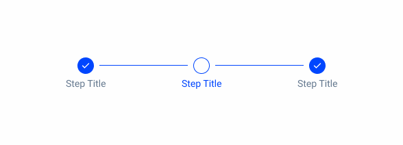
Where appropriate, Steppers should also be responsive. Users should be able to click on a specific step to jump directly to it, allowing them to skip several steps at once, or to move on to a previous step that has already been completed.
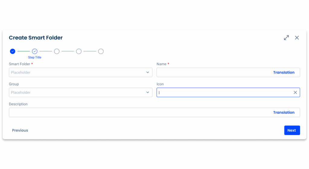
Ensure that all interfaces in which Steppers are implemented must provide a way for users to move forwards and backwards between steps, such as Next/Previous buttons.
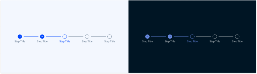
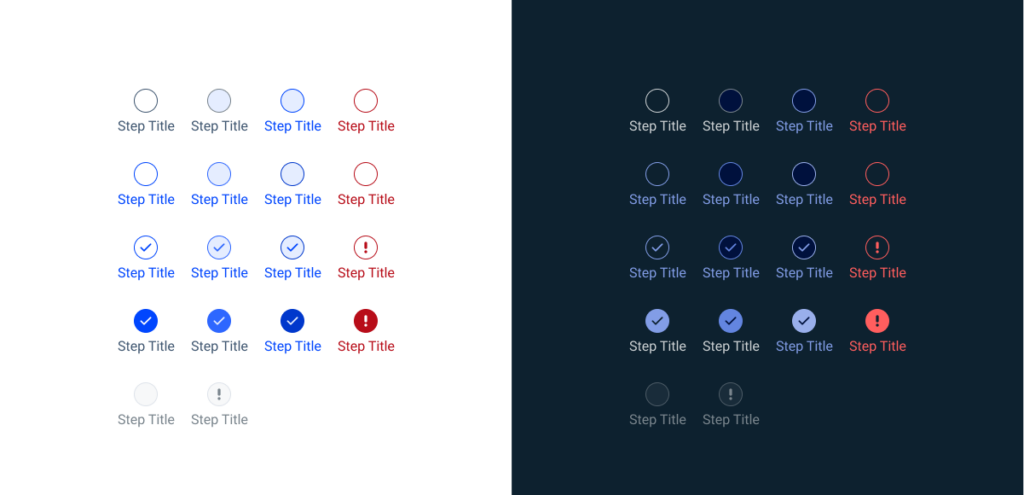
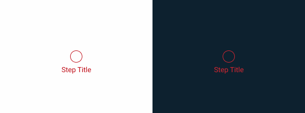
States
The Stepper has multiple states, each serving a specific purpose depending on the situation.
Enabled
This state is applied to any step the user is expected to interact with (or has already interacted with).


Hover
The hover state is applied when a user’s mouse cursor is hovering over the progress indicator step.

Pressed
This state is used when a user presses the progress indicator step, showing that they have successfully navigated to the intended step.

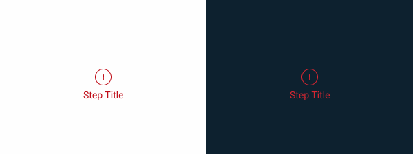
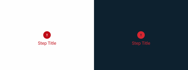
Error
A step may be in error when a user has entered invalid or incomplete information. A server-side error may also have occurred. Provide clear information about the error and guidance on how to resolve the issue.


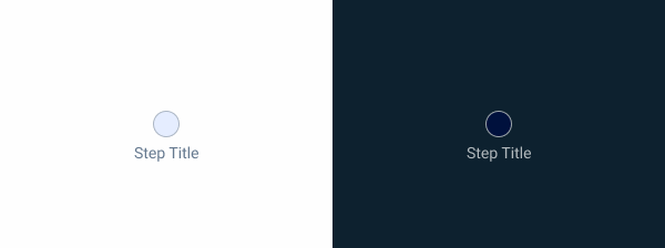
Disabled
If users are unable to interact with a step -either because of an issue or because they shouldn’t – the step should be disabled, preventing the use of all other states.

For guidelines on how to correctly represent these states, refer to the Specs segment of this article.
Ensure users can’t move on to the next step without completing all the required actions.
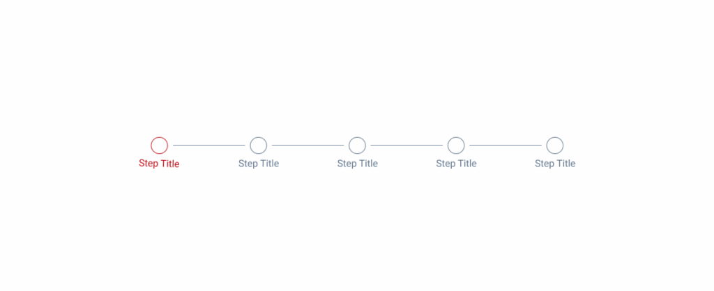
Use the error state on the first step.
Variations
Variations help convey important information to users, while also providing greater flexibility based on where Steppers are implemented.
Step
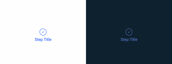
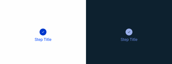
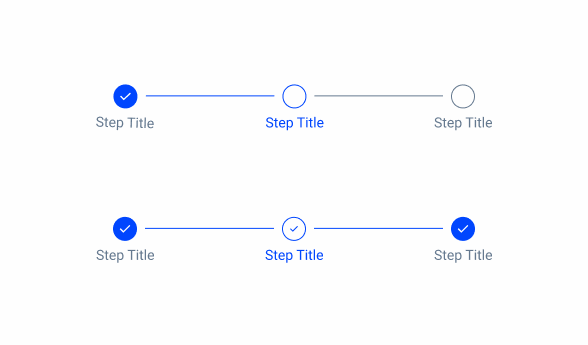
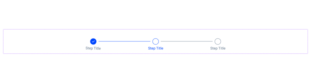
Selected
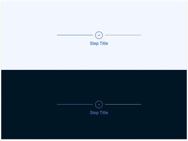
Applied when the user is interacting with the information in that step. When the step is complete, the component should reflect that information.

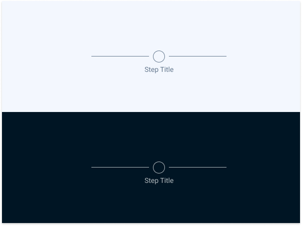
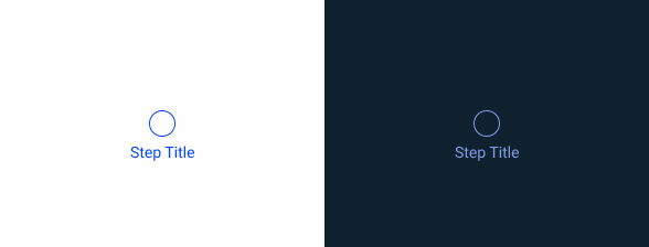
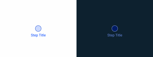
Not Selected
A step is not selected if the user hasn’t interacted with it or if they have completed the required information and moved on to the next step. Whenever possible, use validation to confirm that a step has been completed before the user continues.

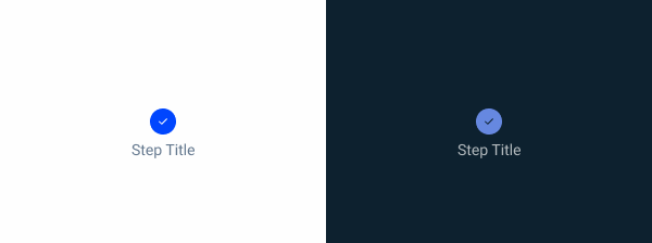
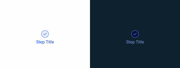
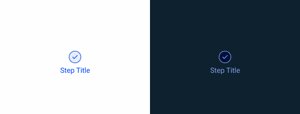
Filled
This Stepper variation represents steps the user has completed. It applies to both selected and not selected steps, each with its own style.
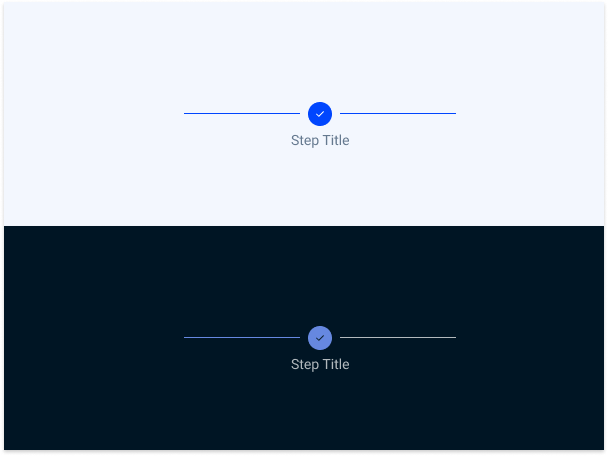

Revert the filled variation. When users return to previously completed steps, the Stepper should remain filled, unless the mandatory requirements are no longer met.
Label
Show/Hide
Labels are crucial as they give users context about the tasks they’re engaging with. Whenever possible, every step should be labeled. However, in cases where simplicity is preferred, we offer a variation that hides the label for unselected steps.

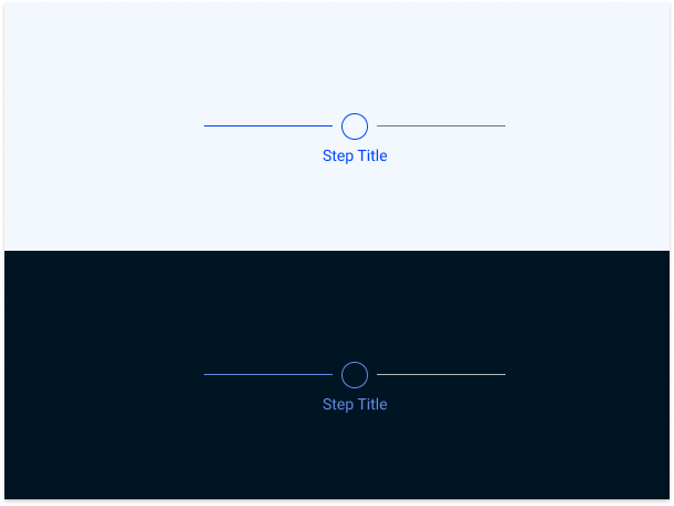
Position
Depending on the UI element the Stepper is applied to, adjusting the label’s position might be helpful. We offer three variations: Default, Top, and Bottom, as shown in the example image.
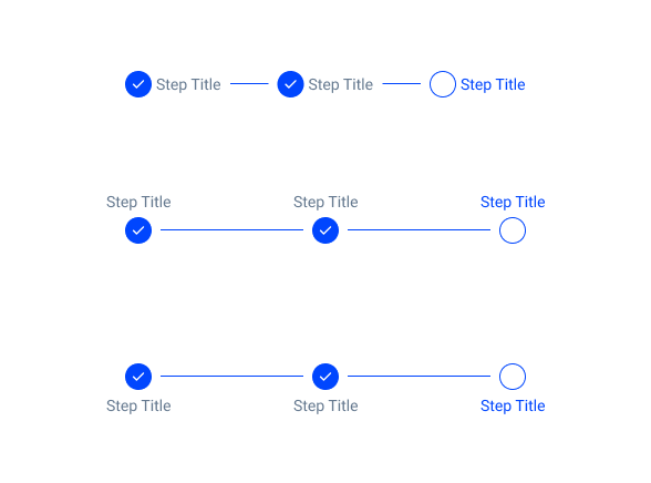
Include the step title elsewhere in the interface if can’t place it in the Stepper.
Responsiveness
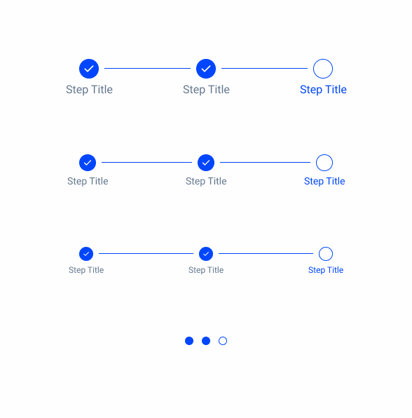
Completed
In some cases, users may have to go back to a previously completed form or document. The completed variation enables navigation between steps, ensuring they remain correctly represented.
Size
Since Steppers are used in various situations, we offer four size variations to ensure they fit well in each case: Large, Regular, Small, and Extra Small, with the latter specifically designed for mobile interfaces.
Position
Steppers are essential for keeping users aware of their progress in a task. Therefore, they must be placed in such a way as to ensure maximum visibility.
By default, they should be placed at the top of the interface which they belong.
Their alignment – whether centered, to the left, or to the right – can vary depending on where they are implemented.
Width
Due to the large number of interfaces in which Steppers can be implemented, they are designed to be flexible. However, there are some restrictions to bear in mind.
The connector line separating each step must be at least 16 px, except for the extra-small variation. This variation is designed for mobile devices, where space is limited and the Stepper component is not intended to be interactive. In this case, there should be 8 px between each step.


The connector line is limited to a maximum width of 200 px. This prevents Steppers with fewer steps from looking awkwardly long when inserted into containers that fill a large interface.

Use Steppers for tasks with two or fewer steps.
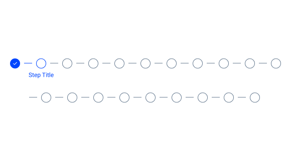
Divide a task into more than 10 steps.
Label
Ensure each label succinctly communicates the user’s task for each step, ideally in one or two words.
Use the {verb} + {noun} content structure to clearly indicate the action of the step, such as “Configure IdP” or “Define endpoints.” If universally understood, a single word like “Cart,” “Shipping,” or “Payment” is enough.
Avoid ambiguous terms like “Processing.” Consider numbering each step to enhance progression clarity.
When space is limited, choose to rephrase the label or truncate it with an ellipsis. Additionally, use tooltips to convey any supplementary information.

Avoid overly complicated names for each step, as labels have a maximum width of 120 px.
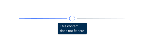
Use tooltips if the step name doesn’t fit on the label.
Case Studies

Handling Background Tasks

Read Mode: Making Content Feel Effortless and Understandable
