
Status Indicator
Status Indicators provide visual cues to convey the status of an element or system, helping users to understand actions or conditions.

- Overview
- Specs
- Guidelines
Component
Status Indicators use colors and symbols to create user-recognizable meanings throughout the product. There’s also various forms to adapt to different use cases.
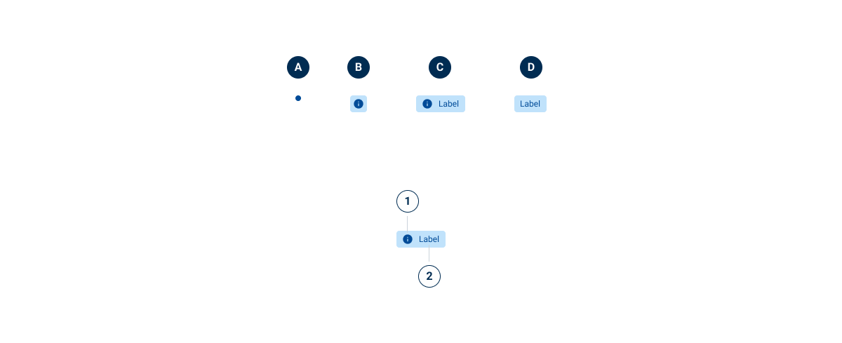
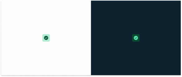
- A : Dot
- B: Icon
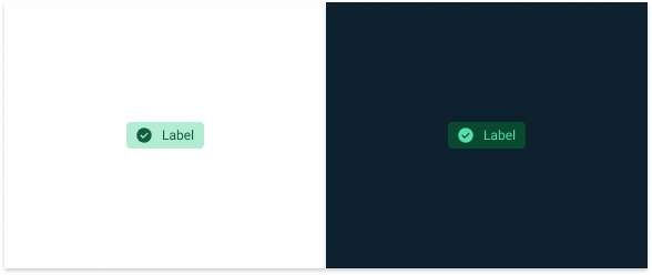
- C: Extended
- D: Label (Variation)
- 1: Icon
- 2: Label

Used for:
Communicating conditions
The main function of the status indicator is to describe the status of an element based on a list of conditions defined by the platform on which it is implemented.
Don’t use for:
Minimal status variation
If there are minimal or negligible changes in the status of the elements, the use of Status Indicators can clutter the interface without providing significant value.
Ambiguous status
When the status of the elements cannot be clearly defined or is subject to interpretation, the use of Status Indicators can lead to confusion rather than clarity.
Unnecessary redundancy
If the status of elements is already conveyed through other means, such as text labels or contextual cues, adding Status Indicators may create redundancy.
Dynamic content
In interfaces with dynamic or rapidly changing content, the use of Status Indicators can be ineffective, as they may not accurately reflect the current status of the elements in real time.
Overwhelming complexity
In interfaces with a large number of elements or complex interactions, the use of status indicators for each element can overwhelm users and hinder comprehension.
Demo
Access the Figma file and inspect the element using Dev Mode.
Last Update
- Several segments updated;
- Guidelines have been added to clarify when to use chips versus Status Indicators.
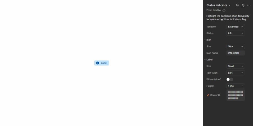
Variations
Dot
.statusIndicator {
    width: 8px;
    height: 8px;
}
Icon Only
.statusIndicator {
    width: 24px;
    height: 24px;
    padding: var(--spacing-4);
    icon: 16px;
}
Extended
.statusIndicator {
    height: 24px;
    padding: var(--spacing-4, --spacing-8);
    gap: var(--spacing-8);
    icon: 16px;
    label: var(--label-small);
}
Label

.statusIndicator {
    height: 24px;
    padding: var(--spacing-4, --spacing-8);
    label: var(--label-small);
}
Status
Informative
.info {
    dot: var(--info-100);
    background-color: var(--info-20);
    icon: var(--info-100), 'info_circle';
    label: var(--info-100);
}
Positive
.positive {
    dot: var(--success-100);
    background-color: var(--success-20);
    icon: var(--success-100), 'check_circle';
    label: var(--success-100);
}
Warning
.warning {
    dot: var(--warning-100);
    background-color: var(--warning-20);
    icon: var(--warning-100), 'error_circle';
    label: var(--warning-100);
}
Negative
.negative{
    dot: var(--error-100);
    background-color: var(--error-20);
    icon: var(--error-100), 'error_circle';
    label: var(--error-100);
}
Neutral
.neutral {
    dot: var(--grey-8);
    background-color: var(--grey-4);
    icon: var(--grey-8), 'block';
    label: var(--grey-8);
}
Useful links

Consult our Figma file to access our assets and inspect them in dev mode.

This component is or will be provided by the Polygon framework. See its documentation to learn more.

This element is in line with the guidelines of the CDS (Cegid Design System). Find out more.
Behavior
Variations
Status Indicators are common components found in many different layouts, so it’s important to ensure they always integrate seamlessly. They come in four variants, each suited to different design needs:
- Dot: represented by a simple dot;
- Icon: represented with the status background and an icon;
- Extended: represented exactly like the Icon variation, but with an additional text;
- Label: represented with text only.
Naturally, variations that have more elements provide users with additional information about an element. However, simpler variations – such as the dot – may be preferable when users already have enough context and adding a label would cause redundancy.
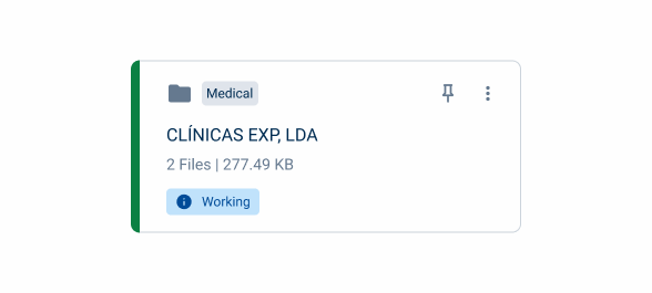
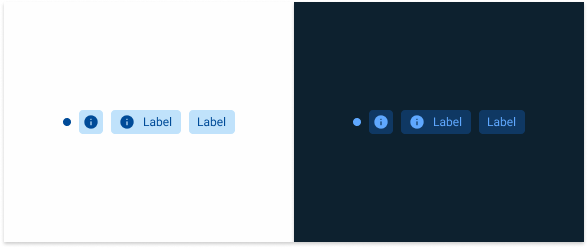
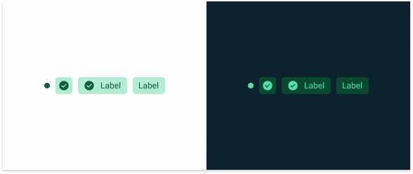
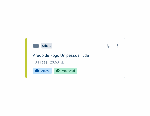
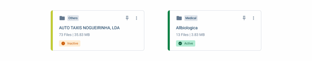
In the example below, the Status Indicator is integrated into a component that already includes labels. To avoid a cluttered interface, the dot variation is used.

Simpler variations can also be useful when working with limited space. However, it’s important to ensure users are given enough context to understand their meaning.
Prioritize the more informative variations, as long as the interface remains uncluttered.

Use simpler variations when the information they are intended to convey isn’t clear.
Status
Informative
This variation is represented by the color blue and the information icon and should be used to reflect the following statuses: informative, active, in use and published.
Positive
This variation is represented by the color green and the checkmark icon and should be used in the following statuses: positive, approved, success and new.
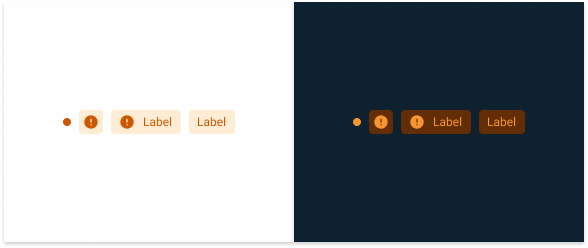
Warning
Represented by the color orange and the warning icon. They should be used in the following statuses: alert, in approval, pending, scheduled, synchronizing, processing and uploading.
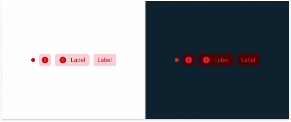
Negative
This variation is represented by the color red and the error icon and should be used in the following statuses: negative, error, rejected, failure and deleted.
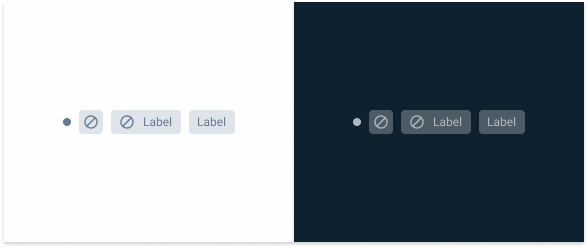
Neutral
This variation is represented by the color grey and should be used in the following statuses: neutral, archived, deleted, paused, draft, not started, complete and finalized.
Consider using more than one Status Indicator if an element is affected by multiple conditions.
Use the Status Indicator for purposes other than status indication, such as giving instructions.
Trimming
When the text is too long, a new line should be created. If there is no room for a new line, the text should be truncated and displayed on hover.

If needed, add a second line of text.
Chips vs Status Indicators
Since Chips and Status Indicators have some similar variations, it’s important to understand when to use each one.
Chips are components that invite user interaction – whether by having users click on them, or by reflecting their inputs. They are versatile components that can be placed in various parts of the layout and are mainly used for categorization and filtering.
On the other hand, Status Indicators are informative components that are not meant to be interactive. Their main function is to convey information or notify users. They’re less flexible than chips as they only convey details about limited conditions set by the system they’re implemented in. They are often placed next to the interface element to which they refer.
It is worth noting that Chips can also be used to provide information to users though its informative variant. In the example below, both Chips and Status Indicators are implemented on a card. The Chip displays a category the user has previously selected, while the Status Indicator conveys information about the card over which the user has no control.
Case Studies

Handling Background Tasks

Read Mode: Making Content Feel Effortless and Understandable
