
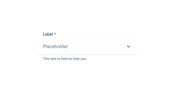
Select Box
The Select Box component allows users to make selections from a predetermined list of options.

- Overview
- Specs
- Guidelines
- Mobile
Component
A Select Box component, in UX, provides users with a predefined list of options from which they can make a single or multiple selection.
It usually appears as a drop-down menu, conserving screen space while offering users a clear and intuitive interface for making selections. Select Boxes are commonly used to display options, such selecting countries, filtering categories, etc..
Select Boxes can enhance usability by reducing cognitive load and ensuring consistent input, ultimately improving the overall user experience.

- A: Single selection variation
- B: Multi selection variation
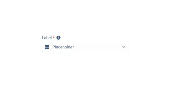
- 1: Label
- 2: Icon
- 3: Closable chip
- 4: List item
- 5: Hint chip

Used for:
Limited choice selection
When users need to make a selection from a predefined list of options, a Select Box provides a clear and efficient interface for choosing among the available alternatives.
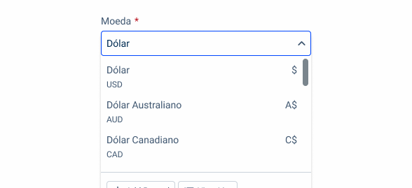
Currency choice
For accounting software that deals with multiple currencies, a select box is invaluable for choosing the currency in which a transaction is recorded. The dropdown might include options like USD, EUR, or GBP, enabling the user to quickly and accurately select the relevant currency.
Tax rates choice
When creating an invoice or entering purchase transactions, the select box is useful for choosing the appropriate tax rate, such as 5%, 10%, or 20%. Since tax rates are predefined by tax authorities, providing these options in a dropdown helps ensure that the correct rate is applied to transactions.
Payment method
When recording payments, a select box can be employed to choose the payment method. Common options like “Bank Transfer,” “Credit Card,” or “Cash” can be provided, allowing the user to quickly select the appropriate payment method for each transaction.
Don’t use for:
Large number of options
When presenting a large number of options, such as hundreds or thousands, a Select Box may become unwieldy and difficult for users to navigate effectively.
Date values expected
If the data entered needs to follow a very specific format (such as dates, phone numbers, or tax ID numbers), a select box may not ensure compliance with the required structure. For instance, when entering a date, it is more efficient to use a date picker rather than a select box.
Numeric values expected
Select boxes are not suitable for continuous or numeric data that covers a wide range. For instance, if a user is entering quantities, percentages, or dollar amounts, it’s impractical to provide a dropdown with every possible value.

Demo
Access the Figma file and inspect the element using Dev Mode.

Last Update
- Added new tab for the mobile version of the component.
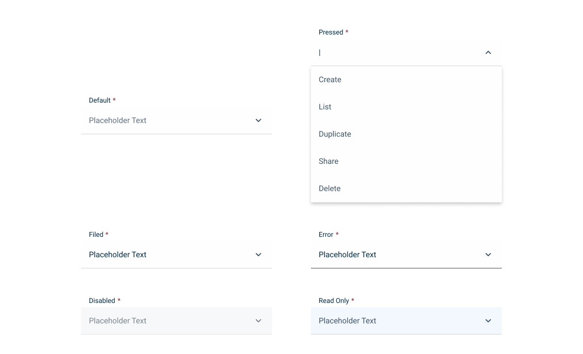
States

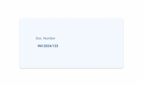
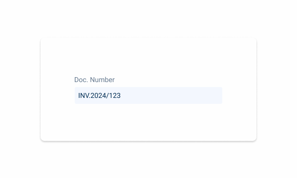
Single Selection
Enabled

.enabled {
  label: var(--grey-7);
  input-border: var(--grey-5);
  input-background: var(--grey-1);
  placeholder: var(--grey-6);
  icon: var(--grey-7);
}
Hover

.hover {
  label: var(--grey-7);
  input-border: var(--grey-6);
  input-background: var(--grey-1);
  placeholder: var(--grey-6);
  icon: var(--grey-7);
}
Focus

.focus {
  label: var(--grey-7);
  input-border: var(--theme-100);
  input-background: var(--grey-1);
  input: var(--grey-8);
  icon: var(--grey-7);
  list-item: var(--grey-7);
  scrollbar: var(--grey-6);
  divider: var(--grey-5);
  chips: var(--chips_hint);
}
Read-only

.readOnly {
  label: var(--grey-7);
  input-border: var(--grey-1);
  input-background: var(--grey-3);
  input: var(--grey-8);
  icon_open_in_new: var(--theme-100);
  icon: var(--grey-6);
}
Disabled

.disabled {
  label: var(--grey-7);
  input-border: var(--grey-4);
  input-background: var(--grey-2);
  input: var(--grey-6);
  icon_open_in_new: var(--theme-100);
  icon: var(--grey-6);
}
Error

.error {
  label: var(--grey-7);
  input-border: var(--error-100);
  input-background: var(--grey-1);
  input: var(--grey-6);
  icon: var(--grey-6);
}
Multiple Selection
Enabled

.enabled {
  label: var(--grey-7);
  input-border: var(--grey-5);
  input-background: var(--grey-1);
  placeholder: var(--grey-6);
  icon: var(--grey-7);
}
Hover
.hover {
  label: var(--grey-7);
  input-border: var(--grey-6);
  input-background: var(--grey-1);
  placeholder: var(--grey-6);
  icon: var(--grey-7);
}
Focus

.focus {
  label: var(--grey-7);
  input-border: var(--theme-100);
  input-background: var(--grey-1);
  input: var(--grey-8);
  icon: var(--grey-7);
  list-item-checkbox: var(--checkbox-enabled);
  list-item: var(--grey-7);
  divider: var(--grey-5);
  list-item-checkbox: var(--checkbox-enabled);
  list-item: var(--grey-7);
  scrollbar: var(--grey-6);
  divider: var(--grey-5);
  chips: var(--chips_hint);
}
Read-only

.readOnly {
  label: var(--grey-7);
  input-border: var(--grey-1);
  input-background: var(--grey-3);
  chip-background: var(--grey-4);
  chip-label: var(--grey-8);
  icon_open_in_new: var(--theme-100);
  icon: var(--grey-6);
}
Disabled

.disabled {
  label: var(--grey-7);
  input-border: var(--grey-4);
  input-background: var(--grey-2);
  chip-background: var(--grey-4);
  chip-label: var(--grey-8);
  icon_open_in_new: var(--theme-100);
  icon: var(--grey-6);
}
Error
.readOnly {
  label: var(--grey-7);
  input-border: var(--error-100);
  input-background: var(--grey-1);
  input: var(--grey-6);
  icon: var(--grey-6);
}
Size
Small

.small {
  label: var(--label-small);
  input-height: 28px;
  input-border: var(--x-small-radius);
  input-gap: 4px;
  input-padding: var(0, --spacing-8);
  icon: 16px;
  placeholder: var(--label-small);
}
Regular

.regular {
  label: var(--label-regular);
  input-height: 36px;
  input-border: var(--x-small-radius);
  input-gap: 8px;
  input-padding: var(0, --spacing-8);
  icon: 20px;
  placeholder: var(--label-regular);
}
Large

.large {
  label: var(--label-large);
  input-height: 40px;
  input-border: var(--x-small-radius);
  input-gap: 8px;
  input-padding: var(0, --spacing-8);
  icon: 24px;
  placeholder: var(--label-large);
}
Useful links

Consult our Figma file to access our assets and inspect them in dev mode.

This component is or will be provided by the Polygon framework. See its documentation to learn more.

This element is in line with the guidelines of the CDS (Cegid Design System). Find out more.
Single Selection
This is the default Select Box. It only allows one selection from your list. When you click or enter, the drop-down is collapsed.

Use a Select Box for a minimum of three options.
Use different list variations in the same drop-down.
Multiple Selection
General Guidelines
When the Select Results option is available, this option must be fixed at the top of the drop-down. The scroll behavior will occur within the records of the Select Box.
When the total number of chips exceeds the space dedicated to the field, a “+ Number of additional options” is displayed. Clicking on the number displays a drop-down menu with the additional options selected.

Consider making the Multiselect variation wider. This allows users with smaller screens to see more Chips.
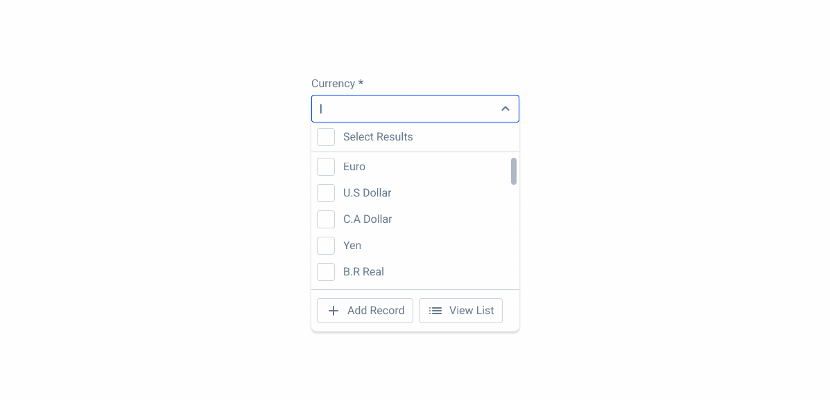
Select Results Behavior
When you need to select more than one option, you can use the multi selection Select Box. A checkbox is added to make the selection which will then be converted into tags. There is also an option to select everything in the list.
In addition, a Select Results option is always fixed at the top of the options list. This allows users to quickly select or deselect all available options with a single click, making the selection process much more efficient, especially when dealing with large datasets.
The placement of the Select Results option at the top ensures that it is easily accessible and visible, simplifying the user experience by reducing the need to check each option individually. This feature is designed to save time and improve the overall interaction with the Select Box component, particularly in scenarios where multiple selections are common.
Furthermore, when a search is made, the label will remain the same, since the Select Results option can be used in both contexts, without the need to change the label.

Alternatives
If the Select Results option of the multi selection doesn’t suit your use case, an alternative without the Select Results option is available for specific cases, such as the use of different frameworks.
One aspect to take into account is that at least five different records must be displayed, and in some cases more may be displayed.

Additional Information
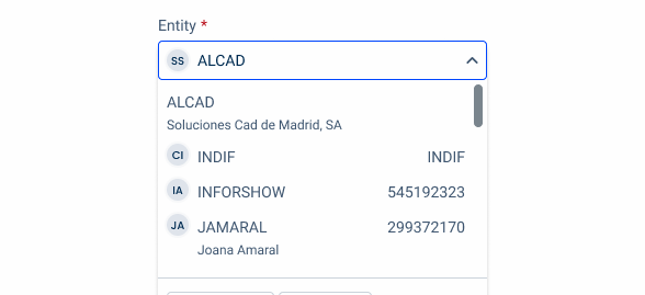
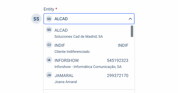
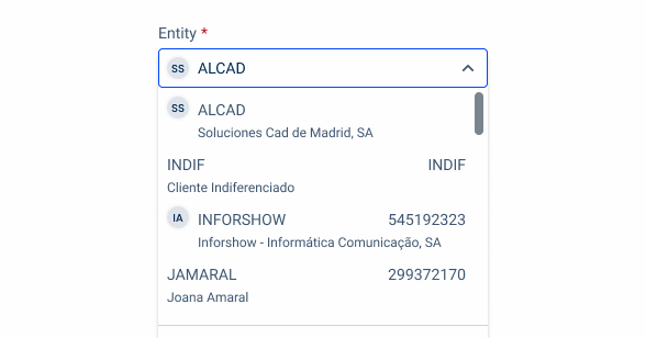
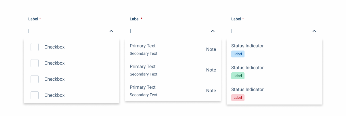
The Select Box is designed to display up to three levels of information.
By default, only one piece of information is displayed. The information that appears and in which position is configured according to each context, taking into account the established hierarchy.
Alongside with this information, an Adornment can be added to the left side of the level one information. This Adornment can take the form of the following components:
- Icon;
- Flag/Image;
- Avatar;
- App Icon;
- Status Indicator.


Apply the adornment out of the Select Box field.
Be inconsistent with icons and adornments. When applying them, make sure to do so on all items in the dropdown.
Position
Input-type components must always be placed on grey-1 backgrounds (white) for optimal usability.
Avoid using them on grey-3 backgrounds (grey), as this can compromise the visibility of disabled and read-only states.
If placement on grey-3 backgrounds is necessary, ensure that disabled or read-only states are not utilized in these scenarios.
Place input-type components on grey-3 backgrounds. This will maintain optimal visibility and accessibility.
Place Input-type components over grey-1 backgrounds.
Empty State
When no matching options are available, the message ‘No data found‘ informs users that their input does not correspond to any selectable item.
Since the select box already allows users to clear their input, additional reset actions are unnecessary. However, if additional actions, such as creating a new record or listing all options, are available, they should remain accessible to ensure a seamless workflow.

Voice-Over
For general guidelines on screen reader compatibility, see the following blog post on best practices: Designing the Invisible: How to Make Your Interfaces Work Without a Screen.
Announce how many options there are in the Select Box.
Ensure that users are informed when the list is opened.
Use unclear option names. For example, acronyms can result difficult for users to understand.
Reading Order
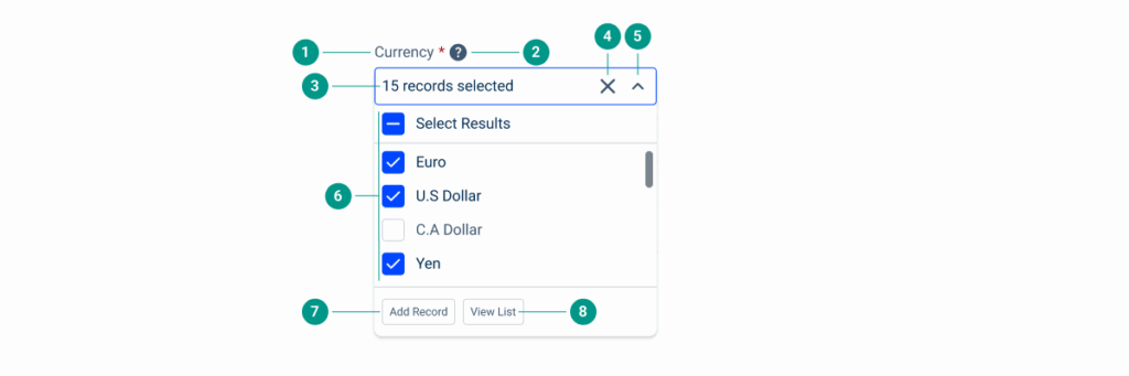
| Reading Order | Element | Screen Reader Reading |
| 1 | Field name | Currency, required field. |
| 2 | Tooltip | Information, [tooltip content]. |
| 3 | Number of selected items | Currency multi-select select box, expanded; 15 records selected. |
| 4 | Close button | Close, button. |
| 5 | Expander | Collapse, button. |
| 6 | Selected items | Select results, selected, 1 of 20. Euro, selected, 2 of 20. US Dollar, selected, 3 of 20. C.A Dollar, not selected, 4 of 20. Yen, selected, 5 of 20. |
| 7 | ‘Add Record’ button | ‘Add Record’, button. |
| 8 | ‘View List’ button | ‘View List’, button. |
Case Studies

Handling Background Tasks

Read Mode: Making Content Feel Effortless and Understandable

A Visual Recap of 2025: how we enhanced chatbot communication
References
What Changes?
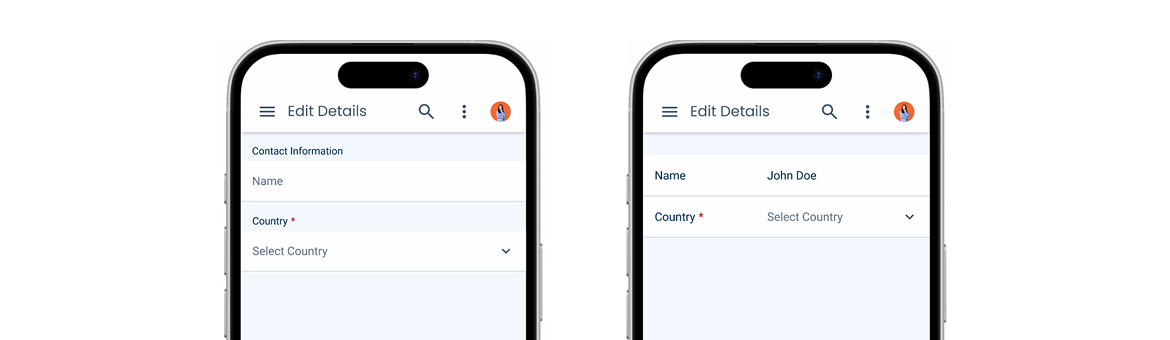
The mobile version of the Select Box has been designed to be similar to other components, such as the Text Field, improving harmony and consistency between the elements of the design system. This also means that it receives improvements that make it more suitable for small screens, such as an increased touch target and fewer states.

Demo
Access the Figma file and inspect the element using Dev Mode.
Variations
Since Select Boxes are often grouped with Text Fields in forms, they share the same variations – default and horizontal. This allows components to be used together without looking strange. The horizontal variation can also be considered in cases where working space is limited.
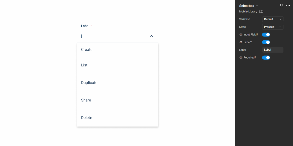
Dropdown
In its Pressed state, the Select Box will show a dropdown menu. Each element is a List Item, which is a flexible component with several variations. This means that they can be organized in different ways, as shown in the image below, depending on the needs of the product.
States
As previously mentioned, and as with all mobile components, states that cannot be used on touch screens – such as Hover and Focus – aren’t available.
Case Studies
Handling Background Tasks
Read Mode: Making Content Feel Effortless and Understandable