
Scrollbar
The Scrollbar component helps users navigate scrollable content by indicating their position within a viewing window

- Overview
- Specs
- Guidelines
Component
The Scrollbar component is a fundamental element of the user interface design that enhances the user experience by providing visual feedback and control over scrollable content.
It serves as a navigational help within interfaces where content extends beyond the visible viewport, allowing users to seamlessly explore and interact with extensive datasets, documents, or web pages.

A: Horizontal Variation
B: Vetical Variation

Used for:
Selectbox
To give the user access to additional information within the selectboxes, a vertical Scrollbar is used;
Modal
To give the user access to additional information inside modals, a vertical Scrollbar is used. For forms applied inside modals, an horizontal Scrollbar is used;
Flyout
When there is a form or a data selection within a flyout, which exceeds the height of the component, a Scrollbar is used to navigate;
Sidebar
As it is the case with th flyout, when the sidebar exceeds the vertical space available, a Scrollbar appears;
Don’t use for:
Fixed content size
When the content within a viewport is static and does not exceed the available space, Scrollbars may be unnecessary and could create visual clutter;
Mobile-First design
In interfaces designed primarily for mobile devices with limited screen space, using Scrollbars may not be ideal as it can occupy valuable space and detract from the overall user experience;
Gesture-Based navigation
In touch-based interfaces where users primarily navigate through gestures, such as swiping or tapping, relying solely on Scrollbars may not align with user expectations and could introduce unnecessary complexity;
Custom navigation solutions
In interfaces where custom navigation solutions, such as infinite scrolling, pagination, or tabbed browsing, are employed to manage content visibility and accessibility, traditional Scrollbars may not be needed or could conflict with the established navigation patterns.

Demo
Access the Figma file and inspect the element using Dev Mode.
Last Update

- New component added to the design system;
Related
Variations

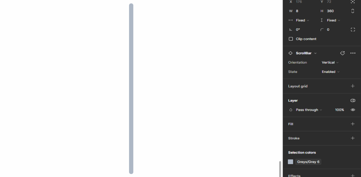
Vertical
Enabled

.enabled {
  rotation: 0º;
  color: var(--grey-6);
}
Hover

.hover {
  rotation: 0º;
  color: var(--grey-8);
}
Drag

.drag {
  rotation: 0º;
  color: var(--grey-9);
}
Horizontal
Enabled

.enabled {
  rotation: 90º;
  color: var(--grey-6);
}
Hover

.hover {
  rotation: 90º;
  color: var(--grey-8);
}
Drag

.drag {
  rotation: 90º;
  color: var(--grey-9);
}
Useful links

Consult our Figma file to access our assets and inspect them in dev mode.

This component is or will be provided by the Polygon framework. See its documentation to learn more.

This element is in line with the guidelines of the CDS (Cegid Design System). Find out more.
Behavior
Size
To let the user know how much content exists on the screen, the Scrollbar height/width can vary to give a more controllable experience to the user.
When the scroll is consequent, the Scrollbar tends to be shorter to give that impression. On the other hand, the longer the Scrollbar, the shorter the extra content to be viewed.

Apply a Scrollbar keeping in mind the size of the extra content.
Apply a scrollbar with different colors.
Case Studies

Handling Background Tasks

Read Mode: Making Content Feel Effortless and Understandable
