
Range Slider
A Range Slider component enables users to interactively select a value or range within a defined scope, offering precise control and visual feedback through an intuitive sliding mechanism.

- Overview
- Specs
- Guidelines
Component
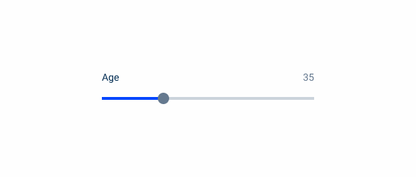
A range slider, in UX, refers to a visual interface element allowing users to select a numerical range within a defined set of values. It consists of a draggable handle along a track, enabling users to specify a single value or a range by sliding the handle.
They allow users to be more precise and provide an improved experience when choosing a specific value, as the handle gives direct feedback and acessibility to the user.

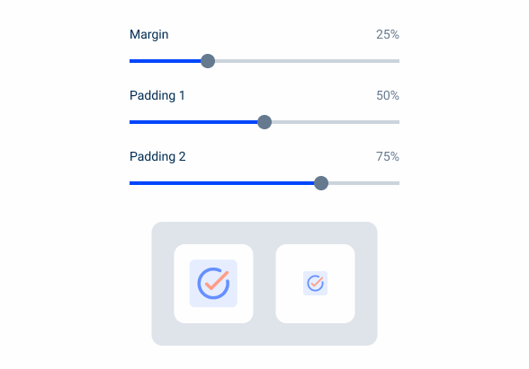
A: Unique Variation
1: Label
2: Progress Bar
3: Progress Indicator
4: Range Handle

Used for:
Filtering and sorting
Range Sliders are commonly used in websites and data visualization tools to filter products or search results based on price, size, or other numerical attributes;
Data analysis
They are valuable in applications for data analysis and visualization, allowing users to select specific date ranges, numerical ranges, or performance metrics;
Configurators
Range Sliders can be incorporated into configurator tools for customizing products or services, enabling users to specify dimensions, quantities, or other parameters within a defined range;
Don’t use for:
Precision required
If users need to input precise numerical values, such as when entering specific dates, times, or monetary amounts, sliders may not provide the necessary precision compared to direct input fields;
Large value ranges
Sliders may become cumbersome to use when dealing with large value ranges, as users may need to drag the handle across the entire length of the track to reach their desired value. In such cases, input fields with up/down arrows or drop-down menus may offer more efficient input methods;
Complex data input
When dealing with a complex data input that requires multiple parameters or constraints, sliders may not provide enough flexibility or granularity. In such cases, a combination of input fields, drop-down menus, checkboxes may be more suitable;
Complexity overload
In interfaces with already high cognitive load or complexity, adding sliders may further overwhelm users, especially if they introduce unnecessary decision-making or interaction steps.

Demo
Access the Figma file and inspect the element using Dev Mode.

What’s New?
- Added Non-Editable variation;
- Added States;
Variations

Non-Editable
Without Value

.WithoutValue {
  label: var(--grey-8);
  handle: var(--grey-8);
  stroke: var(--grey-5);
}
With Value

.WithValue {
  label: var(--grey-8);
  handle: var(--grey-8);
  stroke: var(--grey-5);
  progression-stroke: var(--theme-100)
}
Handle
Enabled

.enabled {
  size: 16px;
  color: var(--grey-8);
}
Hover

.hover {
  size: 20px;
  color: var(--grey-9);
}
Focus

.focus {
  outerCircle_size: 24px;
  outerCircle_stroke: var(--theme-100);
  innerCircle_size: 20px;
  innerCircle_color: var(--grey-9);
}
Pressed

.focus {
  outerCircle_size: 24px;
  outerCircle_stroke: var(--theme-100);
  innerCircle_size: 20px;
  innerCircle_color: var(--grey-9);
  tooltip-background:var(--grey-9);
  tooltip-text:var(--grey-1);
}
Disabled

.disabled {
  size: 16px;
  color: var(--grey-6);
}
Size
Unique Size

.UniqueSize {
  height: 56px;
  width: 300px;
  label: var(--label-regular);
  label-indicator: var(--label-regular);
}
Useful links

Consult our Figma file to access our assets and inspect them in dev mode.

This component is or will be provided by the Polygon framework. See its documentation to learn more.

This element is in line with the guidelines of the CDS (Cegid Design System). Find out more.
Behavior
Double-click to Reset
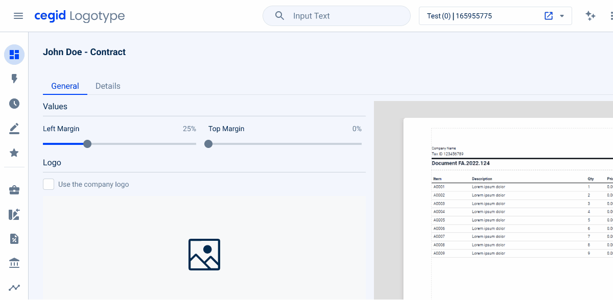
Once we open a model or template for invoices or e-mails, we retrieve default values that were saved when we last used it, therefore, to avoid losing data or misclicking on the slider and, consequently, on the models/templates, there is the possibility to reset the values to the original value. Double-clicking the handle will reset the value.
Range Sliders should be applied for real-time changes within the product (e.g. Templates).
Navigation
In order to facilitate the use of the keyboard alongside the Range Slider, once the user is within the focus – that can be activated with Tab, or pressed state – it would make sense to have an incremental behavior once we press the left or right arrows.
Do not use Range Sliders for precise values.
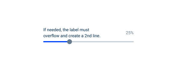
If needed, the label must overflow and create a second line.
Handle Cursor
In order to give the user context about what lies ahead, there is a cursor to indicate that a handle appears, as the cursor directly impacts on how users navigate or interact with digital interfaces. This point follows within the Feedback and Affordance category, because we provide visual feedback to indicate which elements are interactive.
Case Studies

Read Mode: Making Content Feel Effortless and Understandable

A Visual Recap of 2025: how we enhanced chatbot communication